Survey 9: Color Theory and Cool Type

Typography: Bauhaus-the universal typeface by Herbert Bayer

Herbert Bayer

when it comes to this time period, the most iconic leap in typography just cannot be looked over; the Bauhaus movement forever shook the world of type.

Herbert Bayer and the Universal Typeface

Herbert Bayer (1900-1985) was an Austrian-American designer of the infamous design school, Bauhaus. In 1925, the Bauhaus typeface was created. Walter Gropius, the founder of Bauhaus, asked Herbert Bayer to design a font that represented the communication of Bauhaus. Herbert Bayer took on this task, the results? A slick, modern-looking, and simplistic font was born. He successfully created a “universal font”, which was a sans-serif font that did not include any capital letters.

The Bauhaus font by Herbert Bayer, 1925
The universal typeface
Example of the Bauhaus font being used in brands today, such as Nintendo’s amiibo.

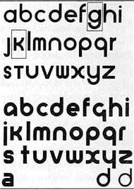
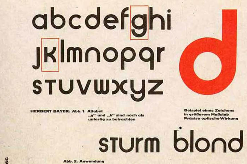
This font greatly improved legibility, and simplified the alphabet to only its most essential shapes. As you can tell, the forms of these letters revolve heavily around the shape of a circle. This is what the Bauhaus identity was all about-simplicity, effectiveness, and functionality. Herbert Bayer definitely achieved “form follows function”.

Architecture: Bauhaus

The world of architecture today is still very much influenced by the visual elements of Bauhaus’s building designs. You may not even know it, but many of the modern, clean looking buildings that we see today have evolved and took inspiration from Bauhaus.

The Bauhaus school building

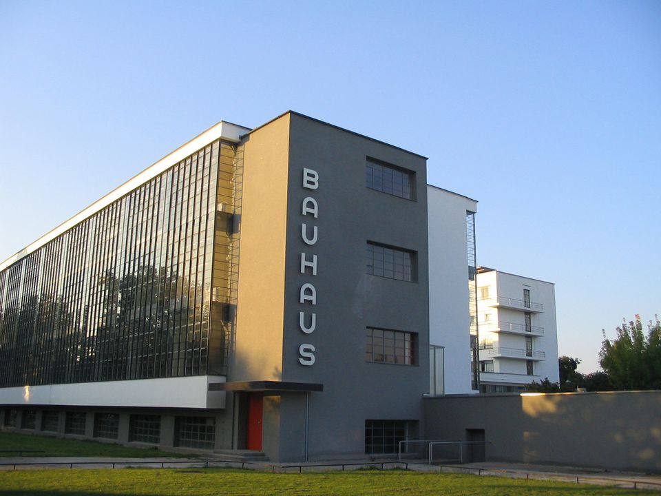
Again, everything coming out of Bauhaus follows the rule “form follows function”. There is no visual extravagance in their architectures, just what is needed and is always kept simple.

Bruno House, 3 Strauss Street by Ze’ev Haller, 1933

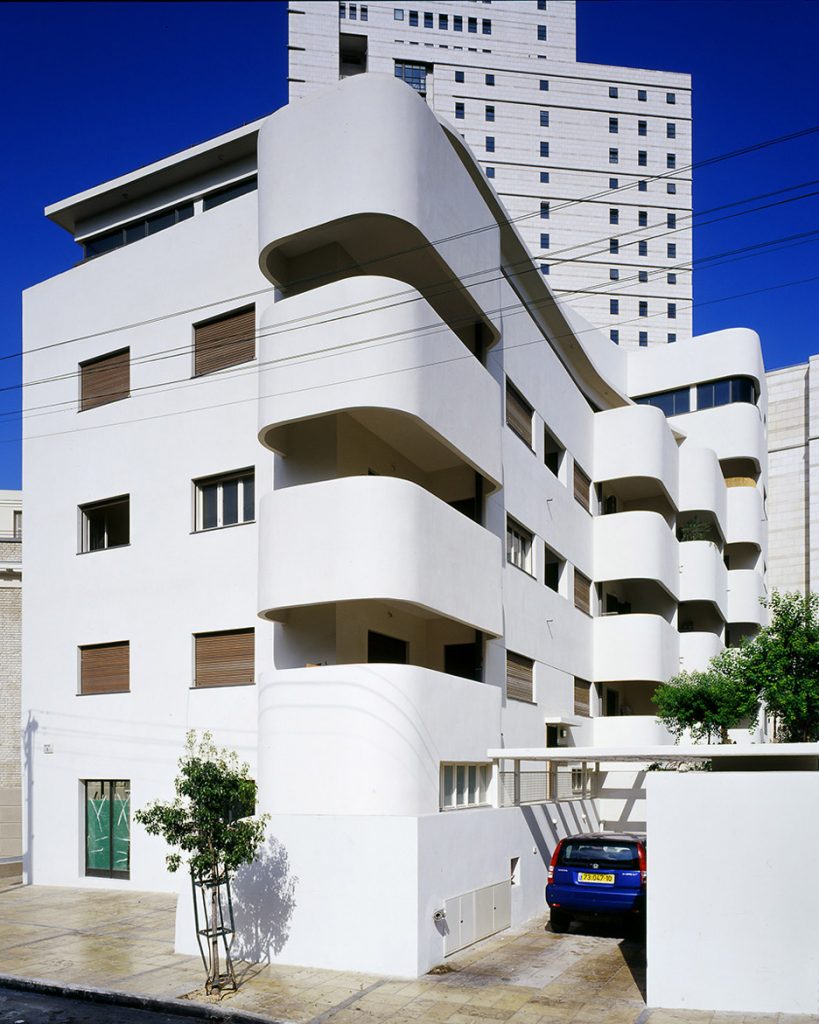
Hard to imagine, right? Can you believe this is a building from almost 100 years ago? Fascinating. The Bauhaus movement and style was definitely ahead of their time, as they saw the value in simplicity and “less is more”.

Bauhaus Archive, Berlin, Germany

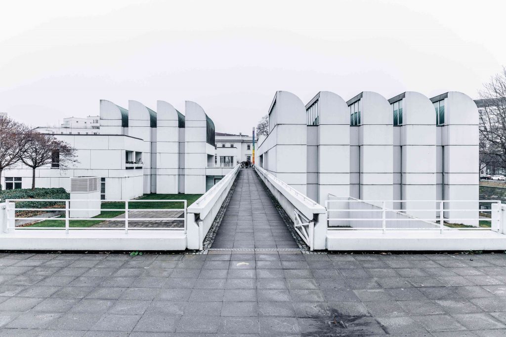
As you can probably tell by now, although not every Bauhaus-styled building looks the same, they all have very similar elements. Rational, simple forms that stick to basic geometric shapes such as triangles, squares, and circles. The colours are often muted, natural colours of the building material itself, such as metal, concrete, and glass. Makes me wonder what other design styles in our current era would thrive even until 100 years later.

Sources

http://www.designhistory.org/Avant_Garde_pages/BauhausType.html

https://www.dezeen.com/2018/11/06/herbert-bayer-bauhaus-100-typography-universal-typeface-font/

https://www.widewalls.ch/magazine/bauhaus-typography/herbert-bayer

https://www.dezeen.com/2016/08/24/10-tel-aviv-best-examples-bauhaus-residential-architecture/

https://www.thespruce.com/what-is-bauhaus-architecture-4784133

Historical artifacts: rational

This was overall a fun project, and I enjoyed experimenting with the art nouveau art style by creating a label for it. I looked at many Art Nouveau packaging references before attempting to recreate this label, and I think it turned out mostly accurate. For materials, I used pencil crayons and ink for the label, and I painted over the box. I do wish, however, that I spent a little more time to perfect it and maybe add a bit more details to the overall look of the packaging. Overall, I give myself 7.5/10 for the accuracy and details.

Survey 6: Claude Monet’s colors and the Victorian Gibson girls

1895-1905

Color: Impressionism

You’ve definitely heard of a few artists of this period, but have you noticed the iconic style of color usage in their paintings?

Claude Monet: The Father of Impressionism

Claude Monet (1840-1926)

I think we’ve all heard of him, haven’t we? Let’s talk about the characteristics of the way he changed color usage in paintings.

“Boulevard de Capucine” (1873)

Claude Monet is known to be the one who caused impressionism to rise. He paints the motif or the “impression” of a scene by being in the environment and quickly capturing a moment. Though these paintings may look “sketchy” and loose, he is a master of controlling the balance of colors, by balancing foggy, muted colors with saturated atmospheric colors. This is the iconic character of color usage in impressionist paintings.

“The Grand Canal” (1908)

As seen in this painting, Monet’s colours are often low in contrast of values, but high in contrast of saturation. This would become a classic style of impressionist colors.

“Impression, sunrise” (1874)

Another great example of the foggy, soft, and low contrast impressionistic colours.

Many great impressionist artists who were influenced by Monet use this same style of color combinations in their artworks.

“The Reader” (1872)
“Woman with a Parasol” (1875)

This is where we begin to see a common theme emerge from the paintings in this era: the Victorian Gibson girls. From here we move on to fashion.

Women’s Fashion: Victorian style

Noble women in the late 19th century usually had the standard Victorian combo: Bustles, high updos, corsets, and draped, frilly dresses.

Example of the trendy hairstyle in the late 19th century

As seen in Monet’s paintings, women often wore high, curly updos with lots of buns and braids. The hair got even taller once bustles became the “hot new thing”!

French women fashion in the late 19th century
Bustles and hoop skirts were used to accentuate the bottom half of a woman’s figure
Classic Victorian fashion trends at its peak

The large, exaggerated bustles in contrast to a tiny waist was very common. The dresses reached their max fullness in volume, and it was beginning to get a little too fancy.

However, bustles began to back out of the fashion trend near the beginning of the 20th century.

Early Edwardian era fashion

Here, we see the fashion trend moving towards a new era: the Edwardian era. The Edwardian era represented a more serious, well-conducted, and strict fashion trend. The skirts began to diminish in size, as well as the height of women’s hair. Instead, a straighter, slimmer silhouette of simpler dresses was much more preferred, and the big hats became very trendy.

The Edwardian era fashion standards

As we can see here, women’s dresses were much more toned-down in terms of puffs, frills, and fancy folds. They were almost suit-like.

A family in the Edwardian era, with classic big hats and formal, mature attire

Sources

monet parasol

impression sunrise color palette

boulevard de capucines monet

https://www.nga.gov/collection/art-object-page.61379.html

https://www.theartstory.org/artist/monet-claude/artworks/

monet the reader

https://www.pinterest.ca/redhookcath/edwardian/

https://bellatory.com/fashion-industry/Fashion-History-Victorian-Costume-and-Design-Trends-1837-1900-With-Pictures

https://www.pinterest.ca/pin/614108099166841084/

https://commons.wikimedia.org/wiki/File:Illustrated_fashion_catalogue_-_summer,_1890_(1890)_(14597302399).jpg

Survey 4: Steam and the Speed of Light

1750-1850

Technology: the Watt engine-new and improved steam engine!

Watt said it’s time for the steam engine 1.1 update.

The invention of the steam engine was no doubt a revolutionary leap towards a thriving industrialized society. James Watt, a mathematical-instrument maker, was the one who made the Watt engine, a revised version of the original prototype——the Newcomen atmospheric steam engine. While Watt attempted to fix a Newcomen engine, He was not impressed with the waste of resources that Newcomen atmospheric steam engine causes and realized that all the luscious energy and heat being lost in the process needed compensation. Watt added another compressor, reducing the steam consumption and upgrading efficiency. He partnered up with a British inventor, John Roebuck, and successfully launched the Watt engine in 1777-1778. Pumping water from mines has never been easier for them!

Watt’s version of the steam engine greatly improved efficiency and reduced energy consumption.
James Watt (1736-1819)

Architecture: Neoclassical Architecture-going back to Ancient Greece and Rome

Have you ever wondered why the White House and many other important buildings look like this?

Greatly inspired by Ancient Greek and Roman architecture, the neoclassical style emerges in the mid-18th century. The consistent designs of these buildings have many common themes: grand simplicity, geometrical harmony, usage of columns, and classical nobleness. This style is believed to be a reaction to the Rococo and Baroque period, which focused more on ornamental elements and sophisticated designs. Learning from the old masters of architecture was definitely a trend back in the days. Neoclassical architecture spread through Europe quickly, and today we can see these elements being used commonly in governmental buildings, theatres, museums, and other buildings that require a visually grand scale. This is why the Neoclassical form is often associated with power, seriousness, and grandness.

Pueblo County Courthouse, Pueblo, Colorado USA
U.S. Capitol building in Washington DC
The White House in Washington DC

sources:

https://www.uh.edu/engines/epi2869.htm

https://www.sciencephoto.com/media/997991/view/james-watt-s-prototype-steam-engine-old-bess-c1778

https://www.britannica.com/biography/James-Watt

https://interestingengineering.com/james-watt-father-of-the-modern-steam-engine

https://www.designingbuildings.co.uk/wiki/Neoclassical_architecture

https://www.mayfairgallery.com/blog/neoclassical-style-guide-art-architecture-18th-century

https://www.barrons.com/articles/how-much-is-the-white-house-worth-1471060823

Survey 3: Block books and Baroque

Typography: Gutenberg’s printing press

We just want to read the Bible! give books. now.

Johannes Gutenberg can be considered the father of western printing technology. He replaced wood-based printing with metal text blocks in 1450, which is the first metal movable type. This was a revolutionary step to printing in Germany, as it allowed books to be printed in large quantities of copies.

Gutenberg’s printing press

It is believed that Gutenberg had borrowed money from a business partner who believed in Gutenberg’s innovative idea—-Johann Fust. Fust lent 800 guilders to Gutenberg which kickstarted the printing career (Gutenberg was kinda broke). Gutenberg continued to improve the press while updating new versions of it, slowly but surely perfecting what he had to work with. In 1455, Gutenberg published the 42-line Bible which contained easy-to-read text in gothic font, and even colored illustrations, which was very popular amongst the churches. Great job at finding your first target audience, Gutenberg :).

The Gutenberg 42-line Bible

However, in 1456, Fust grew impatient and demanded the loan to be returned. This issue quickly escalated to court, and Gutenberg lost the trial. In the end, Gutenberg was unable to pay 2,026 guilders (gasp) —- much more than the original amount because of added interests. This resulted in his invention being taken away from him, and the press was handed to Fust (come on Gutenberg, you can do better than that). Fust carried on with this technology and explored new printing strategies and fonts, and it is believed that he credited Gutenberg as he did so. Some also believe that while Gutenberg became bankrupt, he had the freedom to open his own small printing shop, and continued from there. Although Gutenberg isn’t the first person to use printing technology, he definitely made revolutionary advances and brought it success in the western world. I personally think if he dealt with the money before wanting to perfect the technology, he and Fust possibly could have been great partners for a longer period of time and made even better improvements to the printing press.

Gutenberg working on the printing technology in his workshop

Art – the Renaissance and the Baroque painters

There’s this Artist who was definitely wild and you’ll quickly see why.

The 14th century is considered to be a rebirth and revolution in the art world by many since some of the most influential artists in art history originated from this era. The infamous father of Baroque painting, Caravaggio, is one of them. When the Italian painter first settled in Rome, he was greatly influenced by previous artists such as Masaccio and Giotto, masters of the Renaissance era. However, Caravaggio’s art shook the art world by using his own naturalistic interpretations.

Hidden self-portrait of Caravaggio in “David with the head of Goliath” (1610)

Caravaggio took Chiaroscuro to the next level by pushing the contrast of light and dark in his works, which is an iconic characteristic of his paintings. Using this technique, he often depicted the biblical events as dark, gruesome, gory, but still natural and realistic to the point where the audience immediately puts themselves inside the image. This was the magic of his paintings. As you can imagine, controversies emerged because Biblical stories were not always pretty in his paintings, and not everyone was a big fan of that.

“The incredulity of Saint Thomas” (1601-1603) (Yes, his finger is inside the wound)

He went on to influence many great artists after him who also made great impacts on the art world, such as Rubens, Velazquez, and Rembrandt. Without Caravaggio’s works, art would not be what it is today.

“Death of the Virgin” (1601-1606)

As you can probably tell, these people didn’t always look like the prettiest Gods and Goddesses. That’s because Caravaggio wanted the paintings to look natural and believable, so he picked models from people on the street. This is also why his naturalistic style is so different from previous famous artists, as they were mostly about “photoshopping” and idealizing the figures to look perfect.

Sources

http://www.visual-arts-cork.com/old-masters/caravaggio.htm

https://en.wikipedia.org/wiki/The_Incredulity_of_Saint_Thomas_(Caravaggio)

https://en.wikipedia.org/wiki/List_of_paintings_by_Caravaggio

https://www.thoughtco.com/johannes-gutenberg-and-the-printing-press-1991865

https://www.history.com/topics/inventions/printing-press

https://www.britannica.com/biography/Johannes-Gutenberg

https://www.google.com/search?q=gutenberg+and+fust&tbm=isch&ved=2ahUKEwjdwI3NzrPsAhXXBTQIHS9yBckQ2-cCegQIABAA&oq=gutenberg+and+fust&gs_lcp=CgNpbWcQAzICCAA6BAgAEEM6BwgAELEDEEM6BAgAEB46BggAEAgQHjoECAAQGFDu0kBYxNlAYNvaQGgAcAB4AIABmQGIAeoEkgEDOC4xmAEAoAEBqgELZ3dzLXdpei1pbWfAAQE&sclient=img&ei=6K-GX92sFteL0PEPr-SVyAw&bih=1057&biw=1792&client=safari#imgrc=LzbsTu1Nw7bsgM

Mood Board reflection

If I were to give myself a mark, I would give myself a 7.5/10. I think I tried to get all the points down, but I could’ve written some parts with better language, and it was a bit difficult to find the fitting images especially for the camera (very difficult to find non-repetitive images and I couldn’t find a sample of a photo taken with the original Leica). I also think I could have made the connections a bit clearer though that was also hard because seemingly, these three events have no relation to each other. But I think I have the right idea. In all, It was a project heavily research-based, and less visually-creative based in my opinion. I think sometimes I lack skills in the presentation of my research, even though I’m not bad at learning on my own about these topics and simply attaining the information to myself. The main thing I learn through these projects is how to write and present to show that I know this knowledge. So I think this was mainly a writing exercise for me personally. I learned a lot about these events on my own though.

Survey I: Indus river valley civilization

The ancient civilization of the Harappans and their oddly modern cities

lasting from 3300 – 1300 BCE, the Harappan civilization was one of the first of its kind to make revolutionary inventions and advancements in all kinds of technology, especially land planning.

Hierarchy-based height planning

located in Punjab, Pakistan, the remnants of an ancient city sits still, serving as evidence of the once-thriving civilization. The Harappans used an innovative grid-style planning layout for their entire city and put the important buildings such as granaries and assembly halls a little higher than ground level (artificial hills!) to avoid flooding. the lower cities were the residential area, neatly laid out in rows, connected at all the corners in right-angles (just like a modern residential area).

example of grid-style layout of buildings

Drainage and residential areas

They used lots of clever tactics and technology to avoid flooding. for example, the city walls were built really high, and the walls sectioned off different parts of the city. every single street had connected to one big drainage system. Even every single house had its own “plumbing” with built-in bathrooms and wells that connect to the large drainage system for the whole city (yay sanitation!). All buildings’ material mainly consisted of mud-brick walls.

Wells and bathrooms were in every household, with a clean drainage.
very modern houses

The Great Bath

Although there is no evidence of temples and religious buildings, the great bath is believed to serve as a location for ritual/worship. It measures approximately 179 ft x 107 ft, and its drainage is also well-developed, connecting to both a water source and a sewage system.

Granaries

The granary is the largest building found in the ancient city. It is about 150 ft x 75 ft x 15 ft. The building was made so that it was possible to fill it from the outside, and had excellent ventilation. This indicates that they prospered in agriculture and had an abundant supply of food.

Conclusion

Overall, the Harappans were definitely ahead of their time in terms of sanitation control, drainage technology, and architectural choices. The materials they used lasted thousands of years, and the town was set in a location with a nice habitable climate, near accessible water sources. Life seemed good while it lasted.

Sources

https://www.ancient.eu/article/695/harappa-an-overview-of-harappan-architecture–town/

https://www.toppr.com/guides/history/in-the-earliest-cities/harappan-civilization/