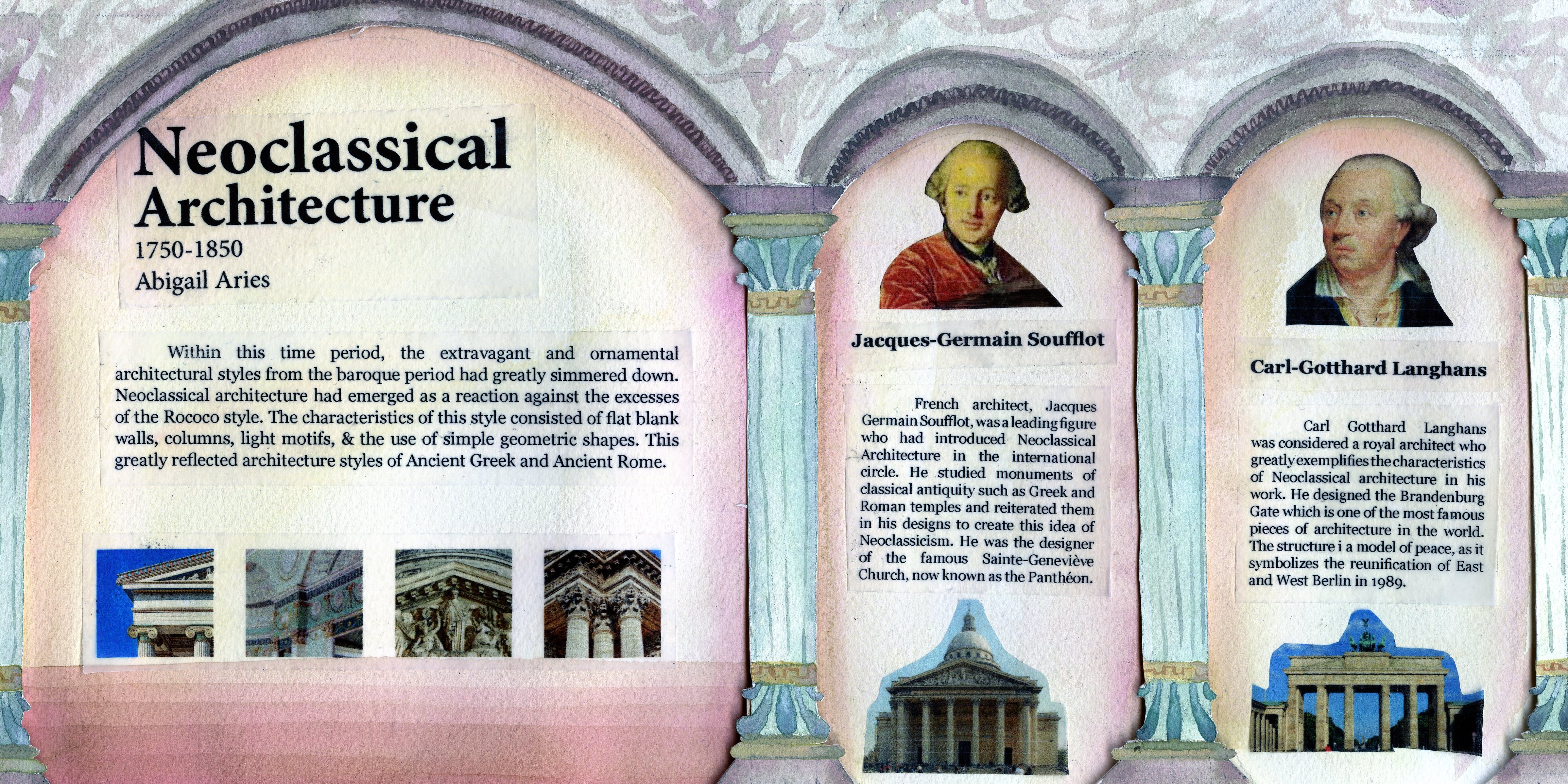
I was assigned as the designer to produce a layout which included research on Neoclassical Architecture, and the biographies of two Neoclassic architects. In doing so, I chose to present the information amongst the forms that were the most prominently known in Neoclassical architecture with the use of columns and arches. These structures unite the idea of the architectural genre throughout the spread while still dividing the information. The background was kept simple due to the choice of incorporating photographs and blocks of text into the spread. I chose to print out these features to present the information as clearly and neatly as possibly to reflect the idea of class and order. I was able to print the images and text onto tracing paper so that I would be able to lay out these aspects without disrupting the gradients in the background. I would give myself an 8/10 for this spread. I believe that I was able to visually represent the research topic attentively, in an easy to understand and organized manner.