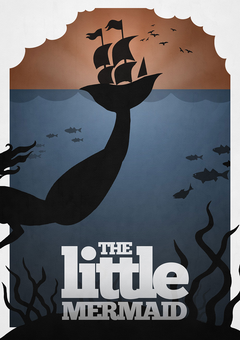
This poster design represents a great way designers could use size to their advantage by creating drama and contrast. By having the mermaid much larger than you would expect since the title is the “little” mermaid you are faced with a contradictory concept creating interest to the viewer. I think this is a successful example for using size in poster designs as it creates a sense of mystery. The target audience questions the poster and wants to know more about what’s going on in this movie since it shows how unpredictable it is made out to be. The artist of this poster knew that the audience was going to be kids and by using size it was a great way to attract attention and spark questions right away keeping the audience engaged from the start.
