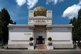
I loved learning about the dreamers of the 19th century because of the new hippie fonts, evolving graphic design posters and the creative artists behind them. One artist that stood out to me was Koloman Moser, he was an artist from Australia. His art was greatly influenced by the twentieth-century graphic art of the Vienna Secession movement. The Vienna Secession started with a group of artists, architects and designs that went out to change the concepts used traditionally and move into what we now call modernism.
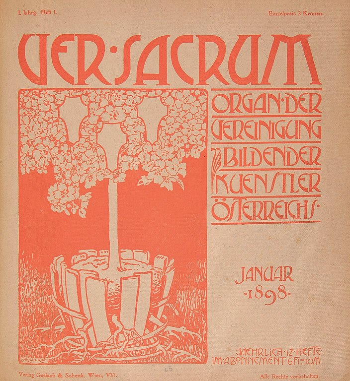
Moser was born on March 30th, 1868 and died October 18, 1918. He was known as a very well-rounded artist which I admire, he designed books, graphic work, stained glass windows, magazines, postage stamps, fashion, furniture, ceramics, tableware, silver and jewelry. He was also the main designer for Austrias leading art journal Ver Sacrum which revolved around design with Gustav Klimt and Josef Hoffmann. Moser later ended up founding Wiener Werkstattee with Josef Hoffman, their studio produced unforgettable designs for household goods, these included rugs, silverware, glassware and flatware. Moser, later on, went to design the Apse Mosaic at the San Clemente Church in Rome in 1904, which features gold and green tesserae making it shine. Along with this project, he also designed the Medallion House of the Linke Wienzeile Building decoration for famous architect Otto Wagner. The reason I enjoy Moser’s art so much is the fact he used such intricate details as well as satisfying symmetry in his work.

Alfred Roller was another artist in this era who I think evolved the typography world with his new hippie typeface. Along with Kolman Moser, he also attended the Vienna Secession because he rejected the prevalent academic art style. Alfred Roller, was born on October 2, in 1864, and first studied in the Academy of Fine arts in Vienna. A surprising fact about Roller is that he designed the layout for the Secession exhibitions. He was known as a graphic designer and draughtsman. He got to design the vignettes and the cover for the Secessionist periodical Ver Sacrum. He also designed the posters for the fourth, fourteenth and sixteenth Secession exhibitions. A piece that caught my eye was his project in 1903, his psychedelic calendar for Ver Sacrum. The letter style is colourful and can be described as blocky, even-sized letters with curvy cuts placed inside to create the outline of each letter. This curvy block lettering is so unique and almost ineligible at times. I think it is most effective when he stretches them out to fill out his artwork.

https://en.wikipedia.org/wiki/Vienna_Secession
https://commons.wikimedia.org/wiki/File:Ver_Sacrum,_Issue_1,_January_1898.jpg