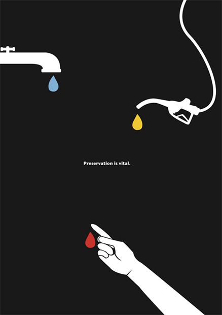
The empty black space used in this poster is very impactful considering the topic “preservation is vital”. The artist did a great job by showcasing how on earth supplies are limited and we don’t have tons of material here. By choosing a lack of elements and empty space the artist is explaining that materials are not everlasting. I believe the artist here chose to use so much black empty space so that you focus on the three drops of colour. The small drops of colour represent how we lack materials. The artist did the same with the text by making it very small, almost hard to read which also showcases a feeling of “lack”. When the audience reads it the message of lack is there with us. If the text was blown up and big it would not have any emotional effect.
