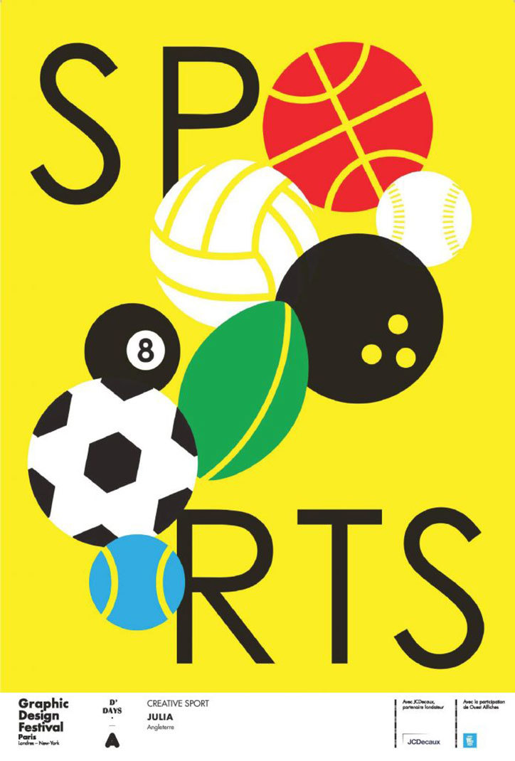
This poster really shows off colour in an interesting way. It is simple but effective by using interesting colours that give contrast instead of predictability. If the artist were to colour the football red, the baseball yellow and the basketball orange we would not have the same effect we do. The colours here create more interest to the eye which makes this poster compelling and not basic. At first glance the colours may seem simple and less creative but it is effective in not taking away from the word sport. I think the reason she kept the basketball a reddish colour was so we could recognize it first and associate it with the letter “O”. Using colours in an unexpected way makes them stand out and adds an element of surprise in a basic design.