Blog Post 4: Kurt Schwitters’ Merz.

When I was growing up in high school, I was introduced to tons of different art movements through my classes or by my own discovery. The special few that I became inspired by were the surrealist movement and Dadaism in the 1910s-20s as well as the Avant-garde movement of the 20s. I was entertained by the ideas of uplifting your artistic potential with concepts of attentive dream theories, absurd whimsy, and the respectfully unorthodox and experimental. I believe that’s something that Kurt Schwitters of the 1920s alternative artistic scene did very well to portray in his work. 

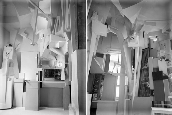
Kurt Schwitter (1887-1948) was a German Dada artist, poet and publisher that always worked to express his passion for the arts of any kind. It was the interest in collage making that inspired the Merz movement. The term he invented for his magazine is from the name of his most characteristic work in 1919, “DAS MERZFIELD” to call the collages he made from newspaper advertisements. Ultimately, Schwitters would use this medium to all his art activities and to the magazine he founded in Hannover in 1923. His style was made from collecting trinkets, junk, articles, old newspapers, pictures, string, wire etc and told his story of his feelings about art at the time. Schwitters also invented the Merzbau, which was a series of multimedia paper construction built into rooms of his house to look like an artistically surreal new world. Schwitters wrote many poems and articles in Merz. Some of them he called Merz Fairy Tales, which focused on ideas of full artistic freedom. art and stories in Merz desired to be creatively free from all restraints to shape things the way you intend to shape them artistically. Schwitter’s magazine also represented the idea that art can be anything and can have any kind of limitation, as long as the artist knows how to create.

He became highly appraised in the dadaist and surrealist movements, His old enemy finally debarred him from Dadaist activities and they became friends. As for the Nazis, when they came to power in 1933, they were offended by Schwitter’s visual artworks All of Schwitters’ fairy tales were considered  provocative because the Nazis saw his work as “degenerate,” displaying as too abstract, too modernist and non-representational of any true German feeling or thinking.

Merz Magazine >

That wasn’t the end of Merz yet. The magazine continued to live on in Europe where Kurt lived as a refugee from the regime. For a short time, Schwitters lived in Lysaker near Oslo in 1937, where he worked on a new Merzbau house (all of the Merzbau projects were unfortunately destroyed by the Nazis.) Later, when the Nazis again invaded him, he spent a short time in a nazi internment camp, then he fled to London, England in 1940 . Schwitters spent the last years of his life writing Merz Fairy tales and making more and more collages. He was highly regarded by the avant garde artists there and was immediately welcomed when he immigrated over. There he began work on a third Merzbau space, but it was far from completion when he died at 61. Today, art historians consider the work of the Merzbau and Merz magazine, a developed sub-genre of Dadaism.

References:

Blog Post #3 – Alphonse Mucha and the making of the Slav Epic (Slovanská epopej).

An older self-portrait by Mucha, 1907 Source

Most of Alphonse Mucha’s popular legacy is deep-seated into his famous Parisian posters of beautiful women posing for theatrical and commercial purposes… But, Mucha personally felt he was truly meant to create more meaningful art than just those works. He had always wanted to try Historical painting, and wanted to complete a series to display the accomplishments of Slavic Peoples in Europe throughout history since he was young. Once he had the ideas for this great project, he went to take photographs and sketches in Slavic countries like Russia and Poland to the Balkans in 1908 and 1909. 

“I will be able to do something really good, not just for the art critic but for our Slav souls.” – writing from Alphonse Mucha to his wife in 1910.

The Slav Epic displayed many patriotic messages , He wanted to make sure that these pieces properly respected and celebrated the great historical achievements of the Slavic Peoples, Including Czechs, Russians, Poles, Serbs, Hungarians, Bulgarians, and the Balkans, not to forget the Orthodox monasteries of Mount Athos. Once he received funding for this great project from millionaire and revolution promoter Charles R. Crane, Mucha continued to create the twenty mural-sized (measured six by eight meters) paintings depicting the history of the Czech and the Slavic peoples. To paint them, he rented and lived in an apartment and a studio in the Zbiroh Castle in western Bohemia until 1928 when he finished. He had help from many costumed models, using both still and motion picture cameras to set the scenes with his models, and encouraged them to create their own poses. It took him 16 years to fully complete them all. He bestowed them to the city of Prague in the same year and they received great praise.

Modelling for No. 9 The Meeting at Krǐžky 
by Alphonse Mucha, 1914/1915

In the late 1939, fascism was already starting to rise in popularity. German troops marched into Czechoslovakia and Mucha, a Slavic Nationalist and a Freemason, was among the first people to be arrested by the Gestapo. A lung infection started to affect him during the intense arrestment and interrogation process. When they released him, he never recovered from the poor conditions of his internment and also seeing his home invaded and overcome. He died in Prague on July 14, 1939 of pneumonia. 

Mucha being known best for his work in the Art Nouveau movement was something he wasn’t a very big fan of. 

“What is it, Art Nouveau?”…“Art can never be new.” 

– Alphonse Mucha, a quote from his biographer and son, Jiří Mucha.
He instead took the greatest pride in his work as a history painter for The Slav Epic, which he considers his greatest masterpiece and is the work that is most spiritually tied to him and his birthplace. The pieces were rolled and stored away to be protected from the Nazis  for twenty-five years before being shown at the chateau in Moravský Krumlov, the South Moravian Region in the Czech Republic in 1963. The pieces are currently being moved to be displayed in the Thomas Heatherwick-designed Savarin opening later in 2026.

Information Sources:

“Alphonse Maria Mucha Biography in Details.” Alphonse Maria Mucha Biography With All Details, 2002, https://www.alfonsmucha.org/biography.html  

Wikimedia Commons. “Alphonse Mucha.” Wikipedia, Wikimedia Foundation, 6 Nov. 2022, https://en.wikipedia.org/wiki/Alphonse_Mucha 

“About Alphonse Mucha.” Serpent Publishing, 2022, https://serpentpublishing.com/about-alphonse-mucha.html#the-slav-epic 

Blog Post 2: Fustcraft.

The story of the printing press has been a staple of the beginning of books, design and illustration. In the timeline of illustration history, I find the ancient process of woodcuts and metal print to be so fun and interesting, because of the different styles that emerged from older designs made to represent many things, simple for replication, show a story from the bible, and also has to make sure everyone can understand it, even for those who are illiterate.

I am currently getting back into lino cut art, its interesting to learn about such an old practice. But, I am much more interested in Johann Fust and his experience being accused of witchcraft and trickery!!! 

For context,  Johannes Gutenberg (1400-1468) was the man first credited to be the inventor of the printing press in Strasbourg, Germany. It was the first instance of book copying and reprinting in Europe, which he began operating in around 1430. Johann Fust ( 1400 – 1466 ), Gutenbergs’ business partner, worked to help finance and create the printing press to mass produce the Bible, later known as the Gutenberg Bible. The printing press had a significant impact on the intellectual revolution of the renaissance though not at first and not for Gutenberg himself.

Fust (Source) & Gutenberg (Source)

Johann Fust was not known to be a printer but a businessman and salesman. When he funded Gutenburg for his invention, it was a very expensive undertaking, first providing 800 guilders (with a % 6 interest, from my research it would be 296,538.41 Canadian Dollars in 2021.) and then another 800 guilders later on once Gutenberg got a hold on the progress, Fust then found the need to partner up with Gutenberg, since he invested so much money into the project.

After years of work on the Gutenberg bible, just before the project was due to be completed with only 3 bibles left, Fust sued Gutenberg for breach of contract, and his press and types became Fust’s property. This was because Gutenberg could not repay the fees back in time for the contract they made. Fust and his brother-in-law, Peter Schöffer (1425-1503) carried on the work begun by Gutenberg, And started to distribute the holy bibles, they were also the first to use colour in their prints, with blue and red.

50 Bibles were printed in Mainz from 1455 onwards, some out of vellum, but most out of paper. Johann Fust travelled across Europe to sell to King XI of France and others who could afford a copy in Paris. Back in the day, there was almost nothing to show the small differences and flaws in these printed copies from previous illuminated manuscripts, it is said that when the public first set eyes on them, it looked like someone had magically been able to write identical copies using magic as well as using blood as ink.

The French almost threw him in jail for black magic, In order to prove the mortal powers of printmaking and to escape a jail sentence, Fust was forced to spill how the bibles were rapidly produced and identical. He feared that the technology Gutenberg developed would quickly be learned and stolen by bootleggers. 

Henry Clarke’s Illustration for Goethe’s Faust – (Source)

Something super interesting that I found is that throughout history, especially in folklore, is that Johann Fust is sometimes confused with Faust and has even been nominated by references throughout the years as possibly the original Faust by some. Johann Faust, Doctor Faustus, or popularized by Christopher Marlow play, “The Tragical History of Doctor Faustus” is a German legend of a man who trades his soul to satan for otherworldly knowledge and pleasures. Johann Fust was often contributed to Faust before Marlow’s story in 1587, and Goethe’s German Text of Faust in 1829, even though Faust was based on the historical Johann Georg Faust (c. 1480–1540). Too many Johanns. Too many Fausts. 

In conclusion, the story of Fust the magician distributing the evil Gutenberg bibles is possibly one that isn’t fully recorded properly, since so many mistook Fust and Faust and clumped them together, Elizabeth L. Einstein, the 20th Century author of The Printing Press as an Agent of Change, Cambridge University Press, 1979, conducted a journal where she suggests that most older references to Fust and his bible were associated with “divine rather than diabolical power.”

References:

Wikimedia Foundation. (2022, May 13). Johann Fust. Wikipedia. Retrieved October 19, 2022, from https://en.wikipedia.org/wiki/Johann_Fust  

Fust, Johann. (2018). In P. Lagasse, & Columbia University, The Columbia encyclopedia (8th ed.). Columbia University Press. Credo Reference: https://ezproxy.capilanou.ca/login?url=https://search.credoreference.com/content/entry/columency/fust_johann/0?institutionId=6884

https://iisg.amsterdam/en/research/projects/hpw/calculate.php

British Library Board. (n.d.). Gutenberg Bible. British Library. Retrieved October 19, 2022, from https://www.bl.uk/collection-items/gutenberg-bible 

Cook, J. W. (2014). printing in the Renaissance. In J. W. Cook, Encyclopedia of Renaissance literature (2nd ed.). Facts On File. Credo Reference: https://ezproxy.capilanou.ca/login?url=https://search.credoreference.com/content/entry/fofrl/printing_in_the_renaissance/0?institutionId=6884

Wikimedia Foundation. (2022, August 26). Faust. Wikipedia. Retrieved October 19, 2022, from https://en.wikipedia.org/wiki/Faust

Broekhuizen, J. S. (1967). Faust and Fust: A case of mistaken identities (thesis). Texas.

Pages of the Middle Ages – Museum Exhibit 141

I just finished up my assignment for the museum project, i made my exhibit on Illuminated Manuscripts, and I love medieval art and the idea of hand-making something so intricate and precious as a religious text that thousands of people come pilgrimage to just gaze at to experience the magical art itself, aswell as the idea of the monks painting and foilign each indiviudal page to be perfect.

I honestly executed the idea for my exhibit that came to mind first.

I looked at the way most museums work their manuscripts, whether real or fake, the similarities their exhibits share work really well with the manuscripts themselves , the complementary blue backgrounds, the bright downwards spotlight, the white and gold fonts and the medieval typeface titles work really well with the topic.

I wanted to do something with these elements AFTER my concepts of doing a Skyrim loading screen as my museum exhibit. Skyrim loading screens are described as a frozen, rotating 3d object or character in a liminal space with small text in the corner , they are very cool and I thought it would be a simple and clean display with an element of epic whimsy. Here are some examples:

I wanted to make it look like its a future museum using either digital 3d groahics or hovering technology to show an illuminated manuscrip tmodel. i started with creating the covers of the pages on procreate, using a manuscript text and a simple design and illustration of the virgin Mary and baby Jesus using various references to replicate an illuminated Manuscript style.

Final design, incorporating the text found here by modern calligraphy artist, Ziggiotti Ivano: https://www.flickr.com/photos/ivano-ziggiotti/6776964604

I then found a creative commons model on sketchfab of a book to UV map my illustration on:

#9 Magic Book – 3December2019 by Canary Games on Sketchfab

At this point i was already super proud of succeeding in my first time at Blender, I believe it was a good choice to use blender because i have been wanting to learn more about 3d after learning a bit of Maya. I am pretty happy with my choices in taking all that time working in the software.

Regarding the final touches in procreate and illustrator, it took a while for me to get the right feel for the typeface in the final, Universal type client was a little annoying when finding a cool medeival font, so I just went with te best one in illustrator, and complimenting it with a simpler text for the box papragraph.

References for the museum text paragraph:

Wikimedia Foundation. (2022, October 5). Illuminated manuscript. Wikipedia. Retrieved October 7, 2022, from https://en.wikipedia.org/wiki/Illuminated_manuscript 

Zirlin, Y. (2013). Illuminated manuscripts. In H. Bar-Itzhak, & R. Patai (Eds.), Encyclopedia of Jewish folklore and traditions. Routledge. Credo Reference:  https://search.credoreference.com/content/entry/sharpejft/illuminated_manuscripts/0

Other:

https://www.theledger.com/story/entertainment/local/2019/05/15/illuminated-manuscripts-on-display-at-pmoa-show-golden-age-of-handmade-books/5154779007/

https://search.credoreference.com/content/entry/fofmedieval/book_of_kells/0

https://en.wikipedia.org/wiki/Insular_art#Other_books

Creative References:

https://sketchfab.com/3d-models/9-magic-book-3december2019-4e245fa384fb486ba7bbc519bdc24464

https://en.uesp.net/wiki/Skyrim:Loading_Screens

References for the Blog Post:

https://www.clevelandart.org/events/exhibitions/glory-painted-page/gallery-views

https://www.theledger.com/story/entertainment/local/2019/05/15/illuminated-manuscripts-on-display-at-pmoa-show-golden-age-of-handmade-books/5154779007/ 
https://www.folger.edu/sites/default/files/Turner-Cradles-for-Displaying-Illuminated-Manuscripts.pdf

Blog Post 1: ふふふ、これをグーグル翻訳で翻訳しています。

Languages have been such a fascinating topic for me to learn. While in middle school and high school, I had great fun learning languages for intensive programs, for an elective, or just hardcore Duolingo training, French and Finnish were very interesting, but my most favourite was the Japanese Language, mostly because learning about its different quirks and niches in their linguistics and their culture. In my last semester of high school, Nothing to me was more interesting (and more complex) than learning the culture of Japan, but the history of their alphabet is a different story. The historical firsts of this language definitely deserves a second look;

Image: A spooky halloween scene from the works of Utagawa Kuniyoshi, “The Ghosts of Asakura Togo” (1851 Edo Period). Source

First off, for clarification, there are three writing systems used in the one Japanese language:

Hiragana,(ひらがな):

Hiragana is one of the phonetic alphabets and represents Japanese words and phrases, it is mostly used for Japanese suffixes and grammatical functions where there are no kanji or katakana for foreign names or foreign loanwords. Example: (English)> Cat (Romaji)> Neko (Hiragana)> ねこ

Katakana,カタカナ: 

Katakana is more often used for loan words that have been adopted from other languages. Example: (English)> Canada (Romaji)> Ka Na Da  (Katakana)> カナダ

Image: Kanada 
A generated image from popularbabynames.com of the Japanese Katakana for Canada. 
Source 

Kanji,漢字 :

Kanji shares much of simplified Chinese characters, it is used for the translation of Chinese words and phrases. The word Kanji translates from the Chinese work Hanzi, (which refers to the Han Dynasty.) example:  (English)> Cat (Romaji)> Neko (Kanji)> 猫 

The 46 characters of Hiragana and Katakana represent consonant/vowel parts that make up the syllables of spoken Japanese (along with 5 characters that represent singular vowels). As with Kanji, the regular-use alphabet of Kanji has 2,136 characters, and the overall amount of Kanji characters have around 5,000 and 10,000 characters. The regular use amount is taught from kindergarten to high school in Japan.

Historical origins

Although there has been no proof yet of the language’s birthplace or linguistic relatives, it is known as of now to originate from Korean languages (Ural-Altaic family of languages) in the 4th century BCE as a spoken language. 

Written Japanese

Japanese was not known to have been written until the 4th Century BCE. The ancient Japanese started by Learning the Chinese language in the 5th century BCE from imported goods from the Chinese across the sea. The Japanese then started adapting and writing the Chinese-Japanese writing style, a great example is the Japanese Kojiki, “Records of Antiquity”, an ancient collection of myths and legendary history, discovered to be dating from the early 8th century (711-712) and composed by Ō no Yasumaro.

Image: 1885 CE, illustration of the gods Izanami (left) and Izanagi (right), creating the islands of Japan with their spear from the Japanese tales, “Kojiki”.
Source 

References:

141 – Yearbook Spread

So, I chose to create my yearbook spread to represent me as much as I could. The first thoughts I had while creating my hypothetical fake yearbook spread was: how would I want people to remember me? What vibe do I want to give off? When I got to work on it, I started with imagining… hrmmmm, I love fall, leaves, a Halloween vibe with spooky greens. Also, I love fantasy, elves, folklore maybe even with a tiny dark twist, that’s the vibe, perfect, great. I started off with a small sketch picture for a profile pic to visualize what I saw in my mind…

… It gave me a better idea of what I want to do for my yearbook spread so I kept going, using the same vibes and changed the colours around a bit too. As for the text, I tried to be as honest as possible, which sometimes requires spontaneity. I made sure to just say what came first and edit it to make a bit more sense and make it more visually friendly. Overall, I believed I tried way too hard, but in my mind I feel that’s a good thing. I want to give off a good impression of myself for my first design project in university so I gave it my best. I spent time working on it during the nights after school and on the weekend to complete my spread. I followed the steps, referring back and forth to them as I worked, and I am very proud of what I’ve done. If these were graded I would give myself an A. Thanks for reading.

You can find the PDF version here

About Me

Hi, my name is Andy Poystila, and this is my short introduction so you can get to know a little bit about me.

I grew up on Salt Spring Island where I attended K-12 grade school. I spent my childhood out in the woods and going sailing with my mom, brother and friends. My hobbies in school were mostly visual arts and the performing arts. Most of my time in high school was spent in the art room or the drama room, learning a lot about myself in both those subjects. I believe if you lay yourself open, bare, and honest to your peers without judgement, when there is mutual understanding, respect and appreciation, you can build a small family with your classmates. I have had that experience many times as a student of art and theatre, and it is something I will carry on and cherish forever. I hope to bring this welcome to any group of people I meet, whether it be a group of coworkers or a whole new classroom.

I currently reside in Vancouver with my partner Bells, where we both study at Capilano University. While Bells works on character design and animation in their second year of the 2D Animation program in the BOSA Building, I design and paint in the IDEA Program in the Arbutus Building. Discovering the world around us has been both been exciting and challenging as we become adults together. We have had a great summer, exploring places like Lynn Canyon, Cleveland Dam and Queen Elizabeth Park. Our next destinations will include much further places like Eastern Canada, Disneyland, Thailand… we have been thinking about travelling to Bells’ hometown in Scotland (when we have the time to of course).

Since I moved to Vancouver last year, I have met many new and different people. I have learned so much about others, myself, and my future career just from getting to know others and their stories. I believe that everybody has something to teach you if you let them.

In the past year, I have been working hard to achieve my dream of pursuing a degree at a university level. At a younger age I was so frantic at choosing what I want to practice- I struggled to choose between working as an artist, psychologist, musician, actor or mortician. It’s been a hard choice to pick one path and follow it. I always knew one thing about myself though; I have always trusted that my need to create and design will draw me into a fulfilling life.

After much hard work and decision making, I chose the IDEA Program, the School of Design in Visual Communication at Capilano University. I believe the choice of IDEA will give me a wider spectrum of different specialties that I can choose from to master that pertain to my creative passion.

Hoping to see you around campus!

  • Andy