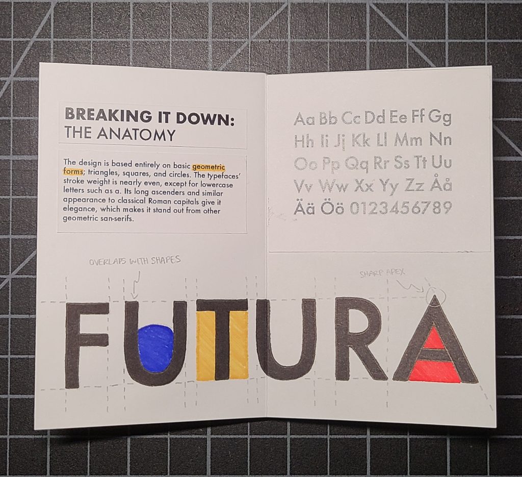
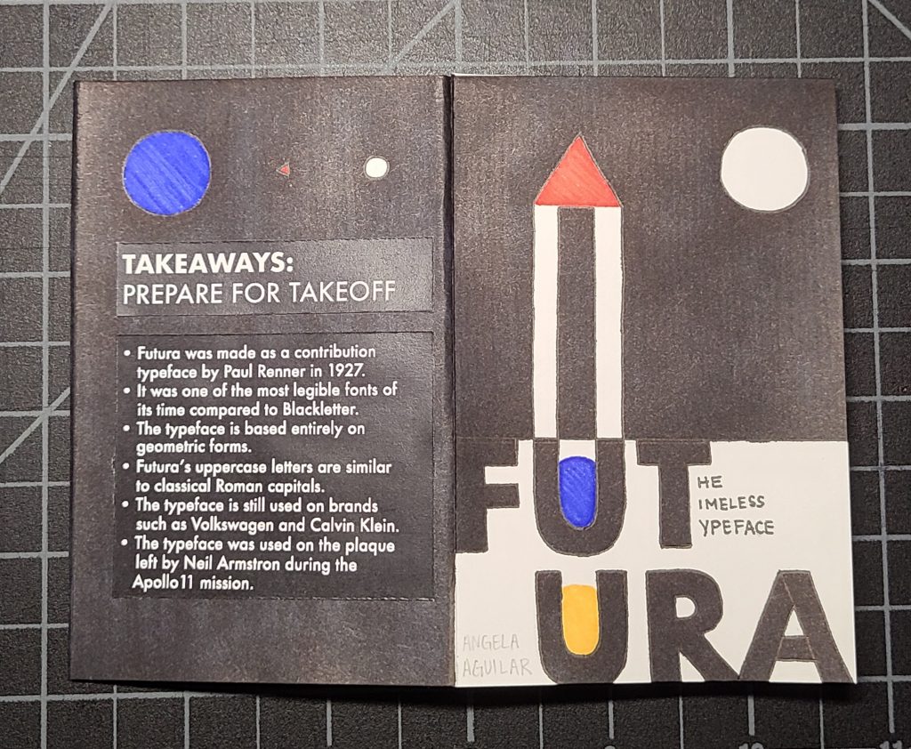
This project was a guilty pleasure as I am such a big fan of Futura. I decided to give a subtle nod to Swiss design and used columns to organize my spreads. I wanted to reflect the typeface and its history as much as I could in my design, and this was also my biggest challenge. Swiss design is known for being precise and uniform, which is really easy to do digitally but is super tedious to do by hand. It took a lot of patience and attempts, but thankfully tracing paper exists. I’m kind of glad I stuck with the theme of geometric shapes as I usually struggle to draw straight lines, and this was really good practice.
The Process: Sketches and layouts!
I always like to have a good sense of how I would go about laying things out, so I stuck with a two-column grid in my mind for reference. I normally go for an odd number of columns to be more flexible, but I decided that two would be good to achieve more balance. And not to forget that this zine is already so small by using A4 (8.5×11) paper.

The Finished Product
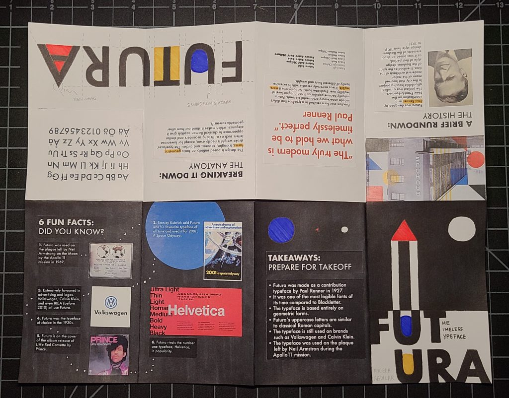


I spent a good 8 hours in total, including the time I spent researching the typeface and creating iterations for my spreads. Overall, I’m pretty content with the outcome of this zine, which is actually the first one I’ve ever made! However, I think I would give myself a 7.5/10. I had some smudging that occurred because of my ruler—note to self, rulers don’t just grip onto paper, they hold on to other residues too—that I couldn’t get off when I was gluing. Also, looking back at my first spread, instead of having a quote, I could have shown how Futura compared to Blackletter in legibility. I also think I could have drawn some more illustrations as well, and what held me back from doing so was the notion that it wouldn’t seem as “Swiss”, but that’s most likely me overthinking way too much.
Works Cited
Here’s Everything You Should Know about Futura, on Its … https://www.digitalartsonline.co.uk/features/typography/heres-everything-you-should-know-about-futura-on-its-90th-anniversary/.
Keung, Laura. “All about the Futura Font and Its History.” Design & Illustration Envato Tuts+, Envato Tuts, 1 Aug. 2020, https://design.tutsplus.com/articles/all-about-futura-font-and-its-history–cms-35382.
“Type in History: Futura.” Sessions College, 16 Oct. 2019, https://www.sessions.edu/notes-on-design/type-in-history-futura/.