
Like my previous project, the historical artifact project, I decided to go outside of my comfort zone with the design of this historical type identification poster. I’ve (almost reluctantly) come to realize that my design style is often corporate or traditional looking—in short, simplified and rarely abstract since I always prioritize legibility and readability.
However, when doing some poster inspiration research along with researching how diverse the eight categories/classifications of typefaces are, I realized that I really couldn’t follow a traditional sense of hierarchy! It almost hit me like a train when I came to, thinking “… Usually designers use two typefaces at most and create an additional hierarchy with fonts, but I have eight typefaces I need to use”, that I sat at my desk for a few minutes. I was really stumped, but this realization helped push me to go for that abstract approach.
The Process

2) It created odd-looking instances of negative space.
I started off with some rough sketches, already coming to the conclusion that I should incorporate all the different typefaces to create a main and eye-catching graphic that could be seen from afar. You could almost see me struggling in these sketches as well—trying to find that balance of legibility and an abstract look while still having the information be readable. Around halfway through my sketches, I tried visualizing them more like shapes, which did help with the final result.
The Rationale

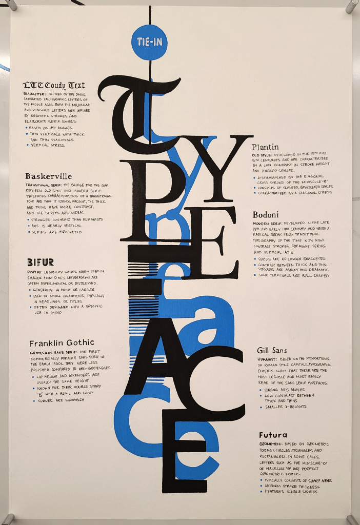
For the overall theme of the poster, and due to me mixing, overlapping, and integrating the typefaces with one another, I went with “Tie-In Typeface”. My reasoning behind this idea is despite how different each classification is, and how they all stem from one another—they are ultimately tied to each other throughout typography’s evolution in history. The colour I chose for the underlayer of “shapes” is sky blue (according to Posca’s naming convention), which is a little reference to InDesigns hidden character options; I also used this to pair the minuscule letters to the main graphic majuscule letters.
The Outcome & Final Thoughts
I am pretty content with how this poster came out, and I’m impressed (albeit a little baffled) that I was able to execute it. I’ve had an ongoing battle with abstraction for the past several years, and this poster is a testament to how I’m branching out of my usual, first instinct, style. All together I spent around 10 hours on this project, with my sketches and digital iterations being the most time-consuming—but after all, that’s how the process goes!
However, despite my best efforts, I would give myself an 8.5/10. I really wanted to incorporate more functionality with this poster, such as having little markings on the typefaces to show their stress angle, for example. It would just give the viewer a more better understanding than just listing the points, and I realized this too late when inking. I even thought about adding this to the typeface headers, but I accepted the fact that I should not do that. Headers are headers, not makeshift diagrams due to poor planning (I also don’t have a thin enough posca marker to make those indications as well, so that’s another reason).
Works Cited
Flask, Dominic. Type Classification : Design Is History, http://www.designishistory.com/1450/type-classification/.
“A Guide to Type Styles.” A Guide to Type Styles | Fontsmith Blog, https://www.fontsmith.com/blog/2019/06/24/a-guide-to-type-styles.
Keung, Laura. “The Different Types of Fonts: When to Use Each Font Type and When Not.” Design & Illustration Envato Tuts+, Envato Tuts, 17 Feb. 2020, https://design.tutsplus.com/articles/the-different-types-of-fonts-when-to-use-each-font-type-and-when-not–cms-33346.
“Type Classifications.” Fonts.com, https://www.fonts.com/content/learning/fontology/level-1/type-anatomy/type-classifications.