Gestalt Principle – Similarity

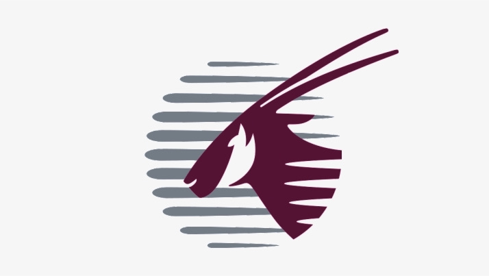
I’ve selected the Qatar Airways logo as an example of similarity from Gestalts Principles of Design. This example is a little more subtle, I paid extra close attention to what’s within the maroon part of the image. The white lines coming in from the right off the image resemble similarities to the grey in the background portion. Both the lines in each section of the image present a strong sense of movement, presented with the white background as if the animal is running. It helps to distinguish that this is an airline logo. 

Gestalt Principle – Similarity

Gestalt Principle – Closure

The logo for the band “The 1975” presents an obvious example of closure from Gestalts Principle of Design. At first the lettering looks incredibly flat and a little bit confusing, I found it hard to make out the words at first. The spaces between the letters and the missing areas apply the principle of closure, they still help us to make out what the title is saying. Upon taking a longer look at the image, I began to realize the letters are indeed 3D, unlike the foreground only the shadows are displayed. It is a deceiving logo, making one believe the foreground is displayed, when it is not. I found even moving my head and looking at it from the left helped to realize.

Gestalt Principle – Closure

Size

This poster I find very intriguing, although I am uncertain if I am grasping the entire idea behind it. I believe the use the large pencil implies the power voting holds over a nations government or a nations leaders. It applies the idea of “every vote counts,” which it truly does, and the sheer power the stroke of our pencils have over the next president or prime minister. It emphasizes the fact that our voices can and must be heard during any political elections.

Size

Shape

Poster by, Ollie Moss

This poster has a very “aggressive” use of shape, I may argue it also has a strong element of size. Although shape has the biggest impression, it feels like it is implying an apocalyptic universe where the dead are emerging. This image presents an aggressive and an eerie vibe, the giant hand outstretching from the surface below provides a feeling of destruction. The silhouette of the house, the man next to the gravestone, and the intensely orange sky emphasizes on that eerie vibe, almost as if presenting that the destruction either is about to happen or has already happened.

Shape

Texture

This poster presents a strong sense of texture and expresses almost a darker tone in itself. The phrase “time may change me,” definitely is a phrase that after it is read, will stick with the reader for an extended period of time and will make you think about it. After I came across this poster, it almost made me feel a little uneasy and portrayed life and time itself to be a little daunting, it made me more aware about the looming feeling of change that is constantly occurring.

Texture