While the Baroque painting style before it utilized mostly bold, warm colours and intense lights and darks to create dramatic, emotional scenes; the Rococo style is much lighter, graceful, and ornate in its presentation. Rococo was actually a reaction to the Baroque style and emerged out of the French court. The exuberant style of decoration and design can be seen across the art and architecture of the period.
The playful palettes of Rococo painting
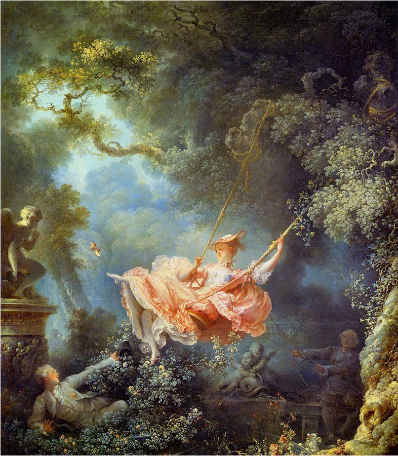
The colours of Rococo painting is one of their most identifiable features, especially when seen in comparison with the paintings of the Baroque period. The palettes used lighter, pastel colours to represent frivolous and sentimental genre scenes. Soft strokes of these colours gave the paintings a more joyful yet delicate appearance. Often strewn about the paintings were an asymmetrical assortment of flowers or seashells; elements that could also be found in other art forms during the period. While I personally prefer the dynamic scenes displayed in Baroque paintings, it was the colours of the Rococo that made me lean towards it as my favourite of the two.
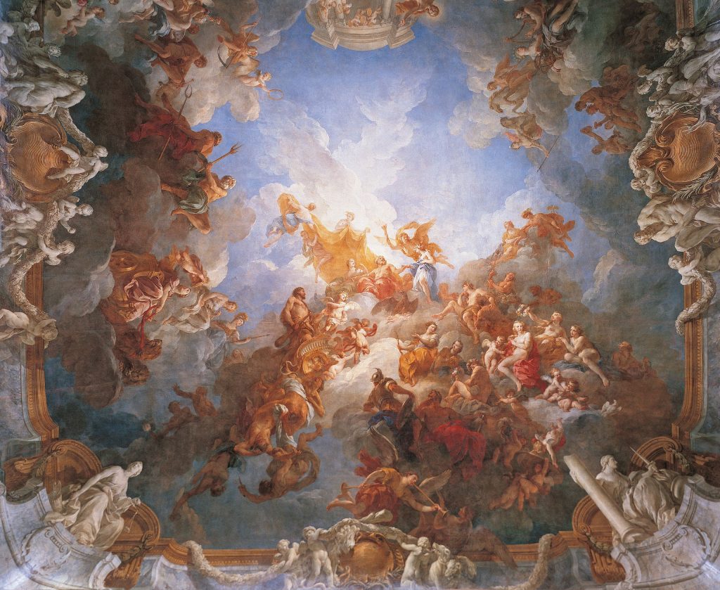
On top of the beautiful colours, The other thing that attracts me so strongly to the Rococo period, is the elaborate detail used in the architecture that makes it so pleasant to look at. The example above shows how the artist Lemoyne took the shape of the ceiling into consideration, and employed spatial illusion to give his work a strong sense of depth.
Ornate details galore!
(https://upload.wikimedia.org/wikipedia/commons/thumb/7/7d/Convento_Santo_Domingo_-Lima.jpg/2560px-Convento_Santo_Domingo-_Lima.jpg)
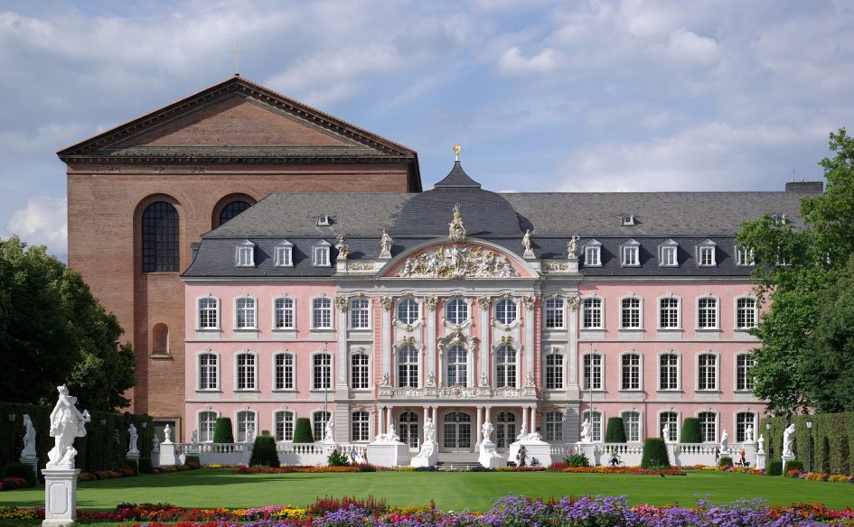
Rococo architecture carries many of the same characteristics that can be observed across the different art forms enveloped in the style. From the lighter, pastel colours, to the ornate detailing; we can appreciate the architecture just as much as the paintings. The exteriors of Rococo buildings were often not too complicated in their overall appearance, such as the example above. However, taking a closer look lets you appreciate the level of detail that is used to decorate the structure. Going inside these buildings is where the extravagant and ornate detailing we have come to expect from Rococo can truly be seen.
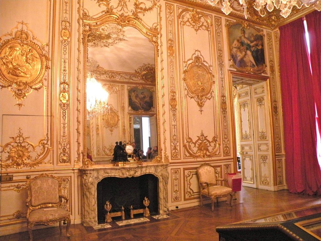
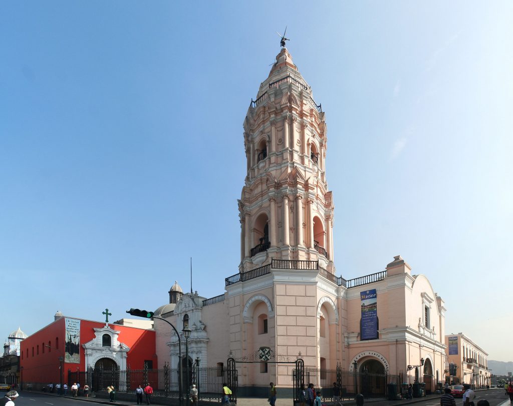
The level of detail used here is simply astounding, with the walls being covered in elaborate, gilded designs.
While the Rococo style would come and go, I deeply enjoy the vast differences it had with what had come before. The priorities of the colours and detailing make it such an appealing style, that it really stands as one of my favourite art periods in history.
Leave a Reply