I would give myself a 10/10 for my final 3 logos as I feel happy with all of the concepts I have come up with. I have tried showing it to other people outside the classroom and there’s been so many debates about which one I should chose from and there have been moments where I thought, I want to use all of them! Maybe I could use them for different purposes haha. I’m feeling really excited to see which one I might end up going for as I am still unsure.
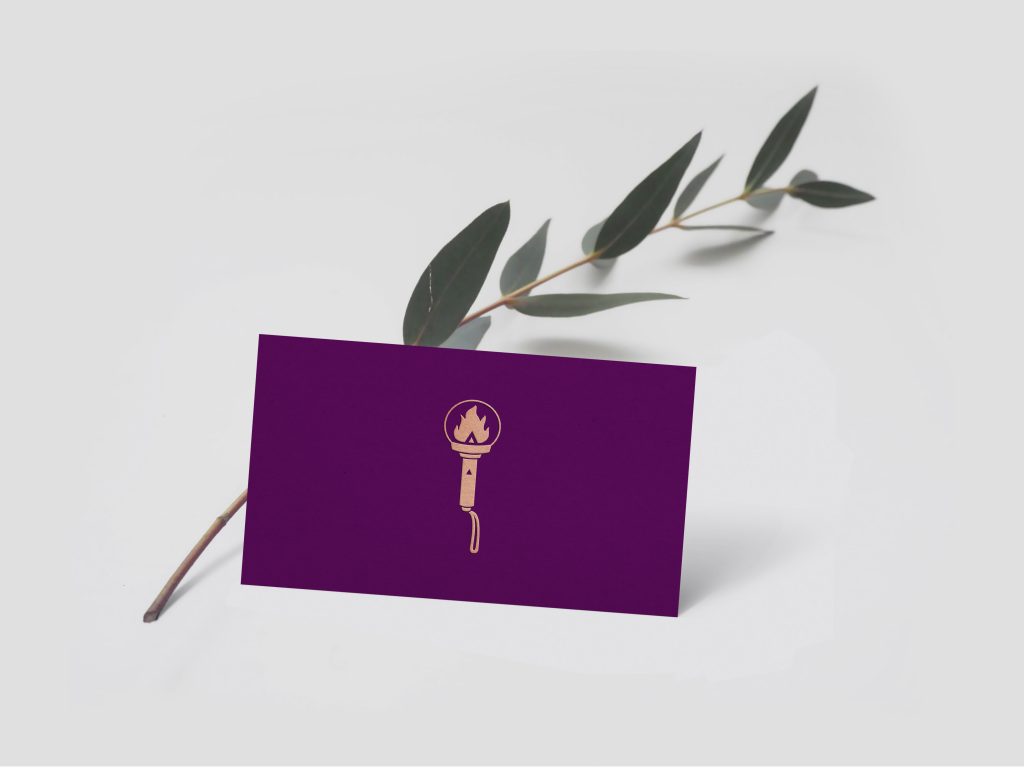
Concept 1: Lightstick
Rationale: As a Kpop fanatic, I decided to use something iconic; the lightstick. In every group, there is a uniquely designed lightstick that represents not only the group, but its fans and differentiates each fandom from the other. When fans come together during concerts, your light becomes a part of thousands of others forming an extraordinary phenomenon; an ocean of a sea of lights, turning the arena into something magical. You become a part of something bigger than yourself. I love sparkling lights, hanging lights, weird looking lights, and just working somewhere where there is lots of natural light (i.e. a window). Also, “Atrin” means fire, with its elemental symbol symbolizing someone who is creative, bright and blazing, mysterious, burning with inspiration, passionate, quiet but always has the potential to burst outwards, warmhearted and spirited. I decided to make something that not only represents my name, but also my personality and style of work.

Concept 2: Stars
Rationale: Working on the idea around lights again, I am always wondering about all the endless possibilities and outcomes that come out with each given project. I often like to venture into the unknown with my work and see people light up with my unexpected solutions. Stars are hidden gems in the sky that form endless galaxies. They are delicate, intricate, and detailed which represents my work and personality. Every galaxy and star is different, and so is my work. I don’t have a specific style, so my work varies from one to the next, since each project is filled with endless solutions that are waiting to be explored.

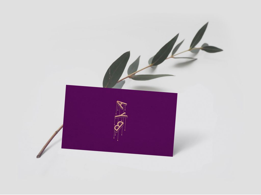
Concept 3: Hanging Letters
Rationale: My work varies in shape, size, style, and form—always different never really the same. I am flexible when using different mediums, applications and can adapt and utilize various styles in my work whether it’s using design or illustration. The hanging letters are the initials of my name which show the quirky, fun, and adventurous side of me, but also displays the elegance and detail that often shows up in some of my work.

Leave a Reply