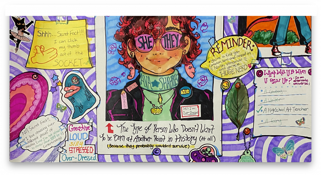
For my yearbook spread, I started out only knowing that I wanted to create a very chaotic composition. Lots of bright colours, different shapes, and overall just super busy to look at.
Generally, I present myself to be pretty boisterous. I like to take up space when the time calls, and I thought, what better to represent that vibe than a cluttered wall? I took inspiration from my own room, since it is covered in things, and it’s a very bright blue, which makes for a very overstimulating space (Just what I wanted, in this case.)
The portrait itself, along with all the other pops of text, are meant to be posters or paper notes, halfheartedly stuck down wherever there was room. Accompanying them are stickers or little trinkets, littered around the space. There isn’t really any rhyme or reason to their placement/what they are. Everything there was simply a nod to the things I keep in my own room.
My hope was that, overall, they’d come together to represent a childishness I carry with me now. Bright, cartoony, and the sort of unbothered messiness my kid-self would love.
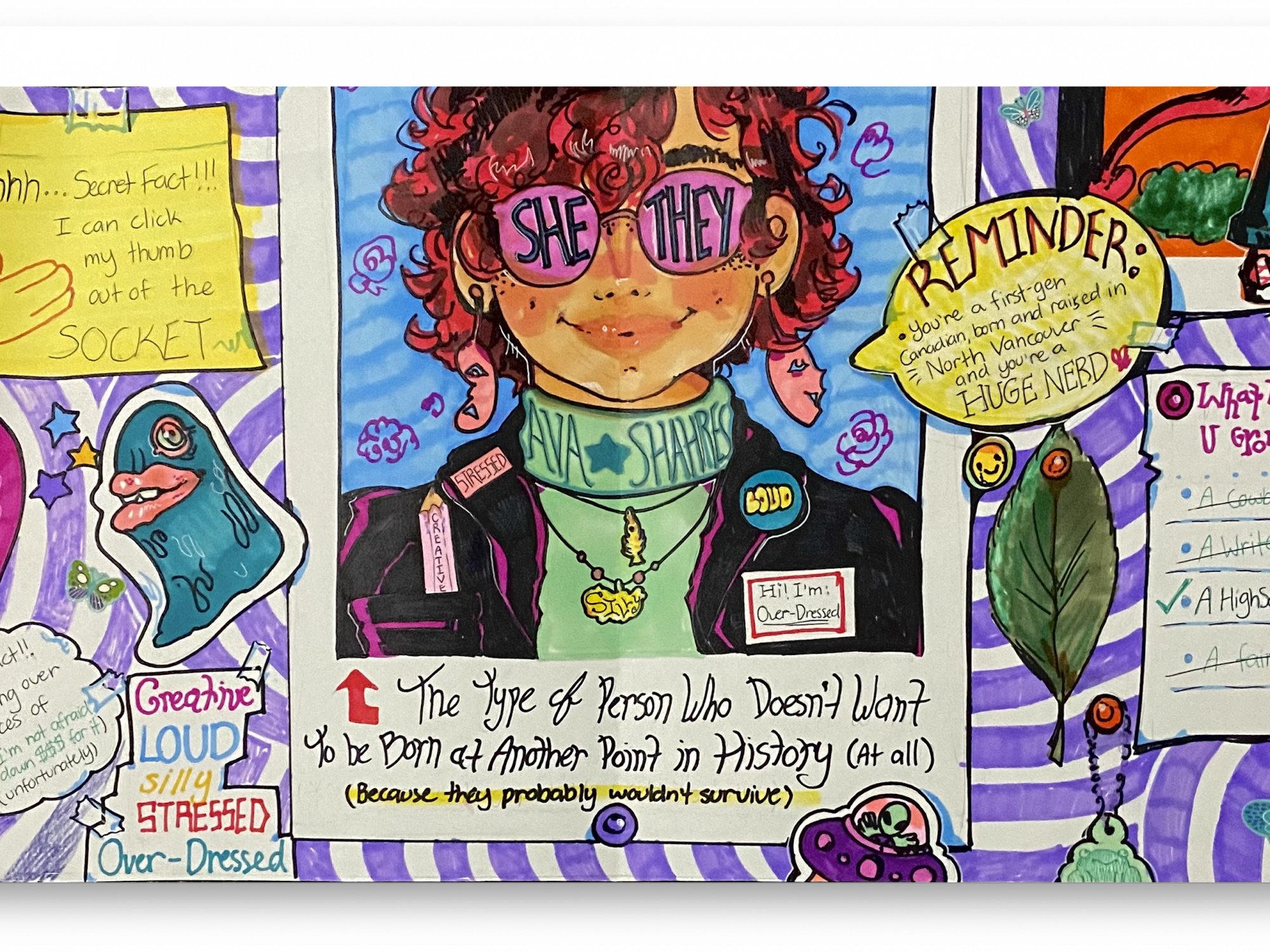
My medium of choice was alcohol markers on paper, partly for convenience, but also because it’s easy to stay bright when using them. Coloured pencils were my initial thought, but the ones I have would leave a very textured finish, whereas I wanted solid blocks of colour. If I had a do-over, I would probably make the piece mixed-media. Instead of drawing the sticky notes or stickers directly onto the page, it would’ve added more depth to glue those pieces on top. As it is, my illustration looks a little flat, and that makes it hard to take-in my written portions.
I’d grade myself a 7/10 for this assignment. I spent about 6 hours total (from planning to completion) and in that time, I could’ve also made something more refined. The rippled background was a poor choice meant to take up blank space, when I could’ve just added more “stickers”. My text is also extremely hard to read, which defeats the point of the assignment. Everything is teetering on the edge of “too much”. However, I think my concept is strong, and my visuals look decent, so that’s why I’ve placed it at a comfortable 7.
