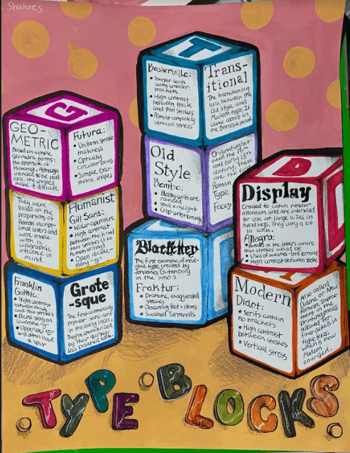
The concept for my poster was based on the idea of the letter block. I wanted something unique, that would also be easy for me to slot information into. Eight type categories, along with their descriptions, characteristics, and examples. It was a lot to take into account.
The letter blocks have unique colours, space for writing, and connect back to the greater concept of letterforms and typefaces. I will admit, I think my concept is stronger than my execution. I’m not sure if my info-dense cubes resemble the toy at all. I tried to add letters to the sides that didn’t have facts on them, in an attempt to make the reference obvious, but I’m still not sure.
I worked with a combination of marker, pen, pencil crayon, and acrylic paint. They’re pretty standard material choices. But, I regret using the ballpoint pen so much. My handwriting is already messy enough, but the black pen didn’t help. When you have to write small, and fairly close together, it doesn’t perform well. There are gaps in my letters that I wouldn’t have had otherwise. Had I prepared better, I would’ve remembered to bring a normal Pigma liner with me. I could’ve avoided a lot of frustration
If I were to do it again, there are a lot of things I would change. My biggest issue is clarity. The dense blocks of black text are hard to read, and they also don’t communicate that effectively. For example; I wrote the category name in my chosen typeface (the word “Blackletter” was written in Fraktur), but the viewer wouldn’t know that. So now, I have this intricate heading, with a random type name + bullet points under it. If you were trying to learn from this poster with no background knowledge, this would be confusing. What does that name mean? How does it relate to these type categories?
I spent about 6-7 hours on this. Most of that time was spent writing. It’s extremely time-consuming.
I’d give myself an 11 out of 15. I believe that the aesthetic + concept is there, but there are a lot of little issues that muddle the communication. I have sufficient info, but it doesn’t get the importance it deserves. As a result of my poor formatting, the “look” of my piece kind of suffers.
References:
https://design.tutsplus.com/articles/the-different-types-of-fonts-when-to-use-each-font-type-and-when-not–cms-33346
https://graphicdesign.sfcc.spokane.edu/dzine/tutorials/process/type_basics/type_families.htm
https://ebookcentral-proquest-com.ezproxy.capilanou.ca/lib/capilano-ebooks/reader.action?docID=3399565
https://en.wikipedia.org/wiki/Didot_(typeface)
https://en.wikipedia.org/wiki/Allegro_(typeface)