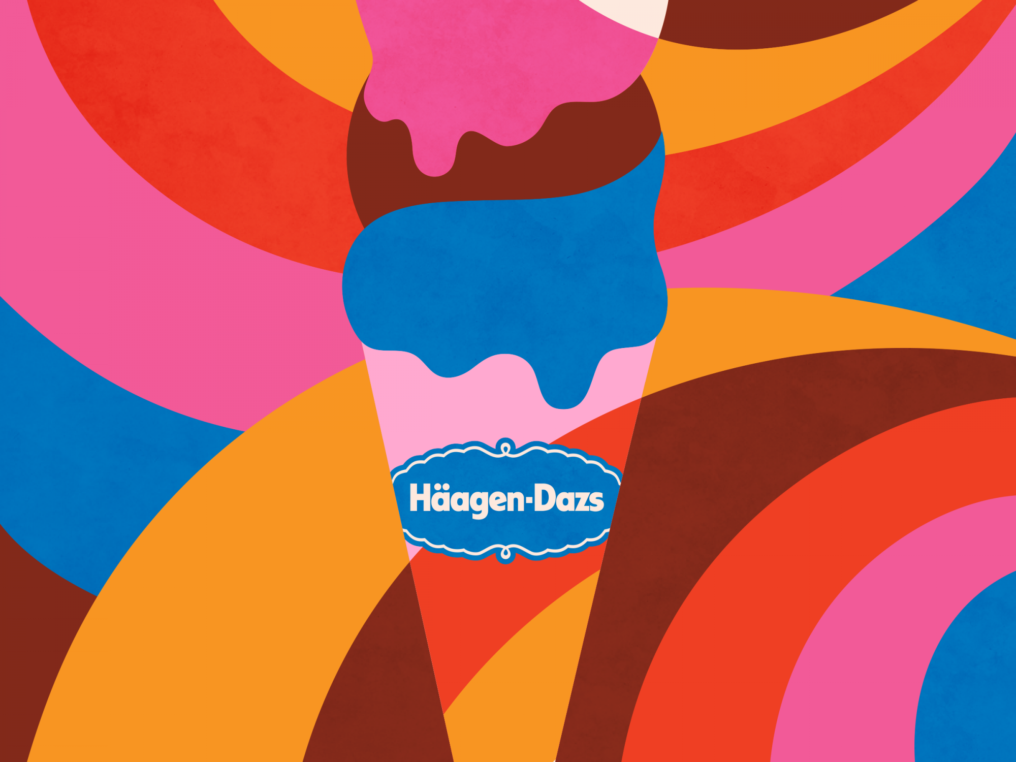
In this advertisement, colour and shape work in tandem to achieve the goal. It was difficult to choose between them, but Colour was deemed more important because, without it, the distinction between the shapes in the ice cream and the ones in the background would look muddled. In a piece without linework, the palette can help imply division and bring together shapes, without the need for a harsh line.
The only actual line throughout the piece is located in the center, highlighting the typography of the Haagen-Dazs logo. Its off-white colour draws the eyes towards it. That shade only repeats two other times in the piece. Once at the top, and once at the bottom, creating an almost directional pull towards the center.
The bright, warm colours selected make Haagen-Dazs as a brand seem fresh and fun. For a brand that is more often recognized by its sophisticated, earthy palette, this change of pace is well-suited to a younger eye. Instead of seeming like a delicacy, this ad brings it back down to a more casual level. This ice cream can be enjoyed during a hot day, too, just for the sake of it.
