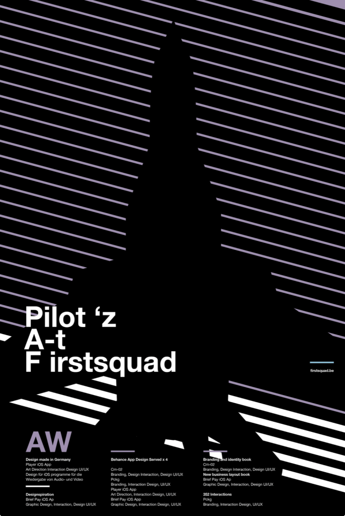
White space makes up a majority of this design, and it is used strategically to convey an edgier feel. The central figure, the plane, isn’t illustrated. Its existence in the piece is implied. This plane silhouette interrupts the diagonal lines that are hatched across the page.
Allowing the plane to be a part of the background, rather than a layer on top, keeps the visual narrative simple while adding a dramatic ambiance to the poster. Brighter elements, like the text and line, jump out, In a way they wouldn’t alongside a fully rendered illustration. In a case where a lot of text is utilized, like the bottom half of this poster, it is beneficial to have breathing room.