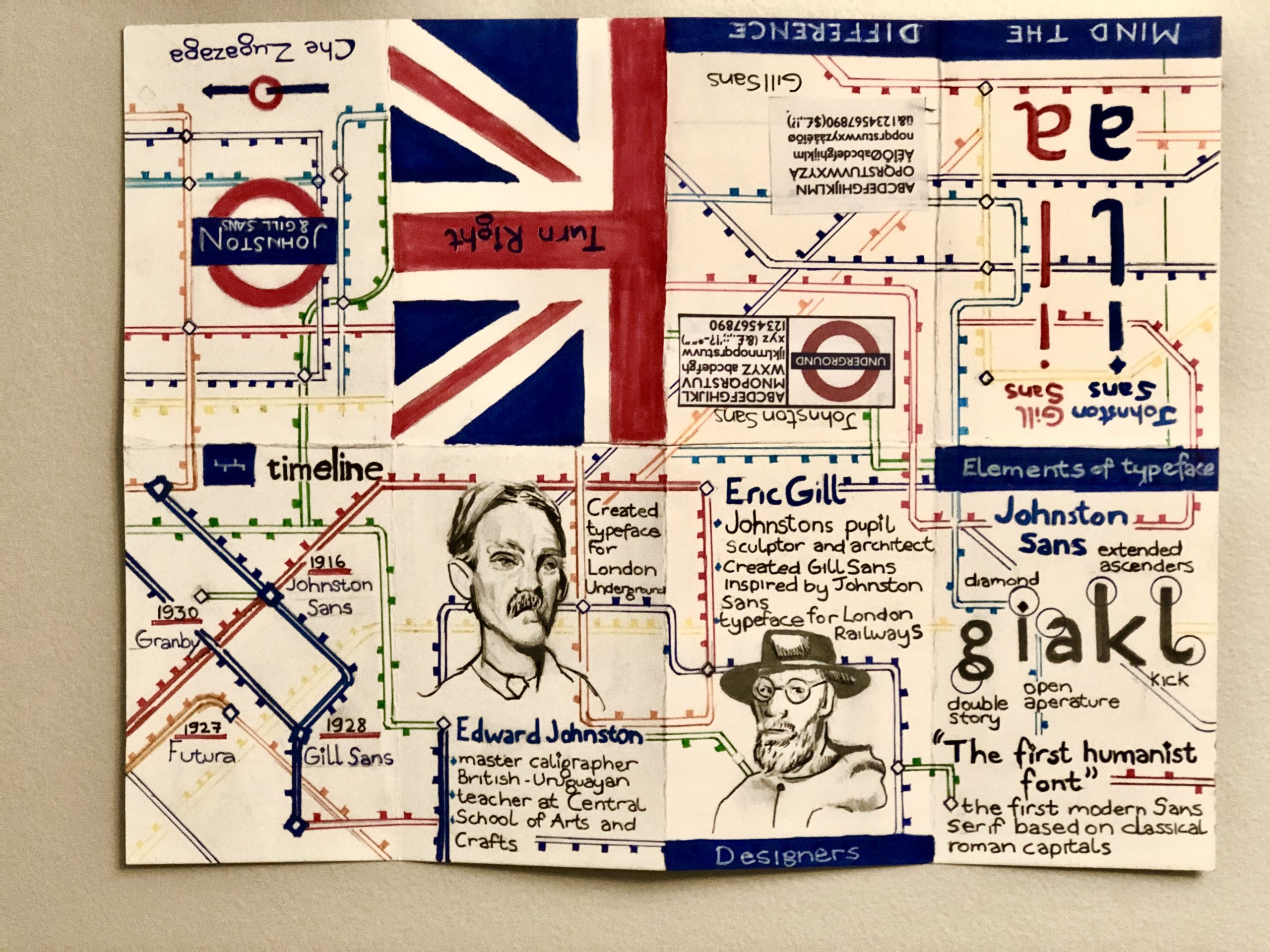
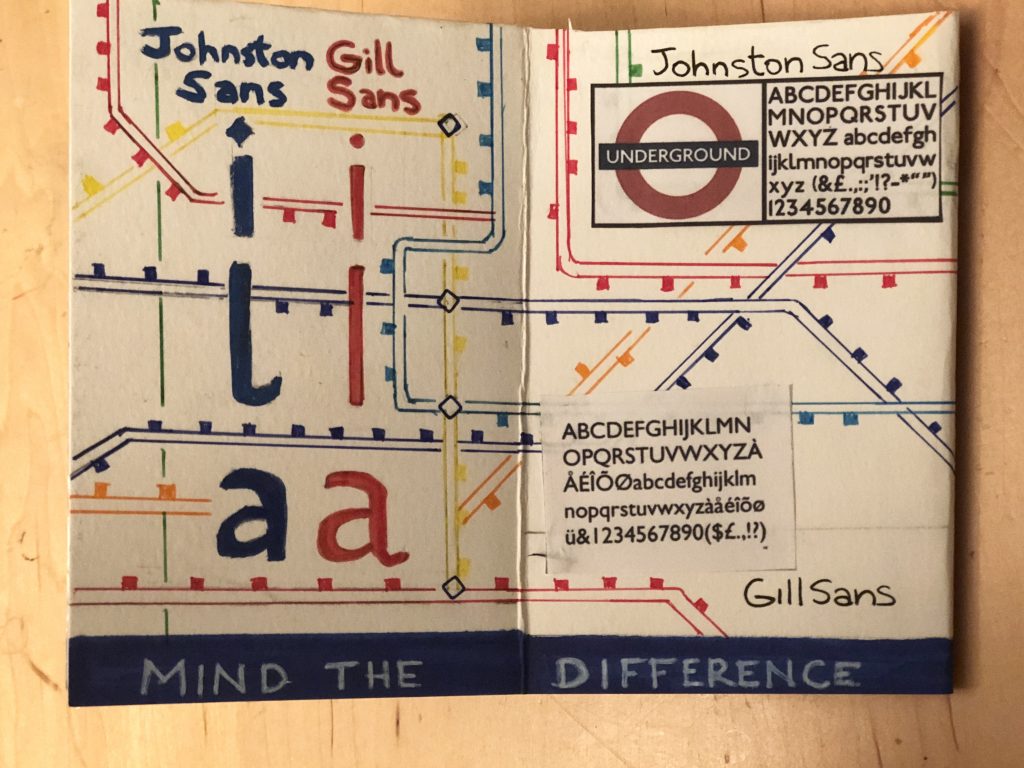
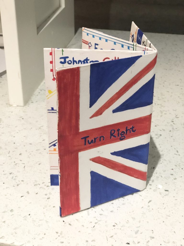
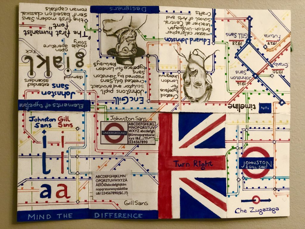
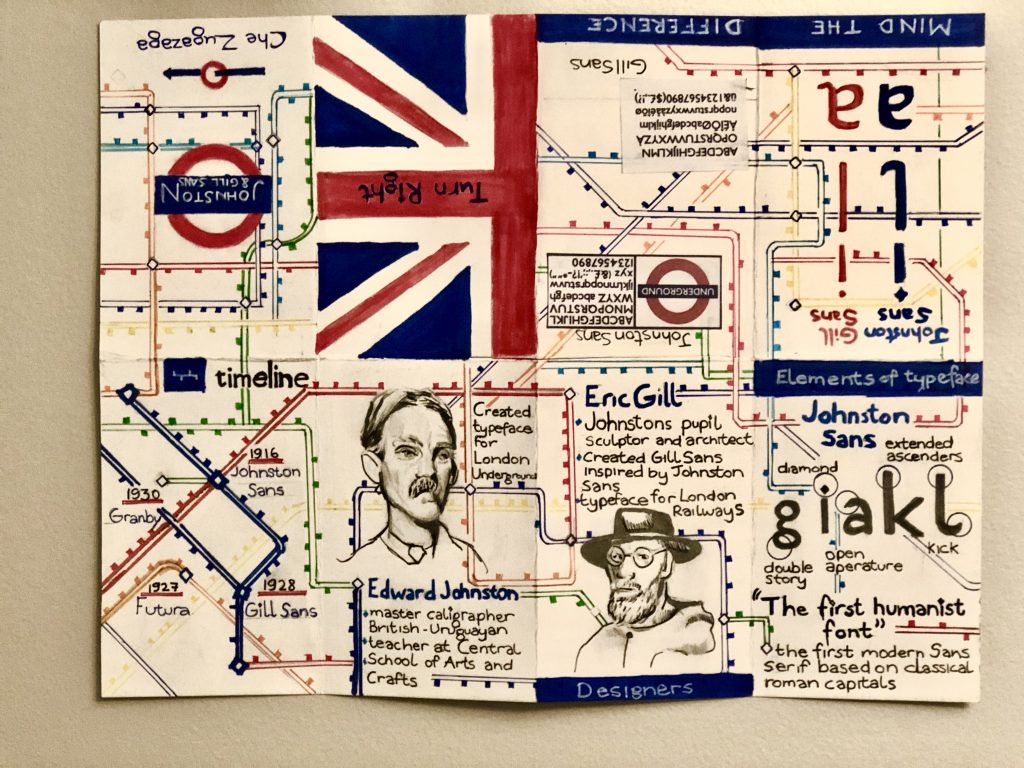
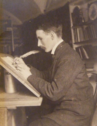
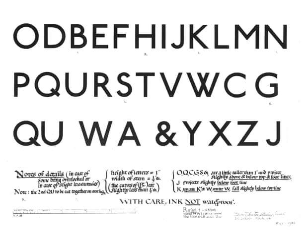
Presented is a handcrafted 11″ x 14.25″ Zine (the same aspect ratio as a 8.5″ x 11″). This 6 page, handmade zine discusses the typefaces Johnston Sans & Gill Sans from the 19th century (1913-1930). One cannot present one typeface without mentioning the other. These two typeface are closely interlinked. Johnston, a master calligrapher of the Arts and Crafts Movement was commissioned in 1913 by Frank Pick for Londons Underground Railway.
The purpose of this commission was to assist in the legibility of boards and prevent overcrowding in the rapid underground transit system. This typeface is still today the longest standing corporate typeface in history. It was only introduced with lower case letters and became public access till recently.
Eric Gill, a pupil of Johnston’s, was deeply inspired and influenced by Johnston’s and his work. In 1927 Gill was commissioned to create a sans-serif type that could compete with the up and coming Futura typeface. The defining difference between Johnston Sans & Gill Sans is their original application; as Gill Sans was designed for letterpress. The two sans-serif humanist typefaces do often get mixed up, Gill Sans can often overshadow Johnston, both typefaces are still used for different railway systems in the United Kingdom. Although, Edward Johnston is accredited with the “first humanist sans-serif font” that was based on classical roman capitals.


Citations:
“Johnston, Edward (1872–1944).” The Thames & Hudson Dictionary of Graphic Design and Designers, Alan Livingston, and Isabella Livingston, Thames & Hudson, 3rd edition, 2012.
“Johnston, Edward (1874-1944).” The Thames & Hudson Dictionary of Design Since 1900, Guy Julier, Thames & Hudson, 2nd edition, 2004. Credo Reference,
“Gill, Eric (1882–1940).” The Thames & Hudson Dictionary of Graphic Design and Designers, Alan Livingston, and Isabella Livingston, Thames & Hudson, 3rd edition, 2012. Credo Reference,
WEB (images):
https://www.monotype.com/resources/case-studies/introducing-johnston100-the-language-of-london
https://medium.com/@glennf/that-london-tube-typeface-look-again-8beaf0d89abb
https://www.ltmuseum.co.uk/collections/collections-online/photographs/item/2002-399
