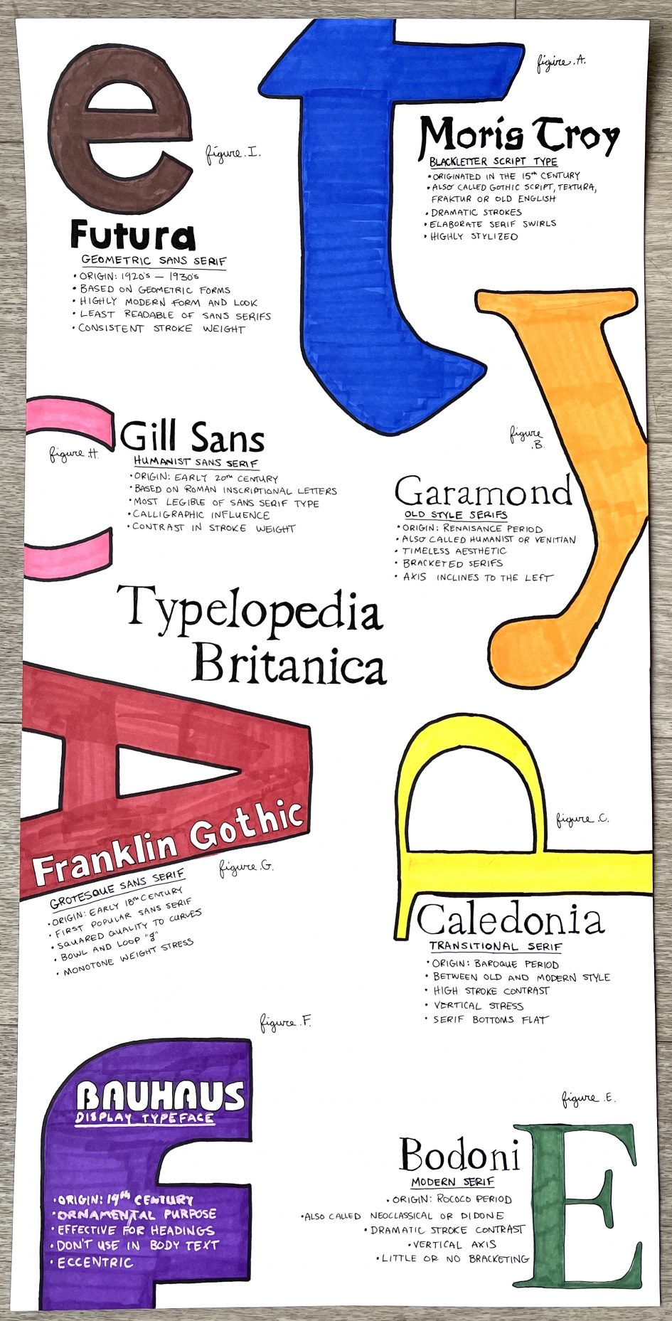
A hand rendered historical type identification poster! (12×24 inches).
I started my type identification poster by conducting a considerable amount of research. I knew I wanted to use digital versions of typefaces as guides when rending type by hand. This would allow me to achieve a high level of accuracy to the original typefaces. This approach, however, also presented some issues. I had to be thorough in my research and ensure that any digital typefaces I used for reference were accurate to the original typesets created pre-1945. In some cases, typefaces are “updated” or altered when digitized, and I made sure to avoid using these versions. Why make things easy, amirite?
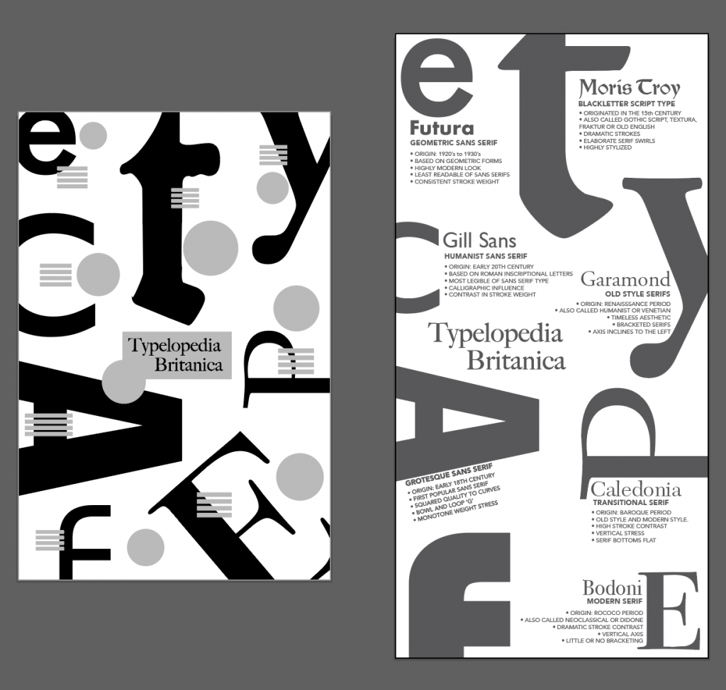
Next, I started sketching the layout. I had a few decent ideas but decided that using large colorful letters on my poster would effectively draw the viewer closer. Once I had the viewer’s attention, the layout would reveal smaller information clusters that feel fun to investigate one at a time.

I was happy my approach visually but wanted to introduce a concept that would provide a more playful role and tie the whole poster together thematically. After working through a few ideas, I came up with the “Typlopedia Britanica” (misspelled on purpose because it’s cheeky). The poster information and layout reminded me of the illustrated pages in the old encyclopedias my grandmother used to have. With a clever title and a visual tip of the hat to those old encyclopedia layouts (figure a, figure b, etc.), I’d be off to the races. I even used the original Encyclopedia Britannica typeface for the title in the center of the poster!
Next, I did some digital mockups to help plan the details of the layout. In the past, I’ve completed projects somewhat flying by the seat of my pants and learned an important lesson. Executing well on a poor idea is like polishing a turd. Spend. More. Time. On. The. Idea. I made extra effort to plan extensively with this piece so the final poster would turn out precisely as intended and showcase some creativity. When I finally sat down to create the hand-rendered poster, I felt less like an artist and more like an architect or a carpenter. I followed my blueprint closely. *laughs maniacally*
Lastly, I used markers for the colours on my poster, making an effort to keep it simple. Each information cluster contains the typeface name hand-rendered in that typeface, with a subheading explaining which category the typeface belongs to and five facts. Two of these facts are the origin and typeface category, something interesting about it, and three characteristics of that category.
The research, planning, and execution project took me about 15 hours in total. I spent considerable time planning and conceptualizing the poster. The execution from start to finish took about 7 hours because I used a carbon copy technique and traced the original typefaces. Sadly, I’m not a massive fan of my choice using markers. The paper was too fibrous, and there was a slight marker bleed. I did test this, but I wasn’t thorough enough. Overall there’s room for improvement here, especially in the execution stage, but I’m still very proud of the concept and layout. 8.5/10.
Leave a Reply