I presented my in-progress project to the class and my nearly-final (tote bags needed some work) version to Arndt in the final week. He offered some great feedback on website functionality, for example in the “find us” section he suggested I link the address to a google maps location instead of having an illustrated map on the site.
Arndt also gave me some tips on what content to present to whom. For fellow designers he suggested I spend more time on the process while client presentations should be more succinct with greater emphasis on deliverables and rationalization.
9/10 – I think I made lots of progress presenting my ideas between the first and final phases!
In this phase I focused on developing the brand logo, website, promotional materials and finally SWAG. Refining the logo took a bigger chunk of time than I expected, but I ended up with an attractive shape that works for the concept I was trying to convey. I showed my top three final drafts to Arndt and he asked me if I was testing his eyesight, so I mocked them up on fake collateral and chose the one that reads best at a variety of sizes. I then moved on to designing the website from the sitemap and wireframes I came up with in the previous phase. For the website and the promotional materials, I used photography I gathered in my brand visuals. Arndt helped me pick out the shots that best suited the feel of the MFM brand and echoed the shape of the logo.
Finally, I designed three variations of a branded tote bag to be distributed at medical conferences. I thought having some variety would demonstrate the versatility of the logo and the solidity of the brand’s visual identity.
8/10 – I like the way the logo turned out, as well as the website navigation system. I was a bit crunched for time in this phase, especially when I got to the tote bags!
I started this phase with creating a project timeline using a scheduling and time-tracking service. My time was separated in five phases: Brand building (coming up with back-end elements to help me define the MFM brand– brand essence, voice, archetype, etc), moodboarding, logo ideation, establishing brand visuals and promotional material ideation.
It was challenging building a brand from very little. There were some elements to consider, such as the relationship between the MFM brand I’m building and the BC Womens hospital brand as the Maternal Fetal Medicine Clinic lives within the hospital. Working on the visual language and feel of the brand and website was a different experience for me as I had to keep the look fairly conservative and trustworthy. It absolutely couldn’t look like an overly designed, trendy student project like some of the work I usually do. Arndt was a great help in keeping me on track with adhering to the brief and critiquing my work twice a week.
8/10 – I ended up going over the allocated amount of time and had to condense the execution phase.
After my kickoff mentor meeting with Arndt Klos (creative director at Vigilantes), I got to work on expanding my project idea into a brief. I met with my client and we explored what they do, their ambitions, and what kind of collateral they were envisioning would come out of this project. They expressed that they felt some branding would be effective to differentiate their division (the Maternal fetal Medicine Clinic) from the rest of BC Women’s hospital. One of their principal aims as a group is to provide education on fetal heart disease for sonographers across BC and the Yukon, and prevent related complications.
When writing the brief, I identified two principal target markets: Sonographers / Care providers, and MFM clinic patients. The branding and marketing-heavy materials were to be geared mostly to patients, while I would develop an online learning platform filled with resources for care providers. The client expressed a want for SWAG items to give away at conferences and education sessions, so I determined I would gear those towards care providers as well since they would be in attendance at these events.
Arndt and I looked over the brief and he sent me some of Vigilantes’ past client briefs to give me an idea of what would be really important to include. He suggested I keep the brief limited to goals, a timeline and deliverables, and put research and additional information in a background document. He also wrote some comments on my document to direct me.
After finishing the brief, I dove into research and got to interview two sonographers with fetal heart disease backgrounds, one of which works at the MFM and the other who has spearheaded a similar project in Manitoba. From these interviews and research I gathered online, I was able to construct a target market empathy map and a user persona to help me build my brand and website.
10/10 – Research was a big part of making this project work and I think I nailed it!
COMICS: Scott McCloud defines comics as “Juxtaposed pictorial and other images in deliberate sequence, intended to convey information and/or to produce an aesthetic response in the viewer.” So basically: Images meant to be interpreted in sequence.
PICTORIAL: For a drawing or symbol to be “pictorial”, it has to have some resemblance to the subject.
ICON: An icon is any image used to represent a person, place, thing or idea.
thinking
CLOSURE: The phenomenon of observing the parts but perceiving the whole is closure. In the medium of comics, closure is an agent of change/time/motion and the viewer is a willing collaborator. Example: In a movie, there is a shot of a person approaching a train with intent to board. When it is followed by a different shot of the person in the train, your mind immediately comprehends that the person boarded the train although it wasn’t directly shown. That is closure.
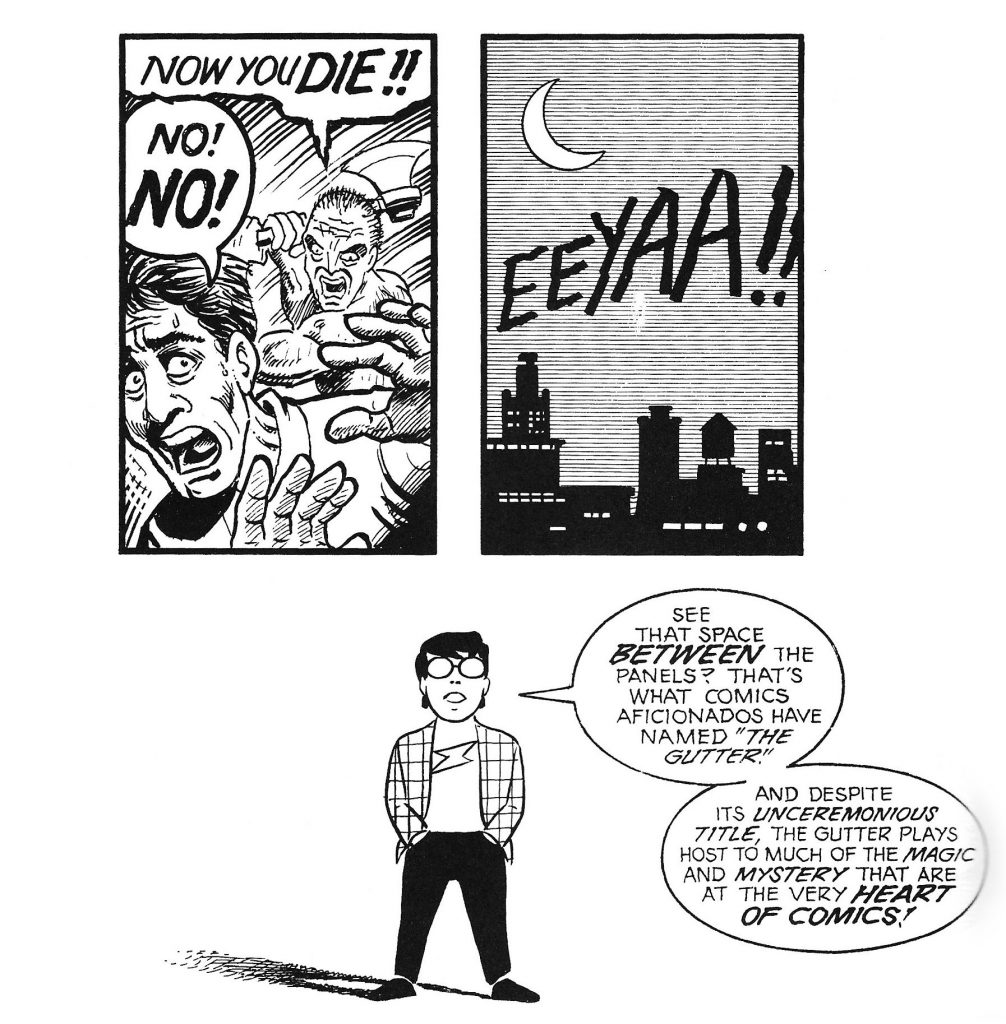
GUTTER: The gutter is the blank space between panels of a comic. In comics, panels fracture time and space, and we use the gutter between them to turn them into a more continuous, unified reality with closure.
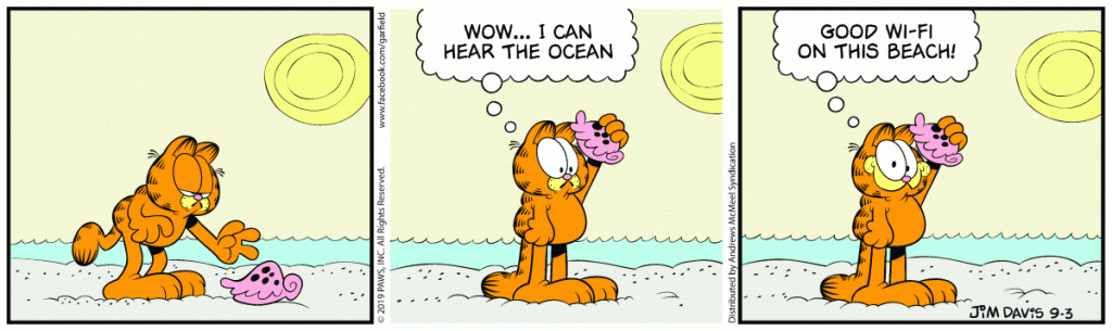
PANEL-TO-PANEL TRANSITIONS: Moment-to-Moment (very little closure needed) Action-to-Action (See Garfield comic below) Subject-to-Subject Scene-to-Scene (across distances of time and space) Aspect-to-Aspect (place, idea, mood, rather than time) Non-Sequitur (no logical relationship – we can find meaning or resonance even in jarring combinations)
garfield
garfield
BLEEDING: In a regular closed panel, time is present and contained. When the panel runs off the page edge, time escapes into space and a mood is set. This is called bleeding, and it is often used by Japanese manga artists.
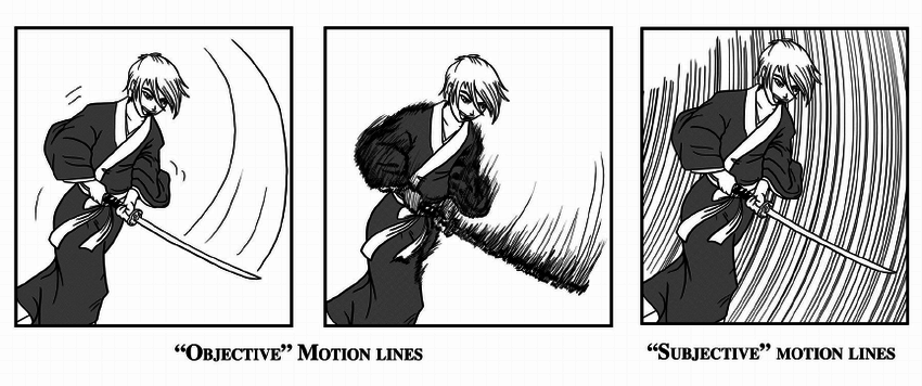
ZIP RIBBON: The line of motion shown in comics. Often used in superhero and action comics where there are lots of fast and sudden movements.
SYN-AESTHETICS: Relating to synesthesia & merging of the senses. Used to evoke an emotional or sensual response .The use of visual icons can give the feeling of things we can’t see “in real life” such as shock lines or smell lines.
SPEECH BUBBLE: The speech bubble is the comic equivalent of quotation marks. The bubble indicates speech and contains a character’s dialogue. The type of speech can be expressed or enhanced with the appearance of the bubble; a spiky bubble with all-caps text can indicate shouting or anger, and a shaky bubble with smaller text could mean the person speaking is feeling afraid or reluctant.
MONTAGE: In comics, a montage is an integration of text into a picture. This text isn’t usually encased in a speech bubble. See the picture below.
I really don’t know where to start when it comes to explaining the process of creation this project underwent. Two hours ago when I started writing this, I went off on a complete tangent about my childhood right around this point, so I’m going to try to keep this on track for your sake (and mine!)
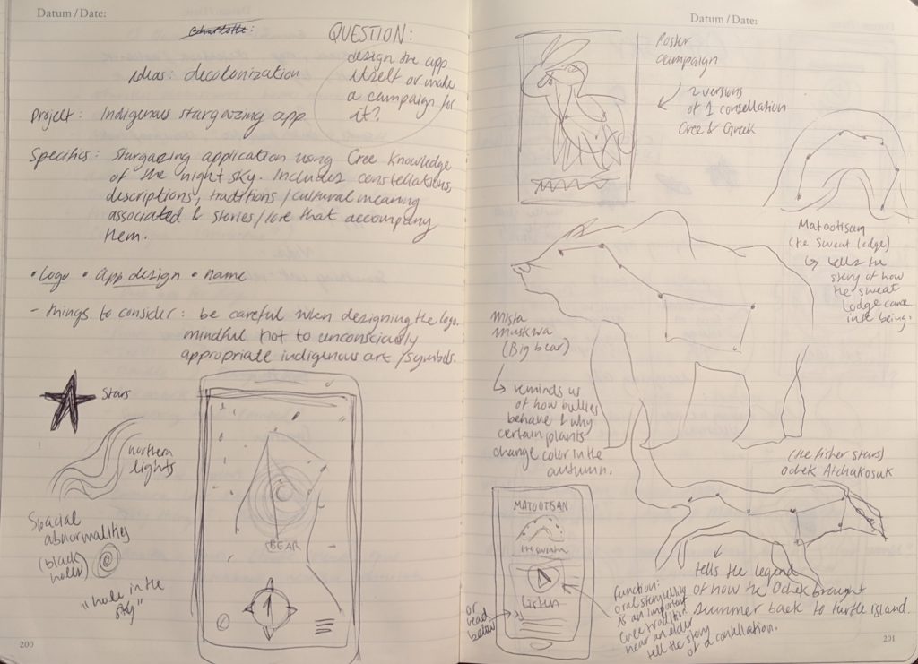
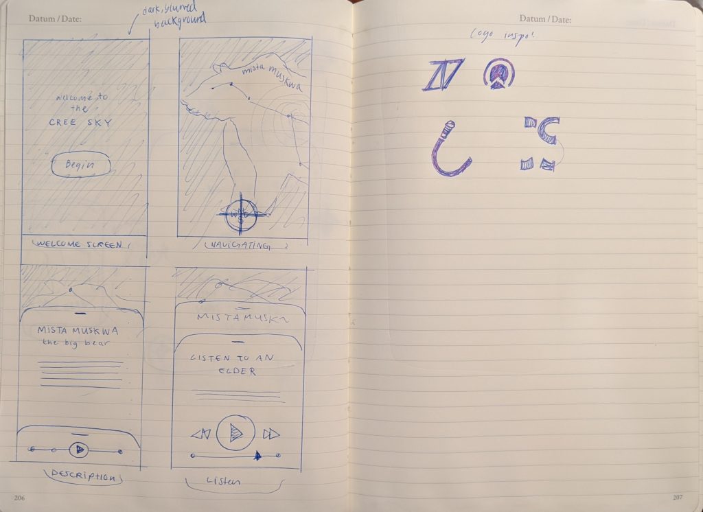
After I was illuminated by my discovery of Wilfred Buck’s knowledge and work (see previous post), I endeavoured to read what I could find about him and and the topic he teaches. I read a number of the stories he tells which are associated with Cree constellations and was inspired to help further his reach and share the Plains Cree’s knowledge of the night sky. I spent some time trying to figure out how I could bring Cree astronomy to more Canadians in a respectful, enjoyable and educational way. I wanted children and adults alike to be able to admire and learn from a culture so deeply rooted in the history of the land. I pondered whether I should create a series of posters showcasing Cree constellations with a short explanation included, but I felt that approach wasn’t comprehensive enough to really educate or create a sense of wonder and discovery for the audience. After contemplating some more guerilla campaign options I landed on the idea of designing a Cree stargazing application. It ticked all the boxes: A free app is accessible to the vast majority, and can house a large amount of information. The active “stargazing” aspect where the user physically moves and manipulates their device to see the constellations where they actually are adds the element of discovery and interactivity.
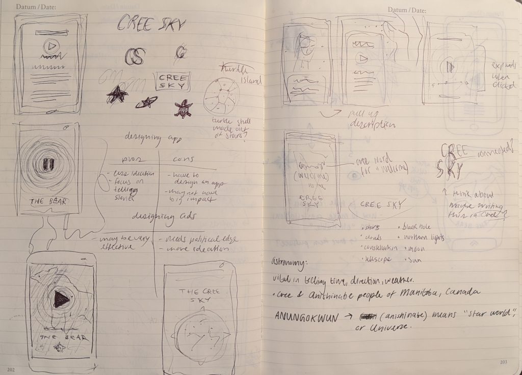
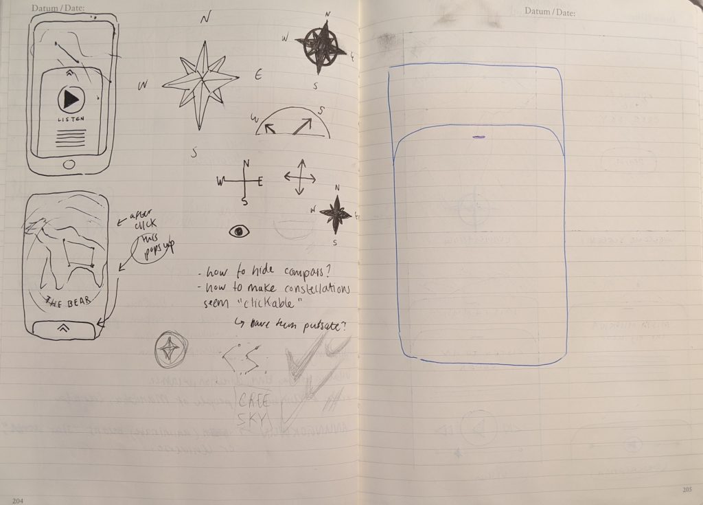
After settling on this idea, I proceeded to download seven different stargazing apps onto my phone. To my dismay, they were all glitchy, plagued with pop-ups and generally very ill-designed. The most important information I drew from them was that the visual of a moving compass could serve as a guide to help the user navigate the sky. I then put together a moodboard comprised of apps, logos, website designs and colours to help me visualize how a user would navigate information and process visuals in my future design. Being very inexperienced in the domain of app design, lots of my research and process was done through moodboarding and navigation of well designed platforms such as Spotify, Squarespace and Peek. Once I felt more at ease with how the app should flow, I started thumbnailing different screens in my notebook and experimenting with layout in sketch. I established the the number of illustrations I would create ahead of time and built the layout around them and the “map” aspect of the app. I utilized a simple pull-up menu system that would appear upon the selection of an individual constellation and offer options. To exit, the user would simply pull them down again. Once the layout was finished, I created two illustrations to fit into the star map and added the copy to match them.
After the app was completed came the logo. This aspect was particularly difficult for me as I struggled to think of a compelling visual that relates to the app’s content without appropriating Cree artwork or symbolism. The trouble was that if I were to steer completely clear of cultural meaning, the logo would feel detached from the app itself. I was leaning towards designing a wordmark as a logo when I thought of using the Cree alphabet. I looked up plains Cree words and sayings and their pronunciation as well as spelling and landed on “Tipskaw” which translates to “night sky”. I was fascinated by the letterforms in the Cree spelling and so decided to design a wordmark based on it.
Evaluation
Although I initially had some feelings of anticipation regarding this project, I ended up having a good time working it out. One of the best decisions I made was choosing the solution based solely on how well it solves the problem rather than how it matches my skillset. I took on designing an app from scratch for the first time and I think it was the right direction to take this project in. While my hard skills in interactive design may be lacking at this point in time, the intent is expressed clearly and the content satisfies the objective. I’d give myself an 8.5/10 for a solid effort and good learning experience!
As a child raised in what most people would call a “regular” Canadian upbringing standard in the past twenty years, I can testify that I had very little, if any, knowledge of the existence of First Nations peoples and their cultures until my later primary school years. Even as we started learning history and bits of trivia the Indigenous people of North America were always shrouded in mystery, in an established “separateness” from the colonial Canadians. Attempts made to diversify our education curriculum and add decolonized content were limited to the occasional field trip and drumming sessions with very little explanation or background provided. To kids, to me, these were fun activities that provided occasion to leave the classroom. They were special events, not to be a part of our fundamental education but what I see now as “fillers” required by the system which nobody in the faculty really knew how to handle. They were just one-off experiences, and students weren’t really provided with the means or opportunity to learn more. The result? A very generalized idea among those of my generation of what “Indigenous culture” is and what it comprises. Drumming, dances, bannock and people of the past.
I think my experience as a primary school student part of the “indigenous kids program” is what drove me to choose a subject related to education. I refined my scope to look into topics not covered by standardized province-wide “Indigenous education” and found out about a man called Wilfred Buck. Known as Manitoba’s “star guy”, Buck works with First Nations schools to bring an Indigenous perspective to teaching science. He is from the Opaskwayak Cree Nation and travels around communities with his mobile dome-shaped planetarium to teach students about Cree constellations. I came across a quote from him which I felt explained the problem I was trying to aid in solving perfectly:
“All these ceremonies and all these so-called mythologies … there’s a depth of knowledge involved. They’re not just quaint little stories. Every Indigenous culture in the world has that depth of knowledge, that intellectual capacity. It’s just that through the colonial process it’s been minimized and it’s been marginalized.”
Buck’s insight helped me to establish my goal: To educate Canadians of Indigenous and non-Indigenous descent on the pre-colonial relationship the First Peoples had with the sky. To share scientific knowledge, philosophy, tales and meaning behind constellations and the Northern lights from a decolonized perspective.
Bruno Monguzzi (1941-) is a Swiss graphic designer.
Monguzzi was born in Switzerland in 1941. After moving to Geneva with his family, he attended the Graphic Design Course at the Ecole des Arts Decoratifs.
In 1960, Monguzzi travelled to London and attended Gestalt psychology, typography and photography courses at Saint Martin’s School of Art and the London College of Printing.
Monguzzi worked with Dennis Bailey in London, then moved to Milan in 1961 to join the Studio Boggeri (which was at the time the leading design and advertising agency in Italy). In 1965, Monguzzi was invited to join the Charles Gagnon and James Volkus office in Montreal. He designed nine pavilions for Expo 67.
In the early 70s, Monguzzi worked independently from his atelier in Meride, Switzerland. He received the Gold Medal from the New York Art Directors Club in 1990, the Yusaku Kamekura Award and various other awards.
In 2003. Monguzzi was awarded the Honorary Royal Designer for Industry distinction by the Royal Society of Arts, London.
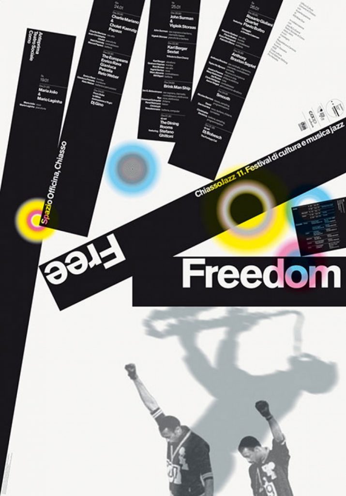
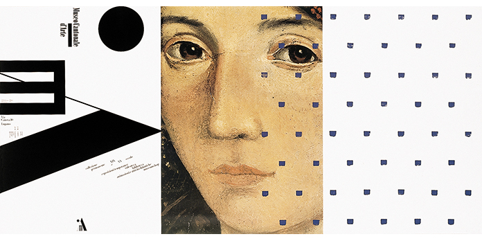
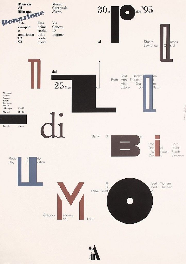
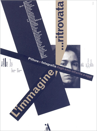
Some of his most significant projects include: the visual identity of the Musée d’Orsay in Paris (which is no longer in use), the exhibition “Majakowskij Mejerchold Stanislavskij” at Castello Sforzesco in Milan, and the posters for Museo Cantonale d‘Arte in Lugano (1987-2004).
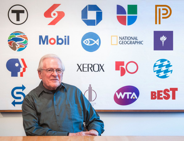
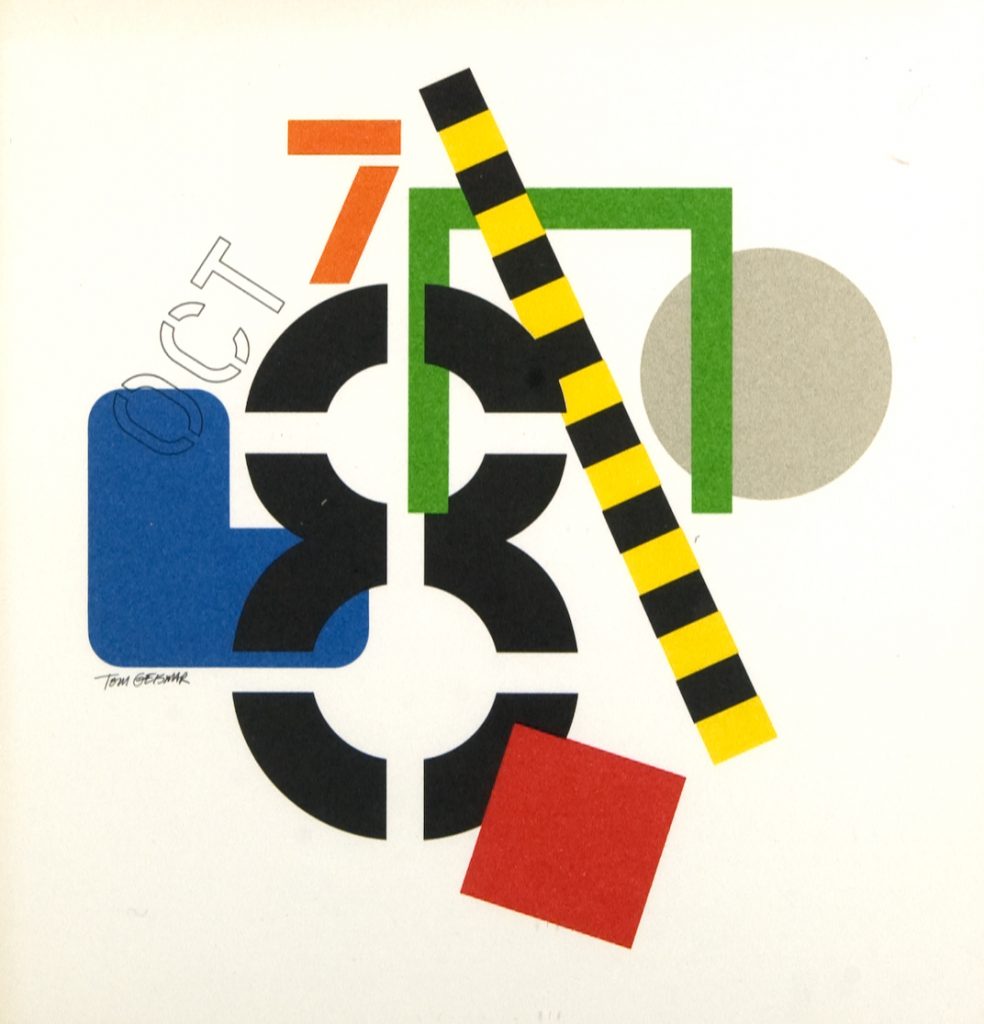
Thomas H. Geismar (1931-) is an American graphic designer.
Born in Glen Ridge, New Jersey, Geismar studied at the Rhode Island School of Design and Brown University. He then received a master’s degree in graphic design from Yale University.
In 1957, Geismar founded the firm Brownjohn, Chermayeff & Geismar (now Chermayeff & Geismar & Haviv) with Robert Brownjohn and Ivan Chermayeff.
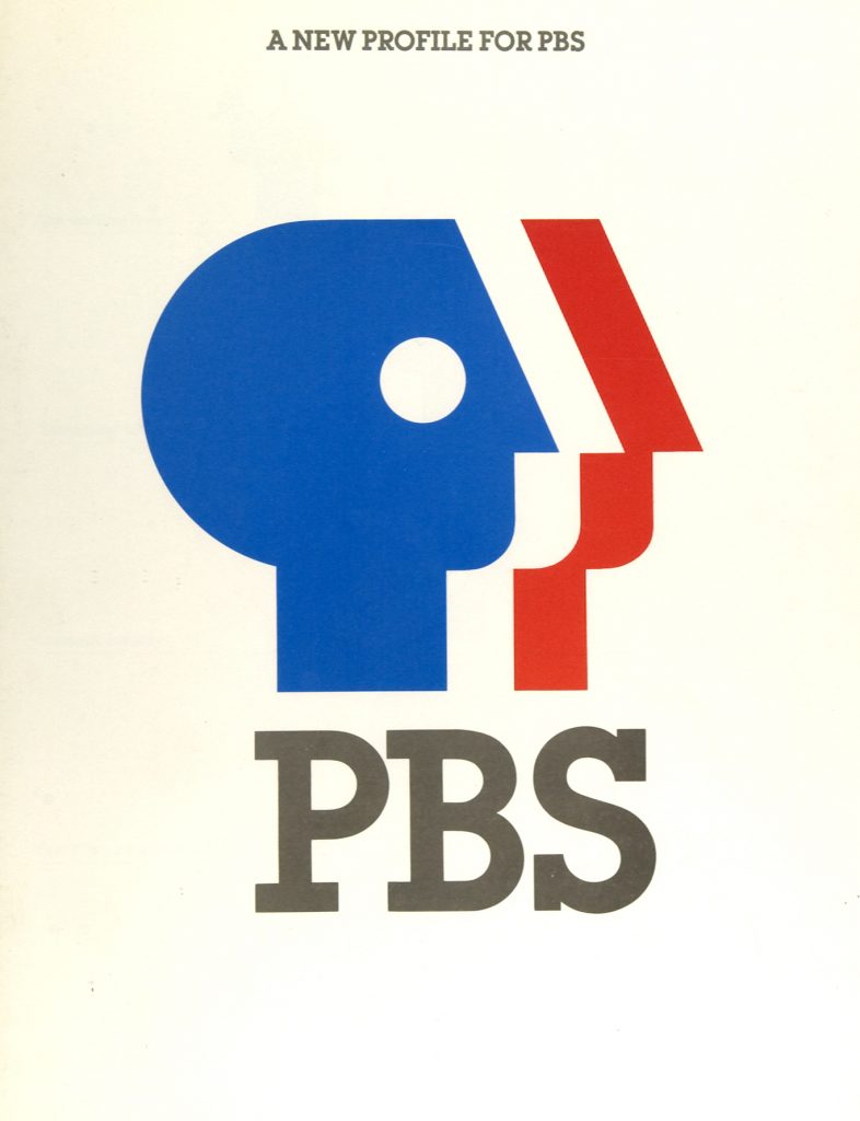
Tom Geismar has designed 100+ corporate identity programs for companies such as Xerox, Chase Manhattan Bank, Best Products, Gemini Consulting, PBS, and Mobil.
Geismar has also had major responsibility for many of his firm’s exhibition designs and world’s fair pavilions. He worked on major tourist attractions as the Ellis Island Immigration Museum, the Statue of Liberty Museum, the Truman Presidential Library, etc.
Geismar has been the recipient of several major awards in graphic design, including one of the first Presidential Design Awards for helping to establish a national system of standardized transportation symbols. Geismar also co-wrote 4 graphic design books with other members of his firm.
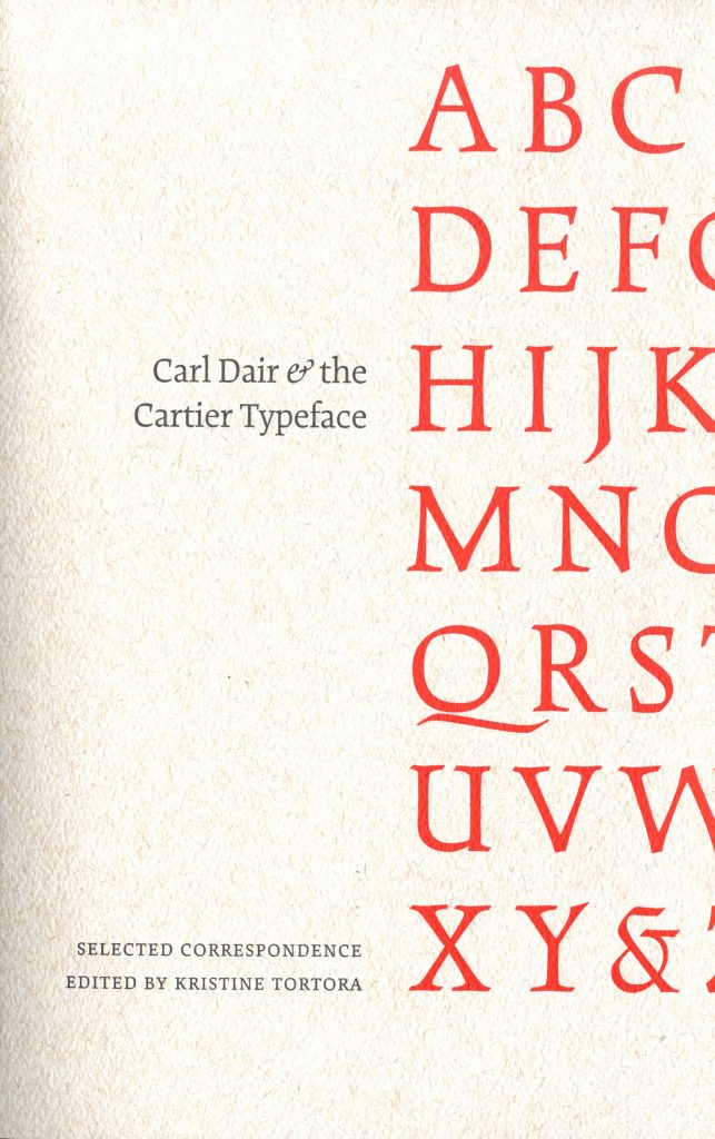
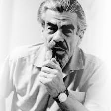
Harris Carleton Dair (1912 – 1967), professionally known as Carl Dair, was a Canadian graphic designer, type designer, author and teacher. He was primarily self-taught in design, but was nevertheless internationally known. He developed visual design principles for typography which are still in use today.
Dair was born in Crowland Township in Welland, Ontario. He landed his first creative job when he was 18, creating advertising and layouts for the Stratford Beacon-Herald.
In a partnership with Henry Eveleigh, Dair founded the Dair-Eveleigh Studio which operated from 1947-51 in Montréal, Quebec. There he worked mostly as a freelance designer. During this time he worked for the National Film Board of Canada. He also lectured on typography at the Ontario College of Art between 1959 and 1962. Dair taught at the Jamaica School of Arts and Crafts for two years.
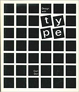
Dair’s book, Design with Type, which described principles of design using typefaces, was published in 1952 and revised in 1967. Design with Type became the first Canadian book to receive the Book of the Year Award from the American Institute of Graphic Arts.
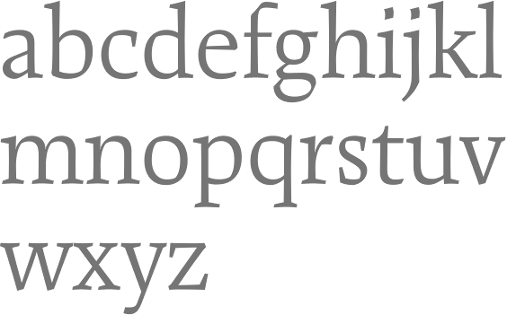
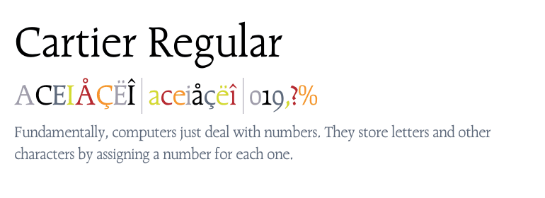
Dair created a typeface called Cartier, which was commissioned and released for Canada’s 1967 centenary celebrations, to be an identifiable Canadian typeface.
In 1967, he became a fellow in the Graphic Designers of Canada (GDC).
Dair died on a flight from New York City to Toronto on September 28, 1967.