Matt Mahurin

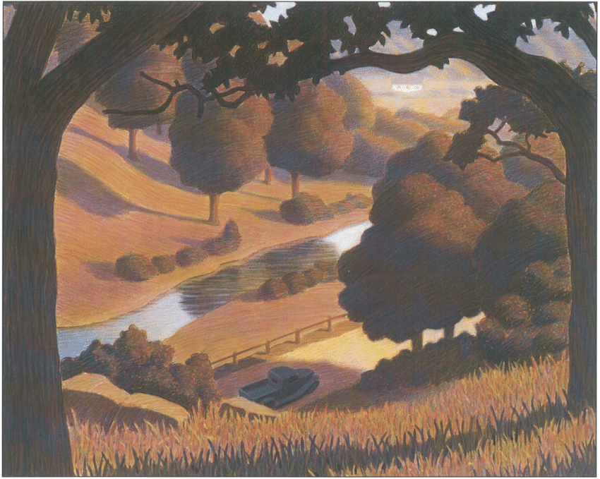
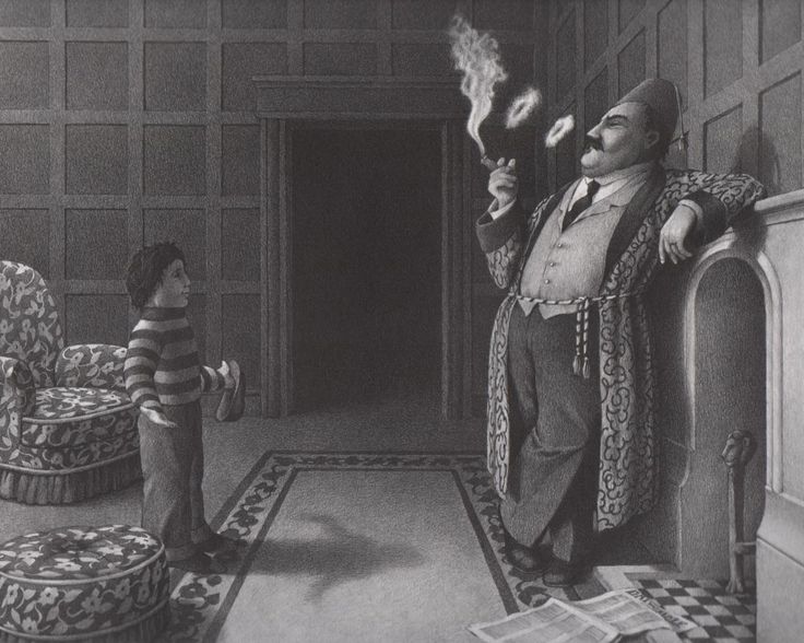
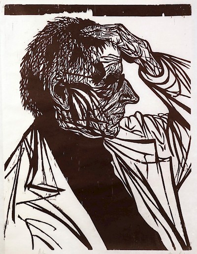
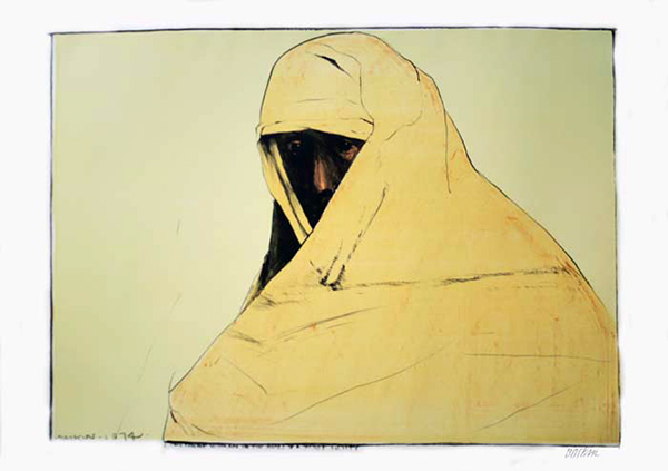
Matt Mahurin (1959-) is an American illustrator, photographer and film director. His illustrations and photographs have appeared in many major publications such as Time, Newsweek, The New York Times, etc.

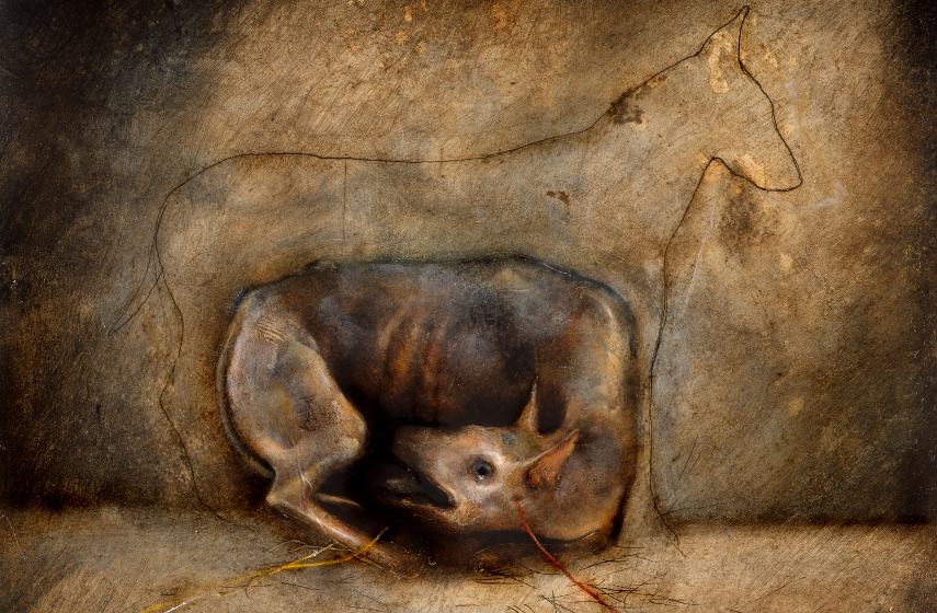
Mahurin’s work as a photo essayist has covered a wide range of subjects, including homelessness, AIDS, the Texas prison system, abortion clinics, Nicaragua, Belfast and Haiti.

Interesting use of photography, photo manipulation and illustration.

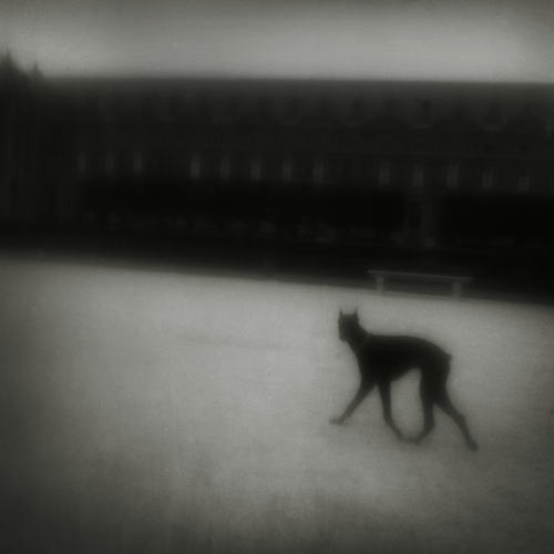
Some of his photographs, including Paris (1984), Clemmons Prison, Texas (1985), Woman’s Face in Darkness (1989), and Texas Prison (1988) are part of the permanent collection in NYC’s Metropolitan Museum of Art.

I’m all about this abstract concept

Mahurin has also directed several music videos since 1986, and has worked with U2, Metallica, Jaye Muller, Tracy Chapman, and many other popular music performers.M

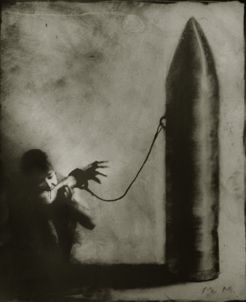
One of Mahurin’s signature moves is to photograph himself and perform photo manipulation in his commercial photo-illustration work. Some of these portraits have appeared on magazine covers: On the November 29th 1993 cover of Time, he appears as Sigmund Freud. On the March 14, 1994 cover of Time, he is depicted as a caveman.

I’m more of a fan of his photography than his illustration. This shot is really cool.

Mahurin’s undoubtedly most notorious work is the Time cover of O.J. Simpson. The cover features an altered mugshot on which Mahurin removed the photograph’s colour saturation (inadvertently making Simpson’s skin darker), burned the corners, and reduced the size of the prisoner ID number. His cover appeared on newsstands next to an unaltered copy on the cover of Newsweek. Some controversy over photo manipulation came out of this.

Mahurin’s OJ Simpson cover for Time magazine.

Wikipedia, Matt Mahurin: https://en.wikipedia.org/wiki/Matt_Mahurin

Matt Mahurin: http://www.mattmahurin.com/

Widewalls: Biography of Matt Mahurin: https://www.widewalls.ch/artist/matt-mahurin/

Chris Van Allsburg

Chris Van Allsburg (1949-) is an American writer and illustrator of children’s books. He attended the College of Architecture and Design at the University of Michigan, majoring in sculpture. During his time at the school, he learned bronze casting, wood carving, and resin molding. After graduating in 1972, he continued his studies at the Rhode Island School of Design, graduating with a master’s degree in sculpture in 1975.

Very nice muted, limited palette. Reminds me of scenery you would see in a Calvin and Hobbes comic.

Van Allsburg set up a sculpture studio on Rhode island after graduation, and worked part-time there, part-time at home. He started writing and illustrating children’s books after his wife told him that his drawings of his ideas had good children’s book potential. H wrote his first book, “The Garden of Abdul Gasazi”, in 1979.

Artwork for the “Jumanji” book. I really like the impression of soft indoor light in this work.

Over the course of his career, Van Allsburg has written and illustrated approximately twenty books. He also illustrated the covers for an edition of C. S. Lewis’s series “The Chronicles of Narnia”, published in 1994. His artwork was featured as well as in three of Mark Helprin’s children’s books.

I’m amazed at how clean these graphite drawings are.

Van Allsburg’s most famous children’s books include “Jumanji”, published in 1981, and “The Polar Express”, published in 1985. Both of these have won Caldecott Medals for U.S. picture book illustration, and were both later adapted into successful motion pictures (which he also worked on as a story writer and executive producer respectively).

One of Allsburg’s fine art pieces. It doesn’t seem like he works much with colour in his children’s books, but I really like this soft palette he’s chosen for this painting.

In 1986, he was a nominee for the biennial, international Hans Christian Andersen Award. He also received the honorary degree of Doctor of Humane Letters from the University of Michigan in April 2012.

Page of an illustrated spread in “Zathura”.

Wikipedia, Chris Van Allsburg: https://en.wikipedia.org/wiki/Chris_Van_Allsburg

Chris Van Allsberg interview: https://www.scholastic.com/teachers/articles/teaching-content/chris-van-allsburg-interview-transcript/

HMH books: https://hmhbooks.com/chrisvanallsburg/

Kinuko Yamabe Craft

Kinoko Yamabe Craft was born in Japan in 1940. She graduated with a degree in fine arts from the Kanazawa College of Art in 1964, then moved to the States and continued her studies in design and illustration at the Art Institute of Chicago.

Pencil Drawing! Better than me haha

After her studies, she worked primarily in the editorial and advertising markets. She is passionate about European fine art and draws inspiration from European art history in creating her work. Leonardo da Vinci, the Pre-Raphaelites, and Symbolist painters are amongst her favourite sources of inspiration. She works in a combination of artist oils and watercolour on clayboard gesso panels.

Craft has illustrated eight children’s picture books in the fantasy and fairy tale genre. Starting in the 1990s, she specialized in creating art for fantasy book jackets. She’s painted book covers for many well-known fantasy authors such as Patricia A. McKillip, Juliet Marillier, and Tanith Lee. Craft has also dabbled in designing opera posters, fairy tale books and cover art for national magazines.

I really love this colour palette. You can really see the influence of Renaissance and Pre-Raphaelite painters here.

In addition to collaborating with a variety of authors, Crafts has also worked with her husband Mahlon F. Craft and her daughter Marie Charlotte Craft.

Love the little easter eggs you find the longer you look at this image. It took me a second to see that there are women in the tree in the background.

Much of her art can be seen on calendars, posters, greeting cards, etc. Craft is a multiple award-winner, including several gold and silver medals from the Society of Illustrators. She has also won the World Fantasy Award for Best Artist in 2011, after being nominated five times.

I like the feeling of flat depth in this one.

Borsini-Burr Gallery, Kinuko Y. Craft: https://www.borsini-burr.com/artists/kinuko-y.-craft

Wikipedia, Kinuko Y. Craft: https://en.wikipedia.org/wiki/Kinuko_Y._Craft

Behance: Kinuko Y. Craft: https://www.behance.net/kinukoycraft

Étienne Delessert

Étienne Delessert (1941-) is a Swiss illustrator and graphic artist. His most famous works include the animated series “Yok-Yok” and his collaboration with Eugène Ionesco (Stories 1,2,3,4,). He is also known for his work with the children’s psychologist Jean Piaget.

Delessert’s work is more often than not aimed at children. He is intent on expanding the the minds of children through questions raised by his strange yet compelling illustrations. Like many illustrators, Delessert consideres himself to be a story teller using illustration to communicate a message. Many of his pieces are rendered in digital media combined with hand sketching.

This one makes me really uncomfortable. It’s terrifying.

Delessert was a finalist for the international Hans Christian Andersen Award in 2006 and 2010 for his children’s illustrations.

Delessert has illustrated over eighty children’s books, some of which are now translated into over 14 languages. His illustrations have appeared in leading magazines and newspapers such as Le Monde, The Atlantic Monthly, Time magazine and The New York Times. He has also animated segments of Sesame Street.

I like his conceptual approach to this one. I’m not a huge fan of some of his work, but I quite like this one. Oddly reminds me of a Dali.

In 1973, Delessert published an illustrated children’s book based on the lyrics to “Being Green” from Sesame Street and The Muppet Show.

He is the recipient of thirteen gold and fourteen silver medals of the American Society of Illustrators as well as the 1996 Hamilton King Award.

I really like this one! Reminds me of Where the Wild Things Are.

Delessert has held several exhibitions of his work, including one in the Musée des Arts Décoratifs in the Louvre, and one in the Library of Congress in Washington DC. 

He has also written an autobiography, l’Ours bleu, which was published in 2015 in France and Switzerland.

“The Blue Bear, memories of an image creator” by Étienne Delessert.

Cited:

http://www.etiennedelessert.com/

https://en.wikipedia.org/wiki/%C3%89tienne_Delessert_(illustrator)

Heinz Edelmann

Heinz Edelmann (1934-2009) was a well-known German designer, illustrator and teacher. However, he was most famous for his work as an art director and character designer for the Beatles’ 1968 animated film “Yellow Submarine”.

Record Cover illustration by Heinz Edelmann

Edelmann studied printmaking at the Düsseldorf Arts Academy, and subsequently started his career as a freelance illustrator and designer. His first designs were for various theatre posters and advertisements in Germany.

Sea of Heads illustration by Heinz Eldemann. I really like this clean, graphic style he’s chosen for this. There’s more restraint in his use of colour than there is in some of his other work.

Throughout the 60s Edelmann was a regular illustrator and cover designer for the West German youth magazine twen (published 1959 to 1971), which was known for its innovative use of design and typography. In 1967 and 1968, he worked on “Yellow Submarine”. Following the release, he worked for two years as a partner in a small London animation company.

Yellow Submarine by Heinz Edelmann

Edelmann then moved to Amsterdam and designed play and film posters as well as book jackets. Among these was a cover design for a German edition of Tolkien’s “The Lord of the Rings”. He also illustrated Kenneth Grahame’s famous children’s book: “The Wind in the Willows”.

Lord of the Rings: The Fellowship of the Ring Cover illustration by Heinz Edelmann

Edelmann taught industrial graphic design at the Düsseldorf University of Applied Sciences from 1972 to 1976, then lectured at the Cologne University of Applied Sciences. In 1989, he became a professor of illustration at the Stuttgart State Academy of Fine Arts.

Really love this simple children’s book illustration by Edelmann. It somehow reminds me of Emma’s Cinderella watercolour illustration assignment.

Edelmann also designed the “Curro”, the 1992 Seville World’s Fair mascot.

Curro!
I felt compelled to add this one because I like the style in which the figures are drawn.

Cited:

http://www.artnet.com/artists/heinz-edelmann/

https://en.wikipedia.org/wiki/Heinz_Edelmann

https://www.independent.co.uk/news/obituaries/heinz-edelmann-illustrator-who-helped-to-create-the-psychedelic-landscape-of-the-beatles-film-yellow-1767253.html

Leonard Baskin

Leonard Baskin (1922 – 2000) was fine artist, illustrator, writer and teacher. He strongly thought figurative art was superior, and this belief can be seen in his work throughout his career.

“Self Portrait as a Priest” (1952)

Baskin was born in New Jersey, and at age seven he moved to New York with his family. Wanting to be a sculptor, Baskin studied at the New York University School of Architecture and Applied Arts from 1939 to 1941. In 1941, he won a scholarship to Yale university and studied there for two years. While he was there, he discovered and was deeply impressed by the illustrated books of William Blake. Baskin decided to learn to print and make his own books, and subsequently founded Gehenna Press in 1942, one of the first fine art presses in the US. His press printed over 100 books and ran until Baskin’s passing in 2000.

“White Man Runs Him” Lithograph by Leonard Baskin, 1974.

Baskin served in the US Navy at the end World War Two, and then moved to the Merchant Navy. Upon his return, he studied at The New School for Social Research, obtaining his B.A. in 1949. 

From 1953 until 1974, Baskin taught printmaking and sculpture at Smith College. During this time (1956), his first solo exhibition was at the Boris Mirski Gallery in Boston.

The Anatomist 1952 Leonard Baskin. Presented by the Museum of Modern Art, New York.

In 1974, Baskin moved to Britain to work with his friend Ted Hughes. They collaborated on several works, including A Primer of Birds (1981).

In 1984, Baskin returned to the US and taught at Hampshire College (Massachusetts).

Portrait of an Irishman, Sean O’Casey. L. Baskin, 1952.

Many of Baskin’s works are now owned by many major museums including the Metropolitan Museum of Art, the Museum of Fine Arts, Boston, the Museum of Modern Art, etc.

Baskin passed away in 2000, and the Art Institute of Portland has a memorial to him.

Cheyenne Woman, lithograph, 1974. Many of Baskin’s works were in Black and white exclusively, but I personally appreciate his bold and flat approach to using colour.

Cited:

https://en.wikipedia.org/wiki/Leonard_Baskin

https://www.davidsongalleries.com/artists/modern/leonard-baskin/portraits/portrait-of-an-irishman-sean-ocasey/

https://www.tate.org.uk/art/artists/leonard-baskin-700

Mead Schaeffer

Mead Schaeffer (1898 – 1980) was an American illustrator active during the late golden age of illustration.

illustration for The Black Buccaneer, published in 1920. Schaeffer had a very distinctive painterly style. He painted from life and often used muted colours in his work.

Schaeffer studied at the Pratt Institute, learning from his teachers Harvey Dunn and Charles Chapman. Schaeffer’s early projects were often critiqued by Dunn. Schaeffer illustrated the first of seven ‘Golden Boy’ books written by L. P. Wyman while he studied.

Illustration for the Count of Monte Cristo.

In 1922, Schaeffer illustrated a series of classic novels for publisher Dodd Mead, whom he continued to work for until 1930. He illustrated Moby Dick, Typee, and Omoo by Herman Melville, as well as The Count of Monte Cristo and Les Misérables by Victor Hugo.

The Count of Monte Cristo Illustration by Mead Schaeffer.

During the 1930s and 1940s, Schaeffer illustrated for magazines such as Good Housekeeping, McCall’s, The Ladies Home Journal, Country Gentleman, and Cosmopolitan. He illustrated a total of 46 covers for the weekly Saturday Evening Post.

Another illustration for The Black Buccaneer. I really really really like the jade green used on the tress being hinted it in the figures’ clothing.

Schaeffer worked as a war correspondent during World War II for the Saturday Evening Post. He produced a series of covers illustrating American military personnel which he became well-known for.

Another illustration for the Count of Monte Cristo. Fantastic framing and composition.

Like many artists and illustrators of his time, Schaeffer lived in New Rochelle, New York, for some time. However, he mainly lived in Arlington, Vermont, in his barn-studio.

Cited:

http://www.artnet.com/artists/mead-schaeffer/

https://en.wikipedia.org/wiki/Mead_Schaeffer

https://www.illustrationhistory.org/artists/mead-schaeffer

Pruett Carter

Pruett Alexander Carter (1891 – 1955) was an American illustrator. He studied fine art in Los Angeles at the Art Students’ League, then studied in New York under the painter Robert Henri.

I like this limited colour palette and how the paint doesn’t seem to have been overworked.

Carter followed a career path similar to that of many other illustrators of the time. He illustrated national magazines such as Life, McCall’s, Ladies’ Home Journal, Woman’s Home Companion and The American Magazine, and was art director at Atlanta Journal and Good Housekeeping. He was successful in his career due to his ease with adapting his work to the needs and wants of the public.

Aside from working for magazines, Carter taught at the Grand Central Art School with N.C. Wyeth and Harvey Dunn, and was later head of the Illustration Department at the Los Angeles Chouinard Art Institute.

Carter was married and had a son with his wife Theresa in 1920. He lived in New York with them until 1930, when they relocated to Los Angeles, California. Around the same time as this move, Carter switched from his main medium of oil paint to that of gouache due to the faster drying time.

In 1955, Carter killed his wife and son in their sleep and subsequently committed suicide.

In 1988, Carter was added to the Society of Illustrators’ hall of Fame.

This is probably one of my favourite illustrations of his (from what I’ve seen). I really love how the lighting affects the feel of the composition.

Kay Nielsen

Kay Rasmus Nielsen (1886 – 1957) was an illustration from Denmark who was active during the early 20th century, or “golden age of illustration”. Nielsen became successful in illustrating early twentieth century gift books. He also collaborated with Disney, providing them with a number of story sketches and illustrations.

Illustration from East of the Sun and West of the Moon

Born in Copenhagen to actor parents, Nielsen went on the study fine art in Paris. His first commission was from Hodder and Stoughton in 1913 to illustrate the collection of fairy tales In Powder and Crinoline, Fairy Tales Retold by Sir Arthur Quiller-Couch.

Another illustration from East of the Sun and West of the Moon. (I love the composition and stark contrast of this!! Wow!!)

Over the course of his career, Nielsen illustrated scenes from ‘Sleeping Beauty’, ‘Puss in Boots’, ‘Cinderella’, ‘Bluebeard’, ‘East of the Sun and West of the Moon’, ‘The Arabian Nights’, ‘Hansel and Gretel’ and the story of Joan of Arc.

Illustration from In Powder and Crinoline

In addition to doing illustration work, Nielsen dabbled in fine art and painted numerous landscapes of the Dover area. He learned with the Society of Tempera Painters to reduce the time involved in the painting process and held an exhibition of his work in New York before returning to Denmark.

Illustration from Hansel and Gretel.

In 1939, Nielsen moved to California and began working in Hollywood. He was personally recommended by Joe Grant to Walt Disney, and he was hired to produce concept art. His work was used in sequences of Fantasia. He also introduced concept paintings for a film adaptation of The Little Mermaid, which was released much later in 1989. Nielsen worked for The Walt Disney Company for 4 years before leaving for Denmark and staying there for the rest of his life.

Illustration from East of the Sun and West of the Moon.

Cited

Wikiart, Kay Nielsen: http://www.artcyclopedia.com/artists/nielsen_kay.html

Wikipedia, Kay Nielsen: https://en.wikipedia.org/wiki/Kay_Nielsen

Artcyclopedia, Kay Nielsen: http://www.artcyclopedia.com/artists/nielsen_kay.html

One of my favourite illustrations of his. Love the smallness of the figure compared to the background.
I love this one too! Great use of leading lines and colour.

Richard ‘Dicky’ Doyle

Richard Doyle (not to be confused with actor Richard Doyle) was an english illustrator active during the Victorian Era. Much of his work was featured in Punch Magazine. He designed the magazine’s masthead, which was used for the next century, and illustrated the first ever front cover. He was born in London, and was one of the seven children of the cartoonist John Doyle, known for his political caricatures. Richard Doyle was fascinated with fairytales from a young age, and also proved to be a gifted illustrator. He finished his first fully illustrated book, titled “Home for the Holidays”, at age twelve. The book was then published in 1887.

Doyle’s design for the cover of Punch magazine.

At age 19, he joined the staff of Punch magazine, and worked there for seven years thereafter. Doyle also illustrated books and stories for notable authors such as Charles Dickens, and was himself an uncle to Sir Arthur Conan Doyle, the famous creator of the Sherlock Holmes series.

In 1846 Doyle illustrated The Fairy Ring, which was a new translation of Grimm’s tales). From this he became well-known as a fairytale illustrator. Some fairytale creatures that frequently appeared in his work were elves, delicate fairies, and pixies.

An elf and a fairy kissing, from In Fairy Land(1870)

Doyle’s principal series of illustrations were those for The Newcomes,  The King of the Golden River, and The Foreign Tour of Brown, Jones and Robinson. Considered his masterpiece is In Fairyland, a series of Pictures from the Elf World, accompanied by a poem by William Allingham.

Illustration by Richard Doyle for Jack and the Giants

While Richard Doyle was a talented fantastical illustrator who produced images both in colour and in black and white, he had a reputation as being “brilliant but unreliable”. He was often late in meeting deadlines for The Newcomes, and only finished the work when threatened to be replaced. His illustrations were often inconsistent in quality as he rushed through them. His excuses for not finishing his work on time were often ridiculous and flimsy, and this negatively affected his career and success.

image from Princess Nobody (1884), illustrated by Doyle, engraved and coloured by Edmund Evans.

Cited:

Wikipedia, Richard Doyle: https://en.wikipedia.org/wiki/Richard_Doyle_(illustrator)

Illustration History, Richard Doyle: https://www.illustrationhistory.org/artists/richard-dicky-doyle

The Victorian Web, Richard Doyle: http://www.victorianweb.org/art/illustration/doyle/bio.html