TRIUMF week seven

This week I finished the ARIEL mural design. I’m unsure whether I’m allowed to post the whole thing here but I’ll include detail shots.

Maria, Diana, and I continued with our morning meetings and shared progress on our projects. I reached out to the ARIEL “clients” on Wednesday to get feedback on the mural design, but I haven’t heard back yet. I’m hoping to get their insight this week so I can make the final tweaks needed. In the meantime, I’m working on the AR portion of the project. The wall the mural is on is divided into three parts by two concrete columns; this is where the names of the contributors will be projected. I’m really hoping to add some motion if time allows for it, both in the illustrative and typographic areas of the AR display.

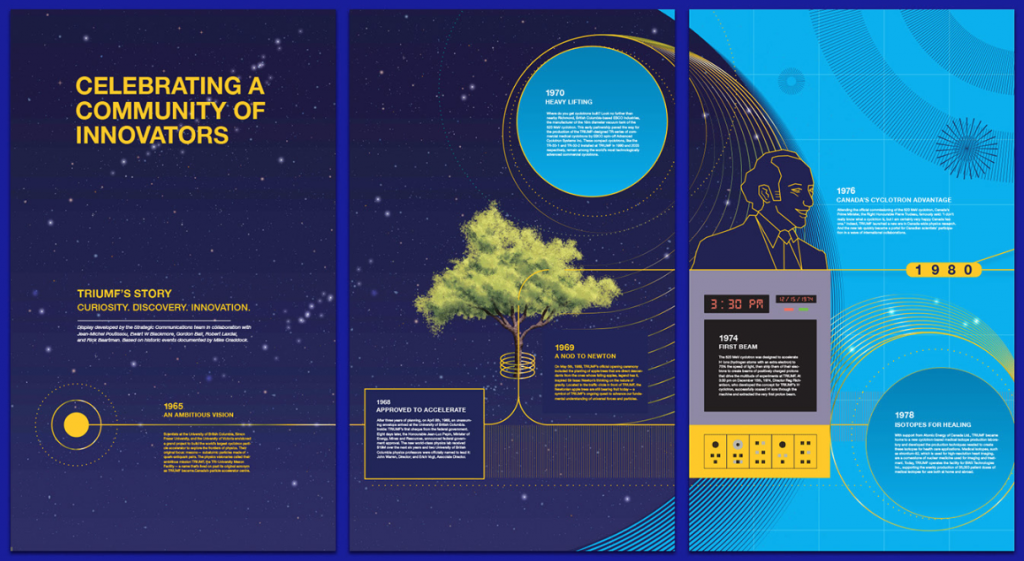
While we’re on the topic of murals and such, I’d like to point out works by IDEA alumni Lillian Zhang, Mustaali Raj, Aaron Campbell, Cristian Fowlie, and Jenny Oakley. The TRIUMF time tunnel (Mustaali and Aaron) is an interactive timeline displaying TRIUMF’s 50 years of discovery and innovation. The lab’s milestones are presented through procedural generation and computational transitions. It’s installed in the lobby of the main building and has its own microsite and animated feature!

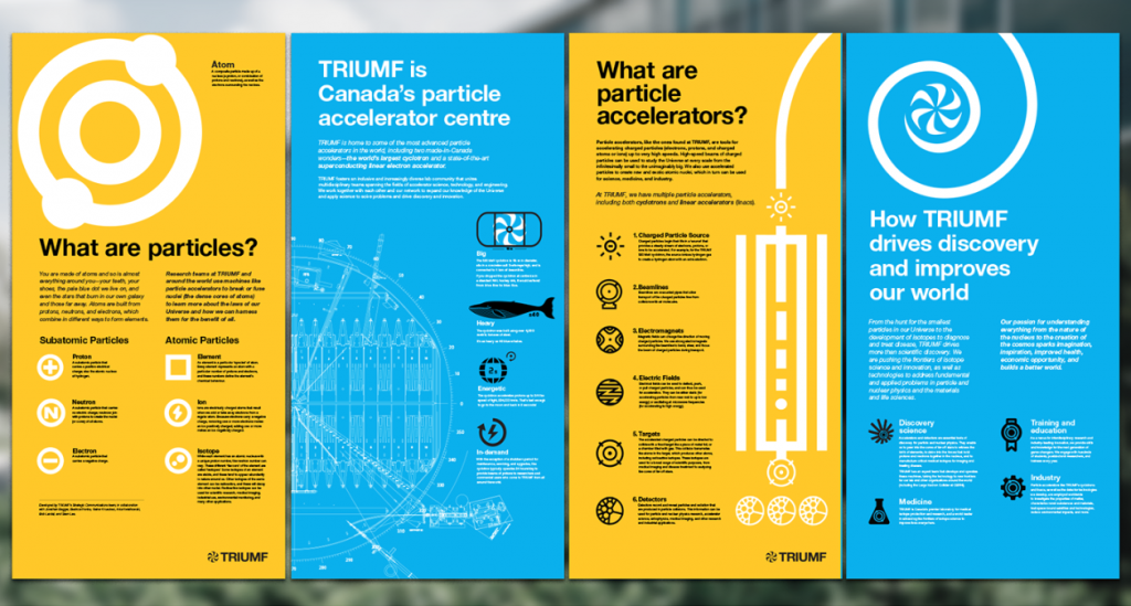
“How particle accelerators work” is a series of infographics by Cristian and Jenny. They break down complex physics principles into digestible morsels of information with the help of illustration and custom iconography.

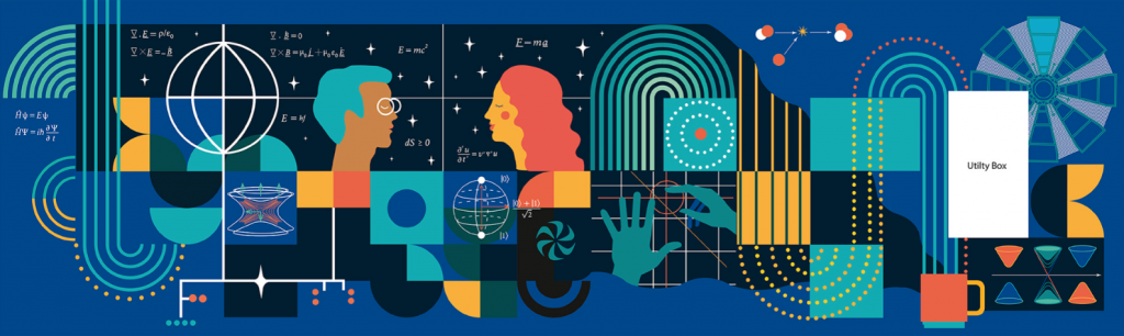
Lilian created the TRIUMF Physical Sciences Office Mural: “Connected”. It’s displayed in the shared workspace for scientists and researchers of the Physical Sciences department. It does an excellent job of simplifying scientific principles and imagery in an accurate and aesthetically pleasing manner, and is a colour palette inspiration for my own mural!

TRIUMF Wheat Flour (okay, it’s a stretch)

Week four at TRIUMF. Monday was kicked off with a morning design team meeting with Maria, and in the afternoon the communications team had a zoom call to go over this week’s tasks. Sean, Jesse, and I set up a time on Thursday to meet with the mural project’s clients. I spent my time from Monday to Thursday meeting with Maria to help out with her website UX research, proofing other members’ designs, and putting together a presentation for the stakeholder meeting. Thursday’s meeting had me a little n e r v o u s but I think I did well! There was some debate on how to approach getting consent to put people’s names up on the mural, and a discussion on terminology, such as using “engineers” vs “engineering” to designate contributors’ roles. More politics involved than I was expecting! In the end, the stakeholders decided on a fully illustrative mural rather than one using typography, largely due to the terminology issue. 

One of the concepts presented

I also worked on the TRIUMF merch this week! Many of the co-op students take issue with the TRIUMF logo due to it supposedly looking like a certain body part (think… Walmart’s logo). Thus, creating a design that still felt true to the TRIUMF brand while pleasing the clients was a delicate balancing act. After some iterations and feedback, we arrived at a potential solution which I’ll have to run by Dana, the co-op student coordinator, and Diana. I’m hopeful that the relatively small output (about 25 hoodies) will help sway them into agreeing.

The second option won!

In other (shocking) news, we had a COVID outbreak at the Tuesday morning intern meeting! Everyone took tests and only a few people came out positive, but it was enough to postpone the highly anticipated weekend trip to Victoria the group had planned. But it’s okay because the purge survivors settled on getting ramen at Danbo instead.   

Shoutout to Jesse for being an awesome handler these past two weeks!   

Phase 5 — Grading/Report/Evaluation

This project was a unique learning experience for me. My main goals were to improve my communication and presentation skills, and to gain an important networking connection! I learned more than I expected in the early phases of the project— student projects are often idea and execution focused but lack the type of set-up process found in a real client relationship. Building a solid brief saves a lot of uncertainty in later phases and carefully planning tasks in linear order can help work be more streamlined. While I am happy with my final deliverables, the most valuable lessons I learned were from a practical and strategic standpoint.

8/10 – I worked well with my mentor but should have made more use of my classmates’ feedback as well.     

Phase 4 — Rationalize/Articulate/Sell

I presented my in-progress project to the class and my nearly-final (tote bags needed some work) version to Arndt in the final week. He offered some great feedback on website functionality, for example in the “find us” section he suggested I link the address to a google maps location instead of having an illustrated map on the site.

Arndt also gave me some tips on what content to present to whom. For fellow designers he suggested I spend more time on the process while client presentations should be more succinct with greater emphasis on deliverables and rationalization. 

9/10 – I think I made lots of progress presenting my ideas between the first and final phases!

Phase 3 — Push/Refine

In this phase I focused on developing the brand logo, website, promotional materials and finally SWAG. Refining the logo took a bigger chunk of time than I expected, but I ended up with an attractive shape that works for the concept I was trying to convey. I showed my top three final drafts to Arndt and he asked me if I was testing his eyesight, so I mocked them up on fake collateral and chose the one that reads best at a variety of sizes. I then moved on to designing the website from the sitemap and wireframes I came up with in the previous phase. For the website and the promotional materials, I used photography I gathered in my brand visuals. Arndt helped me pick out the shots that best suited the feel of the MFM brand and echoed the shape of the logo. 

Finally, I designed  three variations of a branded tote bag to be distributed at medical conferences. I thought having some variety would demonstrate the versatility of the logo and the solidity of the brand’s visual identity.

8/10 – I like the way the logo turned out, as well as the website navigation system. I was a bit crunched for time in this phase, especially when I got to the tote bags!   

Phase 2 — Imagine/Ideate/Explore

I started this phase with creating a project timeline using a scheduling and time-tracking service. My time was separated in five phases: Brand building (coming up with back-end elements to help me define the MFM brand– brand essence, voice, archetype, etc), moodboarding, logo ideation, establishing brand visuals and promotional material ideation.

It was challenging building a brand from very little. There were some elements to consider, such as the relationship between the MFM brand I’m building and the BC Womens hospital brand as the Maternal Fetal Medicine Clinic lives within the hospital. Working on the visual language and feel of the brand and website was a different experience for me as I had to keep the look fairly conservative and trustworthy. It absolutely couldn’t look like an overly designed, trendy student project like some of the work I usually do. Arndt was a great help in keeping me on track with adhering to the brief and critiquing my work twice a week.

8/10 – I ended up going over the allocated amount of time and had to condense the execution phase.

Phase 1 — Listen/Gather/Define

After my kickoff mentor meeting with Arndt Klos (creative director at Vigilantes), I got to work on expanding my project idea into a brief. I met with my client and we explored what they do, their ambitions, and what kind of collateral they were envisioning would come out of this project. They expressed that they felt some branding would be effective to differentiate their division (the Maternal fetal Medicine Clinic) from the rest of BC Women’s hospital. One of their principal aims as a group is to provide education on fetal heart disease for sonographers across BC and the Yukon, and prevent related complications.

When writing the brief, I identified two principal target markets: Sonographers / Care providers, and MFM clinic patients. The branding and marketing-heavy materials were to be geared mostly to patients, while I would develop an online learning platform filled with resources for care providers. The client expressed a want for SWAG items to give away at conferences and education sessions, so I determined I would gear those towards care providers as well since they would be in attendance at these events.

Arndt and I looked over the brief and he sent me some of Vigilantes’ past client briefs to give me an idea of what would be really important to include. He suggested I keep the brief limited to goals, a timeline and deliverables, and put research and additional information in a background document. He also wrote some comments on my document to direct me.

After finishing the brief, I dove into research and got to interview two sonographers with fetal heart disease backgrounds, one of which works at the MFM and the other who has spearheaded a similar project in Manitoba. From these interviews and research I gathered online, I was able to construct a target market empathy map and a user persona to help me build my brand and website.

10/10 – Research was a big part of making this project work and I think I nailed it! 

AHIS 430 Glossary

COMICS: Scott McCloud defines comics as “Juxtaposed pictorial and other images in deliberate sequence, intended to convey information and/or to produce an aesthetic response in the viewer.” So basically: Images meant to be interpreted in sequence.

PICTORIAL: For a drawing or symbol to be “pictorial”, it has to have some resemblance to the subject.

ICON: An icon is any image used to represent a person, place, thing or idea.

thinking

CLOSURE: The phenomenon of observing the parts but perceiving the whole is closure. In the medium of comics, closure is an agent of change/time/motion and the viewer is a willing collaborator. Example: In a movie, there is a shot of a person approaching a train with intent to board. When it is followed by a different shot of the person in the train, your mind immediately comprehends that the person boarded the train although it wasn’t directly shown. That is closure.

GUTTER: The gutter is the blank space between panels of a comic. In comics, panels fracture time and space, and we use the gutter between them to turn them into a more continuous, unified reality with closure.

PANEL-TO-PANEL TRANSITIONS:
Moment-to-Moment (very little closure needed)
Action-to-Action (See Garfield comic below)
Subject-to-Subject
Scene-to-Scene (across distances of time and space)
Aspect-to-Aspect (place, idea, mood, rather than time)
Non-Sequitur (no logical relationship – we can find meaning or resonance even in jarring combinations)

garfield

garfield

BLEEDING: In a regular closed panel, time is present and contained. When the panel runs off the page edge, time escapes into space and a mood is set. This is called bleeding, and it is often used by Japanese manga artists.

ZIP RIBBON: The line of motion shown in comics. Often used in superhero and action comics where there are lots of fast and sudden movements.

SYN-AESTHETICS: Relating to synesthesia & merging of the senses.  Used to evoke an emotional or sensual response .The use of visual icons can give the feeling of things we can’t see “in real life” such as shock lines or smell lines.

SPEECH BUBBLE: The speech bubble is the comic equivalent of quotation marks. The bubble indicates speech and contains a character’s dialogue. The type of speech can be expressed or enhanced with the appearance of the bubble; a spiky bubble with all-caps text can indicate shouting or anger, and a shaky bubble with smaller text could mean the person speaking is feeling afraid or reluctant.

MONTAGE: In comics, a montage is an integration of text into a picture. This text isn’t usually encased in a speech bubble. See the picture below.

Welcome to our Star Blanket

I really don’t know where to start when it comes to explaining the process of creation this project underwent. Two hours ago when I started writing this, I went off on a complete tangent about my childhood right around this point, so I’m going to try to keep this on track for your sake (and mine!)

After I was illuminated by my discovery of Wilfred Buck’s knowledge and work (see previous post), I endeavoured to read what I could find about him and and the topic he teaches. I read a number of the stories he tells which are associated with Cree constellations and was inspired to help further his reach and share the Plains Cree’s knowledge of the night sky. I spent some time trying to figure out how I could bring Cree astronomy to more Canadians in a respectful, enjoyable and educational way. I wanted children and adults alike to be able to admire and learn from a culture so deeply rooted in the history of the land. I pondered whether I should create a series of posters showcasing Cree constellations with a short explanation included, but I felt that approach wasn’t comprehensive enough to really educate or create a sense of wonder and discovery for the audience. After contemplating some more guerilla campaign options I landed on the idea of designing a Cree stargazing application. It ticked all the boxes: A free app is accessible to the vast majority, and can house a large amount of information. The active “stargazing” aspect where the user physically moves and manipulates their device to see the constellations where they actually are adds the element of discovery and interactivity.

After settling on this idea, I proceeded to download seven different stargazing apps onto my phone. To my dismay, they were all glitchy, plagued with pop-ups and generally very ill-designed. The most important information I drew from them was that the visual of a moving compass could serve as a guide to help the user navigate the sky. I then put together a moodboard comprised of apps, logos, website designs and colours to help me visualize how a user would navigate information and process visuals in my future design. Being very inexperienced in the domain of app design, lots of my research and process was done through moodboarding and navigation of well designed platforms such as Spotify, Squarespace and Peek. Once I felt more at ease with how the app should flow, I started thumbnailing different screens in my notebook and experimenting with layout in sketch. I established the the number of illustrations I would create ahead of time and built the layout around them and the “map” aspect of the app. I utilized a simple pull-up menu system that would appear upon the selection of an individual constellation and offer options. To exit, the user would simply pull them down again. Once the layout was finished, I created two illustrations to fit into the star map and added the copy to match them.

After the app was completed came the logo. This aspect was particularly difficult for me as I struggled to think of a compelling visual that relates to the app’s content without appropriating Cree artwork or symbolism. The trouble was that if I were to steer completely clear of cultural meaning, the logo would feel detached from the app itself. I was leaning towards designing a wordmark as a logo when I thought of using the Cree alphabet. I looked up plains Cree words and sayings and their pronunciation as well as spelling and landed on “Tipskaw” which translates to “night sky”. I was fascinated by the letterforms in the Cree spelling and so decided to design a wordmark based on it. 

Evaluation

Although I initially had some feelings of anticipation regarding this project, I ended up having a good time working it out. One of the best decisions I made was choosing the solution based solely on how well it solves the problem rather than how it matches my skillset. I took on designing an app from scratch for the first time and I think it was the right direction to take this project in. While my hard skills in interactive design may be lacking at this point in time, the intent is expressed clearly and the content satisfies the objective. I’d give myself an 8.5/10 for a solid effort and good learning experience!