Bruno Monguzzi

Bruno Monguzzi (1941-) is a Swiss graphic designer.

Monguzzi was born in Switzerland in 1941. After moving to Geneva with his family, he attended the Graphic Design Course at the Ecole des Arts Decoratifs.

In 1960, Monguzzi travelled to London and attended Gestalt psychology, typography and photography courses at Saint Martin’s School of Art and the London College of Printing.

Monguzzi worked with Dennis Bailey in London, then moved to Milan in 1961 to join the Studio Boggeri (which was at the time the leading design and advertising agency in Italy). In 1965, Monguzzi was invited to join the Charles Gagnon and James Volkus office in Montreal. He designed nine pavilions for Expo 67.

In the early 70s, Monguzzi worked independently from his atelier in Meride, Switzerland. He received the Gold Medal from the New York Art Directors Club in 1990, the Yusaku Kamekura Award and various other awards.

In 2003. Monguzzi was awarded the Honorary Royal Designer for Industry distinction by the Royal Society of Arts, London.

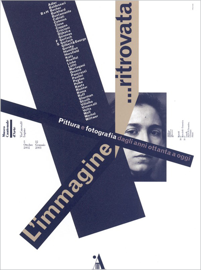
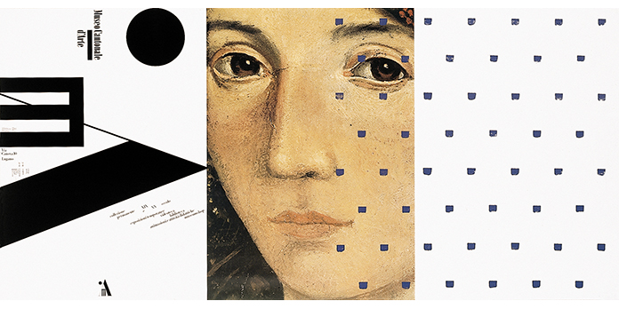
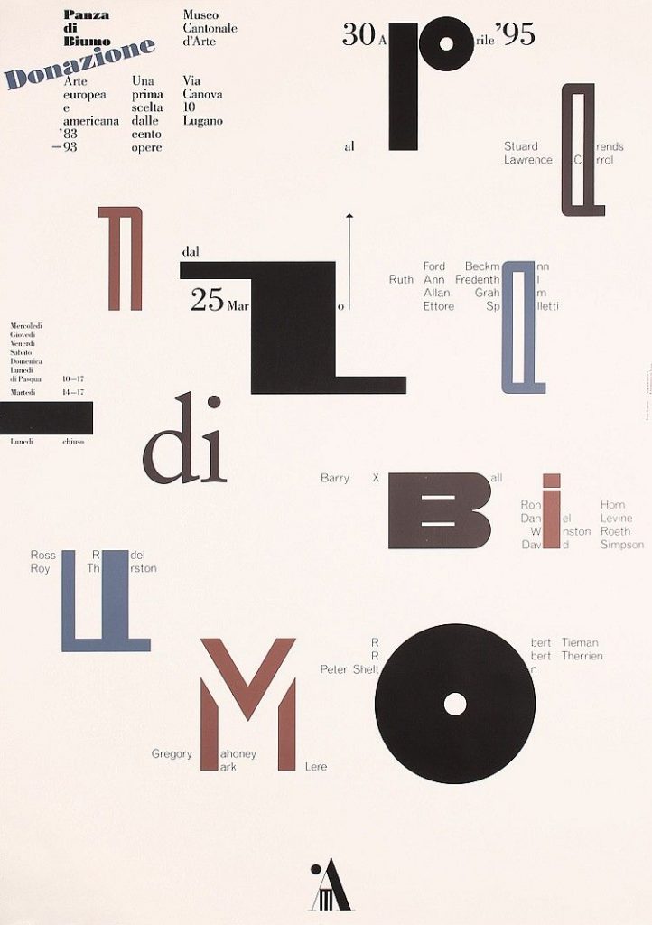
Some of his most significant projects include: the visual identity of the Musée d’Orsay in Paris (which is no longer in use), the exhibition “Majakowskij Mejerchold Stanislavskij” at Castello Sforzesco in Milan, and the posters for Museo Cantonale d‘Arte in Lugano (1987-2004).

Cited:

https://en.wikipedia.org/wiki/Bruno_Monguzzi

http://www.historygraphicdesign.com/the-age-of-information/postmodern-design/983-bruno-monguzzi

Thomas H. Geismar

Thomas H. Geismar (1931-) is an American graphic designer.

Born in Glen Ridge, New Jersey, Geismar studied at the Rhode Island School of Design and Brown University. He then received a master’s degree in graphic design from Yale University.

In 1957, Geismar founded the firm Brownjohn, Chermayeff & Geismar (now Chermayeff & Geismar & Haviv) with Robert Brownjohn and Ivan Chermayeff.

Tom Geismar has designed 100+ corporate identity programs for companies such as Xerox, Chase Manhattan Bank, Best Products, Gemini Consulting, PBS, and Mobil.

Geismar has also had major responsibility for many of his firm’s exhibition designs and world’s fair pavilions. He worked on major tourist attractions as the Ellis Island Immigration Museum, the Statue of Liberty Museum, the Truman Presidential Library, etc.

Geismar has been the recipient of several major awards in graphic design, including one of the first Presidential Design Awards for helping to establish a national system of standardized transportation symbols. Geismar also co-wrote 4 graphic design books with other members of his firm.

Cited:

https://en.wikipedia.org/wiki/Tom_Geismar

https://library.rit.edu/gda/designers/thomas-geismar

https://www.cghnyc.com/about/tom/

Carl Dair

Harris Carleton Dair (1912 – 1967), professionally known as Carl Dair, was a Canadian graphic designer, type designer, author and teacher. He was primarily self-taught in design, but was nevertheless internationally known. He developed visual design principles for typography which are still in use today.

Dair was born in Crowland Township in Welland, Ontario. He landed his first creative job when he was 18, creating advertising and layouts for the Stratford Beacon-Herald.

In a partnership with Henry Eveleigh, Dair founded the Dair-Eveleigh Studio which operated from 1947-51 in Montréal, Quebec. There he worked mostly as a freelance designer. During this time he worked for the National Film Board of Canada. He also lectured on typography at the Ontario College of Art between 1959 and 1962. Dair taught at the Jamaica School of Arts and Crafts for two years.

Dair’s book, Design with Type, which described principles of design using typefaces, was published in 1952 and revised in 1967. Design with Type became the first Canadian book to receive the Book of the Year Award from the American Institute of Graphic Arts.

Dair created a typeface called Cartier, which was commissioned and released for Canada’s 1967 centenary celebrations, to be an identifiable Canadian typeface.

In 1967, he became a fellow in the Graphic Designers of Canada (GDC).

Dair died on a flight from New York City to Toronto on September 28, 1967.

Cited:

https://en.wikipedia.org/wiki/Carl_Dair

https://gdc.design/fellows/carl-dair-fgdc

https://utorontopress.com/ca/blog/tag/carl-dair/

Alton Kelley

Psychedelic design, here we go!

Kelley & Mouse collaboration.

Alton Kelley (1940 – 2008) was an American artist and designer. He was best known for his psychedelic designs for 1960s rock concert posters and album covers. He founded the Berkeley Bonaparte distribution agency alongside fellow artists Rick Griffin,Wes Wilson, Stanley Mouse, and Victor Moscoso. The agency was created with one purpose: to produce and sell psychedelic poster art.

The Grateful Dead poster, ft. skeleton by Edmund Sullivan.

One of Kelley’s most recognizable designs is that of wings and beetles (created in collaboration with S. Mouse) which decorate all Journey album covers. He also illustrated the skull and roses image for the Grateful Dead. His artwork for the 1971 Grateful Dead live album included a black and white skeleton illustration by Edmund Sullivan (originally appeared in a 19th-century edition of the Rubáiyát of Omar Khayyám).

Some more of Kelley’s work includes his 1995 design of a limited edition poster of Jack Kerouac to raise money for the Jan Kerouac Benefit Fund. In addition to designing it, he also printed it himself. Kelley also created the cover art for the King’s X album “Ear Candy” in 1996.

SAAM, Alton Kelley: https://americanart.si.edu/artist/alton-kelley-28928

Wikipedia, Alton Kelley: https://en.wikipedia.org/wiki/Alton_Kelley

Artnet, Alton Kelley: http://www.artnet.com/artists/alton-kelley/

Paula Scher

One of my all-time favourite designers! Hooray!

Paula Scher (1948-) is an American graphic designer, painter and design educator. She studied at the Tyler school of art and finished her BFA in 1970. She then moved to New York City and began her career as a graphic designer. In 1972, she worked at CBS studios in the advertising and promotions department, then went on to become an art director and album cover designer at Atlantic Records two years later. She then moved back to CBS studios in 1975, this time as an art director.

Scher’s most famous album cover – but she herself hates it and fears she’ll never live it down.

In 1982, Scher left CBS to work as a freelancer. In 1984, she founded Koppel & Scher with Terry Koppel. They worked to design identities, packaging, book jackets and advertising. In 1991, she became the first woman to be a principal at Pentagram (NYC).

Some Album covers designed by Paula Scher.

In 1992, she taught at the Maryland Institute College of Art as well as at Cooper Union, Yale University and the Tyler School of Art. She has received honorary doctorates from the Corcoran College of Art and Design, the Maryland Institute College of Art, and Moore College of Art and Design.BFA from the Tyler School of Art.

Some achievements:

  • 1998 – Named to the Art Directors Club Hall of Fame
  • 2000 – Chrysler Award for Innovation in Design
  • Served on the national board of the American Institute of Graphic Arts (AIGA)
  • 1998 to 2000 president of AIGA New York Chapter
  • AIGA Medal
  • 2006 – Awarded the Type Directors Club Medal (first woman to receive it!!)

Works:

Album Covers:

  • While working at CBS, Scher designed around 150 album covers a year.
    • She also worked as an art director, collaborating with photographers and illustrators.
One of Scher’s huge infographic maps – all done in acrylic paint.

Maps:

Scher has created 39 paintings, drawings, prints and environmental installations.

  • Some of them are super large scale (up to 12 feet!)
  • They just look like maps until you look closer and then you realize they’re entirely made up of words and typography – they’re really a TYPE (haha puns) of infographic.

More Work:

  • For the Public Theater:
    • “Bring in ‘Da Noise, Bring in ‘Da Funk” is a poster campaign and brand identity she created. One of her most famous works, her style set the tone for all of NYC design.
  • A lot of her work are filled with typography, as she knows how to work type to her advantage in the layout. It adds to the piece.
  • Scher also designed the microsoft windows 8 logo, the Public Theater logo, the New York philharmonic identity, the citibank logo, rebranded Tiffany & Co. and the NYC Ballet.