One of my all-time favourite designers! Hooray!
Paula Scher (1948-) is an American graphic designer, painter and design educator. She studied at the Tyler school of art and finished her BFA in 1970. She then moved to New York City and began her career as a graphic designer. In 1972, she worked at CBS studios in the advertising and promotions department, then went on to become an art director and album cover designer at Atlantic Records two years later. She then moved back to CBS studios in 1975, this time as an art director.

In 1982, Scher left CBS to work as a freelancer. In 1984, she founded Koppel & Scher with Terry Koppel. They worked to design identities, packaging, book jackets and advertising. In 1991, she became the first woman to be a principal at Pentagram (NYC).
In 1992, she taught at the Maryland Institute College of Art as well as at Cooper Union, Yale University and the Tyler School of Art. She has received honorary doctorates from the Corcoran College of Art and Design, the Maryland Institute College of Art, and Moore College of Art and Design.BFA from the Tyler School of Art.
Some achievements:
- 1998 – Named to the Art Directors Club Hall of Fame
- 2000 – Chrysler Award for Innovation in Design
- Served on the national board of the American Institute of Graphic Arts (AIGA)
- 1998 to 2000 president of AIGA New York Chapter
- AIGA Medal
- 2006 – Awarded the Type Directors Club Medal (first woman to receive it!!)
Works:
Album Covers:
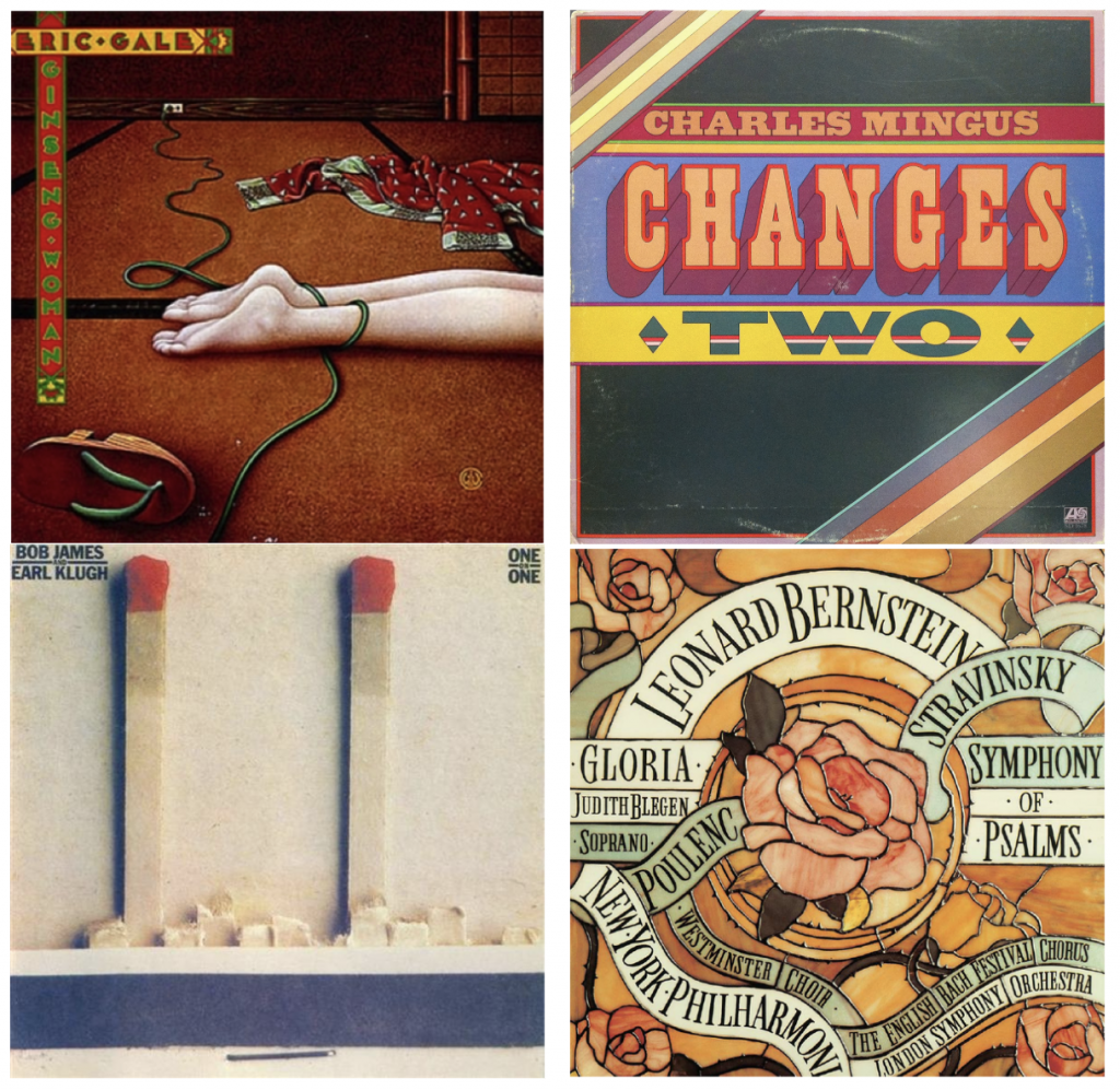
- While working at CBS, Scher designed around 150 album covers a year.
- She also worked as an art director, collaborating with photographers and illustrators.

Maps:
Scher has created 39 paintings, drawings, prints and environmental installations.
- Some of them are super large scale (up to 12 feet!)
- They just look like maps until you look closer and then you realize they’re entirely made up of words and typography – they’re really a TYPE (haha puns) of infographic.

More Work:
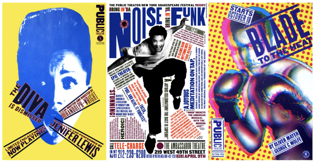
- For the Public Theater:
- “Bring in ‘Da Noise, Bring in ‘Da Funk” is a poster campaign and brand identity she created. One of her most famous works, her style set the tone for all of NYC design.
- A lot of her work are filled with typography, as she knows how to work type to her advantage in the layout. It adds to the piece.
- Scher also designed the microsoft windows 8 logo, the Public Theater logo, the New York philharmonic identity, the citibank logo, rebranded Tiffany & Co. and the NYC Ballet.