Visual Research: Continuity – Art by Olly Moss

Olly Moss in this piece uses continuity to tie two images in this piece. The tiger stripes slowly transition into tree branches that create the forest scenery. This naturally combines the two main subjects in this illustration attractively and cleverly. His use of continuity is quite captivating and just simply fun to take in. Perfect for this piece because his client is Disney, and his main demographic would be children. Olly moss continues to be a huge inspiration to me, not only for his attractive technique and colours, but his ingenious problem solving and talent for visual communication.
Visual Research: Closure – Art by Eiko Ojala

This piece by Eiko Ojala cleverly makes use of the gestalt principle: closure. He utilizes multiple silhouettes of heads and arranges all of them to imply the shape of a side profile without actually outlining a head. This piece made me stop and look for a while to take in Ojala’s ingenuity. This illustration may just be an exercise in closure for Ojala but I like to hypothesize that the deeper meaning is how everyone in our lives influences our thoughts. One day, I hope I can achieve this level of creativity and clean execution in my own illustrations.

Visual Research: Size

    This poster was done for the 2014 Godzilla movie. The artist used size dramatically to capture the grandiose scale of Godzilla compared to the soldiers. The artist achieves this by having three subjects, the soldiers, the buildings, and Godzilla, this is necessary because size is relative.  The scaling is so dramatic that the soldiers look like toy figurines! Godzilla is also a lot more detailed because of the size, and my eyes are instinctively drawn to the monster first.  The point I’ll take away from this poster to apply my art is that to achieve a sense of size I must always have at least 2 subjects.

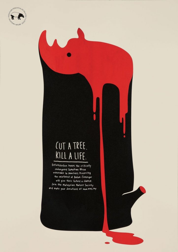
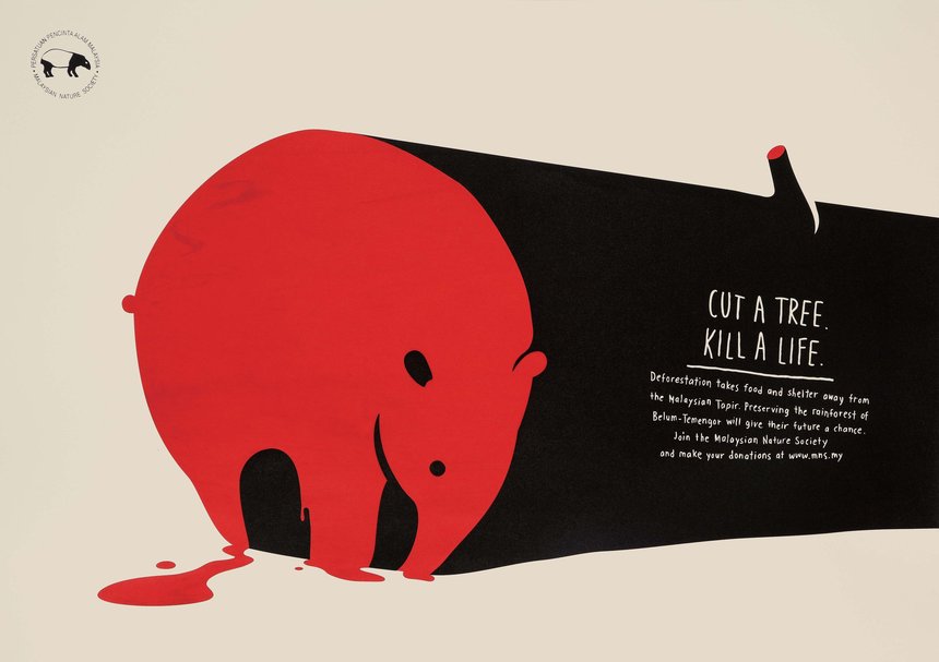
Visual Research: Shape – Art by Law Kok Yew and Gigi Lee (Y&R Malaysia)

             This illustration was made to inform people of the effects of deforestation in Malaysia. The shape of the animal is framed within a cut-down tree with blood pooling out. The artists used the shape to convey the relationship between the trees and the endangered animals. If you cut down the forest you are harming the animals. I love how at one glance the shapes delivers all the information so simply. What I want to take away from this illustration to apply to my art is to always strive for a simple, easy on the eyes design and an easily readable message.

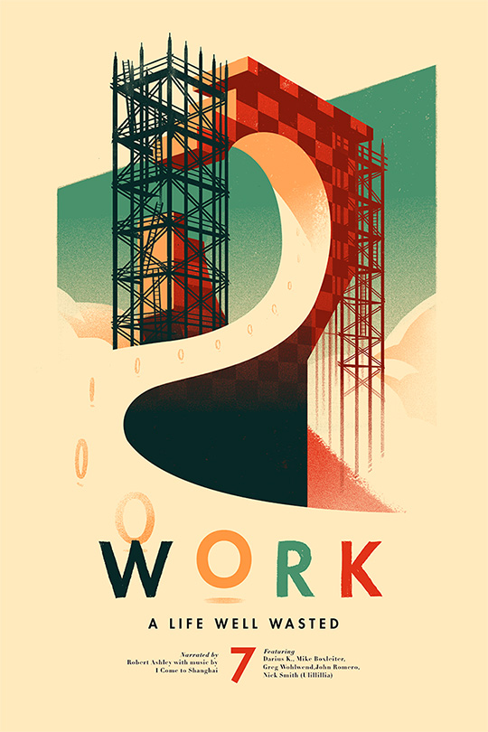
Visual Research: Colour – Art by Olly Moss

This piece was made for “A Life Well Wasted” a podcast discussing the video game industry. This piece is based off the iconic first stage in Sonic. In this Illustration, the artist playfully uses muted but expressive colours to convey a tone of 90’s childhood nostalgia. Something that stands out to me is that the word “work” is used as the colour palette of the piece, the artist never strays far from the pure colours they used in the title. Though arguably it might be more of a shape element, I love the yellow “O” becoming the rings from foreground to background. I think the main thing I’d like to take away from this poster is the use of a limited and attractive colour palette.