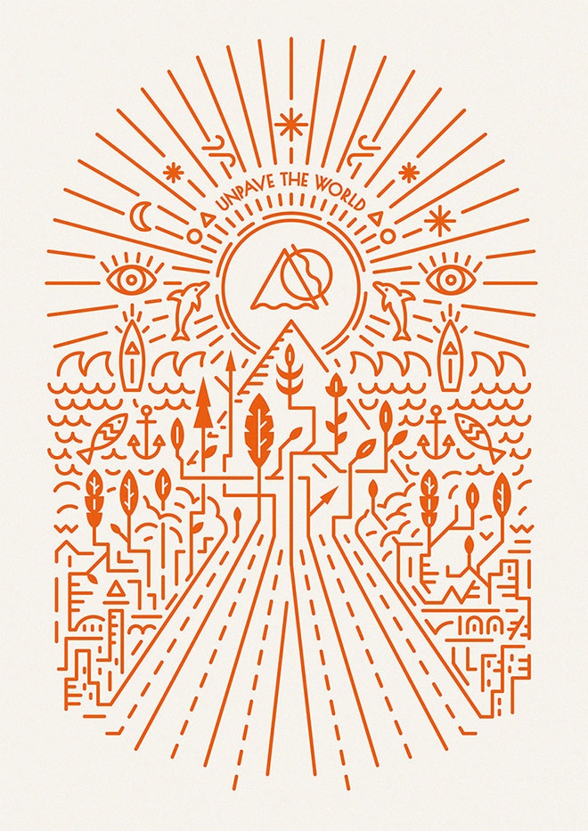
- Line

The main design element that is used in this image is line. This image uses line to form the small structures and shapes. The use of line helps pull the viewer in and it really makes you look at the entire image. I believe it really helps guide the viewers eyes on where to look. I think this image helps portray a good example of how many ways there are to use line. I enjoy how I can see every little detail in this image and how easy it is for me to look at. The image flows quite well together. Overall, I believe the creator did an excellent job of displaying the use of line in this image.
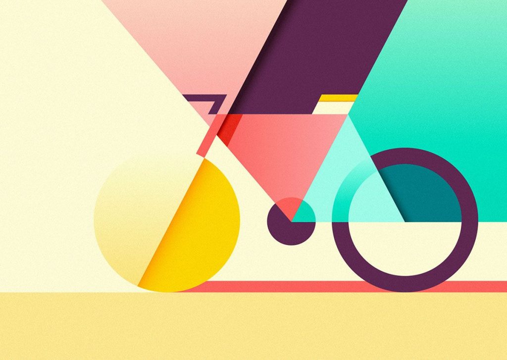
2. Shape

The main design element used in this image is Shape. Looking at this image, one could see that the creator uses the different shapes to form a structure of a bicycle. While it is quite simple and not as detailed, the image still catches the viewers eyes. From this image, I can perceive that the creator put a lot of thought about the placement of each shape. I enjoy how the creator has used a long rectangular shape to create a shadow by the wheels. I think the creator does a good job showing us how shapes can be used to create other objects. I think this is one of the few images where it doesn’t need anything more due to how the shapes are being used by the creator. This image doesn’t really require a lot of detail because the creator uses the shapes to attract the viewers eyes. Overall, it may not be as detailed, but the use of shapes definitely doesn’t make it a boring image to look at.
3. Scale/Size

Matt Needle (2011)
The main design element used in this image is scale/size. From looking at this image, I can tell the creator uses size to attract the viewers eyes and pull them in. The larger outline of the man sort of guides the viewers eyes to the smaller outline and the movie title. I think the use of size helps the poster flow well together. It makes the poster look organized and is easy look at. Overall, I think the creator does quite a good job using scale/size to gain the viewer’s attention.

Leave a Reply