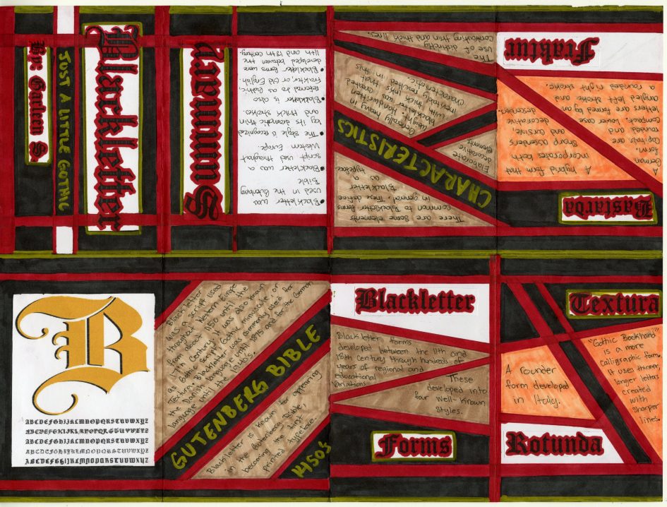
For the typography assignment, I decided to do mine on blackletter. I started by gathering all the research I needed. I chose to include information that I thought was important to the topic since the size of my zine does give me limited space. When it came to organizing the layout for the actual zine, I realized I had no idea about how I wanted to present this. I didn’t know where to start. Through the process of making my zine, I discovered that I couldn’t do anything with my information until I figured out the layout for it. The process to figure out what layout I wanted for my zine ended up taking longer than the actual execution of it.
I decided to start with the front and back covers because I knew once I had the layout of that, I could carry a consistent theme throughout the zine. Initially, I planned to do the lettering of the titles by hand because I wanted to type the research out. However, once I started working on it, I realized it was a lot harder and more time-consuming. I had to scrap that plan, but by that point, I knew I still wanted to include the blackletter type form, I just had to find a different way to incorporate it. That’s when I decided I would instead print the titles in a blackletter form, while I handwrote the research into the zine. Once I had printed the titles for my zine, it was a lot easier to create a consistent layout for it. I decided I wanted the layout for my zine to be a bit simple, so I focused more on the positioning of my text and research rather than the illustrations. The colour scheme for the zine was influenced by the fact that blackletter is also referred to as a Gothic script. It influenced me to make the theme of my zine somewhat gothic and I associated the colours red and black with it. As I started getting towards the end of finishing my zine, I decided to add a gold marker throughout it because it reminded me of medieval times, and it went well with the whole layout. I also used the tan colour because I didn’t want to leave a lot of white space and I thought it worked well with the other colours. The only colour I regret using is orange-yellow because I think it stands out too much from the rest of the layout. In total, it took me about 8 to 9 hours to complete my zine.
When it came to creating the layout and putting it all together, I had quite a bit of fun with it. For this assignment, I would give myself an 8 out of 10 simply because I think the outcome is quite good, but there are a few things that I could have done better. The theme of the zine is consistent throughout and it flows well together. However, I could have added more illustrations or visual images to look at. The orange-yellow colour also doesn’t quite fit into the layout. Overall, I‘m happy with the outcome.

Leave a Reply