For this project, I was working with Megan Barry and our client was the North Vancouver City Fire Department. Our mission was to create something tangible and applicable to connect with 16-25 year olds – a target market not yet reached by the client.
In our initial brainstorming session, we came up with several program ideas to communicate fire safety practices with the audience, but felt that our message was only as strong as the package it was delivered in. Instead of creating a single campaign, we went a different route and instead decided to help the fire department by rebranding their social media. This will allow them to curate a consistent and clean feed, which will appeal to their target audience and make them more receptive to the messaging from the client.
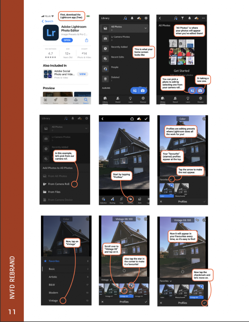
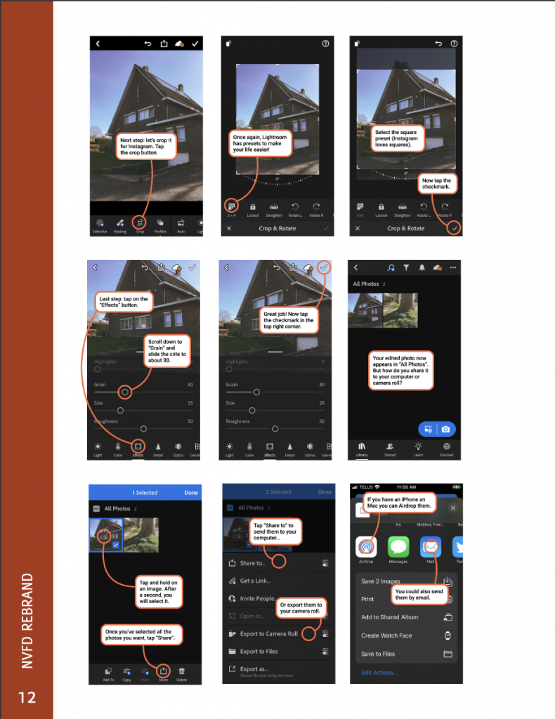
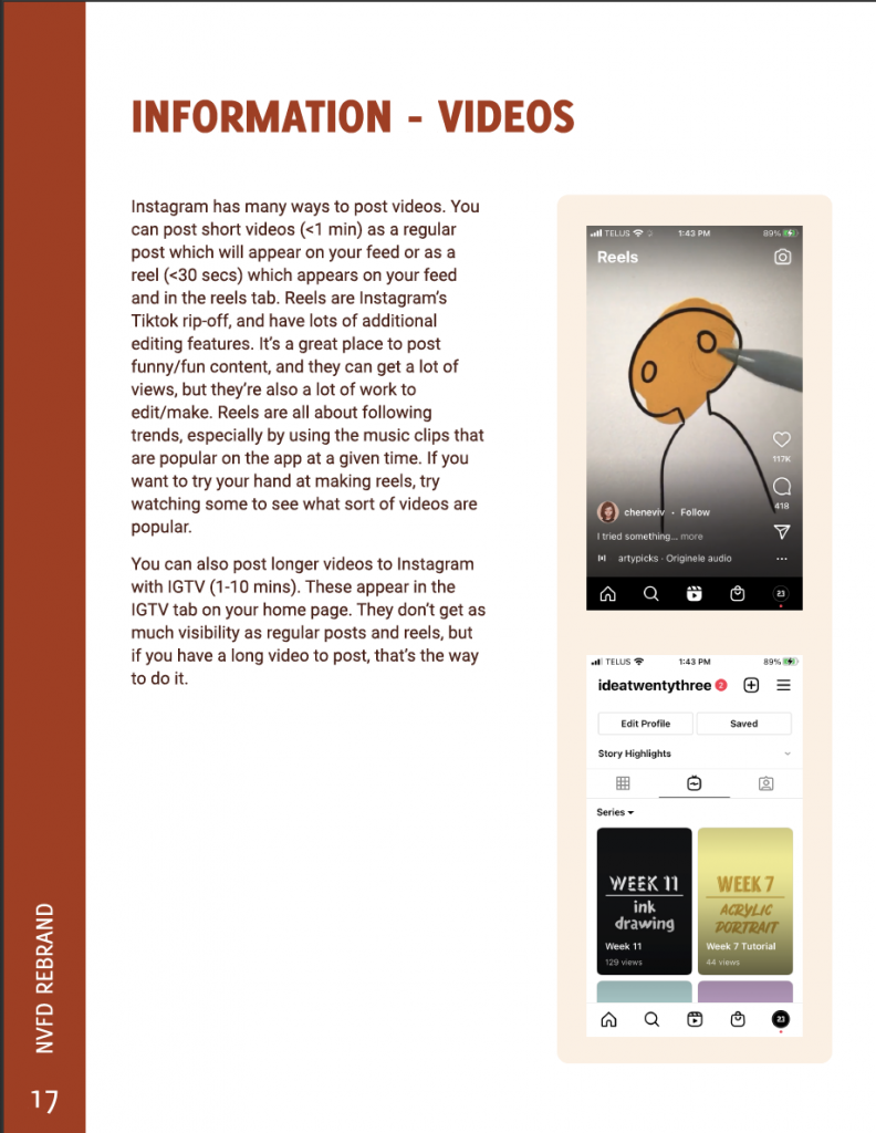
Our solution includes a brand guide with colours, graphics, imagery and typography, a photo-editing tutorial to keep grain and filters consistent, a vector graphics package, copy for 9 posts, a twitter/facebook banner, a revamped logo, and information on hashtags, cropping, accessibility and video content.
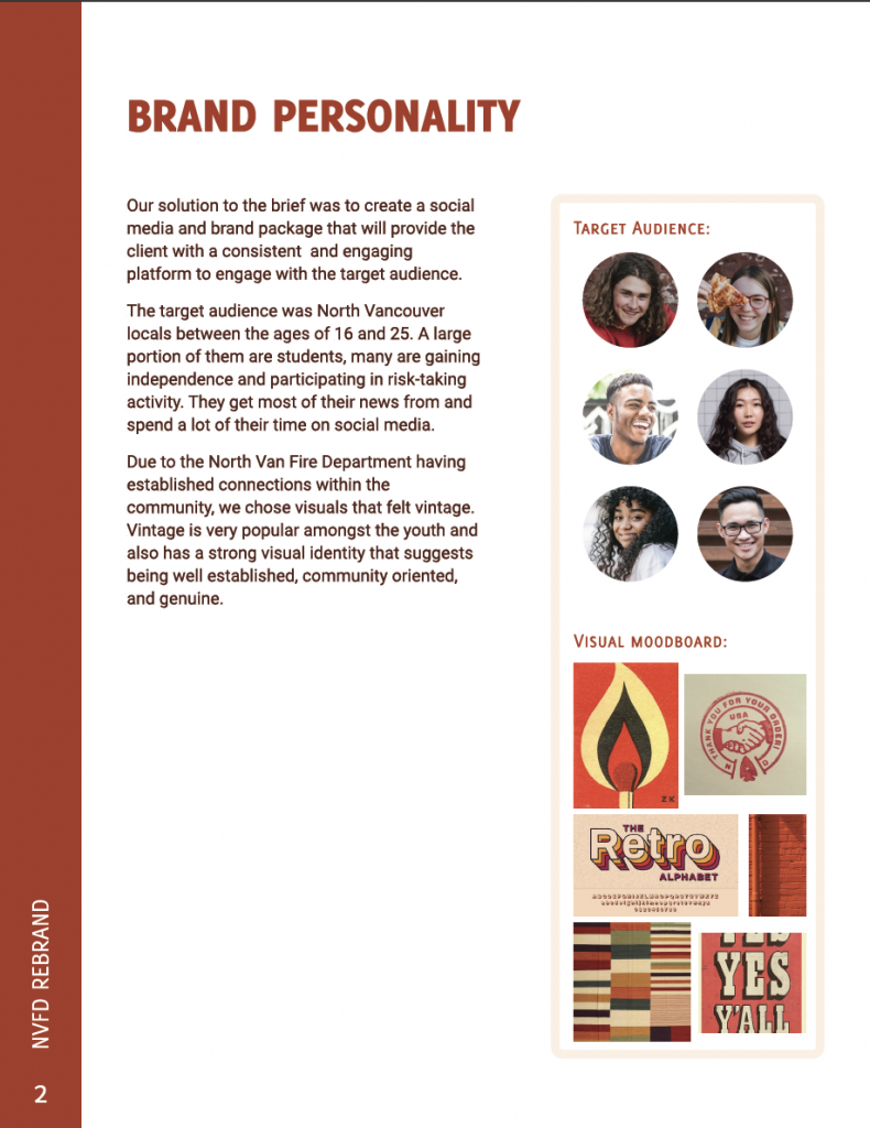

Due to the North Van Fire Department having established connections within the community, we wanted to use visuals that felt vintage. Vintage is very popular amongst the youth and also has a strong visual identity that suggests being well established, community oriented, and genuine.
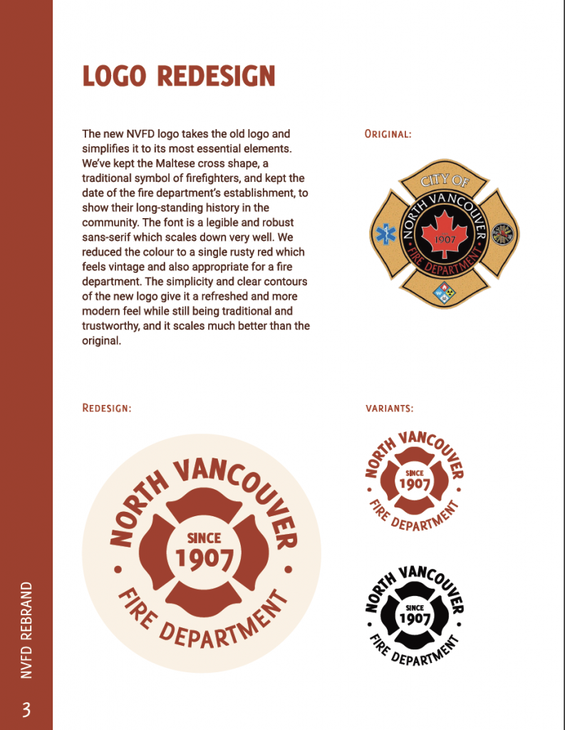
For the logo we took the logo they already had and simplified it so it would be more appropriate for digital use and at a small scale. It was important to keep the logo traditional so it felt trustworthy. We kept the Maltese cross shape, a traditional symbol of firefighters, and kept the date of the fire department’s establishment, to show their long-standing history in the community. The font is a legible and robust sans-serif which scales down very well. We reduced the colour to a single rusty red which feels vintage and also appropriate for a fire department. The simplicity and clear contours of the new logo give it a refreshed and more modern feel while still being traditional and trustworthy, and it scales much better than the original.
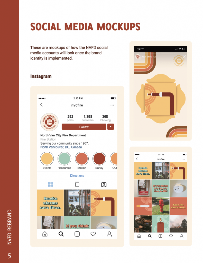
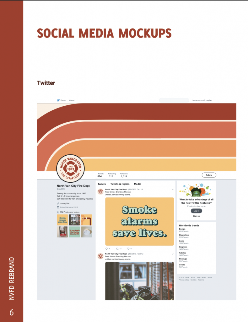
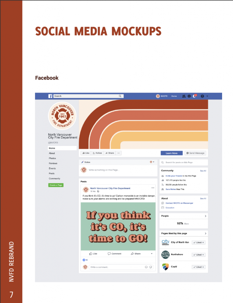
We created a variety of Instagram/Twitter post templates and 3 Instagram/Twitter story templates that were easily editable to allow for a uniform and cohesive feed, while also offering some variety depending on the needs of each individual post. This creates a professional and clean feed that is easy to browse for the audience, and is also quick and easy to modify and create for the client as they do not have a single person dedicated to social media.
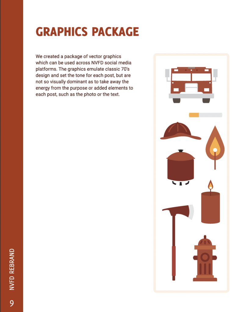
For the graphics, we emulated a classic 70’s design and created stripes and circles that set the tone for each post, but are not so visually dominant as to take away the energy from the purpose or added elements to each post, such as the photo or the text. These were directly inspired by old matchbox graphics. The typography, much like the graphics, is inspired by retro design. Goudy Heavyface is the specific typeface we used to create this effect.
The colour palette is a mixture of rusty tones and fresh greens for contrast, as we wanted to have ties to the warm colours generally associated with fire departments, but also created a unique visual identity that’s warmer and more appealing than the standard emergency red of other fire departments. We wanted colours that indicated their service, but also that they are an integral part of the community.
We chose this direction for our design as the vintage style creates a feeling of comfort within an older audience as not to alienate the rest of the community, while also drawing in the target audience because mid-late 20th century is quite popular with said demographic.
In terms of workload, Megan and I split it as evenly as we could. I feel confident that we both did an adequate share of the work and I would be happy to work with her again as we have a similar work flow and are able to work both collaboratively and independently of each other.
We worked on brainstorming and ideation, as well as concept development and mood-boarding together. Megan created the logo redesign, the photography guide, arranged the layout for the hubbub poster, drew her self portrait for the hubbub poster, did the write-ups on accessibility and video content, and assembled our final client document. I wrote the copy for the hubbub poster, created my self portrait for the hubbub poster, wrote the rationale, created the social media mockups, wrote the sample copy for the posts, created the vector graphics package, and did the write-ups on hashtags and cropping. While we did split the workload, most of it was done collaboratively through Figma so we could view and edit each others work while on video call when we met every week.
I think we deserve a decent mark for this project, as we thought outside the box and decided to approach from a unique angle, while keeping up consistent and professional interactions with the client and creating a useable and large number of resources for the fire department. I think we deserve a 9.5/10.