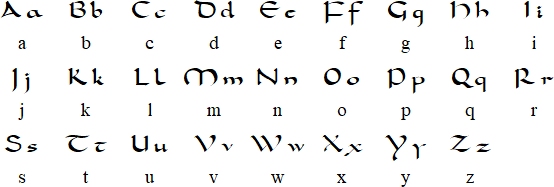
Survey 4: Commercial Photography

Meiji and Taisho

During the Meiji and Taisho era of Japan, the country just opened after closing its borders for centuries. There was trading was prominent, and art culture was exchanged as well. We can see Japanese Art being a strong influence on Western painting around this era. Western people brought their latest technology over as well, which was photography. During the time it was brought over, it was still presented in black and white, so there was a strong desire to see it in colour.

Hand-painted photographs

The Japanese had their own technique, which was different from the Western style. The most distinct difference would be the watercolour technique the Japanese used that made people more lifelike compared to looking like a painting. The Japanese had an idea to photograph daily life, hand-painted them, and sold them to curious tourists – which they did and it was a lucrative business. This was most likely the first instance of commercial photography.

MEIJI PERIOD PHOTO ALBUM with 50 Hand-Colored Albumen Photographs | JAPAN
Kozaburo Tamamura
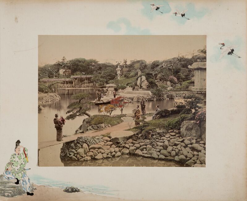
Album of 50 views of Japan, 1897

Notable people

Uchida Kuichi was one of the pioneers of this form of commerce. He staged everyday life and even borrowed old costumes such as samurai armour. Samurais were defunct during the time the photos were taken. He understood that there was a market and demand for these photos. He was also the only person to be granted a sitting by Emperor Meiji to have his photo taken by Uchida. Emperor Meiji was considered a deity and was rarely seen in public.

Kusakabe Kimbei was also one of the prominent figures in commercial art as he owned one of the leading studios that were supplying Japanese art to Western people. Most of the photographs and catalogues featured Japanese women, which were popular with tourists.

Kusakabe Kimbei (Studio) - 252. Girls - Catawiki
Kusakabe Kimbei (Studio) – 252. Girls

Marketing

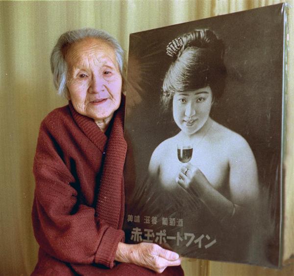
There was controversy over Japan’s first nude image used for an advertisement. It was an advertisement for Suntory’s Akadama Port Wine. The woman in the poster was a stage actress who was later shunned by her family, as they were ashamed of her. However, this poster was effective as it sold so much that it turned Suntory from a failing business to one that still stands to this day. The poster won first place in the Germany World Poster contest.

Japan’s first nude poster – PhotoGuide Japan Blog

Conclusion

Today, there is an abundance of photography in the commercial world. As technology advances, it becomes faster to produce photography than illustrations. It was fascinating to research about the tipping point at the beginning of photography and when painters were still abundant. It was magical to watch the two mediums merge.

Reference

Philbert Ono. “Japan’s First Nude Poster.” PhotoGuide Japan Blog, 19 Apr. 2018, https://photojpn.org/news/2018/04/japans-first-nude-poster/.

Cade, DL. “How Hand-Painted Photographs Helped Introduce Japan to the World.” PetaPixel, 23 Aug. 2022, https://petapixel.com/2020/10/08/how-hand-painted-photographs-helped-introduce-japan-to-the-world/.

“Japanese Advertising History Taisho Period: Exhibitions: The Ad Museum Tokyo.” Japanese Advertising History Taisho Period | Exhibitions | The Ad Museum Tokyo, https://www.admt.jp/en/exhibition/jp_ad_history/taisho/.

Survey 3: Posters

Since the invention of the poster, it has been a consistent form of presentation for designers and illustrators alike. With its versatile purpose, its longevity is undoubted and it has been around since the mid-1500s when the printing press was invented. Before, there could only be one copy of the information and had to be placed in a common place for the word to be spread. Now, posters are being put up everywhere, it was so much to the point where the placement of posters had to be restricted.

Advertising

Living in a capitalistic society, one of the first uses of posters was to advertise. Clubs that needed promotion, and products that needed to sell; there was a high demand for posters once lithography was introduced to the public. At first, the lithographers and printers were in charge of the posters. However, the demand for quality grew exponentially and being unable to keep up with the requests, thus designers and illustrators were called into the market. Later on during the Civil War, there was increased use of advertising posters. This happened due to the rise of consumerism as women worked in the factories while the men were at war, and with no time to make their own products and household goods, many of them turned to rely on companies mass producing these goods.

Poster to promote Moulin Rouge by Jules Cheret

Political, Social Commentary, and Propaganda

Another use of posters would be to simply send a message. During the World War, there was a heightened use of posters meant for propaganda purposes, to recruit people to join the army, and to remind citizens to stay loyal to the country. To fight back, there would be posters meant to incite revolutions and to make social or political statements. However, there is one incident of unintentional homoerotic Chinese-Soviet communist propaganda posters. This was to promote unity between the two countries.

chinese soviet propaganda posters
Soviet-Chinese Communist Propaganda Poster. The words below say “Always Together!”

Art

Posters were used to express creativity as well. In the 1950s, there was a resurgence in the use of type due to the International Typographic Style which was developed in Switzerland, with the introduction of San Serif. During the 1960s, psychedelic graphics were created with the elements produced by the Art Nouveau movement.

Psychedelic poster of the band Jefferson Airplane by Wes Wilson

Conclusion

Throughout history, there were many uses of the poster, there are some of the great significance that are still being echoed today. In the current age, it has evolved into being able to live completely digitally or online. I believe a poster is an irreplaceable tool that designers can use to deliver their message and I find it interesting that even after centuries, we still find new ways to reinvent this tool and still effectively communicate with the audience.

Reference

Cords, S. (2022, April 11). The history of the poster – DW – 04/11/2022. dw.com. Retrieved November 11, 2022, from https://www.dw.com/en/from-art-to-advertising-the-history-of-the-poster/a-61424572#:~:text=French%20artist%20Jules%20Cheret%20became,1%2C200%20posters%20in%2040%20years

Early advertising of the West, 1867-1918. ::: Early Advertising of the West, 1867-1918 ::: (n.d.). Retrieved November 11, 2022, from https://content.lib.washington.edu/advertweb/index.html

Rhp. (2021, November 28). The unintentionally homoerotic Chinese-soviet Communist propaganda posters, 1950-1960. Rare Historical Photos. Retrieved November 11, 2022, from https://rarehistoricalphotos.com/chinese-soviet-propaganda-posters/

V&A · A short history of the poster. Victoria and Albert Museum. (n.d.). Retrieved November 11, 2022, from https://www.vam.ac.uk/articles/a-short-history-of-the-poster#:~:text=The%20pioneering%20French%20poster%20artist,by%20Alois%20Senefelder%20in%201798.

Survey 2: Carolingian Miniscule

During the late eighth and ninth centuries of medieval Europe, there was the Carolingian Renaissance, the first of three medieval renaissances. During that time, one of the rulers was Charlemagne, also known as Charles the Great. He advocated for the right to education, no matter the child’s background.

Roman Literacy & Education

Charlemagne wanted to spread literacy to not only the wealthy, which were the only people who could afford an education at the time, but to the common people as well. This was because he had a severe lack of people capable of serving as court scribes. After he conquered Western Europe, he saw a divide in communication as there were regional dialects and low literacy rate. To combat this issue, he ordered the creation of palace schools and sought for the clergy, who were teaching in the schools, to understand Christian doctrine.

Charlemagne, also known as Charles the Great https://www.history.com/.image/ar_1:1%2Cc_fill%2Ccs_srgb%2Cfl_progressive%2Cq_auto:good%2Cw_1200/MTU3ODc5MDg2OTczMzk2NzAz/portrait-of-charlemagne.jpg

How Carolingian Miniscules came about

He recruited the English monk Alcuin of York to oversee the palace schools. To initiate a generalise reform of the church, they needed every school to have reliable copies of the Holy Scriptures. To produce these scriptures at a larger scale, and at a quick pace, Alcuin had to come up with the Carolingian Miniscule. Vellum and parchment, which was the material that was written on, were expensive. Thus, words had to take up less space on the paper and to be read with ease.

Conclusion

Spacing between words, punctuation, and lowercase (named half-uncial) were seen for the first time in written language. Carolingian Miniscule quickly spread throughout the empire. The scholars of the time did more than just copy manuscripts; they also created their works such as information books for example dictionaries and glossaries.

Introduction of leading lines.https://www.lancaster.ac.uk/users/yorkdoom/palweb/week08/lines.jpg

The existence of Carolingian Miniscule shifted the written Romanian languages and lasts till today. During the 20th century, the type we know as Times New Roman is the remnant of the script of the Latin alphabet used in the past. As Charlemagne campaigned for literacy, he unknowingly set off a domino effect of a system still being applied today.

The Caroline Miniscule against the alphabet today. https://omniglot.com/images/writing/carolingian.gif

Reference

Murray, K. S. (2016). Carolingian renaissance. In Facts on File (Ed.), World history: a comprehensive reference set. Facts On File. Credo Reference: https://ezproxy.capilanou.ca/login?url=https://search.credoreference.com/content/entry/fofworld/carolingian_renaissance/0?institutionId=6884

Wikipedia contributors. (2022, October 6). Carolingian Renaissance. Wikipedia. Retrieved October 21, 2022, from https://en.wikipedia.org/wiki/Carolingian_Renaissance

Museum Exhibit Project

The total time spent from the initial sketching to the end product was over the span of 3 days. At first, I decided to present the letterpress artifact as I wanted the museum exhibit label to incorporate the 1400s type which was the Humanists and Blackletter types. I would also like to challenge myself by completing the project fully digitally, as I was not familiar with the process and would like to get better at it. However, after sketching and deciding on the layout, I hit a wall where I could not produce the effect I wanted. I was unhappy with the progress and felt that even if I completed it I would not be satisfied with the end product so I restarted.

Sketch for the initial letterpress attempt.
Letterpress attempt and progress.

This time, I chose the artifact based on my interest in photography, and it came to mind to decide to present the Camera Obscura. Instead of choosing the first camera invented (which was in 1816). I have chosen the Camera Obscura because it was around in the 1400s (as many famous painters of the time have been accused of using the optical aid) and I would be able to use the Humanist and Blackletter type as I have originally wanted.

The display type that I have chosen for the heading is Goudy and the body text is Garamond. The illustration on the right has a heavy use of lines to replicate the woodcut illustrations used at the time. The person in the middle is a museum visitor.

Overall, I was more satisfied with the process of sketching and also putting the display together. I also enjoyed the process of researching the Camera Obscura and learning about the origins of the camera we now know today.

Inspiration for Camera Obscura illustration.
Inspiration for layout.
Sketch for Camera Obscura artifact.

Survey 1 – Evolution of the Chinese Written Language

Growing up, I have always dreaded Chinese language classes. With its complicated system that was different from what I was learning in English classes, I struggled to learn the language. As I’ve grown to learn and love the language and its origins, I was excited when it was briefly introduced in class, thus my research on the evolution of the written language in Asia.

Derivation of Logograms

Chinese logograms in their earliest form would be pictograms. These pictograms originated from observation of the physical form. For concepts or intangible ideas, ideograms were introduced into the language to be able to present them in written form. Concepts such as direction, for example, “up” and “down” would look like “上” and “下” respectively. Its visuals would try to emulate the concept as directly as possible. In the character for “up”, its stem protrudes from the base, and for the character for “down”, its stem to hang from the base.

Diagram of logograms derived from observations of the world and how it has evolved into traditional Chinese characters.

https://www.omniglot.com/images/writing/character_origins.gif

How Logograms become Simplified

Over time, these logograms with complicated strokes would fall into a system so that it would be easier to draw similarities and understand the character faster. Radial compounds were introduced while simplifying the language. The function of these would be that it would suggest the overall meaning of the character. For example, the character for vegetable, “菜”, its header, “艹“ known as the grass radial header, suggests that the character is related to plants or flowers. Meanwhile the body “采” would imply how the character would sound. This method helped me tremendously in my Chinese oral tests when I had to guess characters that I have never seen in my life.

Chinese Text Reading Method

Although known for its different reading methods (up to down and right to left), do modern Chinese people still read texts this way? The short answer is no. For the entirety of my school life, I was taught to read texts from left to right. The long answer is that there are still some cultural items, such as signboards and novels, that preserve the traditional way of reading.

Signage for an eatery. Read from right to left, “Hé Jì”. In the Romanised version, “Hoe Kee”.

https://media-cdn.tripadvisor.com/media/photo-s/07/c2/a9/0c/hoe-kee-chicken-rice.jpg

Image of a modern Chinese novel, where it should be read from right to left, up to down.

https://chinesebilingual.files.wordpress.com/2018/03/img_0074.jpg?w=600&h=450

Conclusion

The Chinese language has developed its system for characters to be read with ease. The modern or simplified Chinese has this clean look, evolving from the complicated strokes that the logograms had. While its reading counterpart is simple, containing only 4 tones attached to a variety of pronunciations, it is almost impossible to tell what character is being said unless the listener has the full context of the sentence. The complexity of this language has led me to acknowledge that my struggle to learn was valid, and to appreciate its beauty.

Reference

Chinese writing system. (2017). Encyclopaedia Britannica, Britannica concise encyclopedia. Britannica Digital Learning. Credo Reference: https://ezproxy.capilanou.ca/login?url=https://search.credoreference.com/content/entry/ebconcise/chinese_writing_system/0?institutionId=6884

H. (2019). 草字头 Cao Zi tou: The Grass Radical. Written Chinese. https://www.writtenchinese.com/the-grass-radical/

(n.d.). Chinese characters. Wikipedia. https://en.wikipedia.org/wiki/Logogram#Chinese_characters

Yearbook 2022

My yearbook spread took close to a week to come to the final draft. I would give myself a C+ as I wanted an interesting layout but I was unable to achieve that, however I had fun drawing the 8-bit icons.

Since I really enjoy the 8-bit aesthetic and the video game devices of the 90s, I wanted to use the Gameboy SP (since it flips out) and lay it out as 2 pages with its top screen and bottom controls. However, I encountered several problems with that layout as I had trouble presenting text, and more importantly it was vertical, which would be harder to read as a book. Eventually, I scraped the idea and went with a simpler layout but still retaining the 8-bit style.

I mainly used Photoshop to edit and lay out all the elements. I used pink for both the Gameboy and the background as it is my favourite colour. The scroll beside the Gameboy was meant to be the paper from the Gameboy printer. I chose that picture of me as it relates to one of the questions, and the photo holds a lot of good memories for me and my growth as an artist. I used to study, and then eventually worked in the film industry, I still have love for the art but I would like to equip myself with different skills, thus taking the leap to join IDEA.

Although there were many challenges, it was honestly fun to think of solutions to the issues faced. It reminded me of the basis of design which is to solve problems.