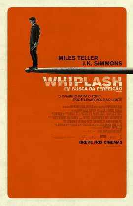
This is a design for the 2014 movie “Whiplash” (I was unable to find the original artist). The poster, much like the movie, is filled with symbolism that is achieved through the striking size difference between Andrew (Miles Teller) and a drumstick. The exaggerated size of the stick relative to Andrew draws in the eye, emphasizes the objects importance in the movie and causes the viewer to speculate the relationship between Andrew and the stick.

This is a design for the TV show “High Maintenance” season 4 on HBO (I was unable to find the artist for this season, but Carol Cai designed the posters for season 3). This poster expertly uses space to create both positive and negative space that add interest to the design yet does not take away from the overall simplicity. The positive space (green) creates the face of The Guy, the main character of the show, while the negative space (white) creates a smoking blunt which hints to the relationship between the two.
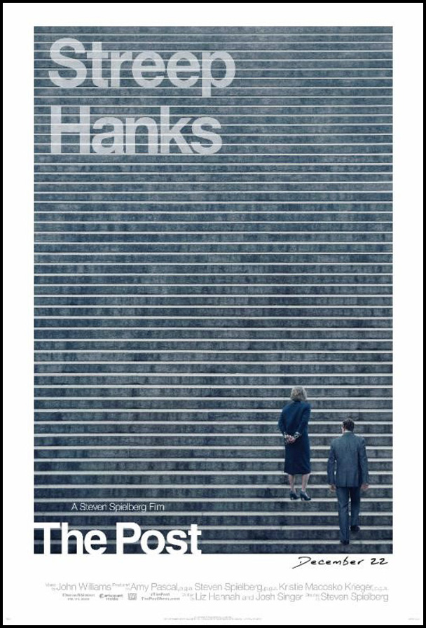
This is a poster design for the movie “The Post” by Gravillis Inc. done in 2017. This poster uses line for many purposes: creating a pattern, incorporating lines where text can sit and be framed and to guide the eye to the right (the way we naturally read on lined paper) towards the subject of the movie characters.
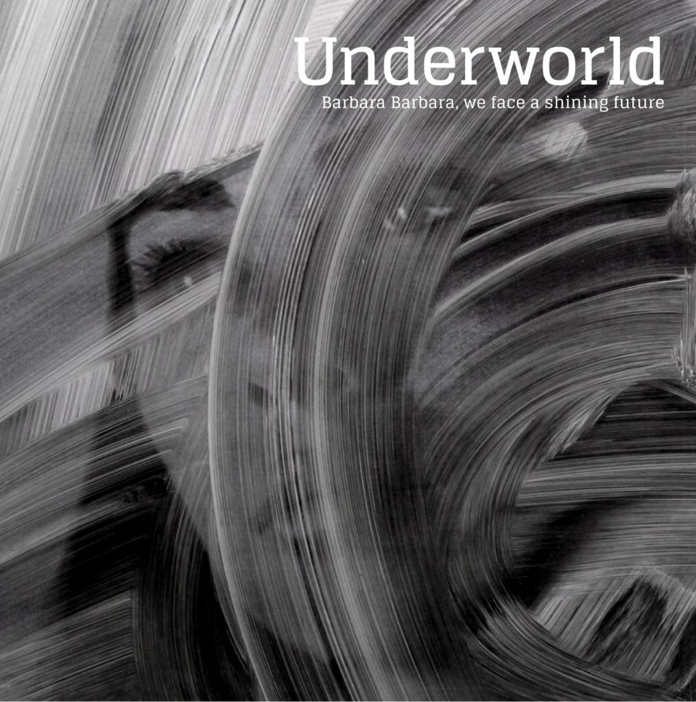
This is an album cover for the British group Underworld’s 2016 album “Barbara Barbara, We Face a Shining Future”. The design was done by Tomato, a “multi-discipline design and film collective” from Britain. This cover uses the design element of texture (the seemingly soapy/greasy texture overlaid on top of the photograph) to add an interesting component to the artwork. This texture has also been used to frame the left eye and draw attention (with the angle of the strokes) to the title.
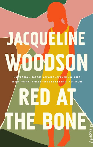
This is a book cover for the novel 2019 “Red at the Bone” by Jacqueline Woodson (artist not found). This cover uses organic shapes (they are irregular and appear to resemble paper shreds) though many of them are pointed with sharp edges. The girl featured on this cover is the only organic shape to have round edges – a softness that sticks out among the hardness of the sharp shapes.
Leave a Reply