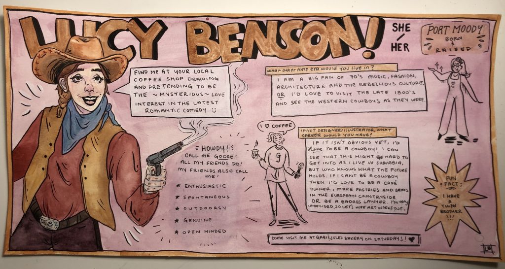
I feel that my yearbook spread has accurately represented who I am and at least one of my many aesthetics. I am recently very into cowboys, characters who are lively, compassionate, always ready to tell a story of one of their many adventures and whom I feel I bear a great likeness to. They also wear big hats and funky leather boots which I happen to do as well. The theme I have chosen then is of course Western/Cowboy in a comic style. I felt that the text boxes, various irregular shapes and blocky title would best convey my theme while also showing my love of comic books and graphic novels. The assortment of browns, especially tan is seen often as a way to further communicate an Old Western colour pallet. The pink background comes from the company colours at Gabi and Jules Bakery, the café and bakery that I have worked at since I was fourteen and has been a major part of my life (I work all day Saturdays, come visit me!). The pink also shows how warm and loving I have been told to be. I tried to have the page balanced with two major pieces of text on either half and to have the big illustrated me on the left stabilized by two smaller drawings on the right.
For this assignment I would give myself a 9/10. I feel that I accurately portrayed myself as a fun loving character, I included all the necessary elements and a few more but I have docked myself a mark as I feel there are areas where I could have moved elements to make room for more information and I could have pushed my theme further by yellowing my paper, making a wanted poster (or something to that degree) and/or burning the edges to achieve an aged look.
Leave a Reply