Margaux Worrall
Judy Snaydon
IDES 141
12 September 2019
Yearbook Spread
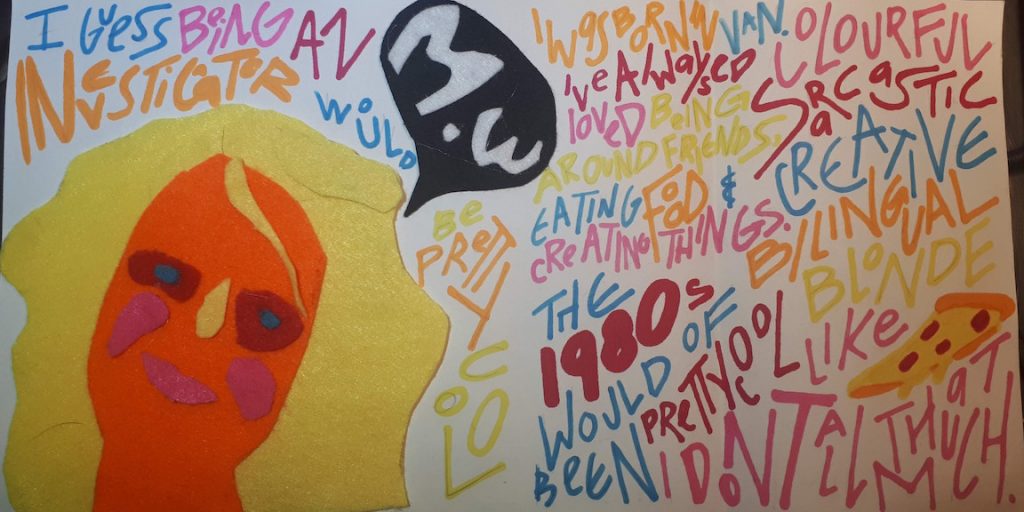
I have two extremely contrasting styles. Either I simplify things at much, maximizing white space and making the message as clear as possible, or I have fun with it. I use fun colors, patterns and typefaces, different mediums and unrealistic illustrations which is the route I chose to take for my Yearbook.
I have always loved brights colors, blue being my favorite, as well as being able to harmonize the chosen colors to make a beautiful palette.I chose to use mostly primary and basic secondary colors to create a fundamental and recognizable palette. As for the typography, I have recently been extremely inspired by the typography work from the British artist Kate Moross, and decided to take inspiration from her work. I wanted to reflect my most( present) interest Although not the most legible typography, I wanted to focus more on the visual of it all and to make it something fun to observe. And finally for my self-portrait, I decided to go a route that reflected my appreciation for abstract art as well as pop art by using vivid colors and loose shapes to create a figure that resembles me as the most basic level.

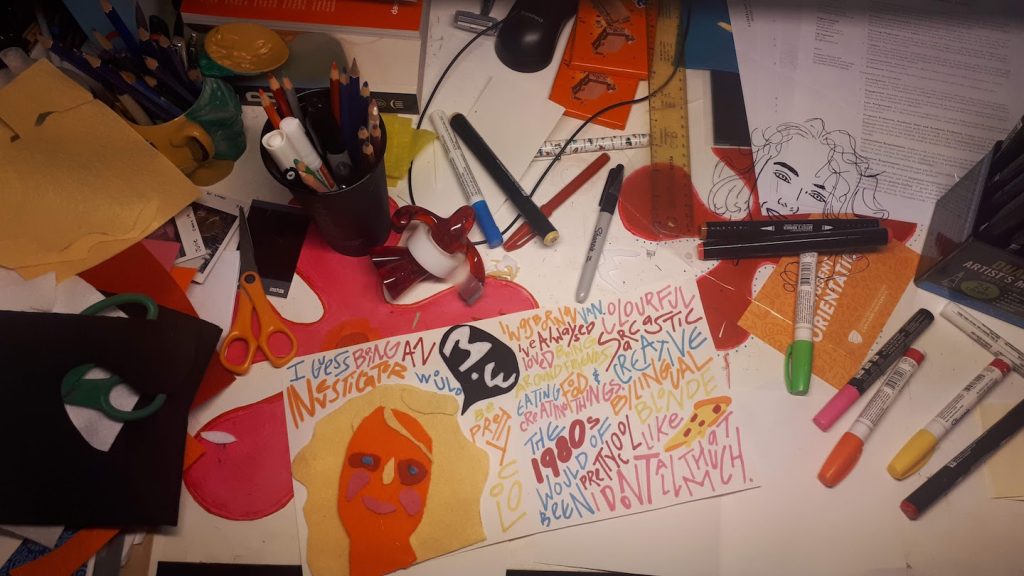
Yearbook spread

Self assessment. 8/10.
I feel as I have followed the criteria and portrayed myself as authentic as possible. Although not a “excellent portrait” in the sense of realism, I feel as I have created a figure of myself following and respecting not only my own style but as well as the criteria.
