Survey 9: Colour Theory and Cool Type (1925-30)

Guide to being the most beautiful woman in the room

For the survey, I was given the category of fashion which I was extremely pleased about. The 1920’s have been an iconic fashion decade in North America. They have this unique silouhette for both women and men, incredible and intricate accessories from hats to jewellery. This abundance of fashion elements made it hard for me to choose on element on which to discuss about in my spread. With more research however, I became more and more inspired by fashion spreads, with multiple women all drawn with different looks and in different poses as if they were to be competing to be the most ostentatious yet poised woman in the room. I then decided to create a spread of my own, adding a bit more contrast and action, that would showcase a guide listing ways to outshine others.

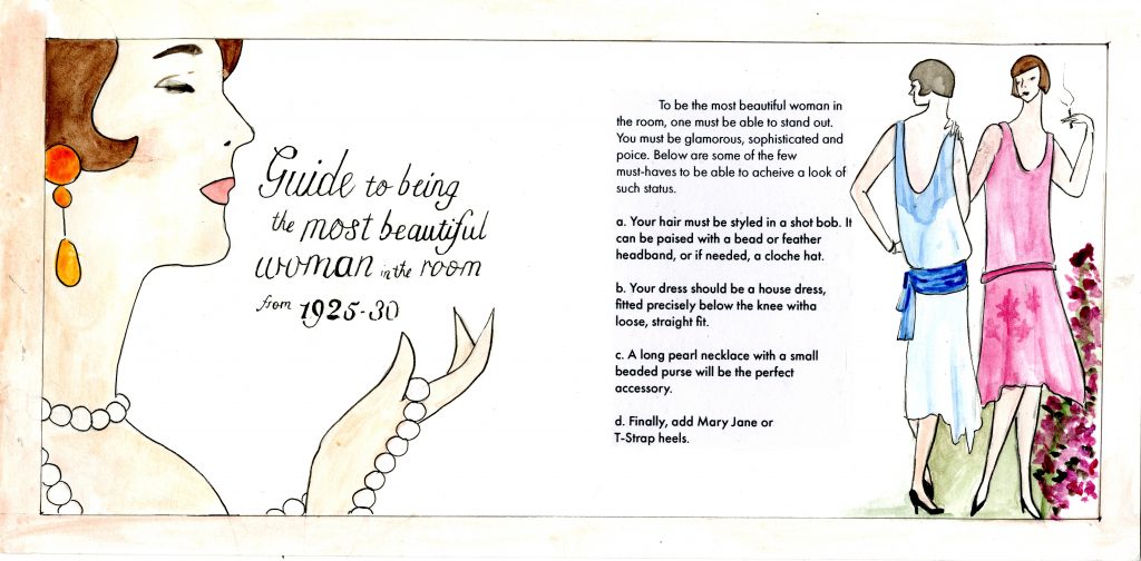
Visually I think I have done a decent job. I was historically accurate with my illustrations – the poses, little facial details, and the hands. I also used water-colour as a way to complement the delicate women. By adding a larger woman to the right, I believe that I have added a more interesting perspective to the layout bringing great attention to the title. I have also used accurate fonts.

However, they’re is this big misconnection between both pages. Both figures, the one to the left and the two to the right, ignoring the same illustration style, have no relation which could have been easily fixed by using the same colour story. The fonts of both the body text and the title have huge contrast. To fix that, as suggested by Judy, I could of added an initial in the same style of the title to tie them together and to bring more readability to the body text. I also feel as if there is too much white space caused by my own fear of information being lost in the middle. I could of added some imagery or border to make it more appealing. Lastly, I forgot my name. I give myself a 6/10.

Survey 6 – Dreams and designers (1895 – 1905)

For Survey 6, my group and I were tasked with the topic of Typography. We decided to focus primarily on the Glasgow Style type due to its unique characteristics such as elongated letters, even-weights and its interesting ascenders and descenders.

For this project in particular, I was assigned to make a zine. At first, I had the idea of creating a zine that illustrated and explained the various key elements of the typeface Willow, a classic Glasgow Style typeface designed by Charles Rennie Mackintosh. However, after discussing it with Judy and fellow classmates, we concluded that it would be more interesting if I described the transition from Glasgow style type to the Vienna Secession style type.

In summary, thanks to The Studio magazine which published upcoming designs and trends, the Glasgow Style was published and shared all over Europe. It especially inspired Eastern Europe such as Germany and Austria. Vienna, in particular, was heavily influenced by the works of The Four due to the upcoming radical movement rebelling against classical and strict Viennese artistic rules.

I was heavily inspired by contemporary design magazines that have an active yet simple way of displaying imagery and text. I felt it was a perfect opportunity to represent the various elements of each typeface. Through dissecting the letters, I was able to create a fun form that serves it’s function.

By keeping it simple, I believe that my message and important elements come across much easier. To emphasize the type even more, I chose a neutral sans serif font. The contrast between the embellished letters and the body text is enough to separate them, but not high enough to make the text clash. In addition, I believe the title is compelling and direct.

Despite achieving a modern editorial look, in my opinion, I don’t think it fits well for the front and back cover. I wanted a really simple and clean front cover to contrast the busy and active following pages. However, I agree with the feedback I had received that the contrast was just a bit too much disturbing the consistency of my zine.

My first body of text also had a few flaws. The first being a lack of a drop cap or an indentation. The second would be the absence of hierarchy and third would be the need for more margin space. All of these create an obstacle for legibility and readability.

Despite these mistakes, I would grade myself a 9 out of 10. I believe that I achieved an interesting zine that explains and illustrated the topic in a create yet functional way. The zine is overall consistent and well-executed.

Survey 3 – Artifact

I was assigned the task of making an artifact relating the my topic – Isaacs Newton’s Law of Universal Gravity. I decided to concentrate on the story surrounding the topic, and create a ‘novel-looking’ spread. I kept the design fairly simple, with an image to the right and simple text to the left. I included decorative flowers and an initial to relate to the time period of my survey. I also gave allot of white space around the text relating to the text layout of that period.

I decided to use origami as my primary medium to create a beautiful and simple spread. I used origami for the leaves and flowers decorating the spread, the initial and the apple. I kept the colours quite complementary, using pinks, reds and greens. Those colours were also used to relate to the time period and the apple.

The apple was the focus of my spread as it was a vital part of the story. I decided to create simple imagery, just showcasing an apple as it is with a white background. The set up of the image creates the sense of importance towards the apple. I also references the apple in the initial with the green leaf placed right next to it.

7/10

I think I have created a nice simple spread, with nice and well thought out elements such as the flowers and the apple. I think also I was clear with my direction and applied decorations only where necessary. I also believe I was quite creative with the use of origami. However, I missed adding my name and title. I also feel that I could of lowered my text and created a type style also referencing more the time period.

IDES 141 – Yearbook Spread

Margaux Worrall

Judy Snaydon

IDES 141

12 September 2019

Yearbook Spread

    I have two extremely contrasting styles. Either I simplify things at much, maximizing white space and making the message as clear as possible, or I have fun with it. I use fun colors, patterns and typefaces, different mediums and unrealistic illustrations which is the route I chose to take for my Yearbook. 

I have always loved brights colors, blue being my favorite, as well as being able to harmonize the chosen colors to make a beautiful palette.I chose to use mostly primary and basic secondary colors to create a fundamental and recognizable palette. As for the typography, I have recently been extremely inspired by the typography work from the British artist Kate Moross, and decided to take inspiration from her work. I wanted to reflect my most( present) interest Although not the most legible typography, I wanted to focus more on the visual of it all and to make it something fun to observe. And finally for my self-portrait, I decided to go a route that reflected my appreciation for abstract art as well as pop art by using vivid colors and loose shapes to create a figure that resembles me as the most basic level.

Self assessment. 8/10. 

    I feel as I have followed the criteria and portrayed myself as authentic as possible. Although not a “excellent portrait” in the sense of realism, I feel as I have created a figure of myself following and respecting not only my own style but as well as the criteria.