
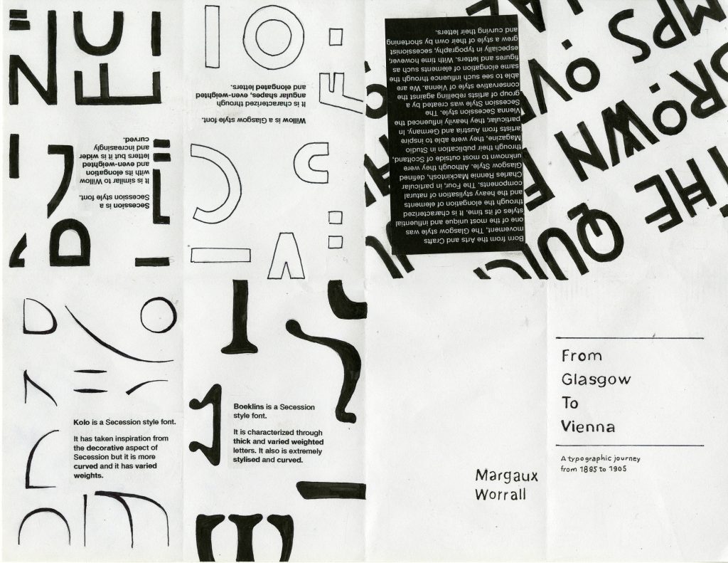
For Survey 6, my group and I were tasked with the topic of Typography. We decided to focus primarily on the Glasgow Style type due to its unique characteristics such as elongated letters, even-weights and its interesting ascenders and descenders.
For this project in particular, I was assigned to make a zine. At first, I had the idea of creating a zine that illustrated and explained the various key elements of the typeface Willow, a classic Glasgow Style typeface designed by Charles Rennie Mackintosh. However, after discussing it with Judy and fellow classmates, we concluded that it would be more interesting if I described the transition from Glasgow style type to the Vienna Secession style type.
In summary, thanks to The Studio magazine which published upcoming designs and trends, the Glasgow Style was published and shared all over Europe. It especially inspired Eastern Europe such as Germany and Austria. Vienna, in particular, was heavily influenced by the works of The Four due to the upcoming radical movement rebelling against classical and strict Viennese artistic rules.
I was heavily inspired by contemporary design magazines that have an active yet simple way of displaying imagery and text. I felt it was a perfect opportunity to represent the various elements of each typeface. Through dissecting the letters, I was able to create a fun form that serves it’s function.
By keeping it simple, I believe that my message and important elements come across much easier. To emphasize the type even more, I chose a neutral sans serif font. The contrast between the embellished letters and the body text is enough to separate them, but not high enough to make the text clash. In addition, I believe the title is compelling and direct.
Despite achieving a modern editorial look, in my opinion, I don’t think it fits well for the front and back cover. I wanted a really simple and clean front cover to contrast the busy and active following pages. However, I agree with the feedback I had received that the contrast was just a bit too much disturbing the consistency of my zine.
My first body of text also had a few flaws. The first being a lack of a drop cap or an indentation. The second would be the absence of hierarchy and third would be the need for more margin space. All of these create an obstacle for legibility and readability.
Despite these mistakes, I would grade myself a 9 out of 10. I believe that I achieved an interesting zine that explains and illustrated the topic in a create yet functional way. The zine is overall consistent and well-executed.