Mia, Michelle T & Margaux
Although all 94 ‘Calls to Action’ hold equal merit, we were particularly drawn to the 74th ‘Call’ made by the Truth and Reconciliation Commission of Canada. The emotional nature of this child-focused call to Action’ inspired us to create a campaign that recognizes and addresses this plea with the greatest sense of urgency. Our campaign ‘The Way Home’ spotlights the missing children who were lost to the Residential School System, while providing a platform where commemoration requests can be accommodated. It is through public interaction, involvement, and empathy that our campaign has the means to provide long-overdue closure for the Indigenous families affected by the Residential School Era.
The beginning stages of our campaign involved mind-mapping exercises to accumulate our initial ideas. Once we had a solid campaign direction, we created a corresponding mood board. The main challenge we faced throughout was in the visual execution of this sensitive subject matter. To respectfully embody our ‘Call to Action’, we came to our somber yet emotionally responsive solution. During the early stages of this project, we also consulted with Bracken Hanuse Corlett, an Indigenous artist from the Wuikinuxv and Klahoose Nations, to ensure we were executing this campaign respectfully.
Our final brand identity reflects an adolescent/nostalgic tone while carrying a subtle sophistication. Through a combination of visual elements, we hope to evoke an emotional and proactive response from our target. As for the campaign’s typography, we utilized Courier New and Arial Black to embody nostalgia and a sense of urgency. In addition, we included bold, orange accents to pay homage to the “Orange Shirt Day” campaign.
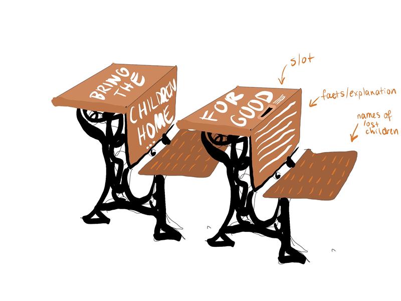
As for the name of our campaign, ‘The Way Home’ naturally evolved from our tagline which reads: “Bring the children home…for good.” This statement represents the closure families may experience once they can properly commemorate their loved ones alongside the feelings associated with coming home. Additionally, this statement incorporates the double entendre “for good” which expresses both closure and pure intent.
The purpose of the desk exhibition is to represent the children who fell victim to the Residential School System. On the seat of each desk, a list of recorded victims is included and the complete number of children is revealed when presented together. Their absence is also represented by the emptiness of each seat. This exhibition is intended to exist in a public space such as the Vancouver Art Gallery to encourage public interaction alongside ongoing donations. It is accompanied by a sign to provide further campaign information.
The ‘Action Needed’ poster is designed to resemble a “missing person” poster. However, instead of representing a single individual, our poster speaks to the missing action presented in call #74. Alone, this poster provides sufficient grounds for action, but when displayed as 2,200 prints on a banner (the number of victims who still need to be accounted for) it has a far greater impact.
Lastly, we created our online platforms to provide further information on the subject matter, for donation details, and to instill brand identity.
SELF EVALUATION
This project was challenging on both emotional and tangible levels. However, it was these challenges that pushed us to successfully meet our self-constructed brief. We believe our campaign has succeeded in evoking an emotional response from its target while respecting the Residential School victims and their families. Through strong communication and open-mindedness, we built off of each other’s ideas to create impactful final solutions. Although we encountered obstacles throughout the design process, we are proud of the outcome and the consistent brand identity.
PROCESS WORK
MindMapping
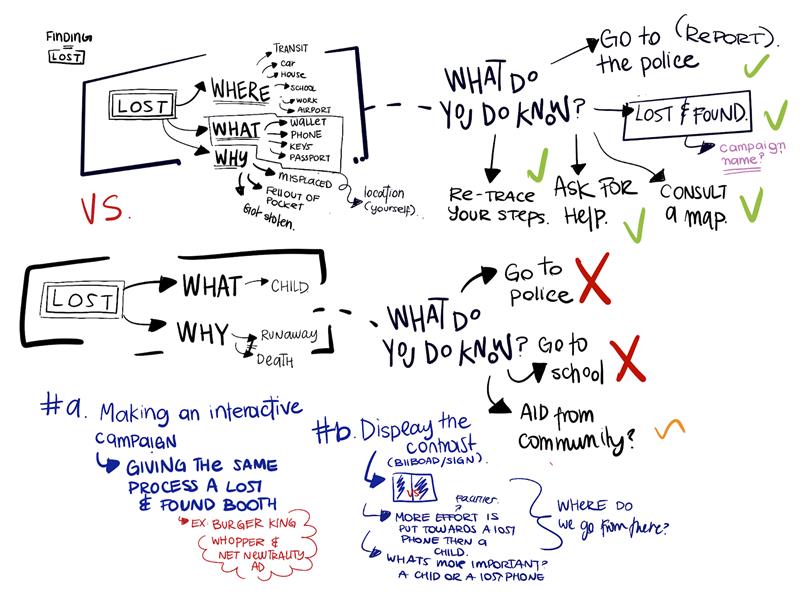
Mind Mapping 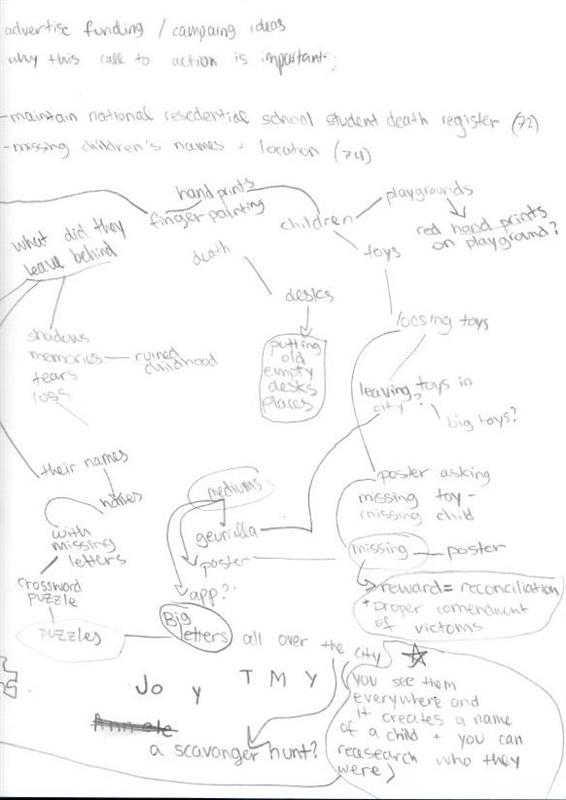
Mind Mapping 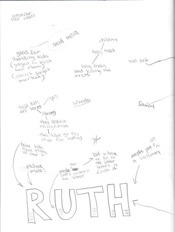
Mind Mapping 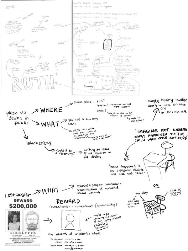
Mind Mapping
Concept development


