IDES 141 – Yearbook Spread

Margaux Worrall

Judy Snaydon

IDES 141

12 September 2019

Yearbook Spread

    I have two extremely contrasting styles. Either I simplify things at much, maximizing white space and making the message as clear as possible, or I have fun with it. I use fun colors, patterns and typefaces, different mediums and unrealistic illustrations which is the route I chose to take for my Yearbook. 

I have always loved brights colors, blue being my favorite, as well as being able to harmonize the chosen colors to make a beautiful palette.I chose to use mostly primary and basic secondary colors to create a fundamental and recognizable palette. As for the typography, I have recently been extremely inspired by the typography work from the British artist Kate Moross, and decided to take inspiration from her work. I wanted to reflect my most( present) interest Although not the most legible typography, I wanted to focus more on the visual of it all and to make it something fun to observe. And finally for my self-portrait, I decided to go a route that reflected my appreciation for abstract art as well as pop art by using vivid colors and loose shapes to create a figure that resembles me as the most basic level.
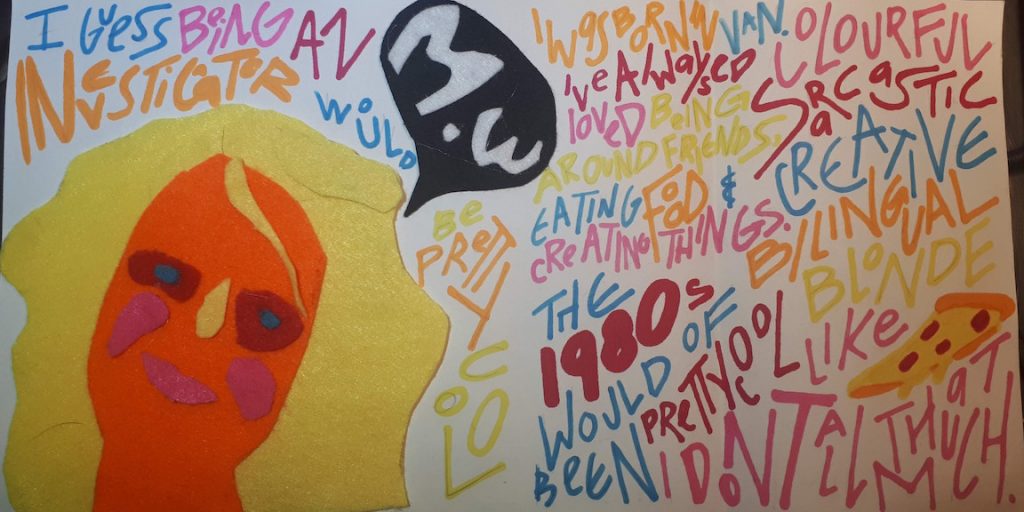
Self assessment. 8/10. 

    I feel as I have followed the criteria and portrayed myself as authentic as possible. Although not a “excellent portrait” in the sense of realism, I feel as I have created a figure of myself following and respecting not only my own style but as well as the criteria.

What gets in the way of care?

There is always a time and a place for care. Whatever it might be, the ability to care is always possible. It is normal in our day and age that some matters might get in the way. School, jobs, family, responsibilities are all plausible attributes seeing that it’s easy to persecute external factors for the mistreatment of ourselves and others. When preoccupations take over, it is hard to prioritize care and that can lead to an extremely unhealthy mental state.

For many, the idea of taking one hour or even one minute out of our day to care for ourselves or others is unfathomable as it is easily perceived as a nuisance and harmful to our productivity. And even then, people insist to believe that care requires grand gestures. Going to the spa or taking a vacation is without doubt popular choices. Many are blind to the fact that care can be as simple as cleaning out our wardrobe, reading our favorite book or eating a favorite snack. It’s the little things that give us high spirits and make us feel cared for daily. Even with care in itself is one of the most subjective topics there is, it always carries a common ground which is that care leads to happiness. And like the domino effect, by caring for ourselves, we can care for others and spread the feeling of happiness. 

It is up to us to take the initiative to make care a priority again for ourselves. And the countless options as to how you can care, it can take time to figure out. But care isn’t something that can be done in a day. It’s a slow process that can as mentioned previously, be temporarily halted by life. We all have our days where caring isn’t something feasible but we can’t let ourselves get mentally acclimated to the idea that care isn’t worth it. It can be hard to care when we aren’t feeling up to it. And when circumstances, emotions, schedules change, it’s easy to take care out of our routine. But what can go from days without care, to months can be extremely harmful. It is our responsibility to get out of a mental space where care isn’t negotiable any more. Funny how something so vital to us and our well being can be so easily forgotten. It might trump everything in importance, but somehow not in priority and makes it possible for anything to get in the way of care.

Margaux Worrall

Late Gothic & Early Renaissance – Master Francke

Well-known german painter, Master Francke was born c.1380 and died c.1440. Compared to artists such as Sandro Botticelli or Giotto, Francke recognition only comes from few paintings such as the St Barbara Altarpiece (c. 1410)1and the St Thomas Altarpiece2

Francke style became one of its own taking both inspirations from the delicate and soft approach of the French3 as well as the realistic depictions specific to Netherland regions 4 where he lived. Throughout the years, Francke developed an ability to demonstrate extreme detail in the clothing, scenery and faces furthering himself from the flat and repetitive style of the early Gothic Period — the Dark Ages, and verging on to the well-known Renaissance style where achieving perspective was a necessary part of the artwork. He pairs his unique technique with seamless gradients for instance in his piece  “Locust miracle from Barbara altar from the Kalanti church in Finland”(c.1410-c.1415)5 as seen in the grass and the mountains, adding to the effect of depth, light source, and perception. His use of vivid colors gives him the ability to reinforce certain emotions and symbols e.g., death, status, and anger. With rich red contrasting with dark cool blues and greens and touches of gold not only make for a touching artwork but a beautifully composed one as well. 

Bibliography:

1.Francke,Master. St.Barbara Altar. Finland

2.Francke, Master. The St. Thomas Altar from St. John’s Church. 0AD, St.John’s Church, Hamburg, Hamburger Kunsthalle.

3.Quarton, Enguerrand. The Coronation Of The Virgin. 1452-53. The Coronation of the Virgin by Enguerrand Quarton, 1453-54.

4.Eyck, Jan Van. The Arnolfini Portrait. 1434, National Gallery, London. 5.

5.Francke, Master. Locust Miracle from Barbara Altar . 0AD, National Museum of Finland, Helsinki, Finland.