The Future of Typography
After the First World War, the world went through many changes. Not only politically, but there was an extreme development in typography and design. This period was, in fact, the birth of the term “graphic design”. Artists started looking at the arrangement of words and using the alphabet to create images. They began to stray away from arranging words in perfect horizontal lines across the page and laying out type according to a hierarchy. These typographic conventions were put in the past as artists stepped towards the future. For example, the Russian revolution propelled artists to see differently, as they had to make use of what they had since most of their tools were ruined. It caused them to become more imaginative and resourceful. This way of looking at typography and modern art was based on avant-garde and was revolutionary.
One of the first examples of breaking typographic conventions was in 1897. Mallarmé was a French poet that wrote a poem which consisted of twenty pages of breaking tradition. She saw the double pages as one, and the placements and white space like a sheet of music. The way they were placed influenced in what way it was read aloud.
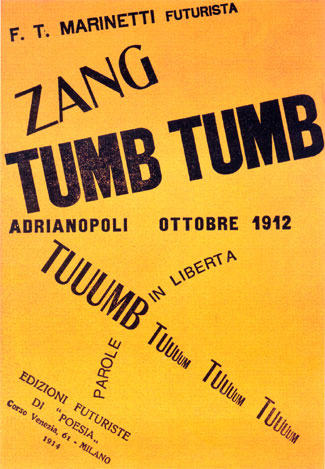
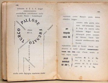
The man who truly rejected original typographic concepts, however, was Filippo Tommaso Marinetti. He was the founder of Futurism in Italy. His first published book was called Zang Tumb Tumb. His goal in this book was to visually represent sounds by placing words and letters in different shapes and sizes on the page. This is when words became considered graphic design. Cubist collages and the chaos of Futurism was the main influence for this experimentation in typographic placement. Futurist typography soon influenced the innovations of constructivism and new typography.
This style was not the easiest to achieve due to the compromises one had to make for the printing machines. The most used machines for typesetting were Linotype and Monotype. Linotype, however, only allowed for bold and italic letters to be the same width as roman. Both Linotype and Monotype couldn’t go over the size of 60 points and length of 60 picas, either. All these restrictions made it difficult to express typography with shape and spacing, however, they must have managed due to the impact of this typographic art form.
Works Cited
“Futurism and Italy.” Graphic Design: a Concise History, by Richard Hollis, Thames & Hudson, 2016.
“Marinetti, Filippo Tommaso (1876–1944).” The Thames & Hudson Dictionary of Graphic Design and Designers, Alan Livingston, and Isabella Livingston, Thames & Hudson, 3rd edition, 2012. Credo Reference, https://ezproxy.capilanou.ca/login?url=https://search.credoreference.com/content/entry/thgraph/marinetti_filippo_tommaso_1876_1944/0?institutionId=6884. Accessed 08 Nov. 2019
White, Alex W. “European and American Typography in the 1920s.” Communication Arts, 28 June 2018, www.commarts.com/columns/european-and-american-typography-in-the-1920s.
Images Cited
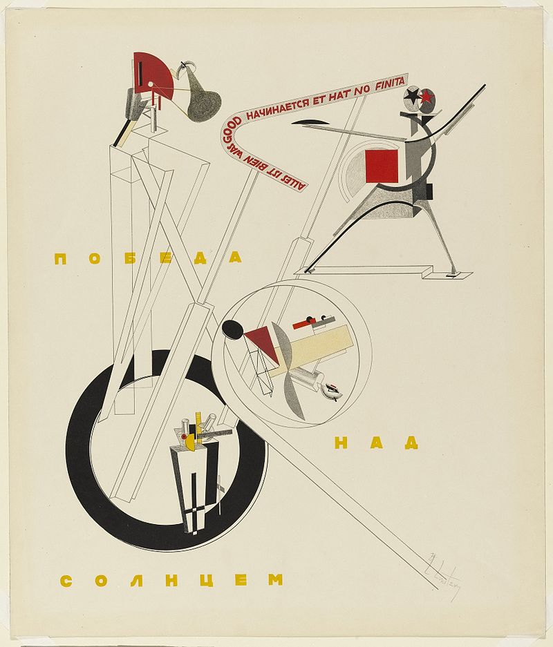
Lissitzky, El. “All Is Well That Begins Well and Has Not Ended.” Russian Futurism, Wikimedia, 1920, en.wikipedia.org/wiki/Russian_Futurism.
Marinetti, Filippo Tommaso. Cover of Zang Tumb Tuuum . 1914. https://en.wikipedia.org/wiki/Zang_Tumb_Tumb
Marinetti, Filippo Tommaso. “ Zang Tumb Tumb Inner.” Zang Tumb Tumb, Wikipedia, New York, 26 July 2017, en.wikipedia.org/wiki/Zang_Tumb_Tumb.