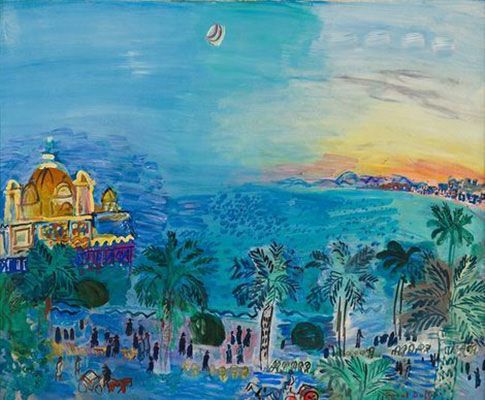
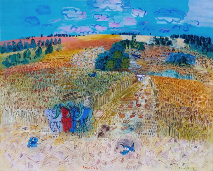
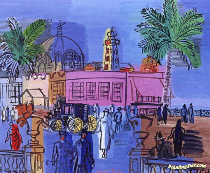
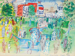
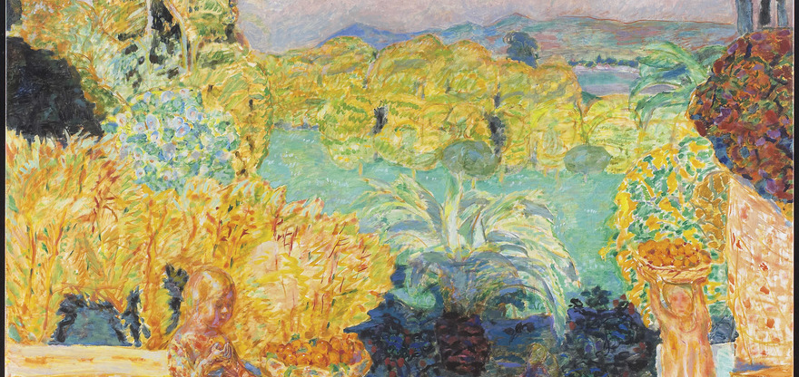
Raoul Dufy was a French painter, watercolourist, and printmaker who had dabbled in many styles. He initially began as an impressionist, however, discovered the brush strokes and bright colours of Fauvism. He discovered Fauvism through meeting Matisse and worked in a museum designing fabric and book illustrations. While Dufy was an exceptional painter, he also created woodcuts and designs for a textile company. He also briefly worked in a Cubist style.
After experimenting with different mediums and styles he decided to focus on painting in his own distinctive style. He painted with the most vibrant and bold colours often using lines that created a playful effect. I truly enjoy his landscapes and renditions of activities, as he makes life seem so wonderful in them.
It was said that “Dufy never painted a sad picture”, and I think his art shows this. I love how colourful and original his art is and how it seems so joyous and carefree. I commend him for that.
This is my spread for survey 7 that explores a subject from 1905-1915. I decided to embody the Plakatstil style in my Infographic poster, focusing on propaganda and advertising. I concentrated on the main Plakatstil designers during this period and illustrated the most famous examples of their works. I then stated info about either the poster or the artist. I worked very hard on recreating the posters in just enough detail that it was accurate, however, still showing their simplicity. In regard to the title, I used the same font as the Priester poster. I struggled with the title and background colours, as I could have used more consecutive colour choices. Perhaps using a red or blue would have made some of the posters pop.
I would give myself an 8/10 as I put a lot of thought into this spread, and I think it overall turned out well, but I wish I had chosen a different background colour.
I am a designer for survey 7. My topic is Design and I am to do an infographic poster. I chose to focus on Plakatstil, exploring its advertisements and propaganda.
Works Cited
“3.” Graphic Design: a Concise History, by Richard Hollis, Thames & Hudson, 2016.
After the First World War, the world went through many changes. Not only politically, but there was an extreme development in typography and design. This period was, in fact, the birth of the term “graphic design”. Artists started looking at the arrangement of words and using the alphabet to create images. They began to stray away from arranging words in perfect horizontal lines across the page and laying out type according to a hierarchy. These typographic conventions were put in the past as artists stepped towards the future. For example, the Russian revolution propelled artists to see differently, as they had to make use of what they had since most of their tools were ruined. It caused them to become more imaginative and resourceful. This way of looking at typography and modern art was based on avant-garde and was revolutionary.
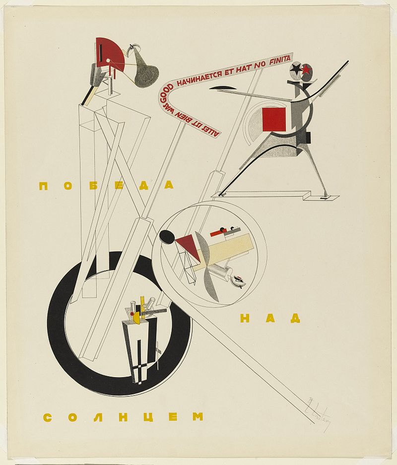
Russian Futurism
One of the first examples of breaking typographic conventions was in 1897. Mallarmé was a French poet that wrote a poem which consisted of twenty pages of breaking tradition. She saw the double pages as one, and the placements and white space like a sheet of music. The way they were placed influenced in what way it was read aloud.
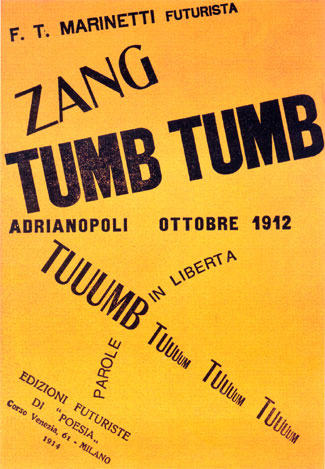
Cover of Zang Tumb Tumb
The man who truly rejected original typographic concepts, however, was Filippo Tommaso Marinetti. He was the founder of Futurism in Italy. His first published book was called Zang Tumb Tumb. His goal in this book was to visually represent sounds by placing words and letters in different shapes and sizes on the page. This is when words became considered graphic design. Cubist collages and the chaos of Futurism was the main influence for this experimentation in typographic placement. Futurist typography soon influenced the innovations of constructivism and new typography.
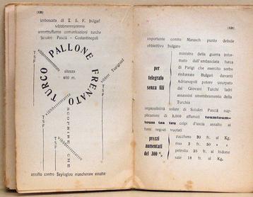
Inner spread from Zang Tumb Tuuum
This style was not the easiest to achieve due to the compromises one had to make for the printing machines. The most used machines for typesetting were Linotype and Monotype. Linotype, however, only allowed for bold and italic letters to be the same width as roman. Both Linotype and Monotype couldn’t go over the size of 60 points and length of 60 picas, either. All these restrictions made it difficult to express typography with shape and spacing, however, they must have managed due to the impact of this typographic art form.
Works Cited
“Futurism and Italy.” Graphic Design: a Concise History, by Richard Hollis, Thames & Hudson, 2016.
“Marinetti, Filippo Tommaso (1876–1944).” The Thames & Hudson Dictionary of Graphic Design and Designers, Alan Livingston, and Isabella Livingston, Thames & Hudson, 3rd edition, 2012. Credo Reference, https://ezproxy.capilanou.ca/login?url=https://search.credoreference.com/content/entry/thgraph/marinetti_filippo_tommaso_1876_1944/0?institutionId=6884. Accessed 08 Nov. 2019
White, Alex W. “European and American Typography in the 1920s.” Communication Arts, 28 June 2018, www.commarts.com/columns/european-and-american-typography-in-the-1920s.
Images Cited
Lissitzky, El. “All Is Well That Begins Well and Has Not Ended.” Russian Futurism, Wikimedia, 1920, en.wikipedia.org/wiki/Russian_Futurism.
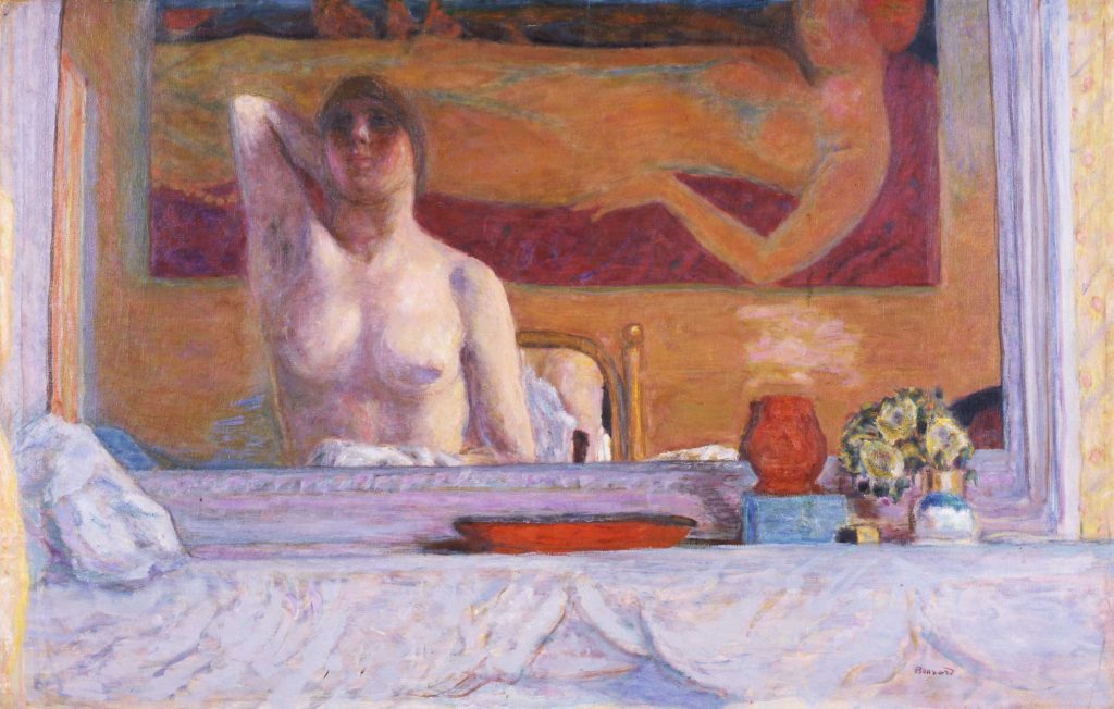
He was a painter, illustrator and printmaker and was a founding member of the Nabis, which was a group of post-impressionist avant-garde painters. He also became a leader of the Intimists.
His work was important because it was the transition between Impressionism and modernism. In his work, I can clearly see how much he was influenced by Paul Gauguin’s artwork and japonism due to the flat, yet bright colours, decoration, and stylized brush strokes.
Although the subjects for his paintings were rather simple, for example landscapes or portraits, he managed to capture such beauty with the flat depth and colour he used. I absolutely adore his choice of colour and how his style complements the compositions.
Art Nouveau made a huge impact on architecture in countries around the world. The architectural style of Catalan Modernisme, which is derived out of the Art Nouveau movement, had a spectacular impact on Spain.
This is the Sagrada Familia, which is an icon of Modernisme
This impact was most significant in Barcelona, Catalonia. Catalan Modernisme left the city with a cultural heritage that stood out from other architectural styles. This style was more of an extreme version of Art Nouveau due to the fact that Spain during this time felt culturally isolated. This allowed them to express themselves in a more exotic and independent way than the rest of Europe. In this period, Art Nouveau in other areas around Europe expressed the Zeitgeist.
After the Industrial Revolution and the technological advancements that came with it, Europe sought out a new way to live. Barcelona wanted a more modern society and for many reasons the city transformed, but it was from Lluís Domènech i Montaner, Antoni Gaudí and Josep Puig i Cadafalch that truly outlined Catalan Modernism architecture. The place in which their theories of modernism were put into practice was The World Exhibition of 1888. This is where these geniuses could live out their architectural fantasies and where it all started.
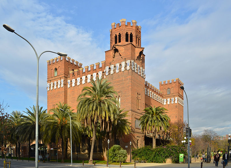
Catalan Modernisme used progressive science and technology and included the national romanticism of the Arts and Crafts movement. The style’s early pieces consisted of clear lines, as in the Castle of the three dragons.
The Castle of the Three Dragons shows the early style of Modernisme.
The Casa Batllo, by Antoni Gaudí shows the iconic style through its shapes, colours, and naturalistic elements.
It grew into using beautiful and organic shapes inspired by nature and forms that were exaggerated in such a way that look surreal, while still maintaining that nationalistic sentiment. The use of colour is also quite lovely.
In 1906, Modernisme was argued against a new style called Noucentisme, which was quite the opposite. 4 years later, Modernism got a reputation of being lavish and “bad taste” due to the patronage of the upper class and the behavior of the bourgeois. If I could speak on behalf of the other people in the world I think we would all agree that Modernism is a truly magnificent style. Today, millions of people visit these buildings just for that reason!
Works Cited
“Modernisme – Barcelona Formative Period of Art.” Barcelona.de , www.barcelona.de/en/barcelona-modernisme-art-nouveau.html.
“Modernisme.” The Thames & Hudson Dictionary of Design Since 1900, Guy Julier, Thames & Hudson, 2nd edition, 2004. Credo Reference, https://ezproxy.capilanou.ca/login?url=https://search.credoreference.com/content/entry/thdesign/modernisme/0?institutionId=6884. Accessed 03 Nov. 2019.
“Modernism- Art Noveau in Barcelona.” The Catalan Modernism and Barcelona, Nunez I Navarro, 2019, www.casalleomorera.com/en/barcelona-and-modernism/modernism/
Selbymay. “The Castle of the Three Dragons in Winter.” Castle of the Three Dragons, Wikipedia, Barcelona, 17 Feb. 2019, en.wikipedia.org/wiki/Castle_of_the_Three_Dragons.
Staudt, Wolfgang. “Barcelona Temple Expiatori De La Sagrada Familia .” Modernisme, Wikipedia, Barcelona, 21 Sept. 2019, en.wikipedia.org/wiki/Modernisme.
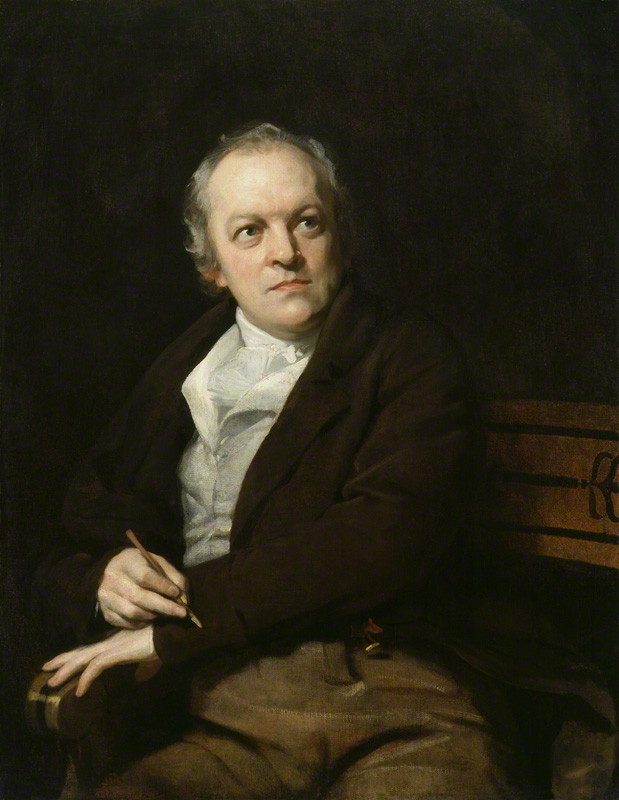
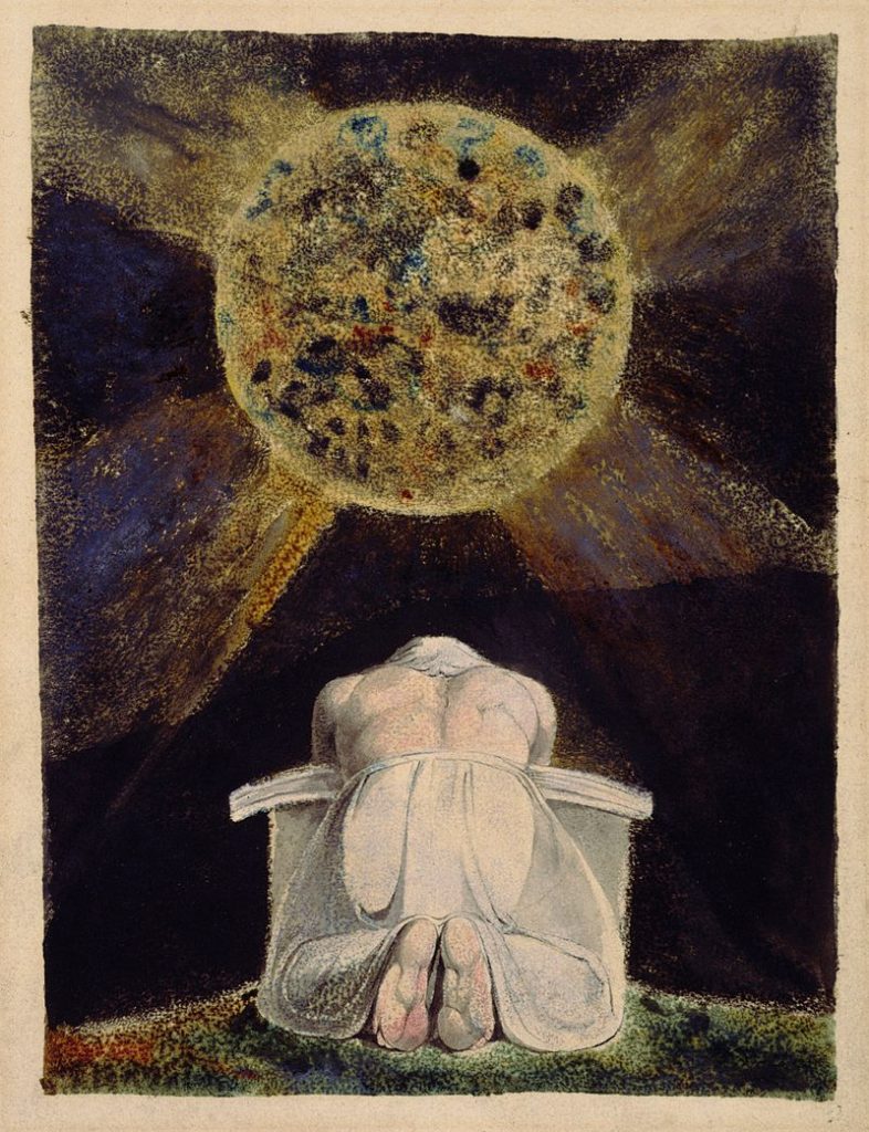
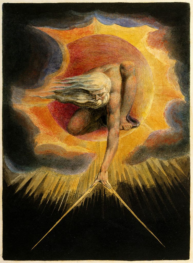
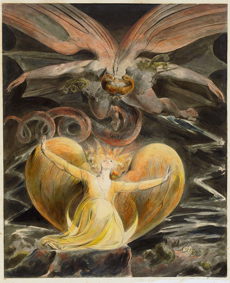
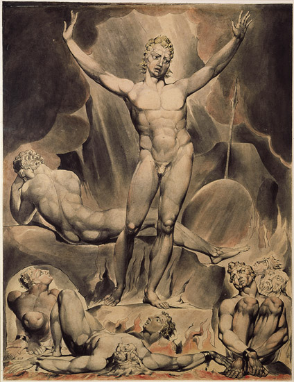
William Blake was an English man of many talents. He was a poet, engraver, artist, and visionary who has influenced a number of writers and artists throughout history. In the early 21st century, Blake was deemed as the earliest and most original Romantic Poet and thinker. Throughout his life, however, he was often misunderstood and dismissed as mad.
He was not recognized during his time, however, he had an everlasting legacy. I believe his artwork is really quite beautiful. His imagery is very powerful and I can see how much he was influenced by his visions of spirituality.
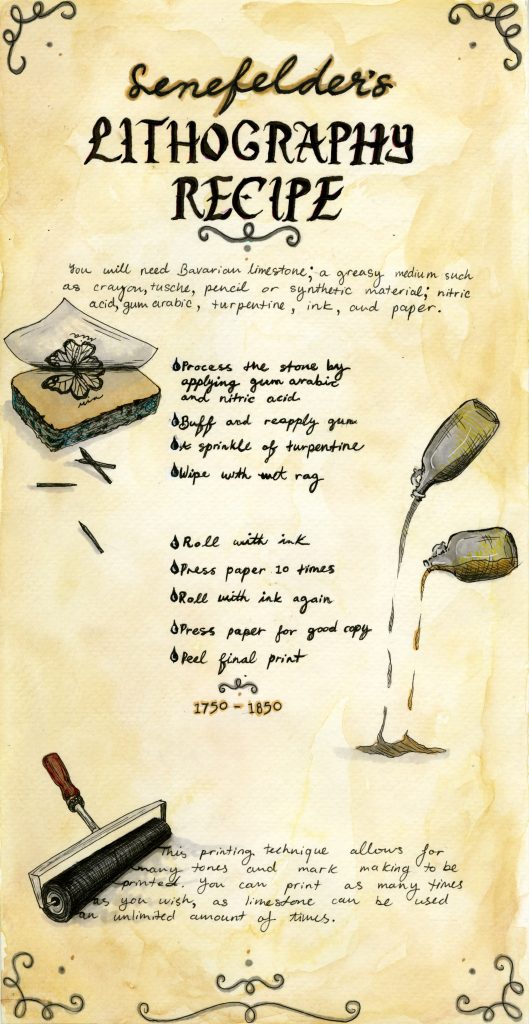
The topic I was assigned for the history spread was tools/technology from 1750-1850. I chose to focus on Lithographic printing, as it was a relevant subject during the industrial revolution and an important invention. I struggled with the ideation of visually representing the action of lithographic printing. However, during the group meeting, the idea of making it a recipe caught my attention. I decided to title it “Senefelder’s Lithography Recipe”, as a spin off of the stereotypical Grandma’s cookie recipe. In place of where the ingredients would go on a normal recipe, I put the steps that one would take to print lithographically. I also drew some of the steps to help visualize it. I used my regular handwriting to act as if Senefelder had written this recipe himself, but I drew the title in a gothic font to represent its age. I also stained the background to make this recipe look old.
For this spread, I give myself an 8/10 because I believe I executed lithography in a creative way that makes sense. I am very proud of the diagrams I drew, as I initially struggled to make them satisfactory, but after working on them, I feel as though I incorporated them well. For example, the ink roller at the bottom is rolling out the words. If I were to change anything, I could have gone lighter on the embellishments. I also think that I could have separated the bullet points more from the words.
The time I spent designing this spread was approximately 4 hours and perhaps 1 hour on research.
During the second half of the 19th century, there were many important buildings and monuments in architecture. This included the Crystal Palace, the Big Ben, the Statue of Liberty, and most importantly, the Eiffel Tower.
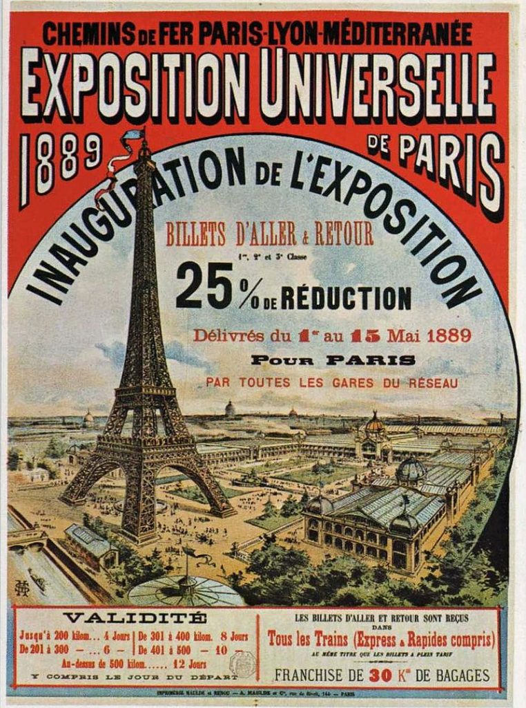
Universal Exposition poster of Paris 1889
In 1889, the French government wanted to celebrate the fact that 100 years had passed since the French Revolution. In this year, no shots were fired and nothing was ruined. The French government wanted to find a way to commemorate the social ideals, art and industry that came from those years. To do this, the French Government put together the International Exposition of 1889. The International exposition also displayed exhibits in other countries.
It was questionable whether the French would host another international exposition because the one prior had lost money. However, since over sixteen million people attended the one in 1878, they wanted to also celebrate the Republican. And so they held “the fourth exposition universelle”. Celebrating the Republic in the exposition brought its own difficulties. Some of the most important European powers tested the Republic by ignoring the Exposition Universelle of 1889.
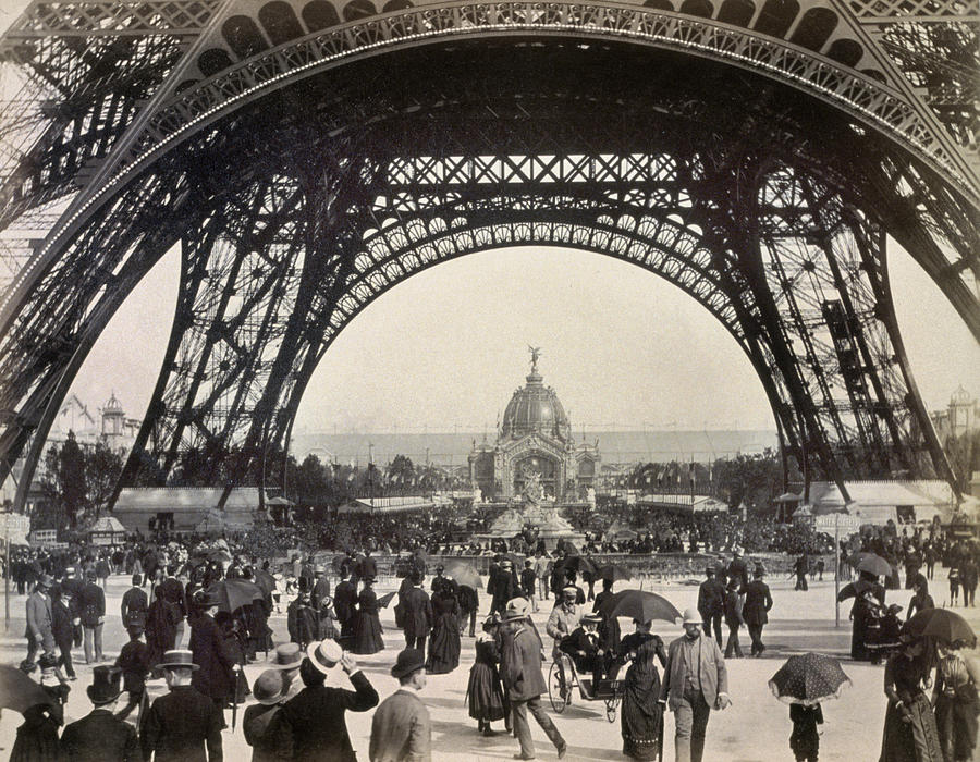
A competition was put forth for designs of a monument that could be put in Paris. Out of 100 submissions, Gustave Eiffel’s concept of the Eiffel Tower won. Although it brought skepticism, it also brought amazement as it became a technological masterpiece. The Eiffel Tower is 300 metres of open-lattice wrought iron that was perfect for the gateway to the exposition.
Eiffel Tower gateway to the exposition
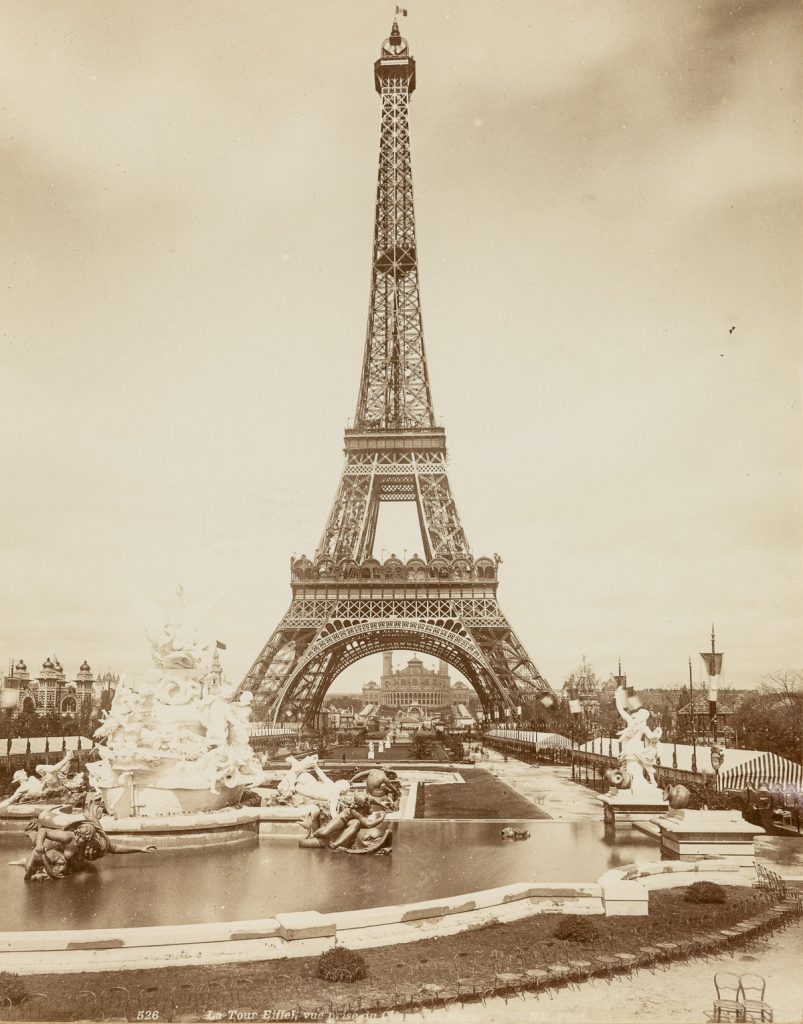
The Eiffel Tower
The elevators were not in service on the day of the exposition, so 30,000 people climbed up the 1,710 stairs to the top. It was the tallest building in the world until 1929, when the Chrysler Building was made in New York. the Eiffel tower, however, became one of the world’s best tourist attractions.
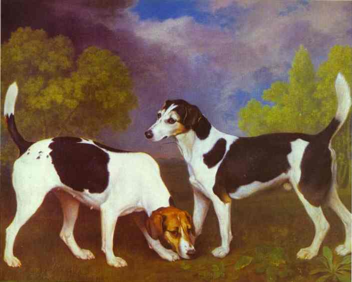
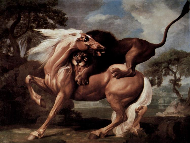
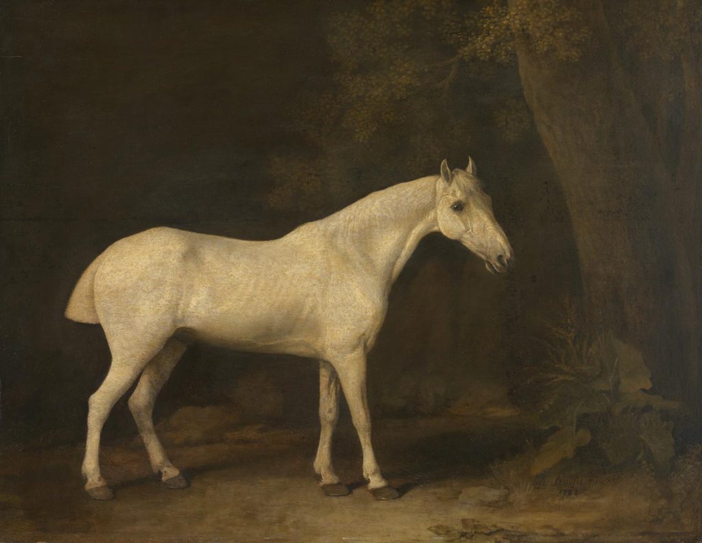
George Stubbs was a British painter from 1724-1806. He is most well known for his incredible paintings of horses, which are arguably the best horse paintings that England had ever seen.
He was a genius in anatomy which resulted in him becoming a teacher of this subject at a hospital in York. He knew the anatomy of horses so well that he decided to share his studies, and analyze horse anatomy in the form of a book. His book was successful and his horse paintings soon became a hot commodity to rich men who wanted some of their own.
Stubbs was a self taught painter; however, he briefly studied with an artist in 1741. His most famous painting is of a horse being attacked by a lion. He managed to show the frightening emotions of the animals and the power that a lion has over the horse.
I believe his paintings are truly outstanding. He was so great at what he did because he loved animals so much. He painted them in such a way that you can’t help but see their emotions.
For example, in Horse In The Shade of a Wood, the stallion is without an owner and is free, however he looks sad. Stubbs depicts his animals in a way that people can understand them and wonder what they are thinking.


_British_Museum.jpg)