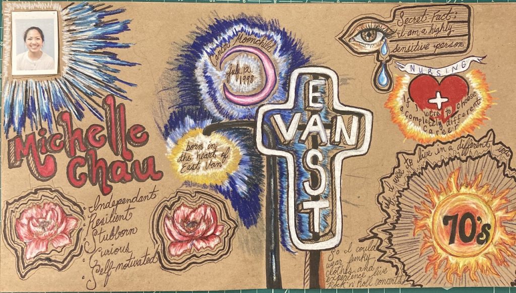
For my yearbook spread, I used lots of vibrant images, similar to symbols as a way to tell my story in a way that is easy to understand. I wanted to create these explosive and engaging visuals by using bold Prismacolor pencils. This yearbook spread helped me experiment with fonts and typography, by naturally freehanding the letters, and finding my style rather than copying letter templates. I wanted to represent my life and personality in a way that’s more fun, imaginative, and amplified from my ordinary life. I used brown toned paper because it would help the colors look more bright and contrasted compared to the regular white paper. I enjoyed this assignment very much as it helped me understand myself in knowing who I am and remembering where I come from. Hence seeing everything slowly coming together was satisfying and therapeutic, I definitely got immersed with the coloring. If I were to grade myself out of 10 I would give it a 7.5 or 8 out of 10. I think the images for storytelling was done quite well, but I do think I could have improved on design elements that we learned this past week to make things look more composed and cohesive.