Survey 9 Color Theory and Cool Type (1925-1930)

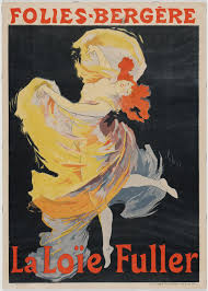
The release of Metropolis (1927 film)

1927 vintage movie poster for “Metropolis”

The inventor C.A. Rotwang (Rudolf Klein-Rogge) and his robotic invention (Brigitte Helm) in Fritz Lang’s silent film classic Metropolis (1927)

How did Metropolis help shape the future of politics, culture in fashion design, music, and interior objects?!(Oof that’s a lot)

Let’s start with what the movie is about

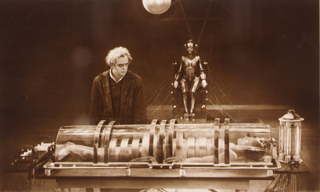
Metropolis is a German film directed by Fritz Lang that was released in  1927 during the Weimar Period, which was an attempt to re-create a new society from post World was one. This film is considered one of the most influential films of all time because it was a visual representation of political and cultural issues that existed in the world at that time. The incredible futuristic visuals also foreshadowed where the world was heading, because it had a great impact on modern-day culture and architecture. The film captures many conceptual science-fiction elements, which is influenced by the Bauhaus, Cubist, and Futurist movement.

Pin on Architecture
Futuristic visuals used for the movie sets

Politics: Metropolis is a political allegory  The effects of Government control and technology

During the time Metropolis was released, Germany had suffered the defeat of World War 1. And the country was under the Weimar Republic Rule, attempting to construct a democracy. The narrative of the movie reflected the societal conflicts and imbalance between classes, that were directly correlated taking place during that time. This impacted the gap between the rich and the poor.  Fritz Lang’s intention was to create a realist dystopian film that took place in 2026. The immense skyscrapers displayed in the city of Metropolis was created from inequality, exploitation, and greed.

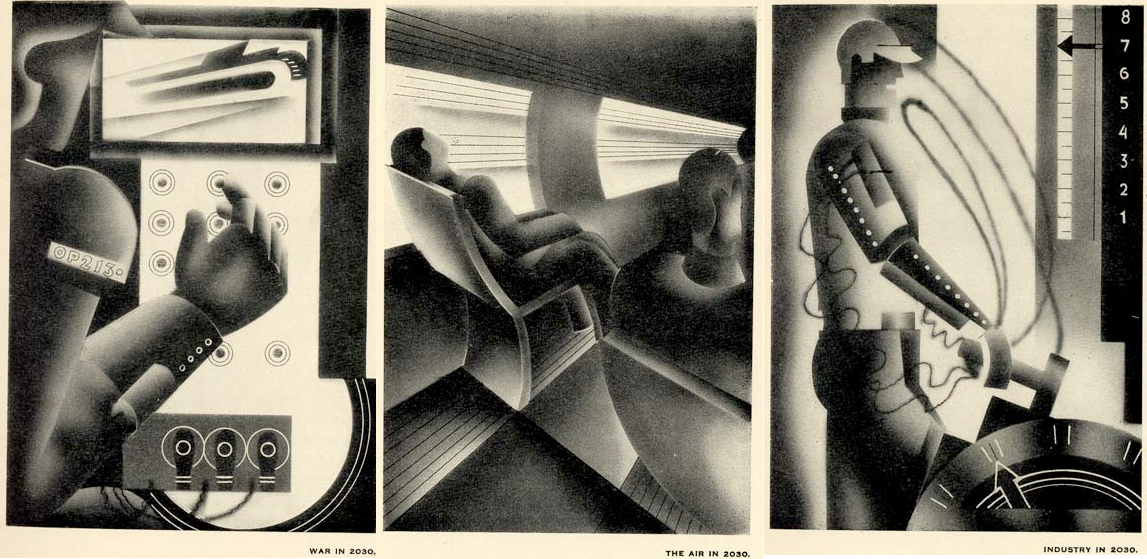
The Film-makers created bold landscapes, to idealize a different universe, which helped shape what we see as a metropolis today.  This film foreshadowed the relationship between humans and technology. The film depicted the dependency humans would succumb to technology. This symbolized the dehumanization of effects that would found in major cities around the world. Metropolis exposed the modern capitalism of hierarchy and oppression. It’s parallel to Mcknight Kauffer’s 1930 illustrations depicting what the world would be like in 2030.

Are humans replaced as robots?

“The world in 2030 A.D”

Or……

Are humans so disconnected from society, and dependently wired to technology?

It’s super neat to see the foreshadowing of an era we are living in at the moment.

Culture: Fashion/Music

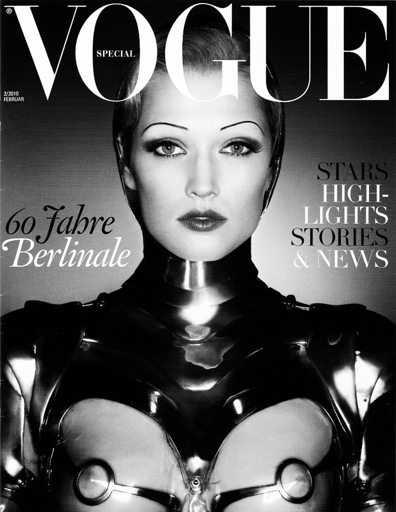
Metropolis also inspired a lot of pop-culture movements, like music and fashion design. Karl Lagerfeld a German creative director and fashion designer of Chanel paid homage to the movie. He did so by designing eclectic clothing for Vogue magazine based on the movie’s robot.

Vogue: “Return to Metropolis” by, Karl Lagerfeld February 2010

Inside My Vault: Vogue: “Return to Metropolis” by Karl Lagerfeld, February  2010

Music

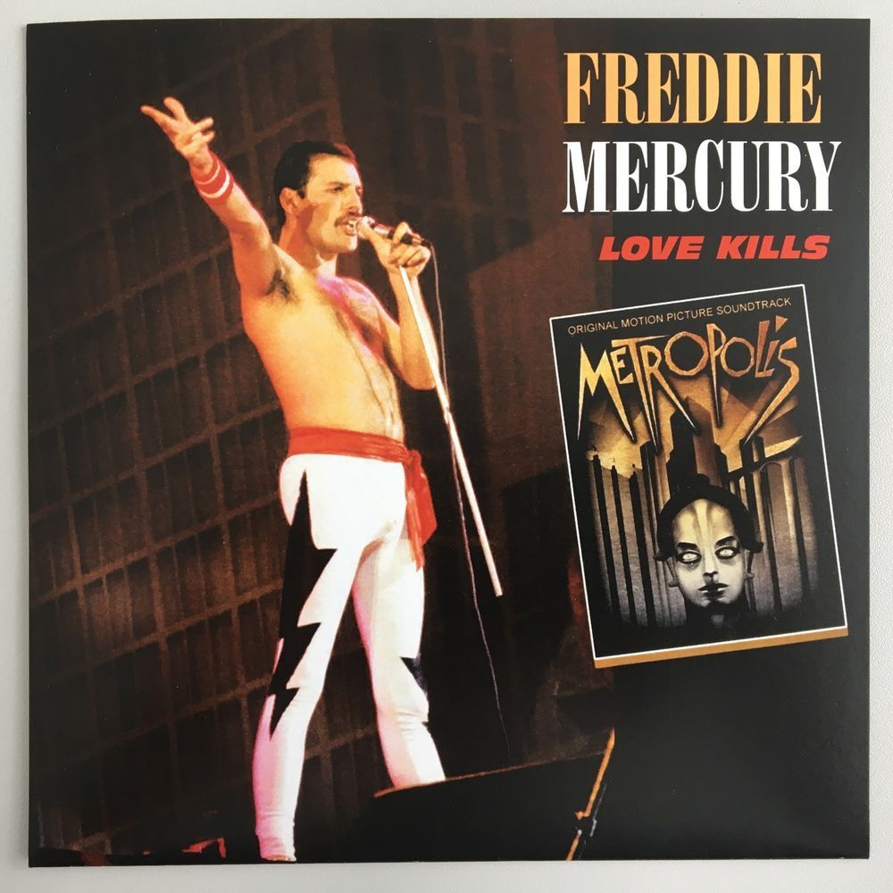
Freddie Mercury, the vocalist of Queen was also a fan of the aesthetics from “Metropolis”, the music video for his song called “Love Kills” is inspired by the film. It is basically a condensed version of the movie.

A link to the music video

Objects: When Metropolis meets art deco

The Movie Metropolis helped shape an aesthetic where beauty and practicality are formed. Also known as “Form and Function” where two things can be one thing. 

From bizarre modern office designs, and elements of copper and brass used for industrial-style objects. Such as lights, lamps, tables, chairs, etc. The incredible futuristic visuals impacted how modern interior designers created a new brand of objects.
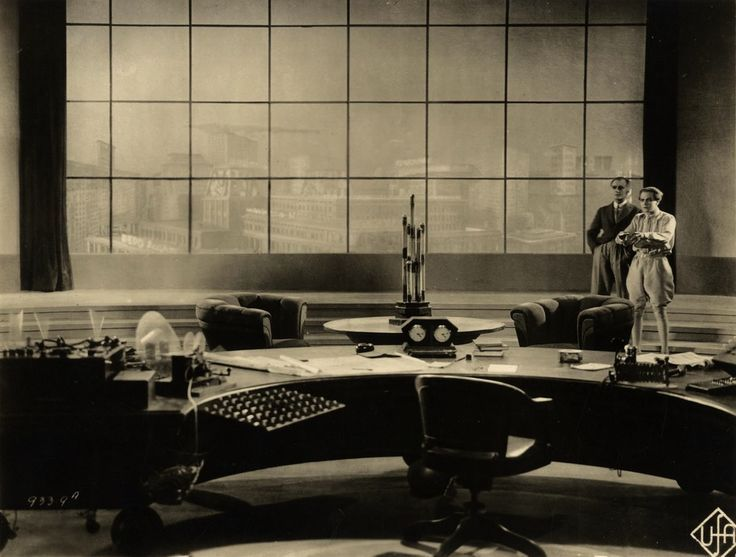
Form and Function

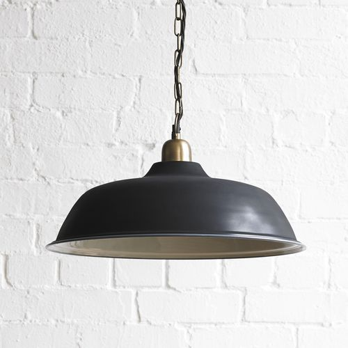
Just simplistically beautiful….and functional!

Link sources:

https://en.wikipedia.org/wiki/Metropolis_(1927_film)

https://www.pinterest.co.uk/pin/471963235930652459/

https://www.pooky.com/2016/03/03/industrial-meets-art-deco-how-metropolis-helped-design-the-future

https://www.mentalfloss.com/article/83617/12-futuristic-facts-about-metropolis#:~:text=Here’s%20a%20list%20of%20just,Hudsucker%20Proxy%2C%20and%20Tim%20Burton’s

Image sources:

http://insidemyvault.blogspot.com/2012/04/vogue-return-to-metropolis-by-karl.html

https://www.britannica.com/topic/Metropolis-film-1927

http://www.mingong.org/blog/film-review-metropolis-1927-and-its-current-relevance

Typographic Infographic Timeline

For my Typographic Infographic timeline poster, I titled the heading “Typography Timeline Express!”. And I decided to use a train as the subject of the poster because typography revolves around form and function. I was inspired by Alexander Rodchenko’s constructivism posters, by using the common abstract red and black geometric shapes. I used the design elements of photomontage, by drawing each typographer’s face enough for them to look somewhat realistic. I tried to depict the timeline of typography and the typographers as a passenger on a train, with the sub-heading “Faces of typefaces”. It includes 8 typographers we’ve learned from the lectures from (1039) Bi Sheng to (1927) Paul Renner. I shaped the trains in a diagonal shape to give a sense the timeline is moving quickly throughout the centuries. I also incorporated Fat Faces for the title and sub-heading, as they were commonly used for posters back in the day. I finalized this poster with some Red and black acrylic paint.

Before the painting.

I would grade myself a 9 /10. Because I really pushed myself for this final project, there was a lot to include, and the dimensions were huge! Overall I am happy with the concepts I have chosen and satisfied with how it turned out. My least favorite and most challenging part of this project would be drawing the typographers that had to look realistic enough. It took a lot longer than it should have, but I thought it was worth it to create a strong outcome for this poster. What I could have done better was the execution of the painting, which could be more precise and polished, however, it was the most enjoyable part. I used a reasonable about of typographers, and I kept it concise although it could have been more informational, there are some small details in the information boxes. It’s not perfect but I believe I put a lot of effort and time into this project. I realized how time-consuming it is to draw letters as well!

Research links:

https://www.behance.net/gallery/57613131/History-of-Typography-Timeline

https://visual.ly/community/Infographics/history/history-typography-timeline

https://design.tutsplus.com/articles/a-brief-history-of-type–cms-30372

The Greatest Show on Earth

Showcasing: A Historical Renaissance woodcut

“The Madonna on the Cresent” by, Albrecht Durer

Woodcuts- The Oldest Form of Print-making

Woodcuts originated in China and made their way over to Europe, as well as paper during the 13th Century. This new printing technique became heavily used in the Middle Ages, for book illustrations and decorative text. In the 1400’s Germany popularized the development of woodcuts. Albrecht Durer was a prolific printmaker, he produced over 300 woodcuts in his lifetime, using wood carving knives, which is an extremely meticulous process. He is also regarded as the “Greatest German Renaissance artist”.

Rationale

For my historical artifact project, I decided to recreate Albrecht Durer’s woodcut of “Madonna on The Cresent”. I did so by buying a linocut block (a hard rubber surface) to imitate the wood, which is closely similar. I found this assignment enjoyable but it also had its challenges. This project did take up a lot of time and patience, luckily I had everything planned and set early on. And I was able to manage my time around this piece, without stressing out or having to rush. I didn’t want to create something that was solely for a school project that becomes disposable afterward, but rather memorable for keepsakes. I am planning to create some prints with this linocut afterward!

I would grade myself a 9/10, based on the effort and time articulated into this project. And for the sore hands, I received from carving this piece, Haha. The materials I used for the backdrop were bought from Dressew Sewing Supplies. And the printing block was bought from Opus art supplies. I tried to imitate a Catholic Church altar. I was fortunate to find a long red skirt at home to use as the background which resembles a red curtain. I think that helped with the success of capturing an alluring photo, however, I could have perfected the shot by using better lighting. But I wanted to use candles to portray the dim-lit Middle Ages. I also think I could have Incorporated the text in a way that is more readable.

Progress Shots

Sketch in progress
Cutting in Progress
Finalized linocut

IDES 141: Typography Zine

Introduction: Page 1 and 2
Front Cover

I had a fantastic time creating this typography zine for Japanese Calligraphy, known as “Shodo”. The project gave me the opportunity to utilize my creativity alongside some design principles, which helped showcase cohesive and clear-cut information. To make the zine more organized I used the principles of “contrast” and “balance” by using black and white pages. I used mixed mediums during the process such as gouache paint for the front cover, Prismacolor pencils, and felt liners for the text. I enjoyed making this zine because it was very hands-on, which I prefer over doing technical assignments. It also allowed me to illustrate ideas and convey topics that were not discussed in depth during typography lectures. One of my favorite parts was creating the front cover which I referenced from an Ukiyo-e print called “Beauty in front of Mirror” by Kitagawa Utamaro. For my rendition, I used bold blue gouache color to alter the flat colors that are often used in these prints. Overall I think I put my best into this assignment and used whatever mediums I could. I enjoyed every part of putting this together, and I would definitely do it again because I am satisfied with how everything turned out.

Page 5 and 6
Brief History: Page 3 and 4
Layout

Survey 6 Dreams and Designers (1895-1905)

Jules Cheret: The man behind the OG Poster girls!

The Father of Modern Posters: Jules Cheret, pioneer of representing female freedom and revolutionizing modern design.

Fetes de Nice by Jules Cheret

Jules Cheret, is a French illustrator and graphic designer, of the 1800s, he was coined “The Father of Modern Posters”. His artworks influenced the predominant designs and advertisements for the 1900s. And is also considered one of the pioneers to change the portrayal of women. He was inspired by Rococo artists such as, Jean-Honore Fragonard, who often painted jovial women and themes of frivolity, and it is evident with many of the posters he designed. He created posters often representing women with full of energy and livelihood.

Both these ladies in pink dresses have a striking resemblance but are very unique in their own style. Fragonard’s painting of “The Swing” has very soft and tender brushstrokes. The woman could be seen as dainty or delicate. Whereas Jules Cheret’s woman on the left looks wild and free, having fun with herself. By the looks of her exposed chest and legs indicates that it is more provocative, but she unashamed and celebrates anyways.

“The Swing” by Jean-Honore Fragonard (Rococo Artist)

“Olympia” by Jules Cheret

Jules Cheret’s posters inspired the culture for female freedom and empowerment:

Jules Cheret impacted the culture of Female Freedoms. His designs usually displayed bold and beautiful women full of life surrounded with vibrant, dramatic colors. These posters were known to be a catalyst for female emancipation. Meaning that women were free from social limitations and traditions. Jules Cheret was able to capture a woman breaking the social norms of the 1800s. Because it was unaccustomed seeing a woman so free-living and confident in her own body. 

“Moulin Rouge” by Jules Cheret

Right Side :”Moulin Rouge” by Jules Cheret

He Was A man of emotions!

Jules Cheret would always convey the emotions rather than the product of his Poster designs:

“Follies Bergere” by Jules Cheret

Cheret’s Design also played a pivotal role in changing the concepts of advertisement. His advertisement designs were aimed to capture the emotion and energy of the individual rather than the functionality product. This was crucial in elevating advertisements to an art form. Cheret was a prolific poster designer, by the end of his career he produced over 1000 posters. In 1890 he was awarded by the French government for his outstanding graphic designs. He was hired to advertise various objects from hats, bicycles, soaps, lamp oil, cough drops, events etc.

“Pippermint” by Jules Cheret 1900

He was able to convey simple objects by enhancing them with a new personality with his techniques of vivid rich colors, typography, and composition. And most often an expressive woman was at the forefront or center to entertain the advertisement. Cheret’s methods were innovative in the advertisement world, inspiring a whole new generation of designers, and poster makers. It played a predominant role in the effects of selling a product, which spanned from the 1900s to what remains in modern-day advertisements.

He’s also an OG Graphic Designer

He pioneered poster design, and inspired many designers of the following century. However his distinctive style can be seen as free-flowing and experimental, which is probably because he mostly conveyed emotions in his advertisements, rather than having objective delivery. And it seemed like there were no strict rules for visual communication and design during that time.Reynold Brown’s poster from 1958 conveys the same subject, which is more compositional, and the text is aligned, by that time design became more developed for the viewer’s eye. But his work is most likely accredited to Jules Cheret’s work.

“Exposition Universille” by Jules Cheret
“Attack of the 50 ft woman” 1958 by Reynold Brown

Sources:

https://www.pbs.org/wgbh/roadshow/stories/articles/2005/1/3/jules-cheret-elevating-ads-art-form/

https://www.thevintagenews.com/2017/03/04/jules-cheret-the-father-of-poster-art-and-the-father-of-womens-liberation/

Photo Sources:

https://www.moma.org/collection/works/5615

https://www.pbs.org/wgbh/roadshow/stories/articles/2005/1/3/jules-cheret-elevating-ads-art-form/

https://www.thevintagenews.com/2017/03/04/jules-cheret-the-father-of-poster-art-and-the-father-of-womens-liberation/

Survey 4: Steam and the Speed of light (1750-1850)

The influence of Ukiyo-e prints on European Design and Objects:

Bijin-ga, meaning “beautiful person picture,” was a dominant genre of ukiyo-e prints.

Ukiyo-e prints!

What are ukiyo-e prints to begin with? Ukiyo-e prints are Japanese paintings or woodblocks that often depicted the Edo period of Japan from which spanned from the 1600s to the 1800s. Common themes and symbols that were exhibited were, nature, spirituality, mythology, love, and sex. The word “Ukiyo” is translated to “ pictures of the floating world”, this term is used from Buddhist philosophy. In a Japanese sense “floating” meant fleeting or transient, that all things are impermanent. The style is described to emphasize shapes, use dark outlines, flat areas of balanced color. It was different from European art because of its absence of dramatic lighting and harsh contrasts. This style of painting often used in Renaissance art is known as “Chiaroscuro”. 

Caravaggio – The Taking of Christ, 1602 is an example of “Chiaroscuro” painting that uses dramatic lighting and harsh contrasts. During this time Japanese people were making art much more differently, with flat colors, and bold lines.

What makes Ukiyo-e prints so unique?

The Ground Spider, 1887 by Kunichika (1835 - 1900) | Japanese woodblock  printing, Traditional japanese art, Japanese prints
Kunichika- The Ground Spider

The unique characteristics of Ukiyo-e prints include the strong outlines, exaggerated foreshortening, and asymmetrical designs.

Japanese Design that broke barriers for European artists:

Ukiyo-e prints were introduced to the western world, at the end of the Edo period, which was a time when Japan was isolated and closed off to the rest of the world. When dutch traders discovered these prints it brought exposure to Europe. Ukiyo-e became a fascination with Europe and influenced many artists during that time. This massive appeal from the western world coined the term “Japonisme” which refers to the influence of Japanese art on European art and design. “Japonisme” was especially prevalent during the impressionism, and post-impressionism period, it inspired new methods of painting and printmaking. European art was shifting and Impressionism was taking over. The concepts of open compositions and ordinary subject matters and scenes of everyday life were impacted western art. Artists such as Edouard Manet and Marry Cassat admired and emulated the style of Japanese art.

1890-91
Maternal Caress
Artist: Mary Cassat

“Japonisme” left an imprint on Mary Cassat’s art. She created dozens of simplistic paintings that reflected everyday life. She borrowed some of the methods by using flat colors, broad lines, and cropping. What I noticed from this style is that it feels more intimate personal and relaxing.

Mary Cassatt: an Intimate Japonisme | Micheline's Blog
The Coiffure Study

Edouard Manet grew an affinity for ukiyo-e prints. In his portrait of Emile Zola it is evident he was a great admirer of Japanese art.

On the left of this painting depicts a landscape screenprint with a bird perched on a branch. On the right side depicts what looks like a Japanese shogun. In this painting, elements of ‘flattening’ and ‘simplifying’ shapes demonstrate the styles used in Ukiyo-e prints.

Manet- Portrait of Emile Zola


Objects (as prounounced in Japanese, オブジェクトObujekuto”!) that were influenced by Ukiyo-e prints:

After ending a long period of seclusion, Japan began reopening its import and export trades. This included Japanese artifacts, paintings, and printing techniques. Ukiyo-e prints were the most popular amongst them all. It was intriguing for Europeans to see something so foreign. This exposure resulted in so much popularity with the Japanese culture, objects like furniture were being manufactured for people’s homes. Japanese art and artifacts began to make an appearance in the antique shops of Paris and London.

Here is an example of how Japanese culture and Ukiyo-e prints inspired this French Cabinet.

Commode (commode à vantaux) with Japanese and French lacquer panels; circa 1790
File:Appert Frères - Carp Vase - Walters 47384 - Profile.jpg
Appert Frères – Carp Vase 1878

In 1867, Japan featured its first formal exhibition for arts and crafts at The Exposition Universelle. The exhibition triggered a wide audience interested in the culture of “Japonisme”. This marked the beginning of all things Japanese becoming fashionable and respected. This definitely inspired European artists to use Japanese elements and symbolism for a more stylistic approach.

The French Exposition Universelle of 1867

Paris 1867 Exposition: History, Images, Interpretation — Ideas

And so it turns out the world was already obsessed with Japanese culture for a longgg time. Basically, the term ‘Japonisme’ is a formal and old-fashioned way to describe a non-japanese person who has an affinity for Japanese culture. Which is equivalent to the modern word we use in pop-culture today known as a “weeb”. I just found that amusing and engaging as an approach to writing this blog post.

And that’s all for Survey 4 blogpost!

Image sources:

https://www.theartstory.org/definition/chiaroscuro-tenebrism-sfumato/artworks/

https://ukiyo-e.org/image/jaodb/Chikanobu_Yoshu-No_Series-The_first_three_Shoguns_of_Tokugawa_Dynasty-00039243-060503-F12

https://www.pinterest.ca/pin/488781365787426194/?nic_v2=1a6bW2lTu

Sources:

https://www.theartstory.org/movement/ukiyo-e-japanese-woodblock-prints/

https://www.theartstory.org/movement/japonism/artworks/

https://en.wikipedia.org/wiki/Japonisme

Sigmund Freud’s “Interpretation of Dreams” moodboard

https://michellechau888758.invisionapp.com/board/Sigmund-Freud-ckg4g8i9v04rh12vkkb9sqi4t

I was chosen for survey 6, and the event I decided to go for was the publication of “The Interpretation of Dreams” by Sigmund Freud. I was excited about this topic because I learned a bit about him in a psychology course, being the founding father of psychotherapy. But I never really delved into his detailed life. I find it interesting how events can be impactful towards so many avenues. I focused on Design, Culture, and Architecture.  I felt very optimistic about this project however I found it very challenging with the technical difficulties and having to troubleshoot the website.

Survey 3: Block books and Baroque

How the legacy of a Rhinoceros woodcut lives on, Fascinating artists for centuries.

Who is this guy? Kinda resembles Jesus, right?

Albrecht Dürer — Wikipédia
Self-portrait of Albrecht Durer at the age of 28. This one stands out because he is described as a christ-like figure.

This wonderful man is known as Albrecht Durer, a German Renaissance artist born in 1471, and he is portrayed here in a self-portrait. He was asked by an unknown artist to draw his interpretation of a rhinoceros. Without any concrete references but only a brief description and sketch, he was able to execute it quite accurately. However he added intricate metal sheets of armor, despite its flaws, it was still freakishly similar to the Indian rhinoceros. This sketch was later turned into an engraved woodcut.

Woah, you could say the resemblance is quite uncanny. However, Durer’s version looks very mythological rather than realistic.

The Rhinoceros, 1515

What you see here is actually a woodblock print from the interpreted drawing. As detailed and meticulous as the drawing is, imagine carving this on wood to create a print. That is incredible.

The image of the rhinoceros was later carved onto a woodblock and then printed.

The Dürer engraving gained massive success, this Rhino sketch spread throughout Europe. Approximately 5,000 original prints were sold during his life. Amazingly this image became an influential emblem throughout eras, to be represented in architecture, design, typography, culture, objects, and fashion.

How does a Rhinocerous print impact design, typography, science, tools, fashion, architecture?

Architecture:

The Dürer Rhinoceros is also beautiful engraved in the door of the Cathedral of Pisa, on the bottom left corner. If you look closely you can tell the rhino stays true to its original design by the rays running down the belly.

The Dürer Rhinoceros is also beautiful engraved in the door of the Cathedral of Pisa, on the bottom left corner. If you look closely you can tell the rhino stays true to its original design by the rays running down the belly.

The original rhino interpretation carved into a jade green door.

Science and tools:

Arms of the Society of Apothecaries logo, originally designed by William Camden in 1617. Used by permission of the Wellcome Library, London

A rendition of the rhinoceros is also represented in science and tools in this medicinal logo. This is the Arms of the Society of Apothecaries, as you can see the rhino is at the top. This is originally designed by William Camden but it was inspired by and indebted to Durer.

Objects and Design:

This iconic image also inspired an iconic artist by the name of Salvador Dali who became fascinated with the rhinoceros.

“The rhinoceros is the only animal that carries an incredible amount of cosmic knowledge within its armor ”.

Salvador Dalí

Fast-forwarding over 400 years later, from 1515 when Durer first sketched the rhinoceros, it became immortalized and still remained relevant. Salvador Dali had an affinity towards this animal, it began in his childhood home where there was a “Rhinoceros”  woodcut xylograph, designed by Albrecht Durer.

Look at these different versions of the “rhino sculptures” created by Dali! If you observe closely again The intricate details of the rhino stay true to its original design. My personal Favourite is “Cosmic Rhinoceros”, it is very distinctive to his style of surrealism, it looks like the creature morphed into a fantasy creature!

ipernity: Rhinocéros de Dalí à Puerto Banús. - by Demetrius Chryssikos
Salvador Dali’s Rhinoceros Statue, Puerto Banus, Costa del Sol, Malaga Province, Andalucia, Spain

“Rhinoceros dressed in Laces” or “Rhinoceros Habille en Dentelles” 1954

amare-habeo | Dali art, Dali artwork, Salvador dali

“Cosmic Rhinoceros” 1956

“Celestial Ride”

Now you can tell his obsession to the Rhino is real.

Fashion:

Even Fashion designers as too? Well, Valentino is a fan! 500 years later this rhino still impacts and fascinates artists, architects, and fashion designers. This beautiful embroidered lace dress inspired by Durer was taken in 2013. A true testament to the iconic rhino spanning throughout centuries. Who would have thought? I wonder what his reaction would be, if he were alive to see this.

Valentino Haute Couture Week. Image Tatler, Russia.
Isn’t it astonishing an experimental woodcut image from 1515 can make a dress look absolutely stylish and stunning?
Image Tatler Russia.
What I find mesmerizing is that most people would just see a model in a stunning dress, even though the focal point of the dress would be obscured. Which is Durer’s original work of the rhinoceros. I wonder if Albrecht Durer were alive if he would be baffled or amazed by how far the wood print has come.

Link sources:

https://www.carredartistes.com/en/blog/the-history-of-the-durer-rhinoceros-n109

http://www.rhinoresourcecenter.com/pdf_files/129/1290852117.pdf

https://www.thedaliuniverse.com/en/news-dalis-fascination-the-rhinoceros

Image sources:

Cathedral of Pisa

https://www.airdolomiti.eu/destinations/pisa/what-to-see/pisa-cathedral-baptistery

Rhino

https://en.wikipedia.org/wiki/D%C3%BCrer%27s_Rhinoceros

https://wellcomecollection.org/works/a9bc353w

https://www.thedaliuniverse.com/en/news-dalis-fascination-the-rhinoceros

https://www.pinterest.ca/pin/194710383863523514/?nic_v2=1a6bW2lTu

https://www.pinterest.ch/pin/552816923001075249/

Survey 1: Handprints and Handwriting (40,000 BCE-O CE)

Mesopotamian Cuneiform

To understand the world of Visual communication and how people perceive the world in what they see is to also go back in time to understand the earliest origins of writings. Writing is universal and it is interesting to see what kinds of methods were used in different cultures. One of the earliest forms of writing derived from Mesopotamia 3500-3000 BCE, and most of us have learned about it at some point in our lives. This system of writing was created by the Sumerians and it was called “cuneiform” also known as “cuneus”, because of its wedge-shaped style. Their method of writing was demonstrated using “pictographs” that were used to represent a word or an idea, it was later advanced to phonograms. Which are more decipherable because the writing resembled sounds, closer to what we understand as a word. Since paper did not exist yet, instead the medium for writing was used with clay blocks and a stylus which would be imprinted as various triangle forms.

Shown below is how Pictographs were understood and developed over time.

.

image source: https://www.theshorterword.com/cuneiform

Interesting Fact: Cuneiform is not considered a language. It also doesn’t contain any letters nor does it have an alphabet. Instead, images were used to convey syllables.

image source: https://www.ancient.eu/cuneiform/

Egyptian Hieroglyphs

Moving on to Hieroglyphics, which were developed shortly before 3100 BCE. It’s similar to cuneiform as there were no actual words but only pictographs and phonograms to represent the sounds. 

Image source:https://www.britannica.com/topic/hieroglyph
Image source:https://en.wikipedia.org/wiki/Lists_of_Egyptian_hieroglyphs

Interesting Fact: Most Egyptians could not read or write, only priests and scribes were literate.

As you can see the images are more distinguishable because they are represented in a more pictorial way. It looks like a more evolved version of cuneiform however, this ancient script is very difficult to understand. The writing actually began as “pictograms”, so as a matter of fact, the images depicted the objects shown. Later on, the images pertained to not only the appearance but the sounds of the word. This new form of writing would be known as “ideograms”. While Egyptians and Sumerians had similar methods of writing in visual communication by representing symbols through illustration, What was the major difference? Hieroglyphs only represented consonants whereas cuneiform represented all of the syllables which also included vowels. Although cuneiform began to evolve into more abstract shapes that were not as recognizable as the images from hieroglyphs, it was easier to distinguish. As pictographs are more discernable than ideograms.

Here is a modern-day pictograph that uses symbols to convey statistical research data. The visuals are straightforward and it communicates effectively for viewers to understand this statistic.

How to Use Visme's New Pictograph Maker to Visualize Statistics

image source:https://visme.co/blog/pictograph-maker/

link sources:

https://www.historyextra.com/period/ancient-egypt/cuneiform-6-things-you-probably-didnt-know-about-the-worlds-oldest-writing-system/

https://www.ancient.eu/cuneiform/

https://www.pbs.org/wgbh/nova/pyramid/hieroglyph/hieroglyph4.html

https://www.historyofvisualcommunication.com/02-ideograms