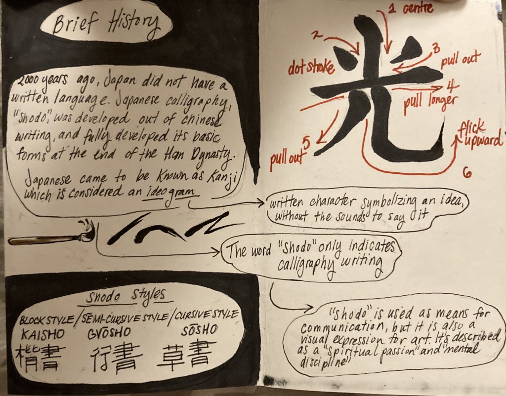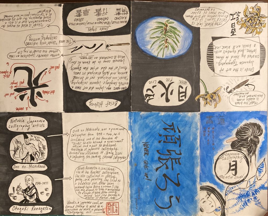
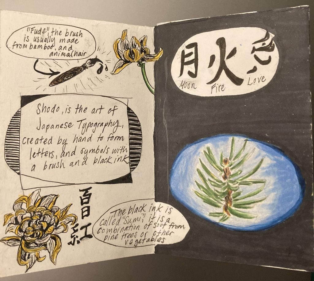

I had a fantastic time creating this typography zine for Japanese Calligraphy, known as “Shodo”. The project gave me the opportunity to utilize my creativity alongside some design principles, which helped showcase cohesive and clear-cut information. To make the zine more organized I used the principles of “contrast” and “balance” by using black and white pages. I used mixed mediums during the process such as gouache paint for the front cover, Prismacolor pencils, and felt liners for the text. I enjoyed making this zine because it was very hands-on, which I prefer over doing technical assignments. It also allowed me to illustrate ideas and convey topics that were not discussed in depth during typography lectures. One of my favorite parts was creating the front cover which I referenced from an Ukiyo-e print called “Beauty in front of Mirror” by Kitagawa Utamaro. For my rendition, I used bold blue gouache color to alter the flat colors that are often used in these prints. Overall I think I put my best into this assignment and used whatever mediums I could. I enjoyed every part of putting this together, and I would definitely do it again because I am satisfied with how everything turned out.