Realism, Pre-impression, Pre-raphaelites and impressionism, and Post-Impressionism

Edward Robert Hughes

Edward Robert Hughes - Wikipedia
“Dealing with the Faeries”

Edward Robert Hughes is a British pre-raphaelite painter. He was born into a family associated with the pre-raphaelites brotherhood, his uncle, Arthur Hughes became acquainted with the founding members, John Everett Millais, Holman Hunt, and Dante Gabriel Rosetti however he was never an official member. Edward Robert Hughes would become a pre-raphaelite artist himself after being influenced by his uncle. After developing his style he became a studio assistant for one of the pre-raphaelite founding members, William Holman Hunt who was an elder at that time. Holman Hunt later succumbed to Glaucoma, that was when E.R Hughes made significant contributions to finalize this painting.

Edward Robert Hughes is known for his alluring paintings of mythological themes, that exhibit faerie, and other fantastical beings. He works predominately in watercolors, he also specializes in oil paintings as well.

The Light of the World (painting) - Wikipedia

The Light of the World by William Wolman Hunt

This is not an original painting of Edward Robert Hughes but it is significant because he is accredited to helping a pre-raphaelite founding member, William Wolman Hunt finish this piece due to his complications with glaucoma. It is a condition that can permanently damage vision loss. or blindness.
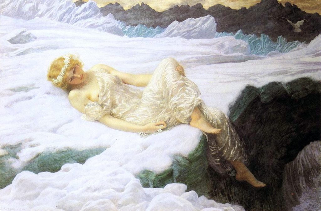
“Valkyrie’s Vigil”

“Valkyrie’s Vigil” is a beautifully rendered watercolor painting. Which is incredibly impressive. I personally find watercolors one of the most challenging mediums, because it is difficult to control the fluidity of water, and it is hard to correct any mistakes. It is also challenging to achieve a range of depth and shade compared to mediums like oil and acrylic. Looking at this painting I am astonished because this looks like an oil painting. The painting has a beautiful luminous translucent effect to it, which I think is hard to achieve with watercolors. When I see how smooth the fleshtones and the texture of the fabric look I am baffled. Because it’s hard to imagine how this was executed.
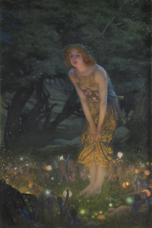
“Heart of snow”

“The Weary Moon”

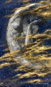
What I absolutely adore about Edward Hughes’s paintings is the ethereal essence that is captured with his soft and tender brushstrokes. However this painting of “The weary moon” stands out because is quite different from the rest of his stylized paintings. His paintings usually display figures at the forefront with expressions conveying soothing tranquility. Instead, this painting exhibits a sorrowful human figure. It is evident by the gesture of the palm which cups the face of disappointment, or someone trying to conceal their face. I am not sure why I would consider this piece one of my favorites compared to all the other paintings which have a much advanced, detailed, and realistic element to them. This painting is absent of fine renderings which are common in his works, but I like this stylistic approach of rough strokes which seems to encapsulate the emotion of this painting. Perhaps it is reflective of the person’s psyche.

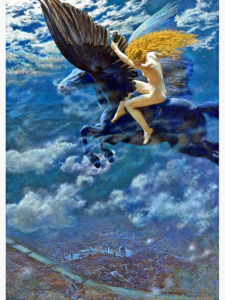
“Dream idyll a valkyrie” or “A Witch”

“Dream idyll a valkyrie” or ” A witch” is perhaps my favorite painting of Edward Hughes. Another aspect I appreciate from Edward Hughes is his secular ideas and themes for his paintings. He predominantly depicts many women in mythological, angelic, and ethereal forms. Although this painting portrays a witch perched on a pegasus. Witches are typically seen as vile or ungodly, yet she still looks like a divine celestial goddess. This painting also demonstrates great value for perspective, with an aerial view of the city down below. When I look at these paintings I get a sense of dream-like euphoria. This type of feeling gives me the desire to live in this sort of universe which is non-existent in our reality. I often get deja vu when I observe paintings, perhaps it triggers a subconscious memory from my dreams.

source:

https://en.wikipedia.org/wiki/Edward_Robert_Hughes

Image source:

https://www.tuttartpitturasculturapoesiamusica.com/2013/01/edward-robert-hughes.html

IDES 141: Typography Zine

Introduction: Page 1 and 2
Front Cover

I had a fantastic time creating this typography zine for Japanese Calligraphy, known as “Shodo”. The project gave me the opportunity to utilize my creativity alongside some design principles, which helped showcase cohesive and clear-cut information. To make the zine more organized I used the principles of “contrast” and “balance” by using black and white pages. I used mixed mediums during the process such as gouache paint for the front cover, Prismacolor pencils, and felt liners for the text. I enjoyed making this zine because it was very hands-on, which I prefer over doing technical assignments. It also allowed me to illustrate ideas and convey topics that were not discussed in depth during typography lectures. One of my favorite parts was creating the front cover which I referenced from an Ukiyo-e print called “Beauty in front of Mirror” by Kitagawa Utamaro. For my rendition, I used bold blue gouache color to alter the flat colors that are often used in these prints. Overall I think I put my best into this assignment and used whatever mediums I could. I enjoyed every part of putting this together, and I would definitely do it again because I am satisfied with how everything turned out.

Page 5 and 6
Brief History: Page 3 and 4
Layout

Survey 6 Dreams and Designers (1895-1905)

Jules Cheret: The man behind the OG Poster girls!

The Father of Modern Posters: Jules Cheret, pioneer of representing female freedom and revolutionizing modern design.

Fetes de Nice by Jules Cheret

Jules Cheret, is a French illustrator and graphic designer, of the 1800s, he was coined “The Father of Modern Posters”. His artworks influenced the predominant designs and advertisements for the 1900s. And is also considered one of the pioneers to change the portrayal of women. He was inspired by Rococo artists such as, Jean-Honore Fragonard, who often painted jovial women and themes of frivolity, and it is evident with many of the posters he designed. He created posters often representing women with full of energy and livelihood.

Both these ladies in pink dresses have a striking resemblance but are very unique in their own style. Fragonard’s painting of “The Swing” has very soft and tender brushstrokes. The woman could be seen as dainty or delicate. Whereas Jules Cheret’s woman on the left looks wild and free, having fun with herself. By the looks of her exposed chest and legs indicates that it is more provocative, but she unashamed and celebrates anyways.

“The Swing” by Jean-Honore Fragonard (Rococo Artist)

“Olympia” by Jules Cheret

Jules Cheret’s posters inspired the culture for female freedom and empowerment:

Jules Cheret impacted the culture of Female Freedoms. His designs usually displayed bold and beautiful women full of life surrounded with vibrant, dramatic colors. These posters were known to be a catalyst for female emancipation. Meaning that women were free from social limitations and traditions. Jules Cheret was able to capture a woman breaking the social norms of the 1800s. Because it was unaccustomed seeing a woman so free-living and confident in her own body. 

“Moulin Rouge” by Jules Cheret

Right Side :”Moulin Rouge” by Jules Cheret

He Was A man of emotions!

Jules Cheret would always convey the emotions rather than the product of his Poster designs:

“Follies Bergere” by Jules Cheret

Cheret’s Design also played a pivotal role in changing the concepts of advertisement. His advertisement designs were aimed to capture the emotion and energy of the individual rather than the functionality product. This was crucial in elevating advertisements to an art form. Cheret was a prolific poster designer, by the end of his career he produced over 1000 posters. In 1890 he was awarded by the French government for his outstanding graphic designs. He was hired to advertise various objects from hats, bicycles, soaps, lamp oil, cough drops, events etc.

“Pippermint” by Jules Cheret 1900

He was able to convey simple objects by enhancing them with a new personality with his techniques of vivid rich colors, typography, and composition. And most often an expressive woman was at the forefront or center to entertain the advertisement. Cheret’s methods were innovative in the advertisement world, inspiring a whole new generation of designers, and poster makers. It played a predominant role in the effects of selling a product, which spanned from the 1900s to what remains in modern-day advertisements.

He’s also an OG Graphic Designer

He pioneered poster design, and inspired many designers of the following century. However his distinctive style can be seen as free-flowing and experimental, which is probably because he mostly conveyed emotions in his advertisements, rather than having objective delivery. And it seemed like there were no strict rules for visual communication and design during that time.Reynold Brown’s poster from 1958 conveys the same subject, which is more compositional, and the text is aligned, by that time design became more developed for the viewer’s eye. But his work is most likely accredited to Jules Cheret’s work.

“Exposition Universille” by Jules Cheret
“Attack of the 50 ft woman” 1958 by Reynold Brown

Sources:

https://www.pbs.org/wgbh/roadshow/stories/articles/2005/1/3/jules-cheret-elevating-ads-art-form/

https://www.thevintagenews.com/2017/03/04/jules-cheret-the-father-of-poster-art-and-the-father-of-womens-liberation/

Photo Sources:

https://www.moma.org/collection/works/5615

https://www.pbs.org/wgbh/roadshow/stories/articles/2005/1/3/jules-cheret-elevating-ads-art-form/

https://www.thevintagenews.com/2017/03/04/jules-cheret-the-father-of-poster-art-and-the-father-of-womens-liberation/

Survey 4: Steam and the Speed of light (1750-1850)

The influence of Ukiyo-e prints on European Design and Objects:

Bijin-ga, meaning “beautiful person picture,” was a dominant genre of ukiyo-e prints.

Ukiyo-e prints!

What are ukiyo-e prints to begin with? Ukiyo-e prints are Japanese paintings or woodblocks that often depicted the Edo period of Japan from which spanned from the 1600s to the 1800s. Common themes and symbols that were exhibited were, nature, spirituality, mythology, love, and sex. The word “Ukiyo” is translated to “ pictures of the floating world”, this term is used from Buddhist philosophy. In a Japanese sense “floating” meant fleeting or transient, that all things are impermanent. The style is described to emphasize shapes, use dark outlines, flat areas of balanced color. It was different from European art because of its absence of dramatic lighting and harsh contrasts. This style of painting often used in Renaissance art is known as “Chiaroscuro”. 

Caravaggio – The Taking of Christ, 1602 is an example of “Chiaroscuro” painting that uses dramatic lighting and harsh contrasts. During this time Japanese people were making art much more differently, with flat colors, and bold lines.

What makes Ukiyo-e prints so unique?

The Ground Spider, 1887 by Kunichika (1835 - 1900) | Japanese woodblock  printing, Traditional japanese art, Japanese prints
Kunichika- The Ground Spider

The unique characteristics of Ukiyo-e prints include the strong outlines, exaggerated foreshortening, and asymmetrical designs.

Japanese Design that broke barriers for European artists:

Ukiyo-e prints were introduced to the western world, at the end of the Edo period, which was a time when Japan was isolated and closed off to the rest of the world. When dutch traders discovered these prints it brought exposure to Europe. Ukiyo-e became a fascination with Europe and influenced many artists during that time. This massive appeal from the western world coined the term “Japonisme” which refers to the influence of Japanese art on European art and design. “Japonisme” was especially prevalent during the impressionism, and post-impressionism period, it inspired new methods of painting and printmaking. European art was shifting and Impressionism was taking over. The concepts of open compositions and ordinary subject matters and scenes of everyday life were impacted western art. Artists such as Edouard Manet and Marry Cassat admired and emulated the style of Japanese art.

1890-91
Maternal Caress
Artist: Mary Cassat

“Japonisme” left an imprint on Mary Cassat’s art. She created dozens of simplistic paintings that reflected everyday life. She borrowed some of the methods by using flat colors, broad lines, and cropping. What I noticed from this style is that it feels more intimate personal and relaxing.

Mary Cassatt: an Intimate Japonisme | Micheline's Blog
The Coiffure Study

Edouard Manet grew an affinity for ukiyo-e prints. In his portrait of Emile Zola it is evident he was a great admirer of Japanese art.

On the left of this painting depicts a landscape screenprint with a bird perched on a branch. On the right side depicts what looks like a Japanese shogun. In this painting, elements of ‘flattening’ and ‘simplifying’ shapes demonstrate the styles used in Ukiyo-e prints.

Manet- Portrait of Emile Zola


Objects (as prounounced in Japanese, オブジェクトObujekuto”!) that were influenced by Ukiyo-e prints:

After ending a long period of seclusion, Japan began reopening its import and export trades. This included Japanese artifacts, paintings, and printing techniques. Ukiyo-e prints were the most popular amongst them all. It was intriguing for Europeans to see something so foreign. This exposure resulted in so much popularity with the Japanese culture, objects like furniture were being manufactured for people’s homes. Japanese art and artifacts began to make an appearance in the antique shops of Paris and London.

Here is an example of how Japanese culture and Ukiyo-e prints inspired this French Cabinet.

Commode (commode à vantaux) with Japanese and French lacquer panels; circa 1790
File:Appert Frères - Carp Vase - Walters 47384 - Profile.jpg
Appert Frères – Carp Vase 1878

In 1867, Japan featured its first formal exhibition for arts and crafts at The Exposition Universelle. The exhibition triggered a wide audience interested in the culture of “Japonisme”. This marked the beginning of all things Japanese becoming fashionable and respected. This definitely inspired European artists to use Japanese elements and symbolism for a more stylistic approach.

The French Exposition Universelle of 1867

Paris 1867 Exposition: History, Images, Interpretation — Ideas

And so it turns out the world was already obsessed with Japanese culture for a longgg time. Basically, the term ‘Japonisme’ is a formal and old-fashioned way to describe a non-japanese person who has an affinity for Japanese culture. Which is equivalent to the modern word we use in pop-culture today known as a “weeb”. I just found that amusing and engaging as an approach to writing this blog post.

And that’s all for Survey 4 blogpost!

Image sources:

https://www.theartstory.org/definition/chiaroscuro-tenebrism-sfumato/artworks/

https://ukiyo-e.org/image/jaodb/Chikanobu_Yoshu-No_Series-The_first_three_Shoguns_of_Tokugawa_Dynasty-00039243-060503-F12

https://www.pinterest.ca/pin/488781365787426194/?nic_v2=1a6bW2lTu

Sources:

https://www.theartstory.org/movement/ukiyo-e-japanese-woodblock-prints/

https://www.theartstory.org/movement/japonism/artworks/

https://en.wikipedia.org/wiki/Japonisme

Sigmund Freud’s “Interpretation of Dreams” moodboard

https://michellechau888758.invisionapp.com/board/Sigmund-Freud-ckg4g8i9v04rh12vkkb9sqi4t

I was chosen for survey 6, and the event I decided to go for was the publication of “The Interpretation of Dreams” by Sigmund Freud. I was excited about this topic because I learned a bit about him in a psychology course, being the founding father of psychotherapy. But I never really delved into his detailed life. I find it interesting how events can be impactful towards so many avenues. I focused on Design, Culture, and Architecture.  I felt very optimistic about this project however I found it very challenging with the technical difficulties and having to troubleshoot the website.

Survey 3: Block books and Baroque

How the legacy of a Rhinoceros woodcut lives on, Fascinating artists for centuries.

Who is this guy? Kinda resembles Jesus, right?

Albrecht Dürer — Wikipédia
Self-portrait of Albrecht Durer at the age of 28. This one stands out because he is described as a christ-like figure.

This wonderful man is known as Albrecht Durer, a German Renaissance artist born in 1471, and he is portrayed here in a self-portrait. He was asked by an unknown artist to draw his interpretation of a rhinoceros. Without any concrete references but only a brief description and sketch, he was able to execute it quite accurately. However he added intricate metal sheets of armor, despite its flaws, it was still freakishly similar to the Indian rhinoceros. This sketch was later turned into an engraved woodcut.

Woah, you could say the resemblance is quite uncanny. However, Durer’s version looks very mythological rather than realistic.

The Rhinoceros, 1515

What you see here is actually a woodblock print from the interpreted drawing. As detailed and meticulous as the drawing is, imagine carving this on wood to create a print. That is incredible.

The image of the rhinoceros was later carved onto a woodblock and then printed.

The Dürer engraving gained massive success, this Rhino sketch spread throughout Europe. Approximately 5,000 original prints were sold during his life. Amazingly this image became an influential emblem throughout eras, to be represented in architecture, design, typography, culture, objects, and fashion.

How does a Rhinocerous print impact design, typography, science, tools, fashion, architecture?

Architecture:

The Dürer Rhinoceros is also beautiful engraved in the door of the Cathedral of Pisa, on the bottom left corner. If you look closely you can tell the rhino stays true to its original design by the rays running down the belly.

The Dürer Rhinoceros is also beautiful engraved in the door of the Cathedral of Pisa, on the bottom left corner. If you look closely you can tell the rhino stays true to its original design by the rays running down the belly.

The original rhino interpretation carved into a jade green door.

Science and tools:

Arms of the Society of Apothecaries logo, originally designed by William Camden in 1617. Used by permission of the Wellcome Library, London

A rendition of the rhinoceros is also represented in science and tools in this medicinal logo. This is the Arms of the Society of Apothecaries, as you can see the rhino is at the top. This is originally designed by William Camden but it was inspired by and indebted to Durer.

Objects and Design:

This iconic image also inspired an iconic artist by the name of Salvador Dali who became fascinated with the rhinoceros.

“The rhinoceros is the only animal that carries an incredible amount of cosmic knowledge within its armor ”.

Salvador Dalí

Fast-forwarding over 400 years later, from 1515 when Durer first sketched the rhinoceros, it became immortalized and still remained relevant. Salvador Dali had an affinity towards this animal, it began in his childhood home where there was a “Rhinoceros”  woodcut xylograph, designed by Albrecht Durer.

Look at these different versions of the “rhino sculptures” created by Dali! If you observe closely again The intricate details of the rhino stay true to its original design. My personal Favourite is “Cosmic Rhinoceros”, it is very distinctive to his style of surrealism, it looks like the creature morphed into a fantasy creature!

ipernity: Rhinocéros de Dalí à Puerto Banús. - by Demetrius Chryssikos
Salvador Dali’s Rhinoceros Statue, Puerto Banus, Costa del Sol, Malaga Province, Andalucia, Spain

“Rhinoceros dressed in Laces” or “Rhinoceros Habille en Dentelles” 1954

amare-habeo | Dali art, Dali artwork, Salvador dali

“Cosmic Rhinoceros” 1956

“Celestial Ride”

Now you can tell his obsession to the Rhino is real.

Fashion:

Even Fashion designers as too? Well, Valentino is a fan! 500 years later this rhino still impacts and fascinates artists, architects, and fashion designers. This beautiful embroidered lace dress inspired by Durer was taken in 2013. A true testament to the iconic rhino spanning throughout centuries. Who would have thought? I wonder what his reaction would be, if he were alive to see this.

Valentino Haute Couture Week. Image Tatler, Russia.
Isn’t it astonishing an experimental woodcut image from 1515 can make a dress look absolutely stylish and stunning?
Image Tatler Russia.
What I find mesmerizing is that most people would just see a model in a stunning dress, even though the focal point of the dress would be obscured. Which is Durer’s original work of the rhinoceros. I wonder if Albrecht Durer were alive if he would be baffled or amazed by how far the wood print has come.

Link sources:

https://www.carredartistes.com/en/blog/the-history-of-the-durer-rhinoceros-n109

http://www.rhinoresourcecenter.com/pdf_files/129/1290852117.pdf

https://www.thedaliuniverse.com/en/news-dalis-fascination-the-rhinoceros

Image sources:

Cathedral of Pisa

https://www.airdolomiti.eu/destinations/pisa/what-to-see/pisa-cathedral-baptistery

Rhino

https://en.wikipedia.org/wiki/D%C3%BCrer%27s_Rhinoceros

https://wellcomecollection.org/works/a9bc353w

https://www.thedaliuniverse.com/en/news-dalis-fascination-the-rhinoceros

https://www.pinterest.ca/pin/194710383863523514/?nic_v2=1a6bW2lTu

https://www.pinterest.ch/pin/552816923001075249/

New Rococo, Neo-classism, and Romanticism.

Antonio Corradini

A master of carving texture:

Antonio Corradini was an Italian Rococo sculptor, born in Venice. He was famous for his illusory textured veiled marbled carvings on women. His carvings are so detailed and intricate realistic that the veils can be portrayed as if they are translucent.

Veiled Truth”, completed in 1750

Truth with Antonio Corradini

I remembering seeing an image of this sculptor somewhere on the internet. And I was astonished at how beautiful and realistic it looked. What captivates me is how subtle protruded carved lines can make the texture look so realistic. What I find very alluring about “veiled truth” is the mystique of the woman’s expression. She can be portrayed as solemn, sensual, or feeling worn out. Sometimes I like to think I am living vicariously through renaissance paintings and sculptors, with their expressions. I feel like it helps me correspond to art.

Phi Stars: Antonio Corradini Venetian Rococo Sculptor 1668 - 1752 Review
“The Veiled Christ”

What I admire about Antonio Corradini’s art is not only his impressive craftsmanship of signature veils but that most of the subjects were females. I find it more evocative, It makes me wonder if he felt a deep sense of connection to women, because he seldom sculpted men. What I find most captivating about his sculptures is the mystique and unknown. Especially in this piece, the women with closed eyes can be depicted as both peaceful yet sorrowful. It looks as though she can be in a deep slumber, or as someone who is passed away.

Antonio Corradini | Art Auction Results
“La Purita”

It looks like a real delicate and tender fabric or linen. But it is so deceiving because this is stone-hard marble.

I adore this piece because of the fine rendering of lines on the veil which looks more delicate and complex compared to the previous carvings. What I also find very fascinating is how these statues are seemingly expressionless however they simultaneously convey a lot of emotion. It demonstrates how subtle and powerful these statues can be.

Rococo,cute girl,adorable
“la pudicizia”

In this statue, the female is looking to her left in an averted gaze. To me, it looks like she is in disbelief or disapproval. She seems to carry more expression and looks more lively in comparison to the previous image. I believe it is because of the twist of her neck and her head tilted onwards to the right.

Antonio Corradini is one of those artists I have just recently discovered, and I have instantly fallen in love with it.

Antonio Corradini's Veiled Women - Lioness Womens Club
“Rafaelle Monti, sisters of mercy”

There seems to be a change of moods from the statues when there are multiple rather than one. There is a sense of intimidation and there is something slightly menacing with their expressions. Maybe because of the proximity and identical faces there is a compelling powerful sense of unity. Which has an interesting eeriness to it. However, his work is incredible and it would be a huge privilege to see one of these masterpieces in real life one day.

Sebastiano Del Piombo

Sebastiano Del Piombo was a High Renaissance painter born in Venice. He was never considered a productive or disciplined painter, and he often avoided the technique of fresco. His works were predominately portraits and religious subjects. He worked alongside notable artists like  Raphael and was acquainted with Michaelangelo. Oil was his medium of painting.

Salome with the Head of John the Baptist or The Daughter of Herodias is a circa 1510 oil on panel painting

This painting conveys a woman holding the head of John the baptist. I find this compelling because of the dominating and unbothered expression of someone holding a decapitated head. I love the realistic rolled-up blue and white silk sleeves. It is a great reference to study his painting technique for textures. I would use this painting as a guide to practice and emulate his methods for smooth and illuminated textures.

Madonna with the Veil

Date: 1525

There’s something very calming and serene about this painting. The muted colors co-ordinate with soft expressions and transparent cloth. It’s pleasing to the eye, especially seeing the baby in slumber.

Pietà

Date: 1517

This painting is both sorrowful and hopeful. An interesting contrast which seems to represent these moods through colors. It appears the focal point is Mother Mary because the light is shining on her. The theme of Hope seems to dominate this painting.

Death of Adonis

This is mythological painting has a very interesting composition. The rule of thirds placement is unexpected. The subject and title suggest the dead body of Adonis to prevail in the painting, but he is rather in the distant background. However, the reactions and expression of the people in the foreground are more enticing.

Tod des Adonis

Date: 1505

This painting seems to be off the grid from his religious and mythological paintings. That’s why it seems unusual hence the painting technique which looks quite stippled.

Survey 1: Handprints and Handwriting (40,000 BCE-O CE)

Mesopotamian Cuneiform

To understand the world of Visual communication and how people perceive the world in what they see is to also go back in time to understand the earliest origins of writings. Writing is universal and it is interesting to see what kinds of methods were used in different cultures. One of the earliest forms of writing derived from Mesopotamia 3500-3000 BCE, and most of us have learned about it at some point in our lives. This system of writing was created by the Sumerians and it was called “cuneiform” also known as “cuneus”, because of its wedge-shaped style. Their method of writing was demonstrated using “pictographs” that were used to represent a word or an idea, it was later advanced to phonograms. Which are more decipherable because the writing resembled sounds, closer to what we understand as a word. Since paper did not exist yet, instead the medium for writing was used with clay blocks and a stylus which would be imprinted as various triangle forms.

Shown below is how Pictographs were understood and developed over time.

.

image source: https://www.theshorterword.com/cuneiform

Interesting Fact: Cuneiform is not considered a language. It also doesn’t contain any letters nor does it have an alphabet. Instead, images were used to convey syllables.

image source: https://www.ancient.eu/cuneiform/

Egyptian Hieroglyphs

Moving on to Hieroglyphics, which were developed shortly before 3100 BCE. It’s similar to cuneiform as there were no actual words but only pictographs and phonograms to represent the sounds. 

Image source:https://www.britannica.com/topic/hieroglyph
Image source:https://en.wikipedia.org/wiki/Lists_of_Egyptian_hieroglyphs

Interesting Fact: Most Egyptians could not read or write, only priests and scribes were literate.

As you can see the images are more distinguishable because they are represented in a more pictorial way. It looks like a more evolved version of cuneiform however, this ancient script is very difficult to understand. The writing actually began as “pictograms”, so as a matter of fact, the images depicted the objects shown. Later on, the images pertained to not only the appearance but the sounds of the word. This new form of writing would be known as “ideograms”. While Egyptians and Sumerians had similar methods of writing in visual communication by representing symbols through illustration, What was the major difference? Hieroglyphs only represented consonants whereas cuneiform represented all of the syllables which also included vowels. Although cuneiform began to evolve into more abstract shapes that were not as recognizable as the images from hieroglyphs, it was easier to distinguish. As pictographs are more discernable than ideograms.

Here is a modern-day pictograph that uses symbols to convey statistical research data. The visuals are straightforward and it communicates effectively for viewers to understand this statistic.

How to Use Visme's New Pictograph Maker to Visualize Statistics

image source:https://visme.co/blog/pictograph-maker/

link sources:

https://www.historyextra.com/period/ancient-egypt/cuneiform-6-things-you-probably-didnt-know-about-the-worlds-oldest-writing-system/

https://www.ancient.eu/cuneiform/

https://www.pbs.org/wgbh/nova/pyramid/hieroglyph/hieroglyph4.html

https://www.historyofvisualcommunication.com/02-ideograms