I came out of this experience with a portfolio-ready piece that I am proud of thanks to Justin, Ariel and Jolanta from We The Collective! I enjoyed the last 2 weeks the most out of this entire process because, at this point, I just had to sit down and design the screens and continue to iterate on them after feedback. What I love most about this design process is getting to the point where it gets nitpicky because it means that the design is almost there. Next week, I will be giving a client presentation to them as if I were trying to sell my product to Playland themselves. When I was building my presentation for class, I struggled with trying to find a way to present all my screens, as they are all vertical and very long and could not fit on a 16:9 presentation slide. What I decided to do was move away from Google Slides and instead present through Figma. I would say it made for a seamless presentation as I did not have to switch windows in order to present my prototype. I would give my final project a 9/10.
Mentored Project: Phase 2 Ideation
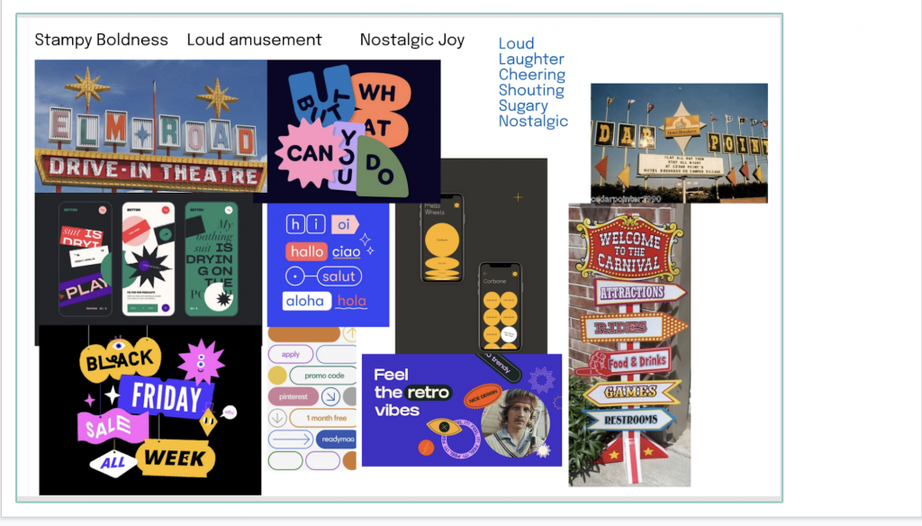
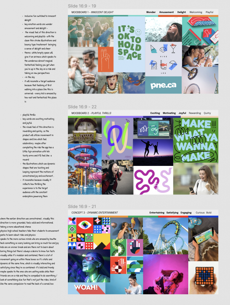
During this phase, I had many learnings. When it came to coming up with concepts, I learned that moodboarding for UX and digital products is different than moodboards for branding. Instead of choosing images and words that gave a strong visual direction for the product, I was told to instead aim towards utilizing images and descriptor words that described experiences, and how my user would feel after using the product. I found that piece of advice incredibly helpful as doing so helped me visualize how the app would turn out and how the tone and language of the elements like buttons and callouts would be like.
I also had difficulty presenting my work as phone screens are tall and unable to fit within a single Google slides page as my mentors did not use Figma. It felt super rewarding to get such thorough feedback and to get to see how my project develops under their guidance. Overall I’m having a great time and I’m excited to continue working on the next stages of this project. I would give myself a 9/10 for my performance for this phase.
Mentored Project: Phase 1 Brief & Research
For this phase, under the guidance of Justin (creative director), Ariel (UX design lead) and Jolanta (design manager), I completed my brief, set milestones and collected research to put them into a presentation. I learned that the creative process is both different and the same as I expected. At first, when I presented my findings, I was told that I had too much information, which was a relief, as I was afraid that I didn’t have enough! I was afraid of disappointing them, which is why I felt the need to put everything I found onto the slides. It was challenging to condense all that information into very few slides but it was way better than having nearly 20 slides of content. They told me how to properly format and present my research so that it could take listeners on a journey. It felt great to get input from industry professionals such as the We the Collective mentor team and it was rewarding getting to hear feedback on my hard work. I would give myself a 9 for this phase.
PERSONAL BRAND ASSIGNMENT/Phase 1.6 (Final brand presentation)
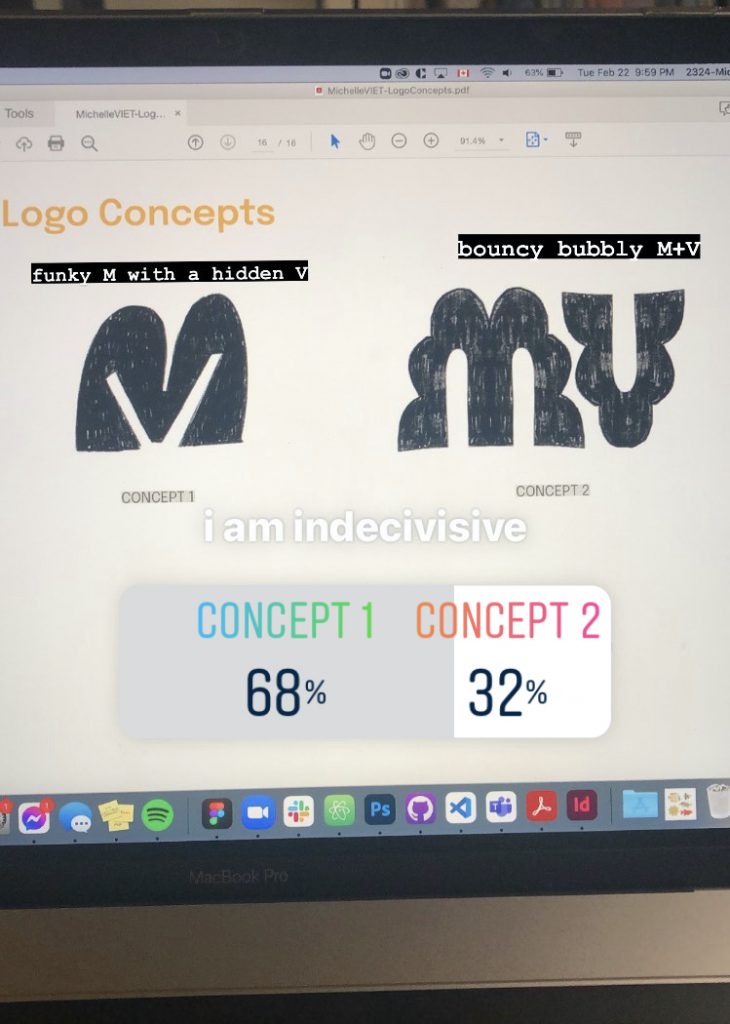
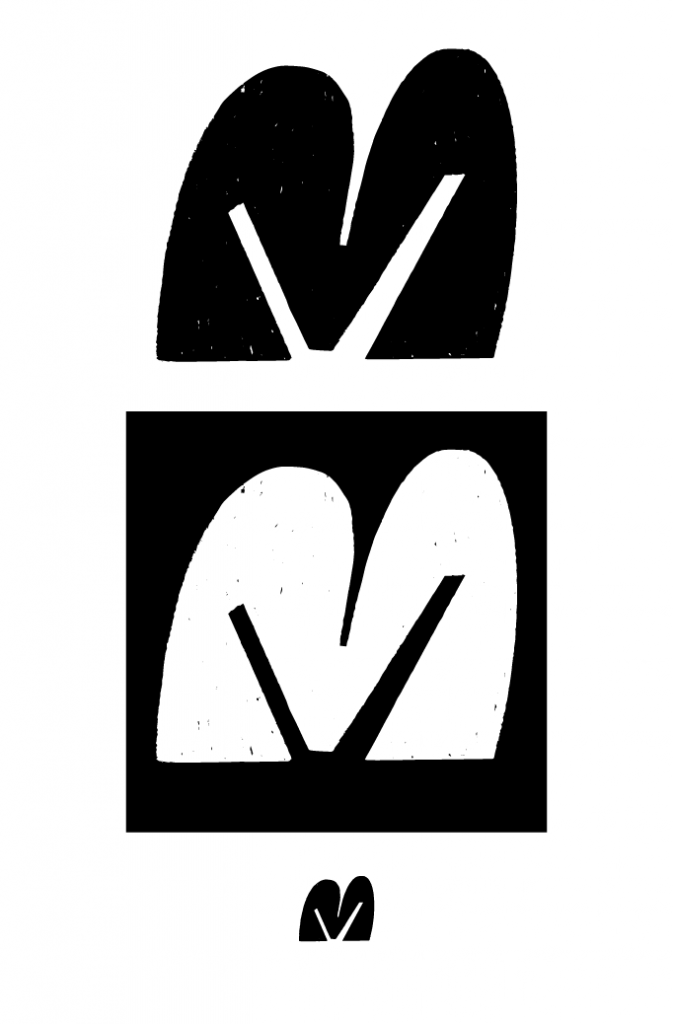
Of the three logo concepts I had, I chose the first concept.
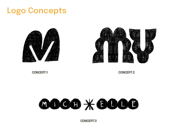
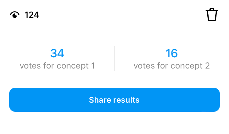
I initially had a lot of trouble deciding between concepts 1 and 2, and even put up a poll on Instagram to see which logo had the strongest first impression with my friends- non-design students, past IDEA alumni and peers from other IDEA cohorts voted and even gave some great ideas and feedback! Even after the votes favoured concept 1, I was still on the fence about it, as I liked how concept 2 looked on potential websites, but ultimately chose concept 1 because it truly fit my personal aesthetic.
I am very satisfied with my final logo and I don’t think I see myself changing it when I graduate. I would give myself a 9/10 overall. While I got stuck from time to time when it came to ideating, I was able to get myself out of those ruts pretty quickly because I was so excited for this project. Here’s the final logo!
PERSONAL BRAND ASSIGNMENT / Phase 1.3 (Mind Map and 200 sketches)
Reflect on the ideation process. What did it teach you about yourself? Include a grade out of 10 for your ideation.
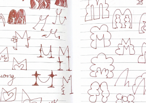
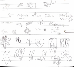
This sketching process has been super enlightening. For the past year and a half, I resigned myself to believing that I simply was not good at coming up with tons of ideas, but I realize now that it was all because I had restricted myself to working solely on my computer, which unconsciously made me edit my ideas before I even had all of them down. I know now that I should keep my ideating completely analog and on a sketchbook and only when I have an idea that I like after rounds of ideating, I can start redefining it on the computer.
This is the first time I filled up so many pages so quickly. I worked entirely in pen, so if there was something about a sketch I wanted to refine, I would completely redraw it with the new edits. I wished I could have taken a time-lapse of myself while doing this to see how the drawings just flowed right onto the page.
While I didn’t struggle very much with getting things on the page, I found that it was MUCH easier to come up with ideas for my peers. I would sometimes get stuck wondering if I’ve encompassed every single part of myself and my personality in this logo, but with my classmates, I obviously don’t know every single thing about them, just their general demeanour and interests, which made it much easier to come up with concepts just based on those. Overall I would grade myself 9/10 for my ideation process.
PERSONAL BRAND ASSIGNMENT / Phase 1.2 (Brief and Mood Boards)
Reflect on your mood board process. What did it teach you about yourself?
I LOVE finding images for mood boards. I find all my images from Pinterest, which is great because Pinterest automatically suggests similar images from the ones I choose, which is super helpful when I want to find more of the same kind. When I start mood boarding, I start with an idea in mind and start diving into general searches until I begin to get an idea of what exactly I want in an image. I am very specific and picky when it comes to choosing pictures because I want them to convey the exact mood I am going for. This used to be a very long and painstaking process, but after having created countless mood boards over the past few years, I know exactly what kind of keywords to type into the search for the perfect image to come up, which speeds up the process by a lot.
From this mood boarding assignment, I learned that I am predictable and know what I like. I found some images that I had saved a few years ago and found that I still resonate with those images. I am into graphic, bright, and bold designs but outside of work and design I really dive into my introvert tendencies and go for more still and calm images— and both give me a sense of joy.
I would give myself a 9 for my mood boards. I feel like they accurately describe my “vibe” as they say.
PERSONAL BRAND ASSIGNMENT / Phase 1 – Research and Analysis
How did you find this research and analysis process—excruciating, fun, etc.?
I enjoy doing the research before starting a project to get a solid foundation to work off of, but since this project was about ME, I felt indifferent and even a little frustrated. I don’t like talking about myself, so having to ask people to perceive me and as well as doing some self-reflection to analyze my desires and goals was a little weird. It wasn’t awful, but I did not like having to come up with the EXACT words that described me.. there are so many words in the world and I am only one person. I had trouble keeping a straight face while my peers listed out my strengths and weakness– I know everyone has an opinion of me, but it’s strange hearing them out loud. I felt a little shy and bewildered knowing that people notice how I work.
How long did it take you to complete this whole project, research, ideation and execution?
I think it took me about 7 hours in total to complete this project? I work slow, and I had some difficulty writing about myself.
What grade would you give yourself out of 10 and why?
I would give myself a 9. I feel like I was thorough in my research, planning and execution.
City Studio Project Solution
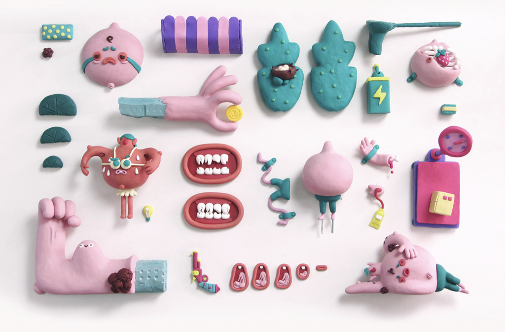
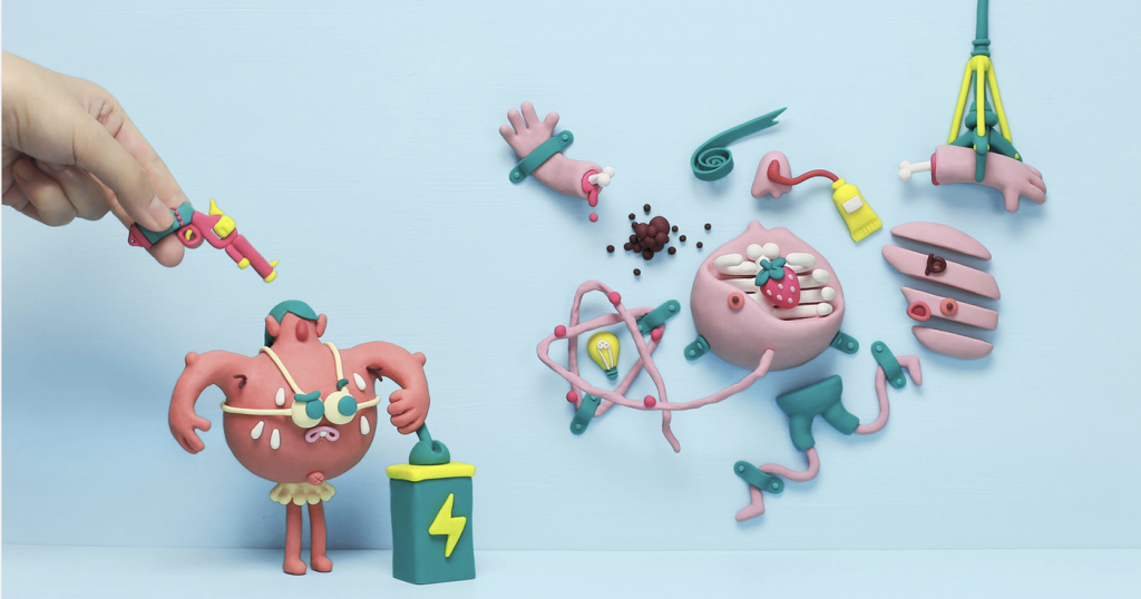
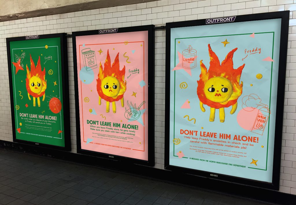
My group, MAKe Studio, consisting of Kat, Amanda and I were tasked to create a campaign for The North Vancouver Fire Department (NVFD). While the fire safety and prevention programs the NVFD has held for young elementary school students and seniors have always been a success, they have had trouble reaching students aged 16-25. A huge amount of fires are not seen from this demographic but when they do happen, the effects are devastating. The main causes of fires from this age group are kitchen accidents and fireworks. With students moving out to live on their own, they may not be used to proper kitchen safety procedures which may lead to fires. Our solution was to create a character that would resonate with these students and gain sympathy. We were inspired by the Knoll Sidekicks commercial and a character from Howl’s Moving Castle, Calcifer, a sentient flame.
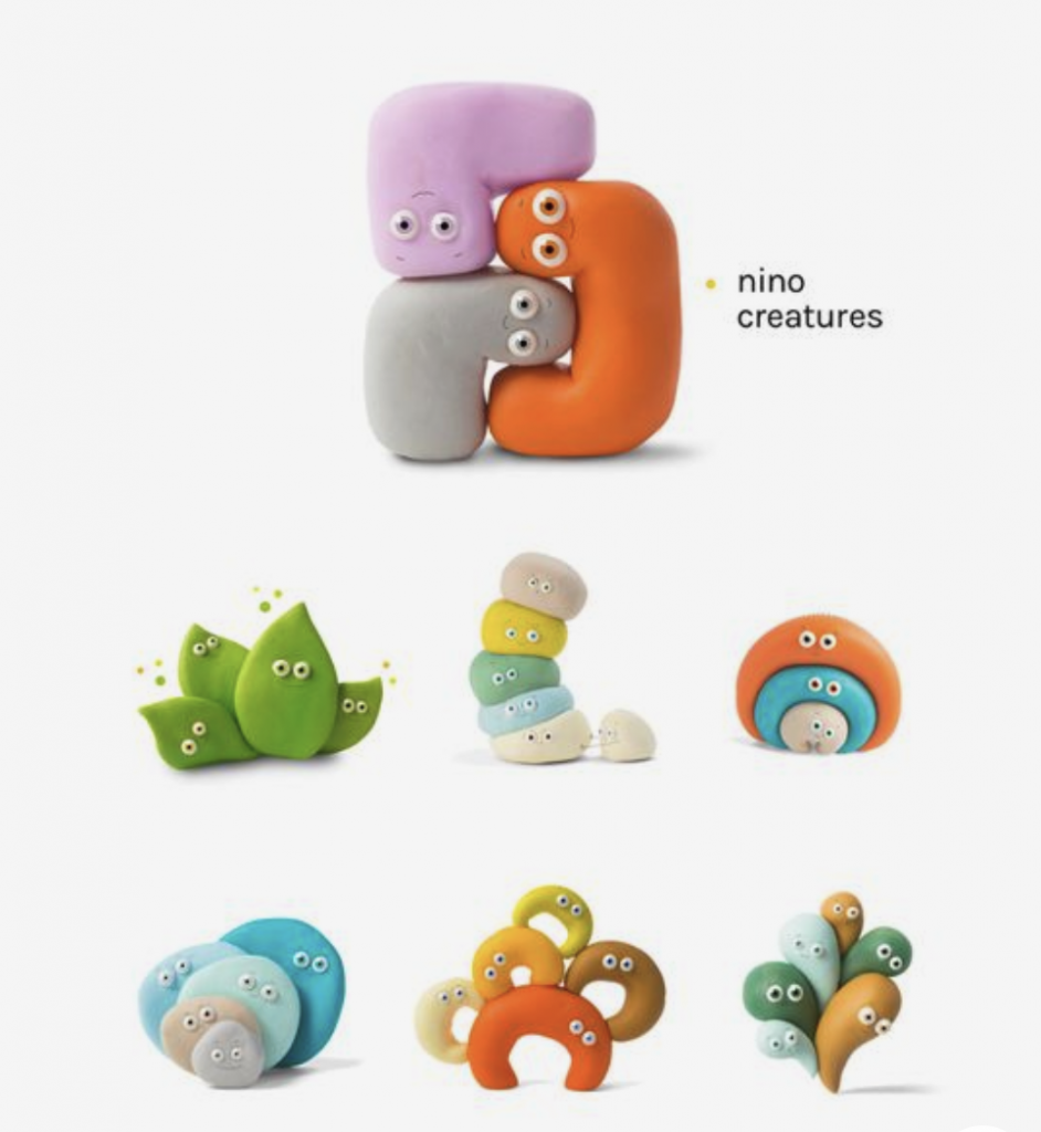
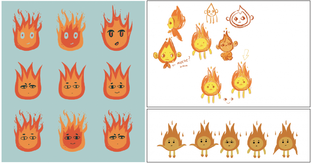
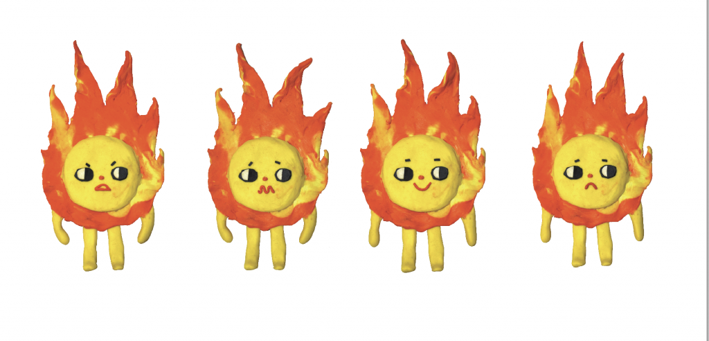
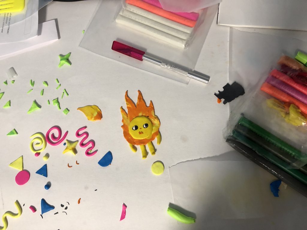
The three of us sketched out potential character designs and eventually settled on my design of our flame mascot, whom we decided to name Freddy. (The initial idea was to call him Feu-reddy, a play on words with the french word for fire [feu]). A popular art medium these days is clay, with artists using the medium in design to give it a contrasting, popped-out 3D look. Bold, bright, cute designs and illustrations are trendy nowadays. Combining those trends with having a cute mascot would be popular with this age group since they grew up watching cartoons, anime and reading comics.
We created posters, with the call to action being: “Don’t Leave Freddy Alone” lest he gets out of control. The wording on the poster imitates the way teenagers and young adults talk so that it is fun to read and is relatable for our demographic. These posters would be placed in areas frequented by students like public transit stops and libraries.
We also created animated posts for Instagram stories since it is one of the most popular social media apps for this target group. It is now more common to see health, safety, and other informational resources are being posted on Instagram these days since the format makes information digestible and is easily accessible since many already have the app.
We also created stickers of Freddy to be given out since they would be fun to collect while acting as a reminder when people see them.
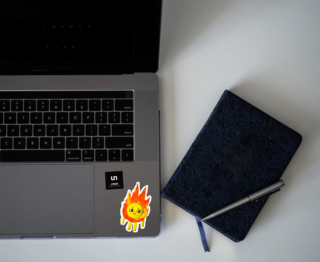
While the entire team worked collectively to put together our creative brief, the initial proposal presentation, sketches, mindmaps and ideate, I put together Freddy and additional design elements out of clay, created the final presentation slides and final PDF. I would give myself a 8/10 for what I did, as I’m quite proud of how Freddy turned out. Kat, Amanda and I worked really well together- we had great chemistry! We came up with great ideas and were able to communicate with each other with ease. I would rate our teamwork 10/10 and would DEFINITELY work with them again!
Reconciliation Project
My partner (Amanda) and I started this project with many ideas. We knew we wanted our target demographic to be students since we could relate to them the most and hoped we could resonate with them. We started a mindmap which led us to consider many possible topics that we could do.
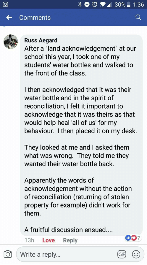
One of which was land acknowledgments. I remember seeing this Facebook post years ago and I have been thinking about it since, so I thought that it would be interesting to do a campaign inspired by it.
We pinned down a call to action that would fit our topic and chose #62. We felt that if we called for a more inclusive and non-colonized education about Indigenous people, their land and culture, more people would see why land acknowledgments don’t do much and instead put their energy into advocating for things like returning Indigenous land or giving compensation. Perhaps taxing non-Indigenous people and organizations who own Indigenous lands and putting that money back into Indigenous communities- there are many options to consider!
We chose to do a guerilla campaign as well as incorporating an interactive element. The general premise of our idea was to alter something to make it unusable and frustrate those who cannot use it to allude to how Indigenous people felt about the slow progress when it came to returning land or fulfilling the 94 Calls to Action.
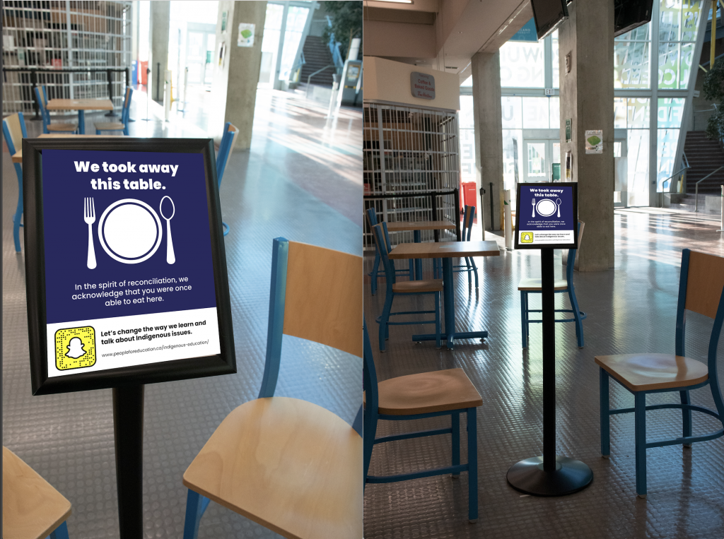
To do this, I made the signs that would have the message and call to action while Amanda went out to campus to take pictures of the signs on things around the school like vending machines and tables. She would then go home to edit out parts of the pictures. Due to lighting issues and other unforeseen circumstances, we had to photoshop the signs to make them more visible in the images, which took a while.
All three guerilla displays have a similar message, so I’ll talk about one. For the bench, we photoshopped the seat out. The bench plaque, which looks normal from far has a message that says it simply acknowledges the fact that this bench was once usable, but is simply not anymore, with no other statement on when it would be repaired or simply kept like that forever, which would prove to be inconvenient and even upsetting for people who used that bench previously. The call to action, which is below the plaque, mentions Indigenous issues, to which the reader might then realize that this display is an analogy for that.
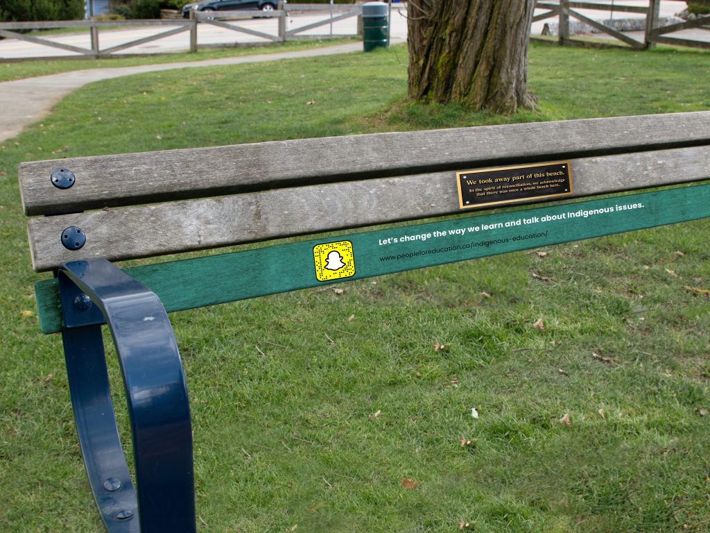
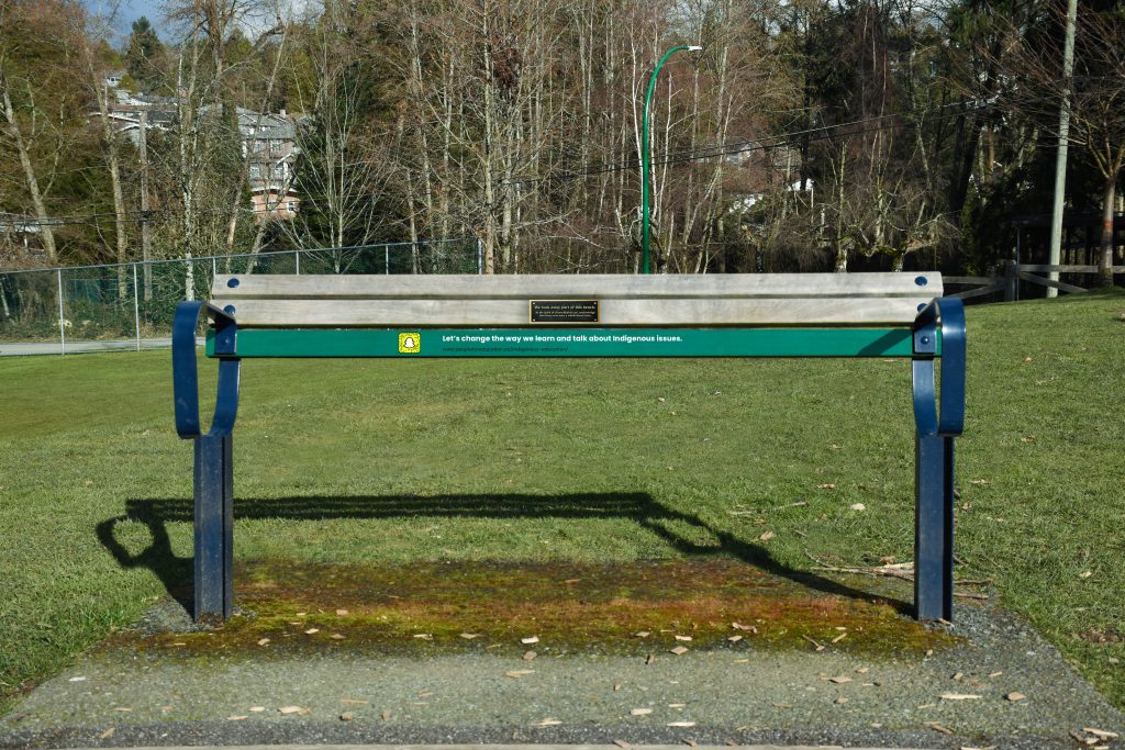
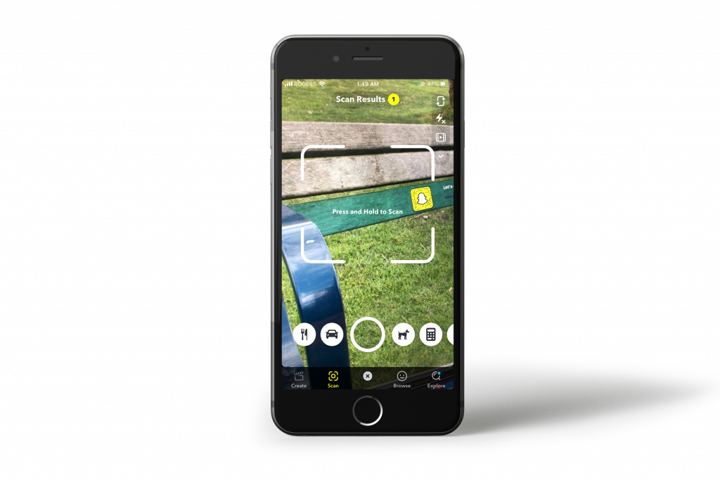
On the bench and the other guerilla ads, we included a Snapcode for people to scan using Snapchat. We discovered that our target demographic, students, likely already have Snapchat downloaded on their phones since it is one of the most used apps by students. Snapchat has a scanning function that we decided to utilize to give information in a quick and digestible way.
I am proud of what we have done. We had a clear idea and executed it to the best of our abilities. If we had more resources to do this campaign again we would find a way to control the environment we worked in so that we would not run into any lighting issues.
Education + Land Acknowledgements
For this project, I would like to highlight the usage of land acknowledgements and how it begins to seem like an empty gesture if no further discussions are being held about them. Since the report of the Truth and Reconciliation Commission had been released, more and more places started to adopt the practice of acknowledging the land they are gathered on, but many Indigenous people have felt that this has become more of a performative gesture that alleviates guilt. There are concerns that hearing such statements about the land they are on might simply become background noise and just another thing to check off on the list in the spirit of reconciliation. Saying them makes it feel like activism, but has no consequences from saying them. To some, land acknowledgements feel like a eulogy, recognizing that Indigenous people once lived on the land, until they didn’t, and now it’s “ours”, which makes them seem like a part of the past. Although land acknowledgements may seem like a good way to start a conversation about reconciliation, it simply isn’t enough anymore.
I would like to communicate this to students from K-12, as they have they are more willing to learn and in turn educate other people such as their peers and people in their household and beyond. Implementing new curriculums about Indigenous land and history in school will help bring their history into conversation or at least a deeper awareness and understanding with younger people. If schools are able to teach their students to care about the state of their planet in the wake of climate change, encourage them to go to climate rallies in the city, and show them ways to act sustainably, they certainly have the ability and means to be able to teach them to care and understand the history of Indigenous people and the land that they live on (since Aboriginal people have always lived in the interest of the well-being of the land long before talk of climate change came around).
I’ll be working with Amanda for this project.
PUBLISHED JANUARY 24, 2021 (11:18AM)
LINKS:
https://www.insidehighered.com/views/2020/01/09/why-land-acknowledgments-arent-worth-much-opinion
https://etfofnmi.ca/wp-content/uploads/2019/10/Going-Beyond-A-Land-Acknowledgement-FINAL-VERSION.pdf