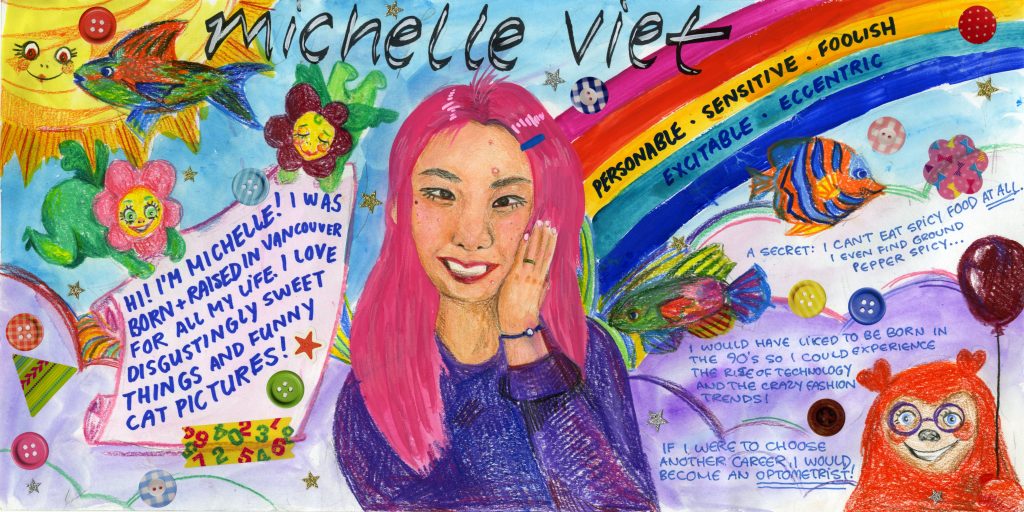
I wanted to have my yearbook spread reflect who I see myself as- strange but charming. To show this, I filled my page with every colour of the rainbow and added various things to make it feel busy and lively. The keywords I chose to put on my spread were: personable, sensitive, foolish, excitable and eccentric, which I feel describe me quite well. I used gouache and watered it down to paint the background, since I dislike colouring large areas with pencil crayons. I used pencil crayons to draw in the weird characters and fish, which I immensely enjoyed doing. These drawings gave off a kooky energy. I intentionally left some small white spaces while colouring to give the drawings a loose, messy feeling. Initially, I was going to print out a picture of myself but then I decided to challenge myself by drawing a self-portrait, using both gouache and pencil crayons. For the finishing touch, I stuck on colourful stickers to make the image feel less flat.
Overall, I would give myself a 8.5/10. I feel quite proud of this piece although there is definitely room for improvement. For one, I feel that my self-portrait does not completely look like me. Although I would like to see it look more realistic, I am still satisfied with how it turned out. I would also change the placement of the last two keywords on the rainbow as they are less visible on the green stripe compared to the yellow stripe. Lastly, I could have written the facts about me in bigger handwriting so that it would be easier to read for those who may have difficulty reading smaller text. Even though this project was not worth any marks, I had fun doing this activity!