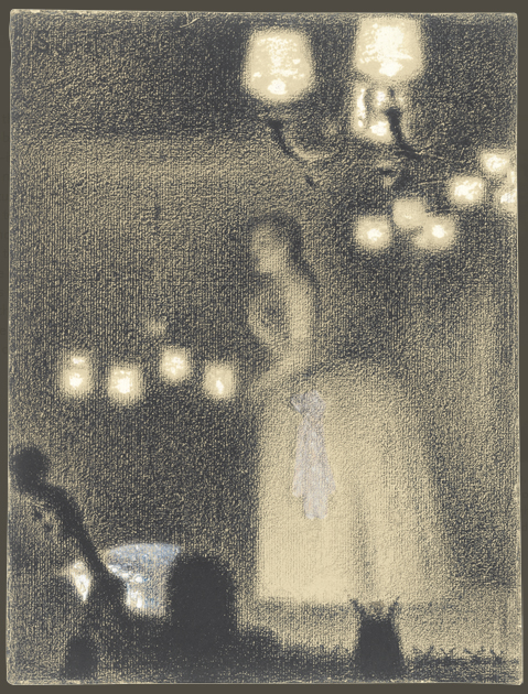
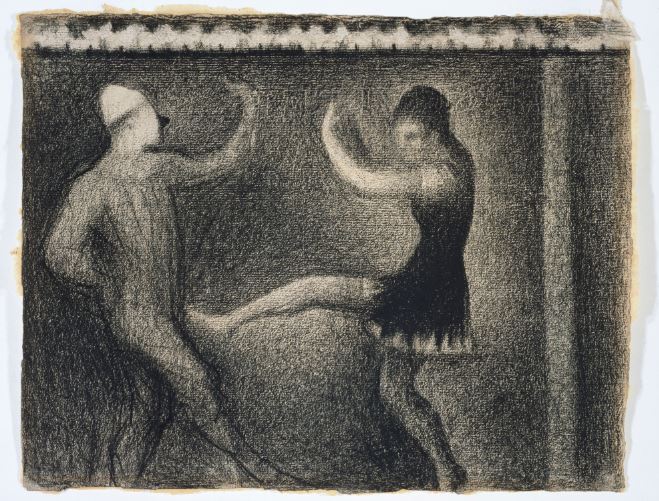
Georges Surat (1859-1891) was a French post-impressionistic artist that made great advances in the art world. From utilizing science in his art to founding a new art movement, he is nothing short of iconic.
Surat learned art the traditional way, studying at the École Municipale de Sculpture et Dessin and the École des Beaux-Arts before doing military service for a year. Upon returning he worked with conté and monochrome drawings before moving on to other things.
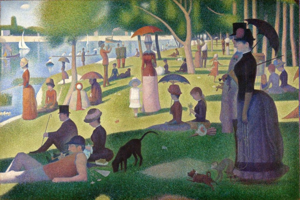
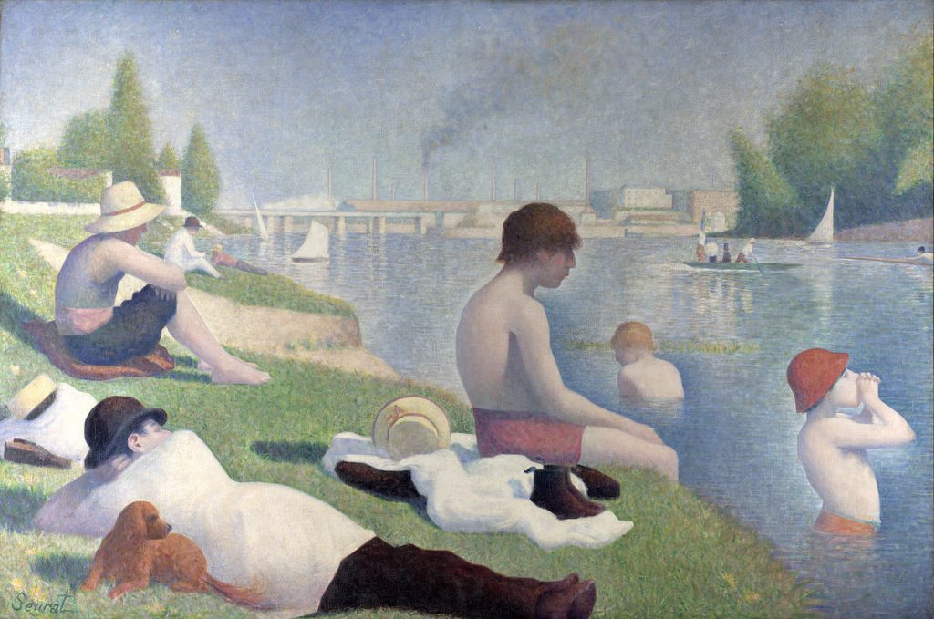
Surat was interested in the relationship between art and science, reading several texts of perception, colour, form and line. Inspired by Michel-Eugène Chevreul’s work in colour theory, he applied his learnings to his paintings. He would paint compositions entirely of pure coloured dots instead of mixing colours together. He stated that the eye would mix the coloured dots together and form a full image from far. This technique he developed was called divisionism, or pointillism.
Sunday Afternoon on the Island of la Grande Jatte by Georges Seurat
Bathing At Asnieres by Georges Seurat
I’ve encountered Surat’s works many times in the past, especially in elementary school where I would have to create works in pointillism for art projects. His paintings were always shown in examples, but his name was never mentioned, so I never connected a name to his works until now. Although Surat is famously known for his pointillism works, I discovered (through Wikipedia) that he has done many works in conté as well, which I personally like better. Something about them feels so.. contemporary?? I really like how soft they are and there are no harsh lines at all.
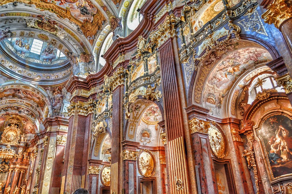
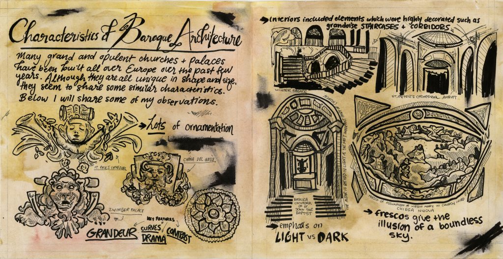
For this spread, I was to cover baroque architecture. The topic was broad as there were many different things that could be covered, so I decided to focus on the characteristics of baroque architecture since I found that the most interesting. I tried to make my spread look like a journal entry/sketchbook page of some European traveller observing baroque architecture. I painted the paper with watercolours to give it an aged effect and exclusively used black ink. I drew different parts of several baroque buildings throughout the spread which I think are most successful part of my spread. I used a black marker and smudged it to give it the effect of smudged ink that fell on the page so that it would feel more realistic. I would give myself an 8/10 for this assignment. If I were to do this again, I would rework the layout as the text size and fonts are not consistent. I think I focused too much on the drawings and therefore did not leave enough space for some of the text so I had to make up for it by compromising the size of them. I am also afraid that this ‘journal entry’ concept is not clear enough and will come off as too simple..? Overall though I am quite happy with my spread and am looking forward to do more.
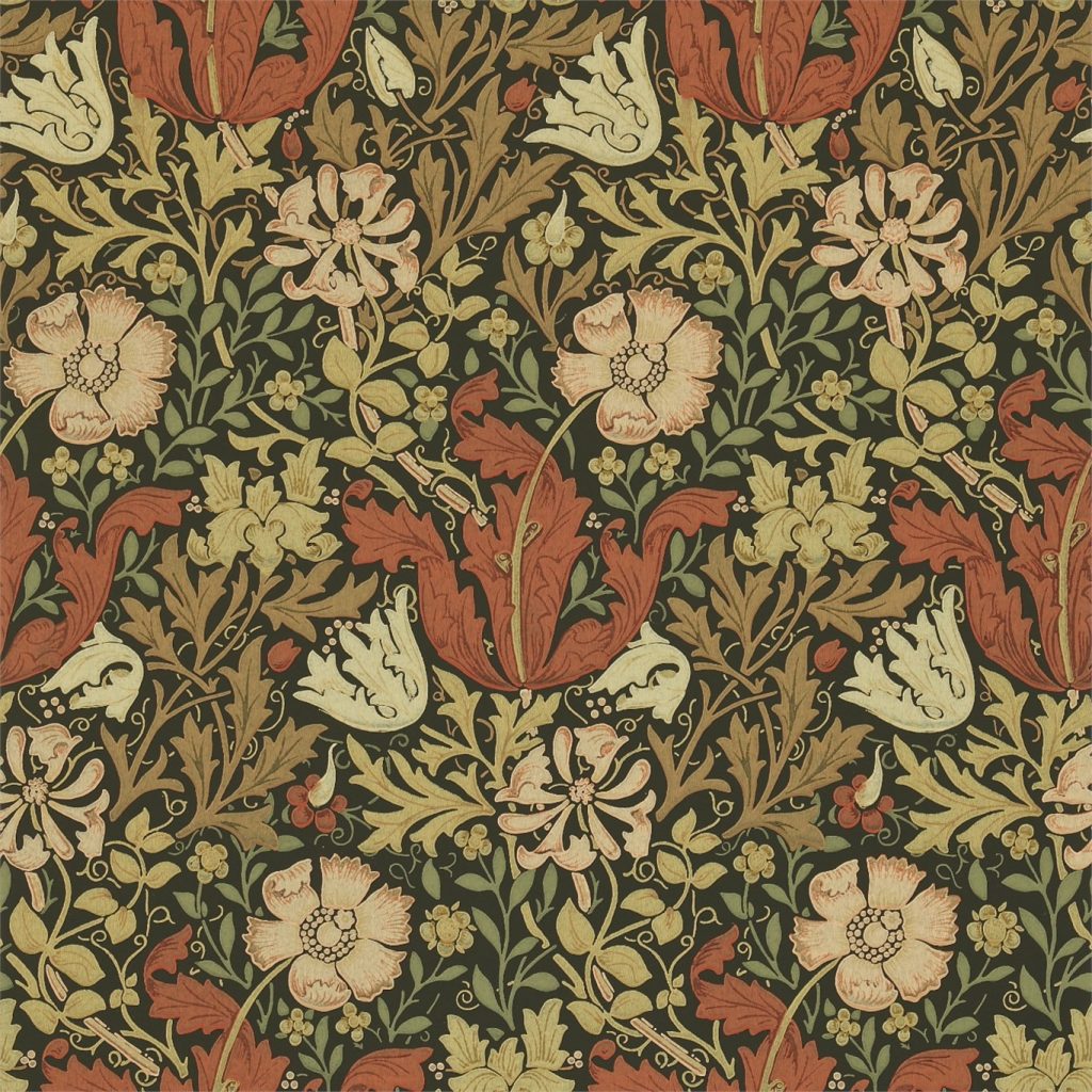
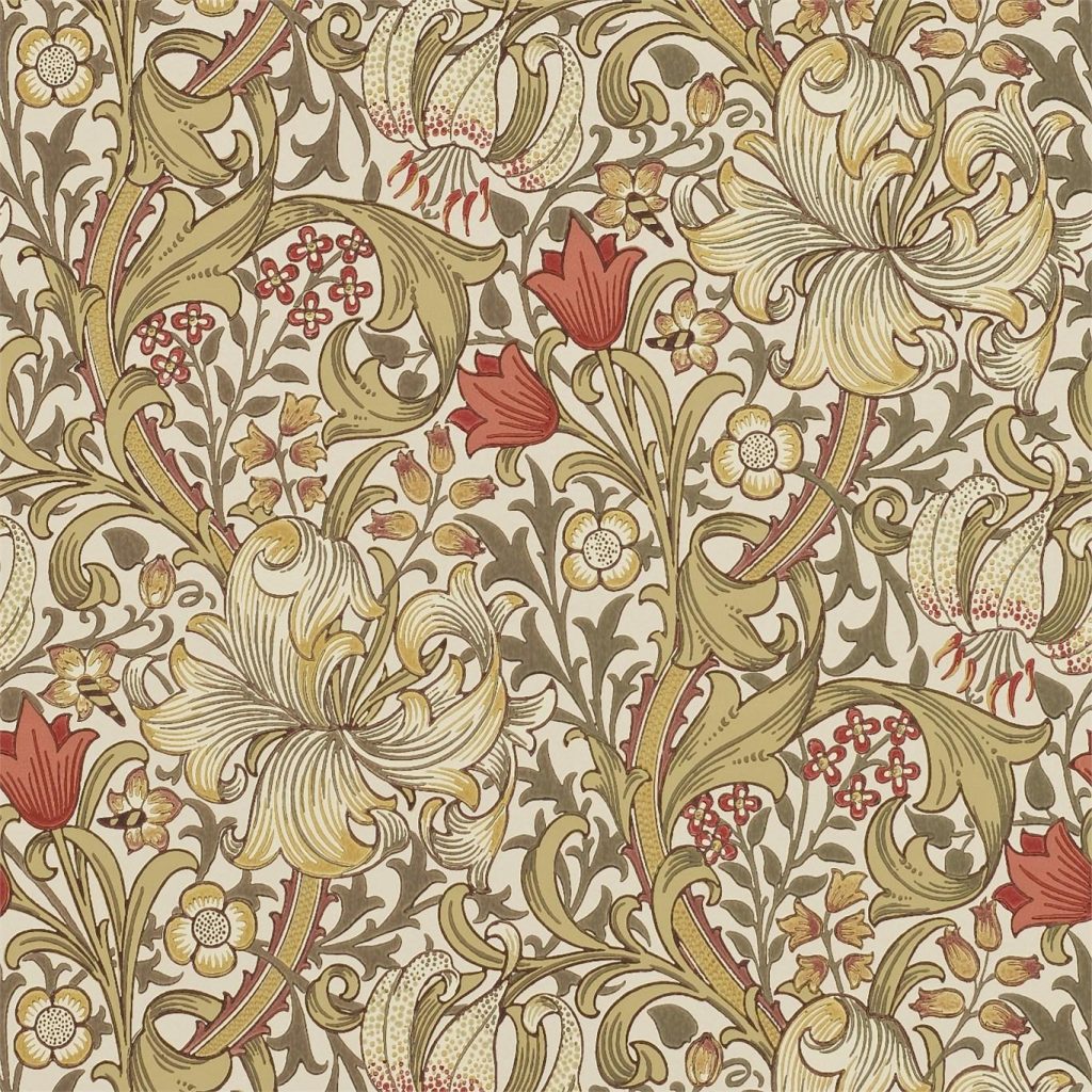
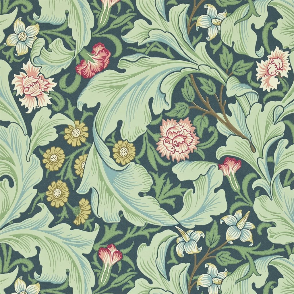
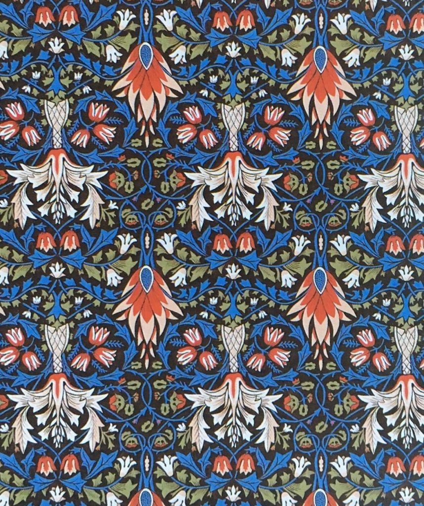
You Can Thank William Morris for Your Great-Great-Aunt’s Ugly Interior Home
As an enthusiast of handcrafted, traditional works of art and furniture, William Morris started a company of artisans that worked exclusively by hand. His company, Morris & Co. introduced the world to a whole new style of textiles and wallpaper and started a movement that brought back the demand for classic craftsmanship as well as an appreciation for the aesthetically pleasing patterns inspired by the past.
The wallpapers that Morris produced all look different yet share similar characteristics such as the colour. Morris brought back the use of organic vegetable dyes instead of chemical aniline dyes. He used indigo for blues, shells and roots for browns, plants and crushed bugs for red and the weld plant for yellows. As a result, the dyes produced a soft, but rich and saturated effect. He would never use bright colours as only chemicals would produce such hues.
Morris was inspired by several art periods which led him to design the naturalistic, yet ornate designs of his wallpaper. This leads us to ask: what inspired him and what were the colour characteristics of them?
The Renaissance
Pigments for renaissance paintings were made from crushed minerals or plants, similar to the methods Morris used for his textiles. As they were made from natural materials, they were rich and deep in colour.
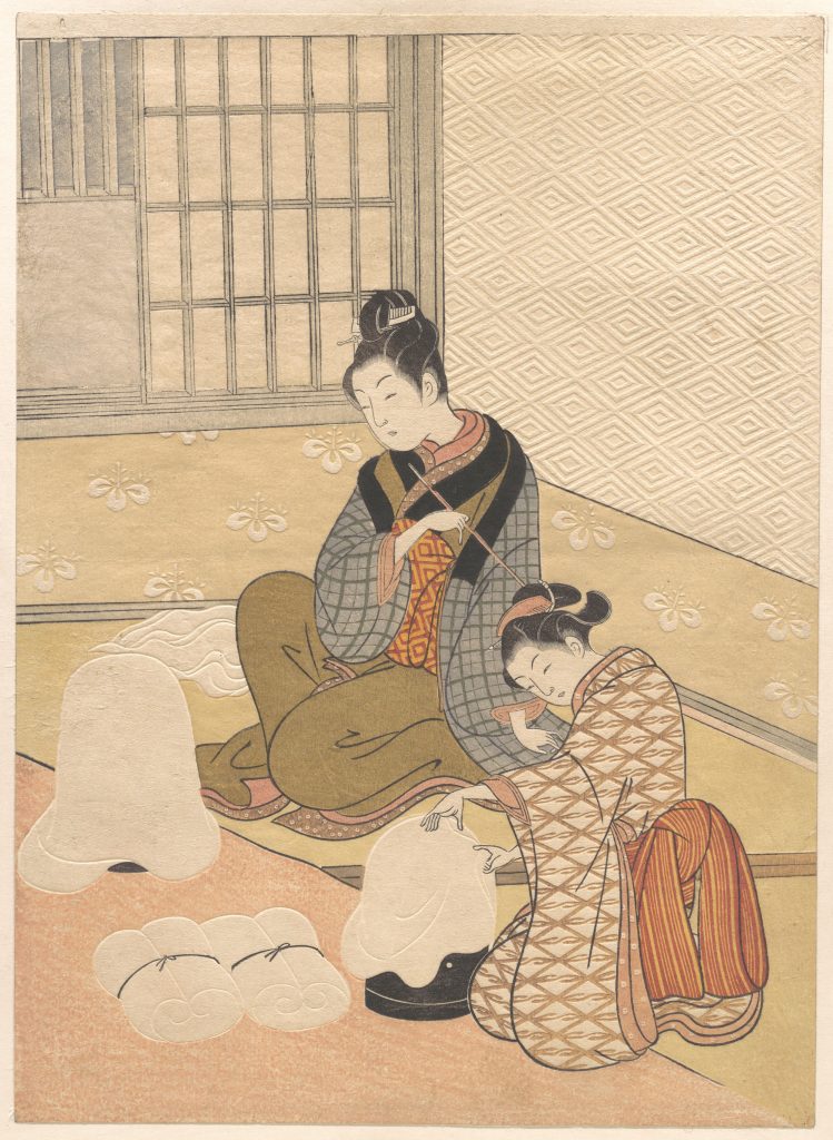
Ukiyo-e
Early prints were monochromatic, which meant that colour was added by hand. Muted shades of pink, orange, green and yellow were commonly added. These colours were made from lead mixed with sulphur and other minerals. The end result is soft, dusty colours.
Rococo
The rococo period was characterized by soft pastels. It contrasted with the dark, primary colours of the Baroque period which preceded it. Other predominant colours were gold, ivory white and other light colours.
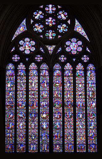
Gothic
Gothic architecture featured stained glass buildings which were brightly coloured in order to create a colourful cast of light when the sun hit. The stained glass has many dark blue and red pieces, along with light blues, greens, purples, a little bit of yellow. The colours are very saturated and pure.
John William Waterhouse (1849-1917) was an English painter who painted in the pre-raphaelite style. Born in Rome to two English painters, he was immersed in the art world from an early age. He enrolled at the Royal Academy of Art when he was 21.
John William Waterhouse
He initially studied sculpture but went on to exclusively study painting. His paintings depicted women of British literature and Classical mythology such as Arthurian legends and Greek myths.
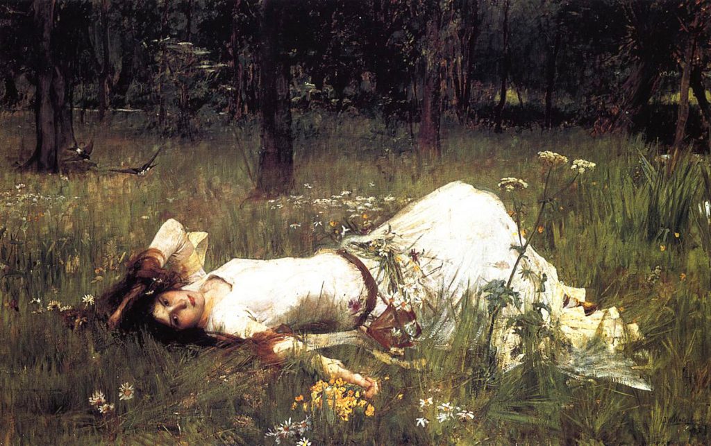
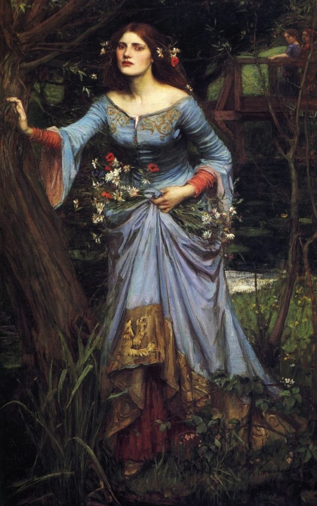
Ophelia (1889) by John William Waterhouse –
Waterhouse painted three versions of Ophelia from Shakespeare’s Hamlet. Each version is a depiction of her at different stages before her tragic death. In the first one (above), she is youthful and innocent. The second painting (1894) shows a slightly older Ophelia, sitting near the stream where she ends her life. The mature, grown woman in the last painting (1910) is Ophelia, who looks starkly different from the previous two paintings. We can see that she has fallen into madness by the look of her challenging gaze and the flushed cheeks. It is thought that she is just about to end her life in this piece as she seems to be balancing herself against the tree in preparation for stepping into the river.
Ophelia (1884) by John William Waterhouse
Ophelia (1910) by John William Waterhouse
He produced hundreds of watercolour and oil paintings. As he became more well known, his paintings grew larger in scale.
Although he was not a true member of the Pre-Raphaelite Brotherhood, his subjects and painting style reflected their tastes. He would continue to paint until his death in 1917 from cancer.
I am in love with Waterhouse’s paintings! They’re richly coloured and dramatically beautiful. All of the women in his paintings have an air of mystery and elegance in them. His paintings seem to have an Impressionistic style to them- I can see and feel the “grain” of his brushstrokes.
The Lady of Shalott by John William Waterhouse Waterhouse Hylas and the Nymphs by John William Waterhouse
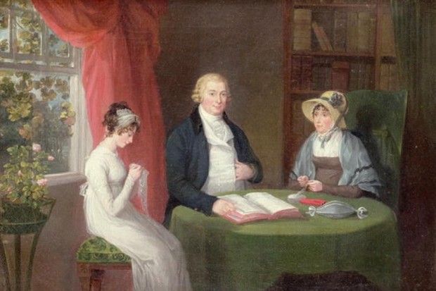
We had Harry Potter and the Hunger Games. What kind of books did the people of the 19th century like to read?
People like to criticize the younger generation of this age for using their phones to distract themselves when they could be reading or doing better things, but did you know, some people of the 19th century considered reading to be dangerous. They feared that people who read books would not be able to tell the difference between reality and fiction. These people would spend hours engrossed in a book.
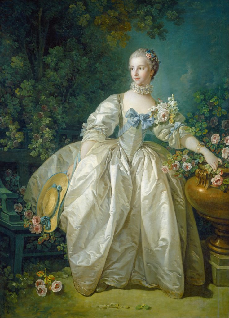
A Young Girl Reading by Jean-Honoré Fragonard
What kind of books were they reading for them to not be able to put it down? Many books during this time were of the realist kind. A popular literary movement during the 19th century, realism was a literary movement that started in France during the mid 19th century and spread to the rest of Europe, Russia and the USA. This movement came about as a response to the Romantic movement, which emphasized imagination, prose, exotic themes and outstanding heroes. Books of this movement had characters of various classes, usually of middle to low classes of society.
In Europe, there were writers like Jane Austen and Charles Dickens. Jane Austen’s novels addressed the limited opportunities women of all classes had. The dialogue is natural and realistic, which was her way of critiquing the unrealistic portrayal of women in books of the 18th century. In her novels, she does not portray all couples as perfect, despite being novels about finding love. Charles Dickens’s novels are thought to have been used for social reform. His books criticized Victorian society for their treatment of the lowest class of people. His characters were often poor, working-class people tackling poverty and injustices.
In the USA, William Dean Howells and Mark Twain were two of many American realist novelists. Howells wrote novels about situations that were realistic such as a marriage falling apart and the rise and fall of businesses. What made Mark Twain’s novels so realistic was that he used colloquial speech that was unique to the United States. During this time, American writers were trying to imitate the fancy writing style of the English, so Twain’s use of American slang was revolutionary and gave American writing a distinctive voice. Twain’s novels had characters that were highly believable and put in tiny details that made his stories highly realistic.
Not only did books help pass the time by immersing readers into the lives of different people and scenarios, but they also brought awareness to social problems that would have otherwise gotten ignored. By writing to fight against the idealization and the dramatization of life in literature, realist writers allowed the voices of the impoverished or less fortunate to be heard.
How To Tell If A Building Is a Piece of Baroque Architecture If The Need To Impress People With Your *Vast Knowledge* of Art History Ever Arises
Renaissance, rococo, classical, medieval… if you are not an art student spending 7+ hours in class every day, you may have little to no clue of what these terms mean. All you know is that these fancy words describe different chapters in the history of art. To the untrained eye, the differences between these periods may be hard to tell, so I’m here to enlighten you about the fantastical majesty that is baroque architecture.
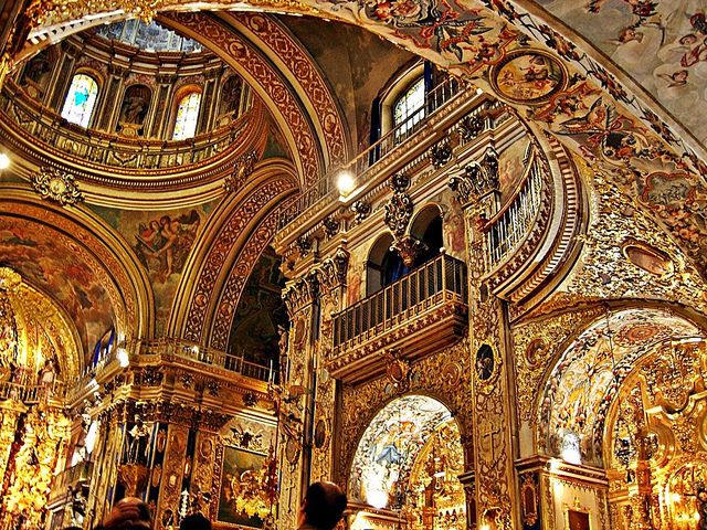
Baroque architecture emerged in Italy during the early 17th century. During this time, the Catholic church’s influence on the people was diminishing due to the Protestant Reformation movement, which challenged the power of the church. To counteract this, the church had extravagant churches and cathedrals built to evoke emotion and wonder to the people, attracting new followers. By doing this, they showed off the vast amount of wealth and power they had. Not long after the monarchy had lavish buildings built as well as a reminder to everyone that they also held a tremendous amount of wealth and power.
Renaissance architecture, which preceded baroque architecture, was a source of inspiration for the latter. The domes, colonnades and other elements of renaissance architecture were taken and made bigger and grander. The complex and highly decorated structures were what made baroque structures so unique.
Other elements of baroque architecture also included:
Broad naves
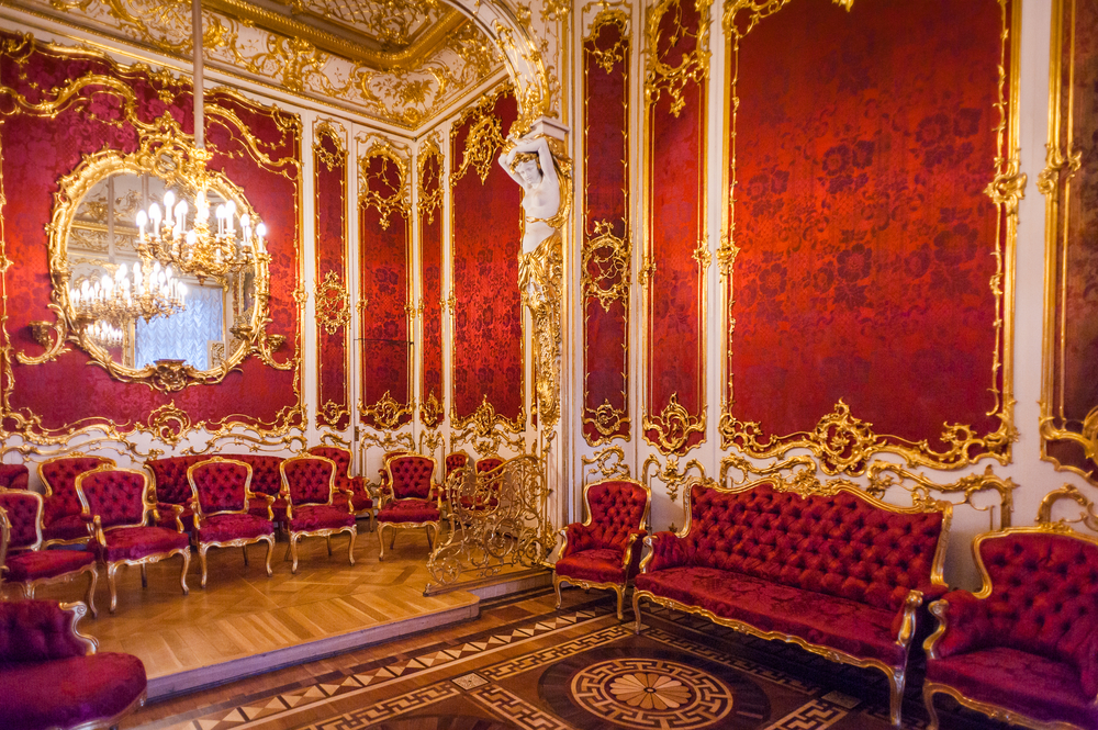
LOTS of ornamentation, often inlaid with gold
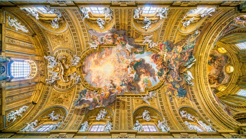
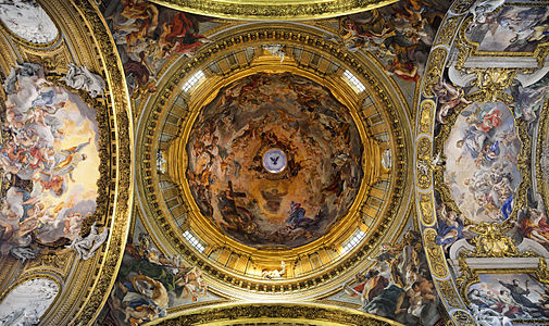
Emphasis on light and darkness- in churches, the altar is bathed in light as it is the most important part of the church
Trompe-l’oeil (forced perspective) paintings on the ceilings
Plaster or marble finishings for a fancy look
Strong curves and twists
Large frescoes
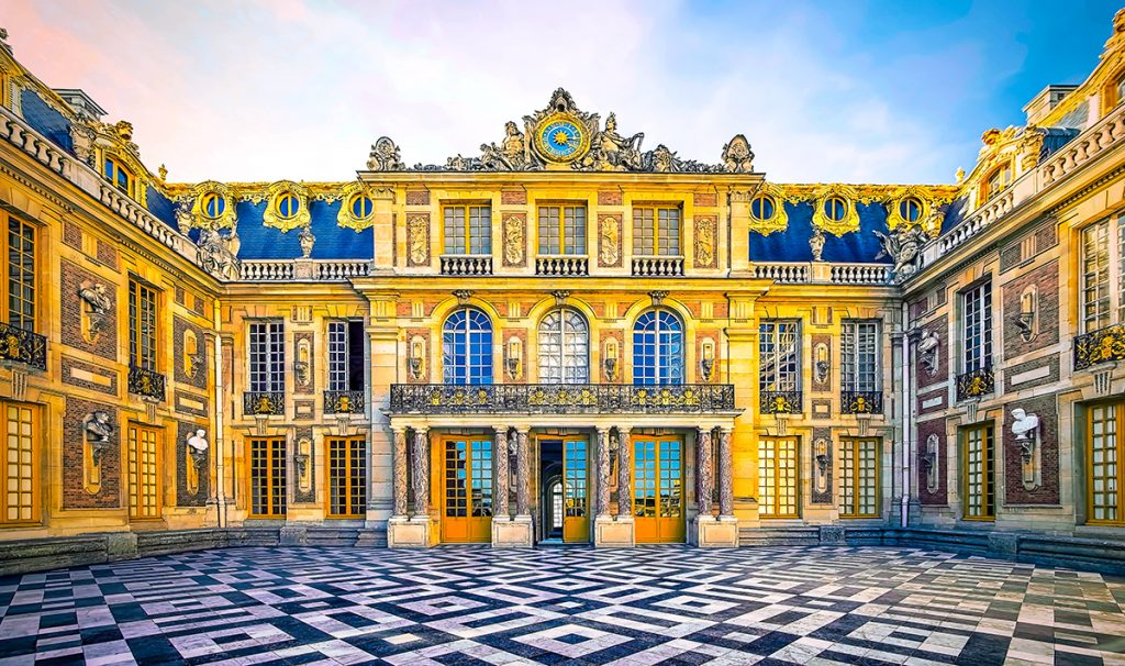
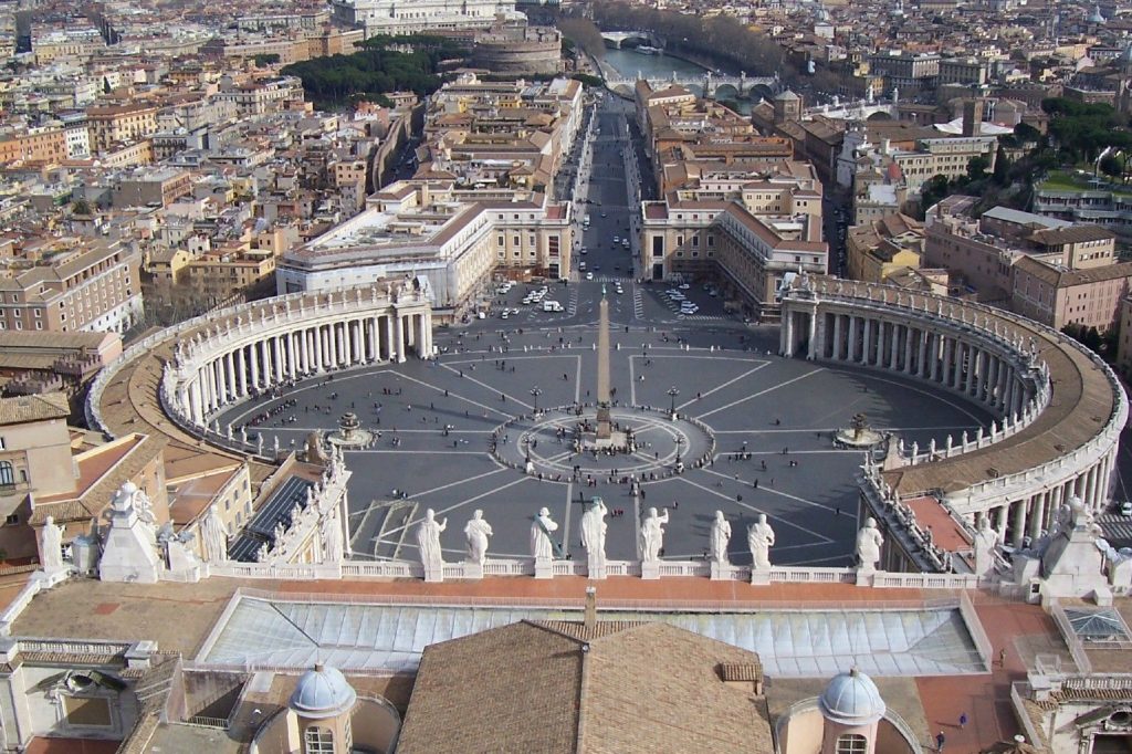
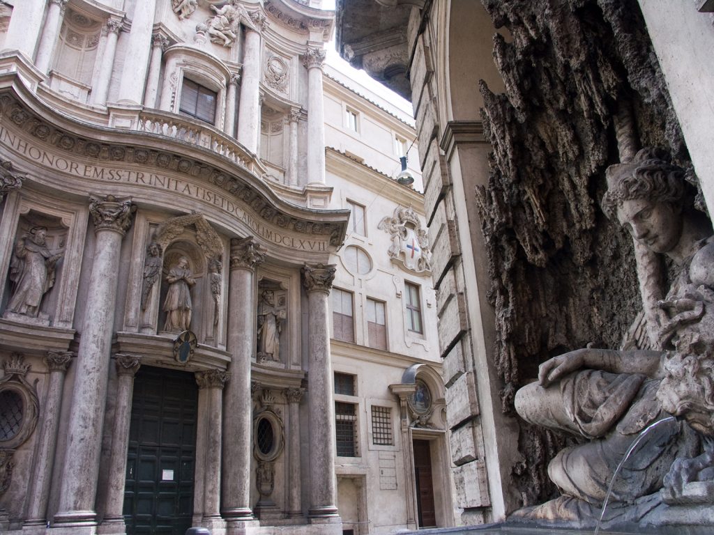
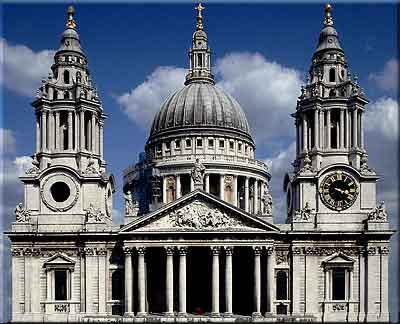
Some baroque buildings:
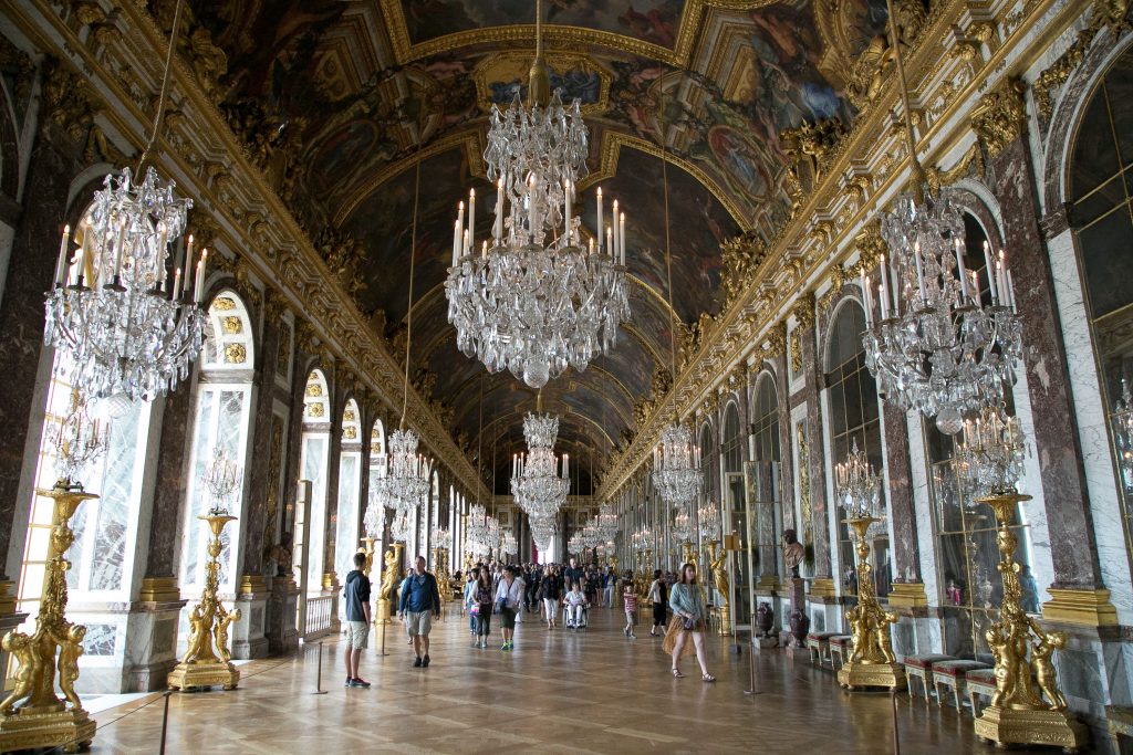
The Palace of Versailles, Versailles St. Peter’s Square, Vatican San Carlo alle Quattro Fontane, Rome
St. Paul’s Cathedral, London
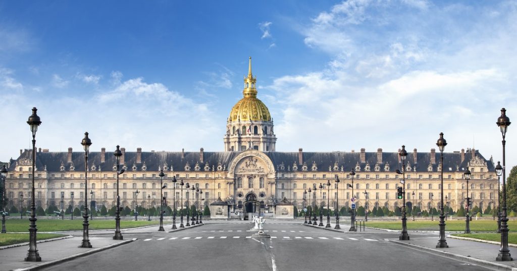
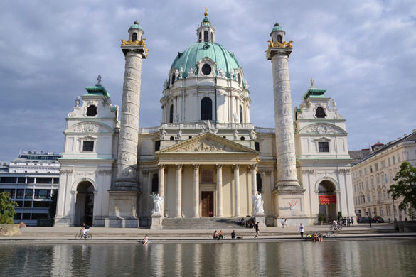
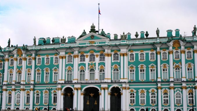
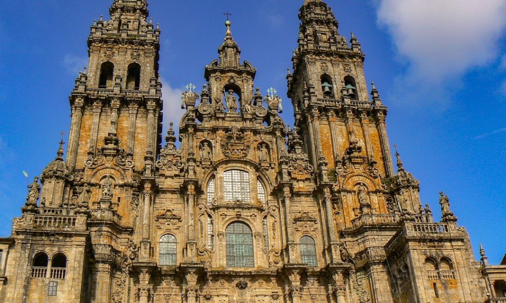
Les Invalides, Paris Karlskirche, Vienna Winter Palace, Saint Petersburg Cathedral of Santiago de Compostela, Western Facade
Throughout history, clothes could be worn to signify status, to enhance one’s looks, provide warmth or other practical uses. The clothing worn by Native Americans in the 15th century greatly varied across North America due to differences in weather, access to resources and differing values from tribe to tribe. Prior to the Europeans arriving and initiating trade in the 1500s, Native Americans mainly relied on hunting to provide the skins for clothing.
Native American tribes were divided into several cultural regions. The tribes in these regions shared the same language, climate and environment.
The cultural regions and the clothing worn in these areas follows:
The Arctic: Located in the North of present-day Alaska, Canada and Greenland, this region had flatlands and had no trees. Living in one of the coldest regions on the planet, groups such as the Inuit relied on wearing several layers of thick clothing to keep them warm. Their outfit consisted of a parka, pants and boots made from seal and caribou. Seal skin would keep their clothing waterproof, while caribou fur lined the inside and covered the outside of their clothing to keep them extra warm.
The Subarctic: This area featured swampy lands and boreal forests. Stretching across inland Canada and Alaska, people of this region lived a nomadic lifestyle, following herds of caribou. Women wore long dresses with removable sleeves while men wore breechcloths and leggings. Alternatively, both men and women also wore tunics with knee-length pants. Everyone wore moccasins, a type of soft leather boot.
The Northeast: This region covered the Canadian Maritimes, the Great Lakes region, the Mid-Atlantic states, and the American Midwest. The region had temperate weather and a rolling landscape, which made good land for farming. Everyone wore moccasins and clothing made from deerskins and pelts. In the summer, women would wear deerskin aprons while men would wear breechcloths. When the weather got colder, the people would don bearskin capes and gloves. For ceremonies, beads, shells or porcupine quills were used to decorate the cloths.
The Southeast: North of the gulf of Mexico, this region was full of fertile land. Men and women wore little clothing, wearing short skirts in warmer weather, while children wore nothing at all. In colder weather, they wore skin cloaks and moccasins. They also wore jewellery made from shells and bones. Feather headdresses and capes made from bark and feathers from eagles and turkeys were worn during ceremonies.
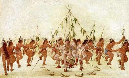
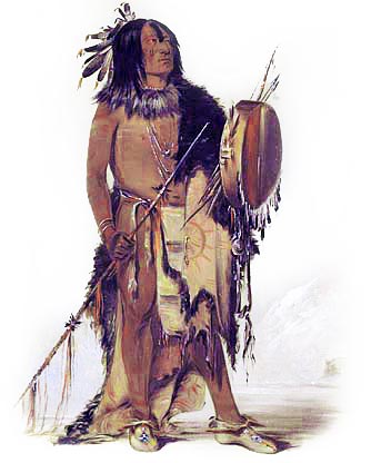
The Plains: Spanning the vast prairie region between the Mississippi River and the Rocky Mountains, the people of the Plains dressed according to the weather. During the warm summer months, women would wear loose-fitting dresses and men would wear breechcloths. In the winter, men would wear robes and high boots. Deerskins and buffalo hides were used to make their clothing. Popular American media loosely based their depiction of an “Indian” from the Plains people due to the fact that they wore feathered war bonnets.
The Southwest: This area lies between present-day Arizona and New Mexico. It was a desert ecosystem and rained very little, although there were many rivers. Everyone wore deerskin moccasins. Men wore breechcloths and cloth headbands. Women wore knee-length cotton dresses called mantas. The dress was fastened over one shoulder while the other remained bare.
There are many more cultural regions such as the Northwest Coast, the Great Basin, and the Plateau. The areas I have talked about above are meant to show how different people dress depending on the region’s climate and topography. Not long after this period in time, Native Americans were exposed to the influences of the European settlers, adopting their styles as well as the styles of neighbouring tribes due to trade.
Sir Joshua Reynolds (1723-1792) was an English painter who was famous for his work in portraiture. He was born into a well-educated family, growing up and becoming versed in the classics. He became apprenticed under Thomas Hudson, who was well known for his portraits during this time.
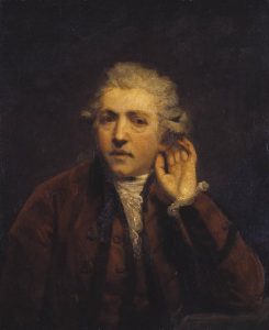
Self-Portrait as a Deaf Man by Sir Joshua Reynolds – Joshua Reynolds became partially deaf in his 30’s after a bad cold. He was often seen with an ear trumpet.
Reynolds later developed a style unlike any others of his time, using impasto (the texture of thick paint) and large brush strokes. He studied the works of the old masters, Italian painters, and ancient Greco-Roman sculptors.
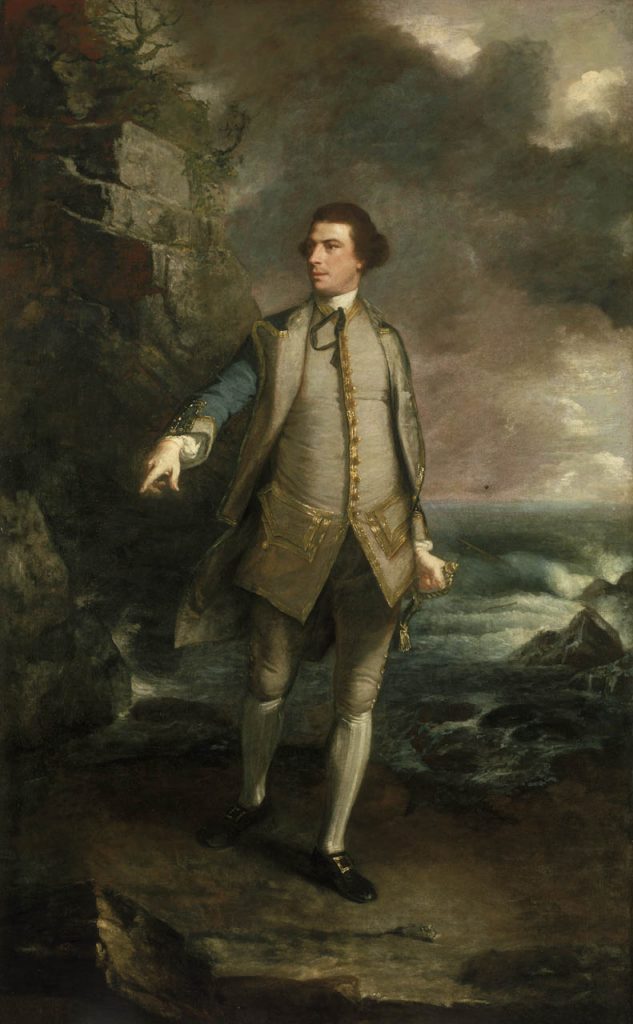
Captain the Honourable Augustus Keppel by Sir Joshua Reynolds – Inspired by Romans, Reynolds based this painting off the famous statue of Apollo Belvedere.
He founded and became the first president of the Royal Art Academy, where he delivered a series of lectures. There he greatly encouraged people to refer back to the classics and works of the old masters. He believed in idealizing the natural world, choosing not to paint things as they are in real life; this would be later called the “grand manner” of painting.
Colonel Acland and Lord Sydney: The Archers by Sir Joshua Reynolds – Grand manner was utilized in history painting, which Reynolds greatly appreciated and claimed to be the greatest form of art. He did not get the chance to do many epic history scenes as his portraits were in greater demand. Reynolds managed to incorporate this style into his portraiture.
What I enjoy about his paintings are that they all have blurred, almost rough-looking backgrounds that contract with the soft, smooth subjects, pulling the eye in. Their somber, pensive looking faces give them an air of dignity.
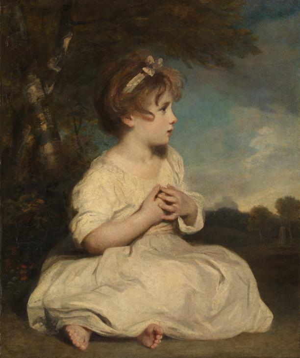
The Age of Innocence by Sir Joshua Reynolds
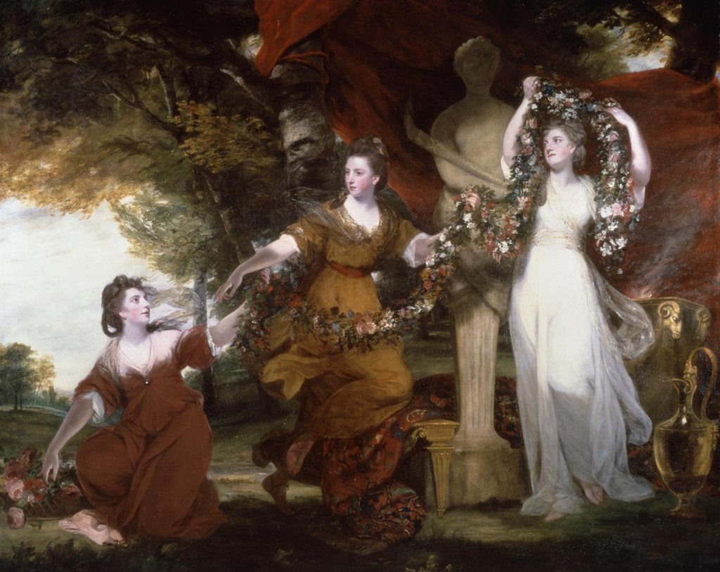
Three Ladies Adorning a Term of Hymen by Sir Joshua Reynolds


#/media/File:John_William_Waterhouse_-_The_Lady_of_Shalott_-_Google_Art_Project_edit.jpg)
#/media/File:Waterhouse_Hylas_and_the_Nymphs_Manchester_Art_Gallery_1896.15.jpg)