
You Can Thank William Morris for Your Great-Great-Aunt’s Ugly Interior Home
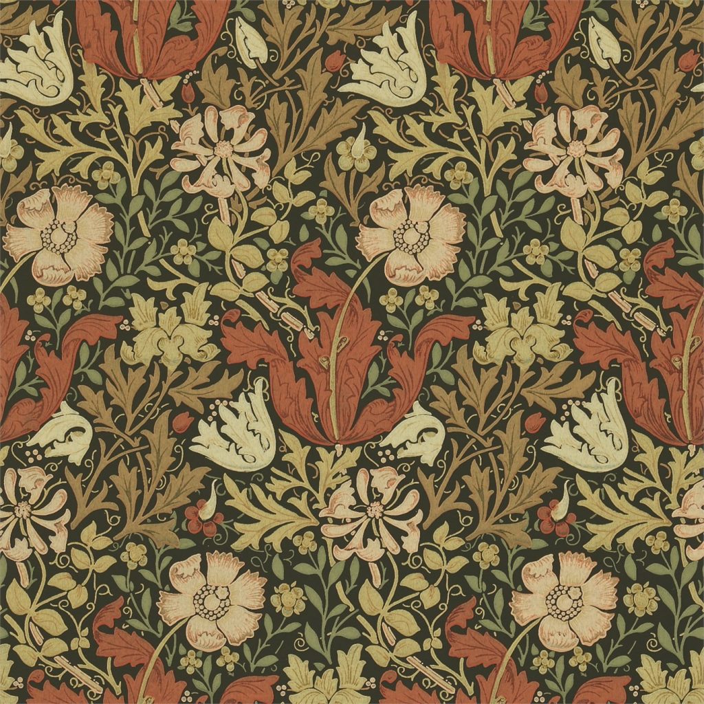
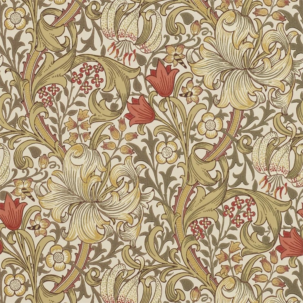
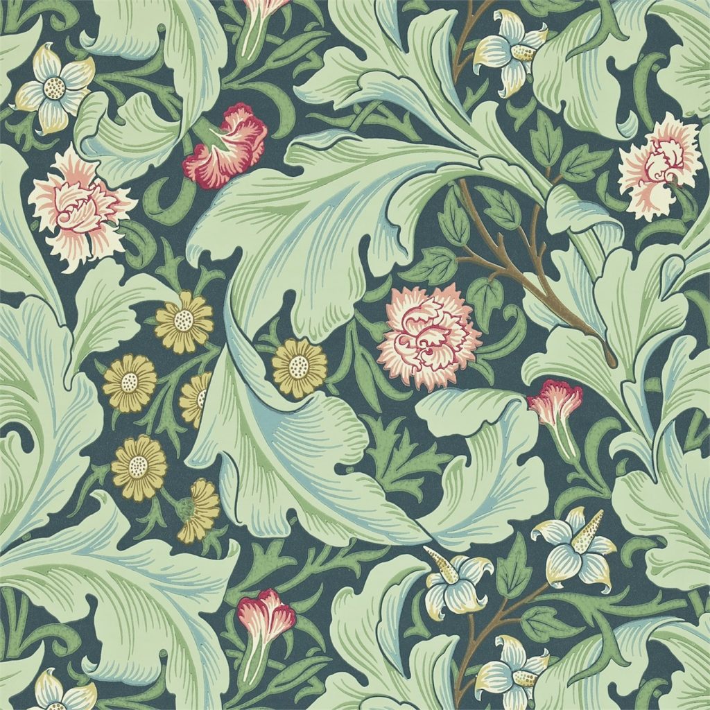
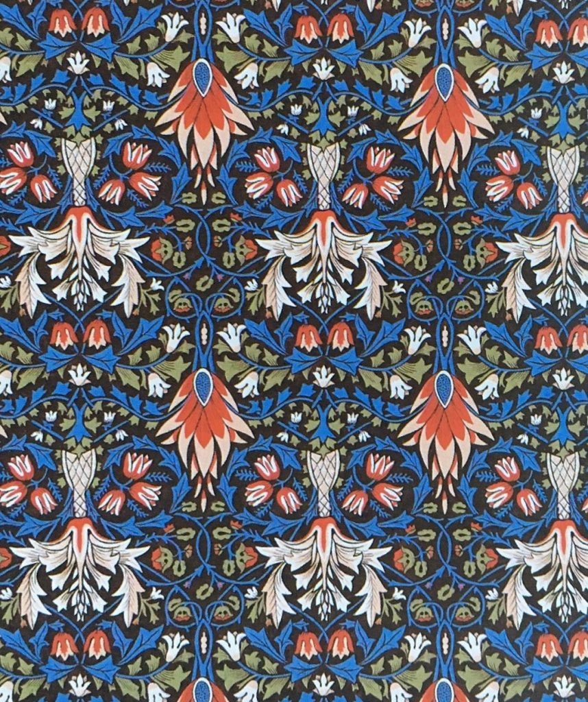
As an enthusiast of handcrafted, traditional works of art and furniture, William Morris started a company of artisans that worked exclusively by hand. His company, Morris & Co. introduced the world to a whole new style of textiles and wallpaper and started a movement that brought back the demand for classic craftsmanship as well as an appreciation for the aesthetically pleasing patterns inspired by the past.
The wallpapers that Morris produced all look different yet share similar characteristics such as the colour. Morris brought back the use of organic vegetable dyes instead of chemical aniline dyes. He used indigo for blues, shells and roots for browns, plants and crushed bugs for red and the weld plant for yellows. As a result, the dyes produced a soft, but rich and saturated effect. He would never use bright colours as only chemicals would produce such hues.
Morris was inspired by several art periods which led him to design the naturalistic, yet ornate designs of his wallpaper. This leads us to ask: what inspired him and what were the colour characteristics of them?
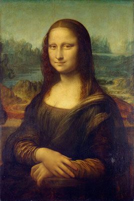
The Renaissance
Pigments for renaissance paintings were made from crushed minerals or plants, similar to the methods Morris used for his textiles. As they were made from natural materials, they were rich and deep in colour.
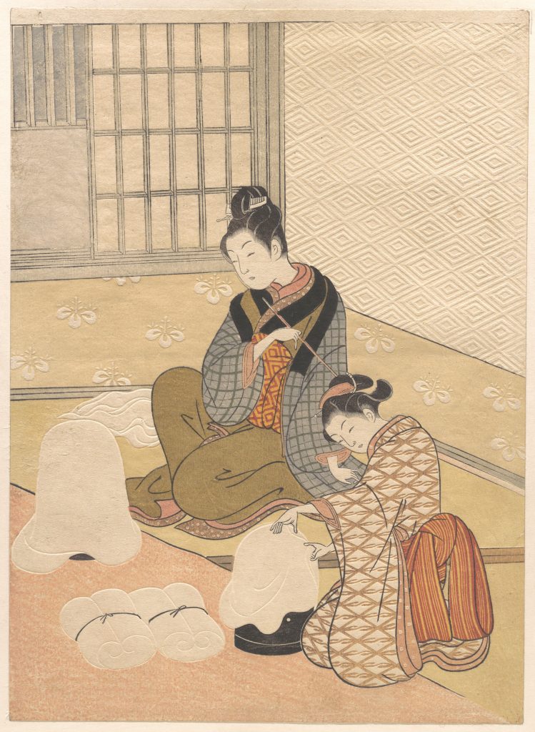
Ukiyo-e
Early prints were monochromatic, which meant that colour was added by hand. Muted shades of pink, orange, green and yellow were commonly added. These colours were made from lead mixed with sulphur and other minerals. The end result is soft, dusty colours.
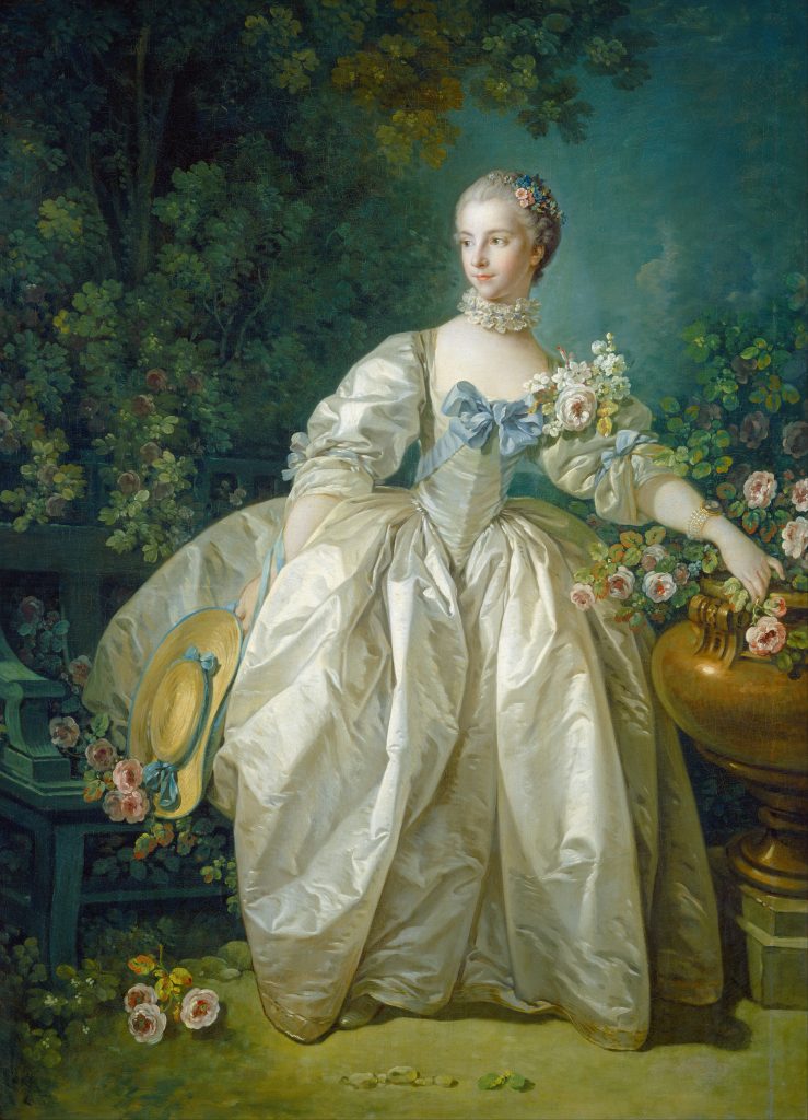
Rococo
The rococo period was characterized by soft pastels. It contrasted with the dark, primary colours of the Baroque period which preceded it. Other predominant colours were gold, ivory white and other light colours.
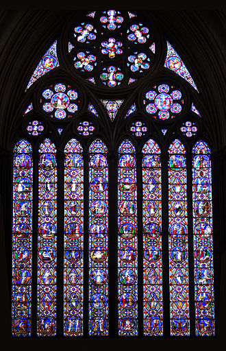
Gothic
Gothic architecture featured stained glass buildings which were brightly coloured in order to create a colourful cast of light when the sun hit. The stained glass has many dark blue and red pieces, along with light blues, greens, purples, a little bit of yellow. The colours are very saturated and pure.
Sources:
www.jankanuch.int-des.com/uncategorized/william-morris-a-visual-guide/
www.patternobserver.com/2014/11/25/history-surface-design-william-morris/
www.craigandrose.com/all-articles/period-styles-arts-and-crafts-movement/
www.victorianweb.org/authors/morris/delucia10.html
www.daydreamtourist.com/2014/12/09/william-morris/