
Architecture/Spread
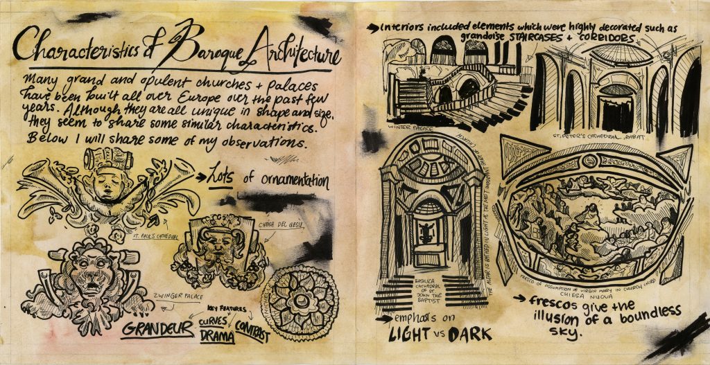
For this spread, I was to cover baroque architecture. The topic was broad as there were many different things that could be covered, so I decided to focus on the characteristics of baroque architecture since I found that the most interesting. I tried to make my spread look like a journal entry/sketchbook page of some European traveller observing baroque architecture. I painted the paper with watercolours to give it an aged effect and exclusively used black ink. I drew different parts of several baroque buildings throughout the spread which I think are most successful part of my spread. I used a black marker and smudged it to give it the effect of smudged ink that fell on the page so that it would feel more realistic. I would give myself an 8/10 for this assignment. If I were to do this again, I would rework the layout as the text size and fonts are not consistent. I think I focused too much on the drawings and therefore did not leave enough space for some of the text so I had to make up for it by compromising the size of them. I am also afraid that this ‘journal entry’ concept is not clear enough and will come off as too simple..? Overall though I am quite happy with my spread and am looking forward to do more.