Typography/Zine
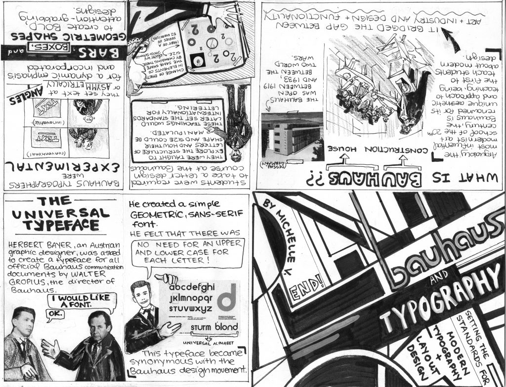
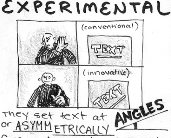
For my final history book assignment, I did a typography zine. I had trouble choosing what to make my zine about. Initially I was going to make it about key typographers of the time, then I changed it to exclusively Bauhaus typography since they were so iconic. I noticed that the zines done before me were super neat and very aesthetically pleasing, however they were rather text-heavy and I would find myself glazing over the text. I made sure to put in as many pictures as possible in addition to copy so that there could be ‘breaks’ from reading. I was inspired by how Grace printed and pasted a picture of Behrens for her zine, so I decided to incorporate printed images into my zine as well, which worked really great since I’m sure my drawings could not produce the same effect. I felt that putting straight text would be boring to look at, so I made certain words stand out by making them a different font, or put them into speech bubbles and boards.
On the 4th page I summarized the writing on that page in a meme format, which I hope was translated well. I did this because I wanted to present the information in a funny, yet understandable way. Nothing captures one’s attention more than a meme, and it adds to one’s understanding if they understand memes.

Judy pointed this out but the information on the zine did not seem to have an ‘order’ and was kind of all over the place, and I agree it seems like that. There was a lot of information to work with so I put whatever sounded the coolest, which made the zine unable to flow as smoothly as it should have.
I would give myself a 9/10 for this zine. It was my first time making a zine and I was incredibly pleased with the results. Someone suggested that I could have made some of the copy in the style of Bauhaus, which I agree with, so I’d definitely do that if I were to do it again, but otherwise I’d keep it that way it is.