Blog 4: Herb Lubalin

American graphic designer Herb Lubalin was known for being a typographic GOD. He began working at S&H, a healthcare advertising agency, where he quickly became known for his work with type. He became one of the pioneers of expressive typography, or word pictures, as he called it. He left the company to pursue graphic design instead of continuing to create advertisements. 

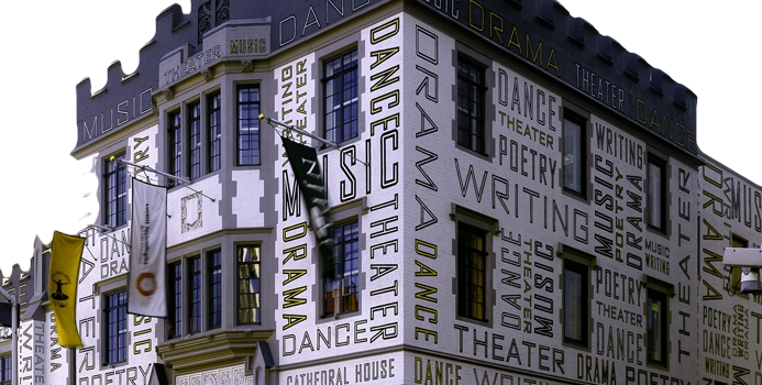
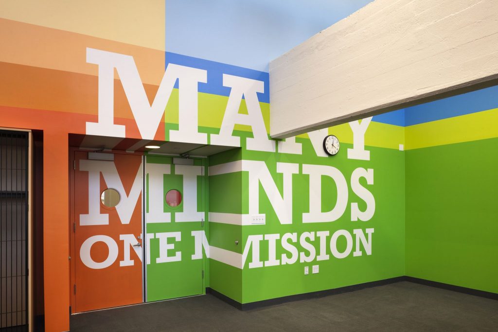
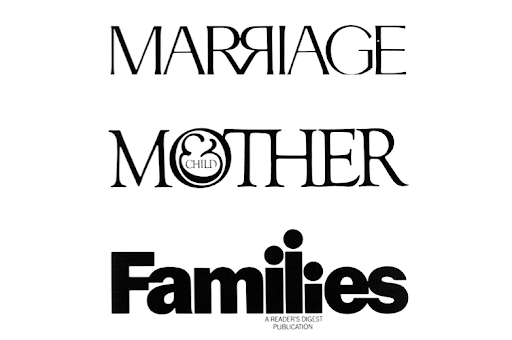
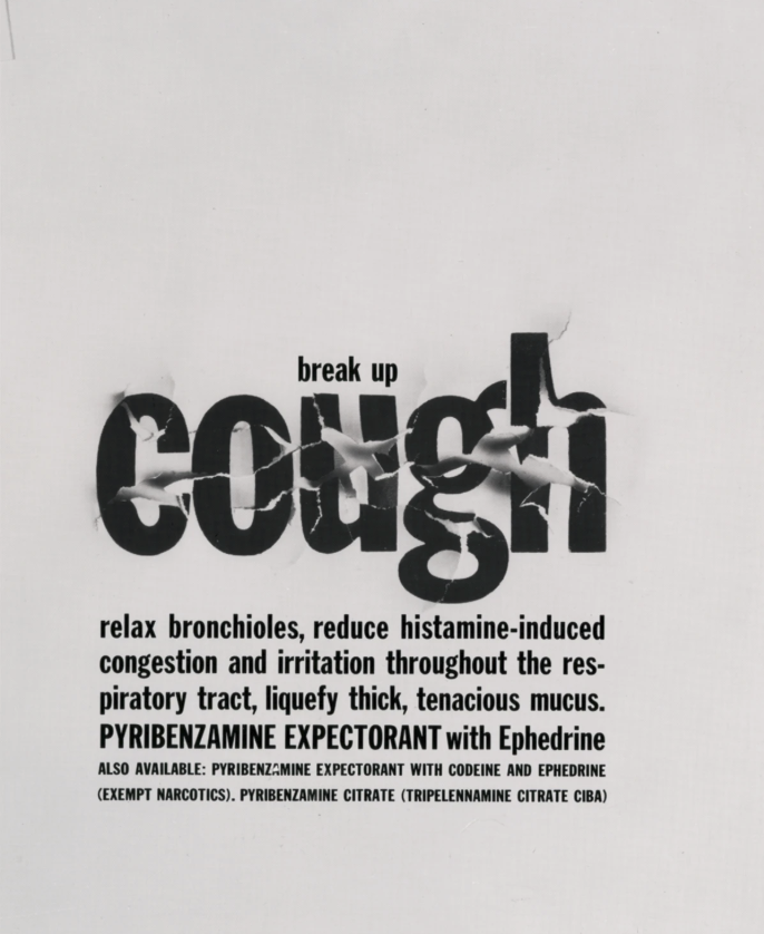
Like other postmodernists, he rejected modernism, deeming the style too plain and bare, which did not fit the American essence. In response, he created a new conceptual style called ‘graphic expressionism’, which was the use of text in a creative and expressive way instead of the conventional way it is normally used, which was to simply have them be placed on the page with no other purpose.

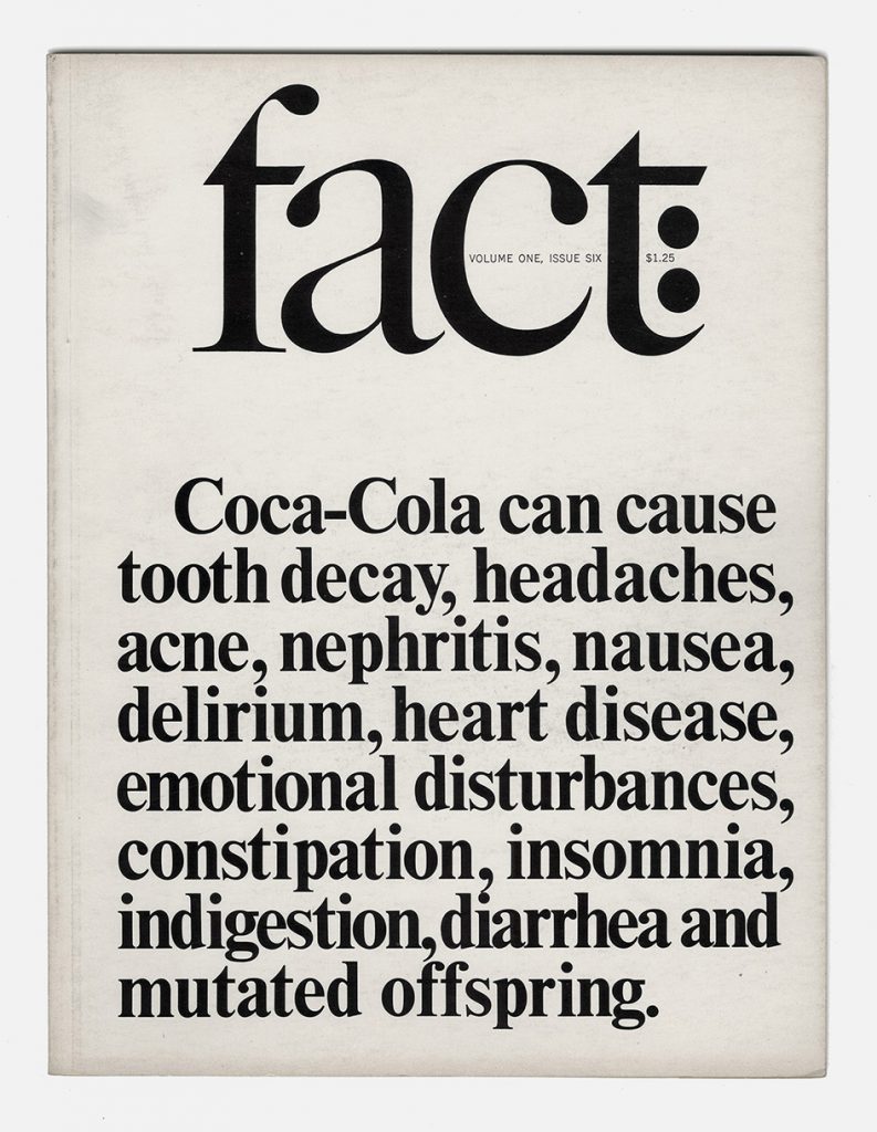
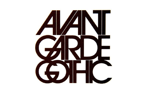
He created many typefaces, one of which was called Avant Garde. Based off the logo font of the magazine Avant Garde, this font was different and innovative. As it was so unique and interesting, the font became widely used, but it was not used correctly, and so the font became stereotypical of the 1970’s.


Sources:

Blog 3: Paula Scher

Known as one of the most influential graphic designers in the world, Paula Scher has spent her 40-year career developing brand identities, advertisements and packaging with her keen eye for all things eye-pleasing and interesting. She started off her career working at CBS records, designing album covers and magazines, then went on to become the first female principal at Pentagram, the world’s largest independent design firm. Scher has done a wide range of work, but she is most known for creating brand identities and logos for companies such as Citi. 

“…Scher designed the logo during an initial client meeting, later admitting that it took only a few seconds to sketch the initial idea for the logo on a napkin. ”

Although not as well known as her other works, her supergraphics cover the walls of rooms and building exteriors in many public structures and are just as marvellous as her other works.

Paula Scher for the Queens Metropolitan Campus.

Scher calls these ‘environmental graphics’, although they hold the same definition as supergraphics, which are used to describe graphics that are put up over large surfaces to decorate and brighten up buildings, spaces in rooms, or halls.

Supergraphics on the walls of The New Victory Theatre, located in New York.
Environmental graphics for the agency’s headquarters in New York.
Restrooms at Grey Group on the second and third floors feature superscale male and female icons that appear “correct” at their respective entrances but then graphically stretch down the halls.

Typography on the New Jersey Performing Arts Centre’s exterior.

It is amazing how she can have such a diverse portfolio of work when it comes to design, there is no distinct style in her works, which makes it hard to tell what exactly she has done- but she has done just about everything there is.

Supergraphics on put up in a Brooklyn public high school.

Sources:

www.fastcompany.com/90471135/back-in-the-1996-presidential-race-the-world-wide-web-was-a-flashy-novelty

www.pentagram.com/about/paula-scher