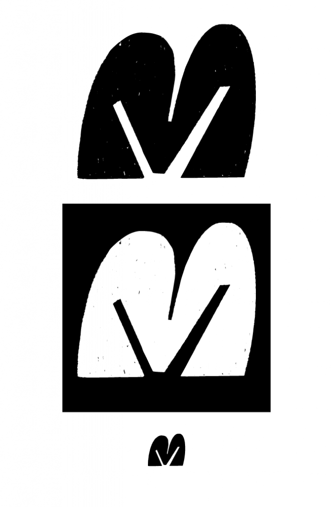
Of the three logo concepts I had, I chose the first concept.
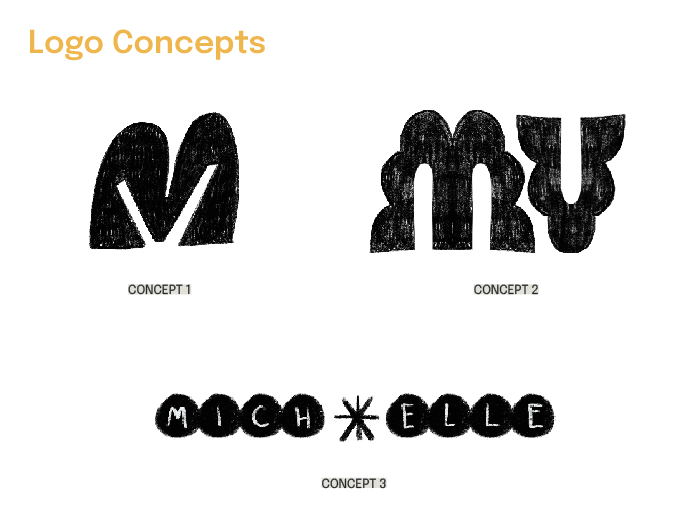
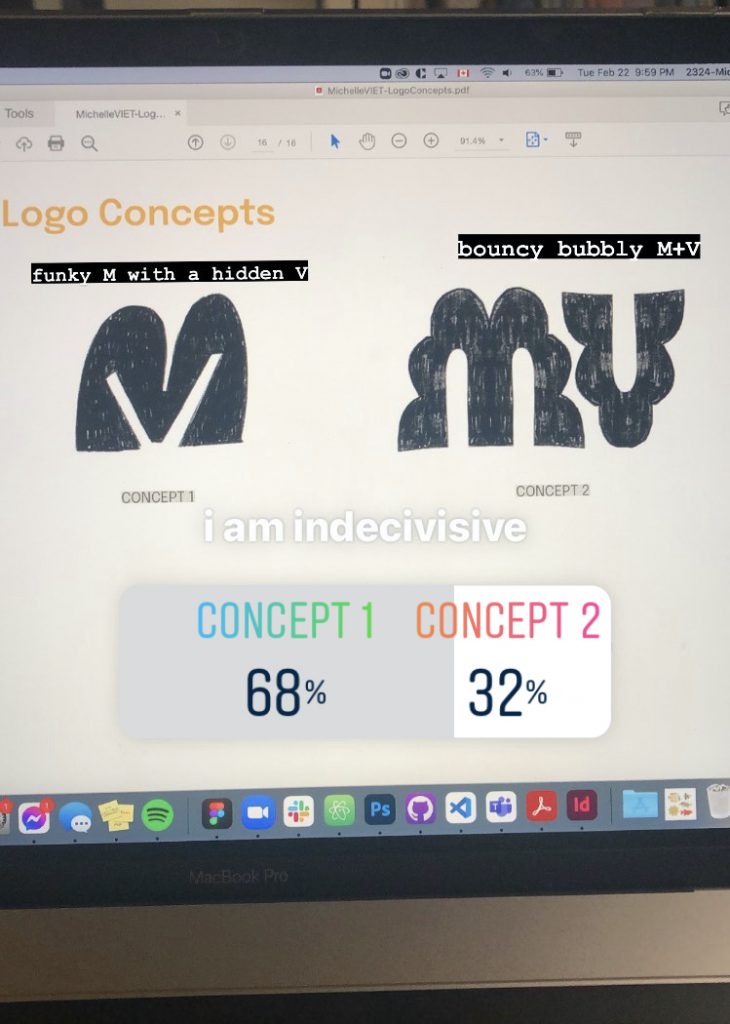
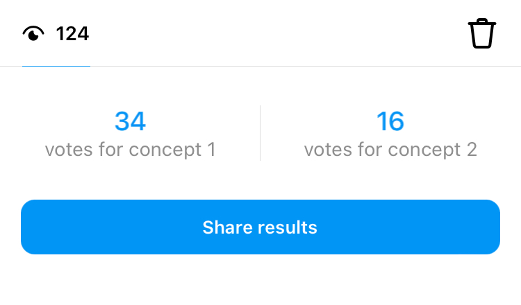
I initially had a lot of trouble deciding between concepts 1 and 2, and even put up a poll on Instagram to see which logo had the strongest first impression with my friends- non-design students, past IDEA alumni and peers from other IDEA cohorts voted and even gave some great ideas and feedback! Even after the votes favoured concept 1, I was still on the fence about it, as I liked how concept 2 looked on potential websites, but ultimately chose concept 1 because it truly fit my personal aesthetic.
I am very satisfied with my final logo and I don’t think I see myself changing it when I graduate. I would give myself a 9/10 overall. While I got stuck from time to time when it came to ideating, I was able to get myself out of those ruts pretty quickly because I was so excited for this project. Here’s the final logo!