History Book Spread #4 (BOOK INDEX)

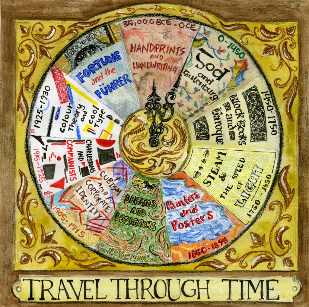
I did the index of the book! I had too many ideas and had a lot of trouble narrowing them down to good ones. Since the index was not going to include page numbers, I felt that the purpose of the index was to just show the chapters of the book and not where to find them. With this in mind, I wanted to stray from the standard linear form that most indexes follow, which is why I played with different ways of arranging the content. I liked the theme of time and travelling through time, which is why I decided to put the chapters onto a clock face. I also put a little plaque on the bottom that said “travel through time” to really drive that point home.

Initially, I was going to draw the names of the surveys and their dates in typefaces from that time, but I felt that the clock face would still look too plain. I put patterns and little elements from that time period in addition to the dates and chapter names in the background to make it eye-catching.

I would give myself 9/10 for this index. I felt that my index reflected the research I did prior to making this, and that it would give the viewer an idea of what the sections would be about. I think everything looks great, although if I were to do this again I would change the look of the survey 4 section (steam and the speed of light).

History Book Spread #3 (SURVEY 9)

Typography/Zine 

For my final history book assignment, I did a typography zine. I had trouble choosing what to make my zine about. Initially I was going to make it about key typographers of the time, then I changed it to exclusively Bauhaus typography since they were so iconic. I noticed that the zines done before me were super neat and very aesthetically pleasing, however they were rather text-heavy and I would find myself glazing over the text. I made sure to put in as many pictures as possible in addition to copy so that there could be ‘breaks’ from reading. I was inspired by how Grace printed and pasted a picture of Behrens for her zine, so I decided to incorporate printed images into my zine as well, which worked really great since I’m sure my drawings could not produce the same effect. I felt that putting straight text would be boring to look at, so I made certain words stand out by making them a different font, or put them into speech bubbles and boards.

On the 4th page I summarized the writing on that page in a meme format, which I hope was translated well. I did this because I wanted to present the information in a funny, yet understandable way. Nothing captures one’s attention more than a meme, and it adds to one’s understanding if they understand memes. 

Judy pointed this out but the information on the zine did not seem to have an ‘order’ and was kind of all over the place, and I agree it seems like that. There was a lot of information to work with so I put whatever sounded the coolest, which made the zine unable to flow as smoothly as it should have. 

I would give myself a 9/10 for this zine. It was my first time making a zine and I was incredibly pleased with the results. Someone suggested that I could have made some of the copy in the style of Bauhaus, which I agree with, so I’d definitely do that if I were to do it again, but otherwise I’d keep it that way it is. 

History Book Spread #2 (SURVEY 6)

Geopolitics/Artifact 

For my second spread, I was to cover geopolitical issues of the late 19th and early 20th centuries. I chose to recreate signs that the suffragettes held while taking to the streets. I set a timer on my camera and had my siblings and myself pose as if we were in the process of creating the signs, as I felt that it would be more interesting than just having the signs being held. I changed my camera settings to shoot in black and white to imitate how pictures were like back in the 1920s. The most memorable and common catchphrase on the signs were “VOTES FOR WOMEN” which was why I had to create two signs containing the phrase. I scattered objects that I thought would make the space throughout the image less empty. The third sign that was slightly hidden behind the two ‘votes for women’ poster was there because it was partially incomplete due to the fact that I had run out of space, however, instead of throwing it away, I liked how natural it made the scene look, so I kept it.

I would give myself an 8/10 for this spread. I felt that my signs looked successful and authentic, however, I would spread out my block of information so it is easier to read if I had to do this again. I would also create more signs that have more interesting phrases.

History Book Spread #1 (SURVEY 3)

Architecture/Spread

For this spread, I was to cover baroque architecture. The topic was broad as there were many different things that could be covered, so I decided to focus on the characteristics of baroque architecture since I found that the most interesting. I tried to make my spread look like a journal entry/sketchbook page of some European traveller observing baroque architecture. I painted the paper with watercolours to give it an aged effect and exclusively used black ink. I drew different parts of several baroque buildings throughout the spread which I think are most successful part of my spread. I used a black marker and smudged it to give it the effect of smudged ink that fell on the page so that it would feel more realistic. I would give myself an 8/10 for this assignment. If I were to do this again, I would rework the layout as the text size and fonts are not consistent. I think I focused too much on the drawings and therefore did not leave enough space for some of the text so I had to make up for it by compromising the size of them. I am also afraid that this ‘journal entry’ concept is not clear enough and will come off as too simple..? Overall though I am quite happy with my spread and am looking forward to do more.

Yearbook Spread

I wanted to have my yearbook spread reflect who I see myself as- strange but charming. To show this, I filled my page with every colour of the rainbow and added various things to make it feel busy and lively. The keywords I chose to put on my spread were: personable, sensitive, foolish, excitable and eccentric, which I feel describe me quite well. I used gouache and watered it down to paint the background, since I dislike colouring large areas with pencil crayons. I used pencil crayons to draw in the weird characters and fish, which I immensely enjoyed doing. These drawings gave off a kooky energy. I intentionally left some small white spaces while colouring to give the drawings a loose, messy feeling. Initially, I was going to print out a picture of myself but then I decided to challenge myself by drawing a self-portrait, using both gouache and pencil crayons. For the finishing touch, I stuck on colourful stickers to make the image feel less flat.

Overall, I would give myself a 8.5/10. I feel quite proud of this piece although there is definitely room for improvement. For one, I feel that my self-portrait does not completely look like me. Although I would like to see it look more realistic, I am still satisfied with how it turned out. I would also change the placement of the last two keywords on the rainbow as they are less visible on the green stripe compared to the yellow stripe. Lastly, I could have written the facts about me in bigger handwriting so that it would be easier to read for those who may have difficulty reading smaller text. Even though this project was not worth any marks, I had fun doing this activity!